Dashboard Crosstab Table
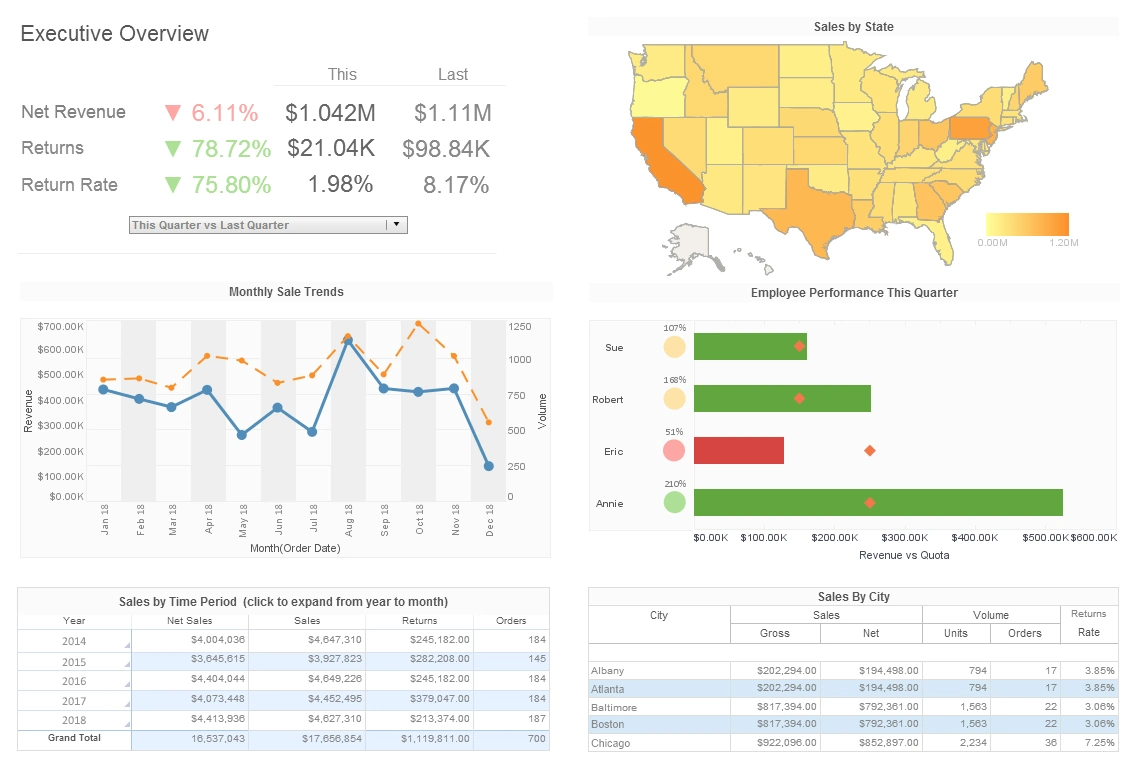
Users can integrate disparate data sources into crosstab tables and create sophisticated real-time reports using InetSoft's award-winning dashboard software. View the example below to learn more about the Style Intelligence solution.
A crosstab table, also known as a pivot table, is the tabular equivalent of a chart. A Worksheet crosstab contains one column header, one or more row headers, and one measure.
The values at the row-column intersections of the crosstab table represent summary (aggregate) information of the measure. For example, a crosstab with row headers representing 'Salesperson' and column headers representing 'Month of Year' might contain values at the intersections representing 'Average Sale Price' or 'Maximum Sale Price'. The measure in both cases is 'Sale Price'. The summarization method is, respectively, Average or Maximum. By using summarization, crosstab tables display large amounts of data in a compact form.
Step by Step Crosstab Creation
To create a crosstab table from an existing Data Table, follow these steps.
- Right-click the table title, and select 'Group and Aggregate' from the context menu. This opens the 'Aggregate' dialog box.
- In the 'Aggregate' dialog box, click 'Switch to Crosstab'. The 'Aggregate' dialog box switches to the crosstab view.
- In the 'Row Header' panel, select one or more fields from the left menus.
- In the 'Column Header' panel, select a field from the left menu.
- (Optional) For each selected field in the 'Row Header' and 'Column Header' panels, select a Named Grouping (if one exists) from the corresponding right menu.
- In the 'Aggregate' panel, select a measure column from the left menu. This is the column whose values will be summarized.
- In the 'Aggregate' panel, select the aggregation method from the right menu.
- If you select a bivariate aggregation measure (e.g., 'Correlation', 'Weighted Average', etc.), select the second operand (column) from the 'with' menu.
- (Optional) To display the measure as a percentage of the grant total, select the 'Percentage' option.
- Click 'OK' to create the crosstab table.
More Articles About Dashboards
Aspects of Governed Data Integration - While governed data integration may seem straightforward, it can actually be quite complex. There are many factors to consider, including data quality, security, and privacy. In addition, there may be legal or regulatory requirements that must be taken into account. One of the most perplexing aspects of governed data integration is data quality. When data is being combined from multiple sources, it is essential that the data is accurate, complete, and consistent. This requires careful planning and execution to ensure that data is properly cleansed, deduplicated, and standardized...
Executional Agility - Now let's talk about executional agility. Nowadays you have to be able to deliver a new service in weeks, not months, because within two weeks all your competitors are going to offer the same thing. When you're taking a look at marketing campaigns, you need a better understanding of customer buying behavior. Does it take you 5 or 6 months to get those insights disseminated, or can you quickly get those into your organization? That is the flexibility and agility that you need to build in...
Investment Client Servicing Monitoring - Operations involving investments must provide top-notch customer service. The following KPIs and analytics are used by analysts: Client Satisfaction Surveys: Surveys and other forms of feedback are used by analysts to gauge customer satisfaction. This qualitative data aids in pinpointing problem areas and enhancing the customer experience as a whole. Service Level Agreements (SLAs): SLAs describe the performance measurements and service standards that have been agreed upon between investment operations teams and their customers. To make sure service delivery meets or exceeds customer expectations, analysts keep an eye on SLAs...
Make Strategy Part of Everyone's Job - So there is no connection between what budget do we need next year and what is really the work that we have got to get done next year. So when you put these things together, you can pretty much count it up that nearly 9 out of 10 companies fail to execute their strategy. Great strategy, lousy execution. So what do we have to do? Well, we have to make strategy and performance thinking part of everyone's job. The ideal case is that you get to your desk in the morning, and the first thing that you do is you focus, hey, what do I have to get done today? How does it link to the strategy? How does it link to the business plan, and what is the impact if I cannot get all of these things done...
Report Execution Monitoring - The 'Reports' page under the 'Monitoring' node provides key information about reports that are currently executing on the server, as well as reports that are awaiting execution, and those that have already been executed. A pending report is a report that the user has requested, but that has not yet been assigned an execution thread (due to natural or designed processing limitations). As soon as the required processing resources become available, the pending report will be generated and immediately displayed to the user. Note that a pending report is different that a queued report...
Trade Reconciliation Efficiency Monitoring - Trade reconciliation makes ensuring that the deals actually conducted match the trading records. Effective reconciliation is essential for quickly identifying inconsistencies or mistakes. Analysts might avoid suffering financial losses as a result of trade disparities by keeping proper trade records. Compliance and Regulatory Metrics A crucial component of trading operations is compliance. To make sure that all transactions follow corporate standards and regulatory requirements, analysts keep an eye on compliance KPIs. Legal problems and significant financial fines are avoided thanks to these metrics...

