What Is the Best Dashboard Software for Executive-Level Reporting and Presentations?
Executive-level reporting is a different world from everyday analytics. C‑suite leaders need concise, trusted, and visually compelling dashboards that turn complex data into clear decisions. When someone asks, “What is the best dashboard software for executive-level reporting and presentations?”, they are really asking a deeper question: which platform can reliably deliver governed KPIs, fast performance, and polished presentation experiences without drowning executives in noise.
There is no single tool that is objectively “best” for every organization. Instead, the right choice depends on your data landscape, governance requirements, presentation style, and how your leadership team prefers to consume information. This article walks through the key criteria for executive dashboards, compares leading platforms, and offers a practical way to decide which software is best for your executive reporting and presentations.
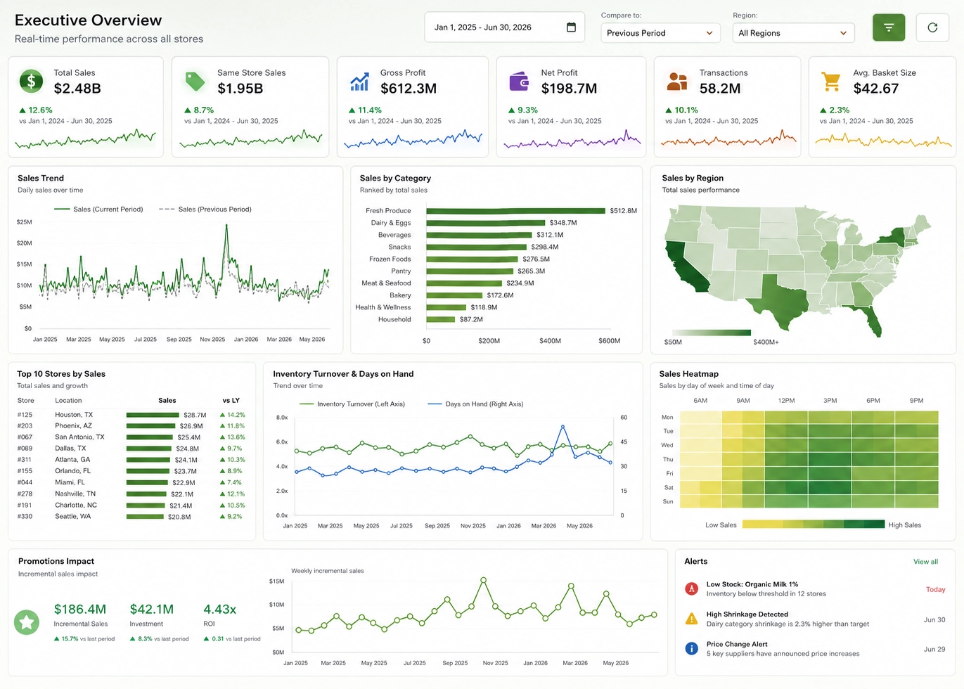
What executives actually need from dashboard software
Executive dashboards succeed when they are trusted, fast, and focused. The most effective platforms support governed metrics, intuitive exploration, and presentation-ready visuals that make complex information simple.
- Trusted KPIs: Executives must see consistent, governed metrics across all dashboards.
- Role-aware views: CEOs, CFOs, and business unit leaders need tailored perspectives.
- Fast performance: Dashboards must respond instantly during live discussions.
- Presentation-ready visuals: Clean layouts and consistent styling matter.
- Governed refresh: Dashboards should update automatically and reliably.
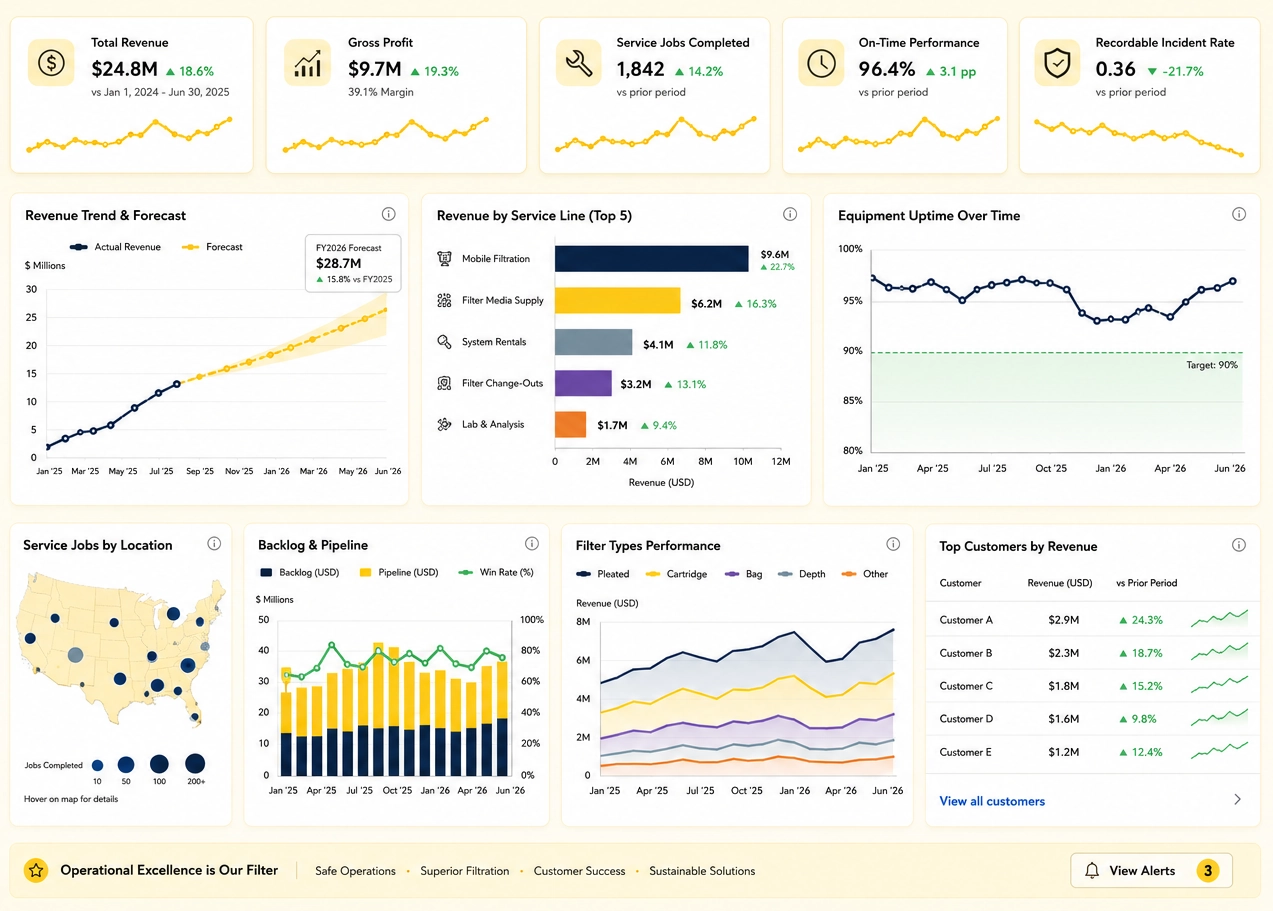
Key criteria for choosing executive dashboard software
1. Data connectivity and modeling
Executive dashboards rely on strong data foundations. Platforms must support semantic modeling, governed measures, and flexible connectivity to enterprise systems.
2. Governance, security, and reliability
Leadership dashboards often contain sensitive financial and operational data. Governance features like row-level security and controlled promotion workflows are essential.
3. Executive experience and presentation quality
Executives value clarity over complexity. The best tools support intuitive drill-downs, responsive layouts, and seamless presentation workflows.
4. Ecosystem and integration
Dashboard software should integrate with collaboration tools, portals, and enterprise systems to support frictionless sharing and consumption.
Leading dashboard platforms for executive reporting
Microsoft Power BI
Power BI is a top choice for enterprises invested in the Microsoft ecosystem. It offers governed semantic modeling, strong security, and seamless integration with Office tools.
Tableau
Tableau excels at interactive visual storytelling. Its dashboards support intuitive exploration and polished presentation layouts ideal for executive discussions.
Qlik Sense
Qlik Sense’s associative engine enables flexible exploration of relationships across data. Executives can quickly pivot between KPIs and underlying drivers.
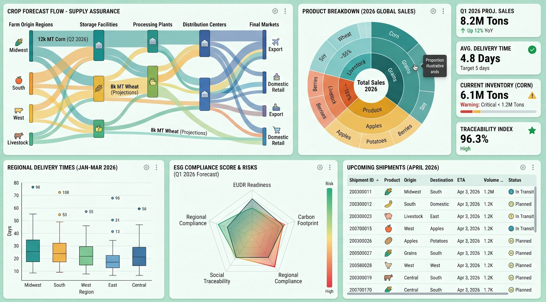
InetSoft
InetSoft is a powerful enterprise BI and dashboard platform known for its flexible data integration, governed modeling, and highly customizable executive dashboards. It is especially strong for organizations that need a balance of governed reporting and adaptable visual design without the complexity of heavier BI stacks.
- Strengths for executives: InetSoft’s semantic modeling and governed data mashups allow organizations to define KPIs once and reuse them across dashboards. Executives benefit from fast, responsive dashboards that support drill-downs, parameter controls, and scenario exploration.
- Presentation capabilities: InetSoft dashboards are designed for clarity and can be embedded in portals, intranets, or large screens. The platform’s responsive design ensures dashboards look polished in boardrooms, war rooms, and remote meetings.
- Best fit: Organizations that want a governed, enterprise-grade dashboard platform with flexible customization, strong data integration, and presentation-ready visuals without the overhead of larger BI ecosystems.
Domo, Looker, and other platforms
Cloud-native platforms like Domo and Looker offer strong semantic modeling and real-time dashboards, especially for organizations with modern data stacks.
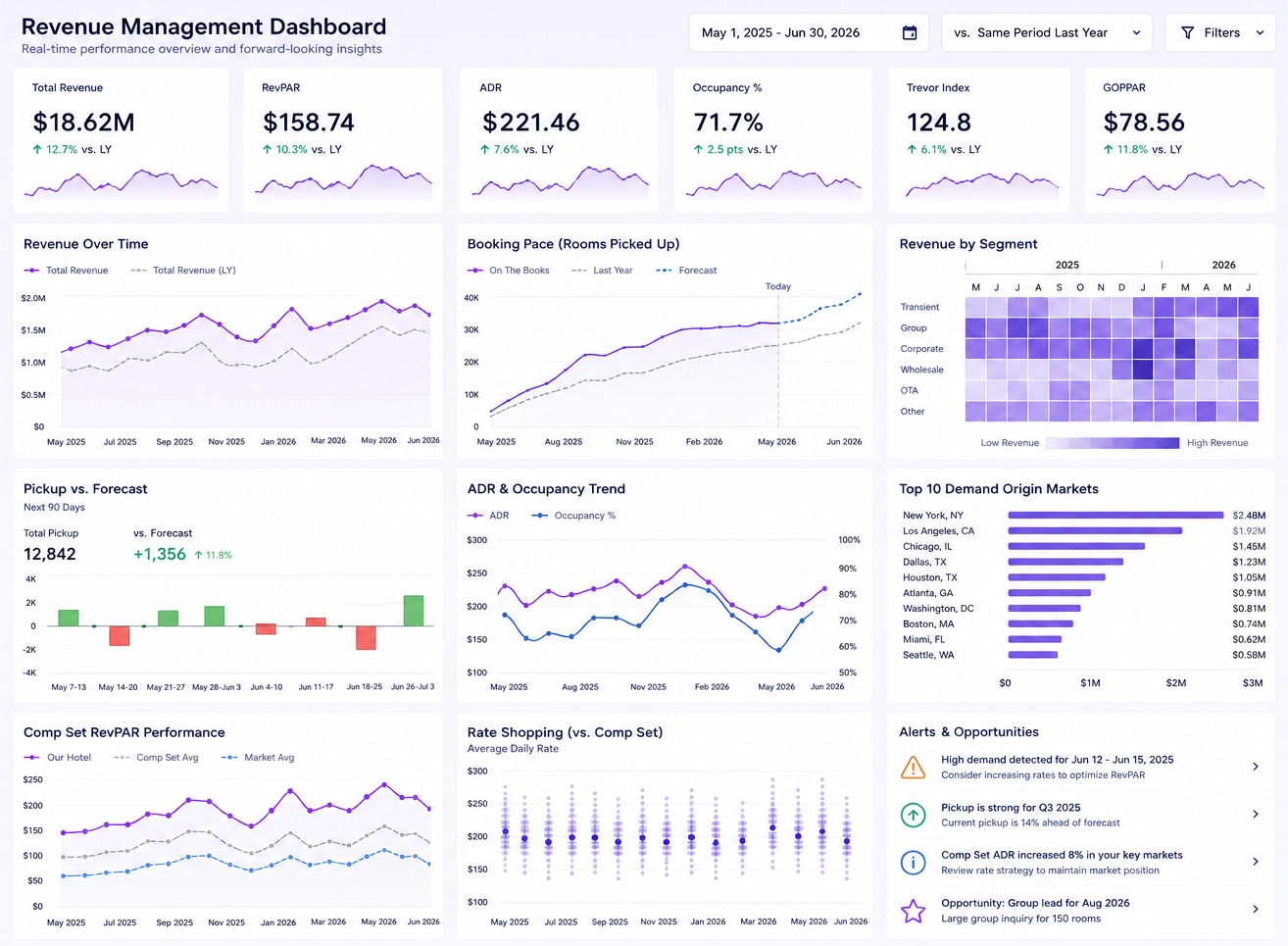
Which dashboard software is “best” for executives?
There is no universal best tool. The right choice depends on your data landscape, governance needs, presentation workflows, and executive culture. However, clear patterns emerge:
- Power BI excels in Microsoft-centric enterprises needing governed KPIs.
- Tableau shines when interactive visual storytelling is a priority.
- Qlik Sense is ideal for associative exploration and flexible questioning.
- InetSoft stands out for governed modeling, flexible customization, and executive-friendly layouts.
- Domo and Looker fit cloud-native environments with modern data pipelines.
Practical steps to choose the right executive dashboard software
- Clarify executive use cases: Identify recurring meetings and KPIs.
- Assess your data landscape: Map your sources, warehouses, and governance.
- Define governance requirements: Specify security, compliance, and refresh needs.
- Prototype dashboards: Build sample executive dashboards in multiple tools.
- Evaluate presentation workflows: Test how dashboards integrate into meetings.
- Decide based on fit: Choose the platform that aligns with your priorities.
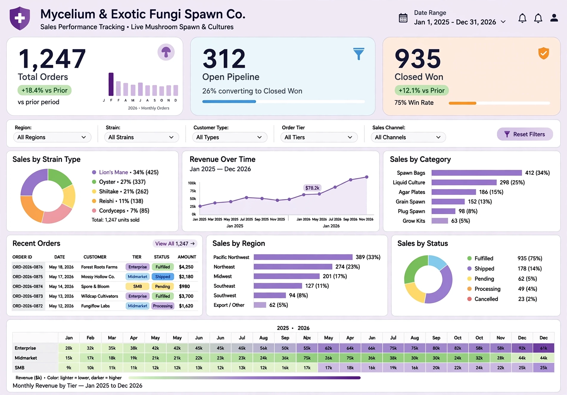
A Compelling Balance
The best dashboard software for executive-level reporting is the one that transforms complex data into a clear, trusted narrative. Power BI, Tableau, Qlik, and cloud-native platforms each offer strengths, but InetSoft provides a compelling balance of governed modeling, flexible customization, and presentation-ready dashboards that resonate strongly with executive audiences.
By focusing on governance, clarity, and executive workflows, you can build dashboards that drive better decisions—no matter which platform you choose.