Manufacturing Sales Dashboard Example
Are you searching for good examples of manufacturing sales dashboards?
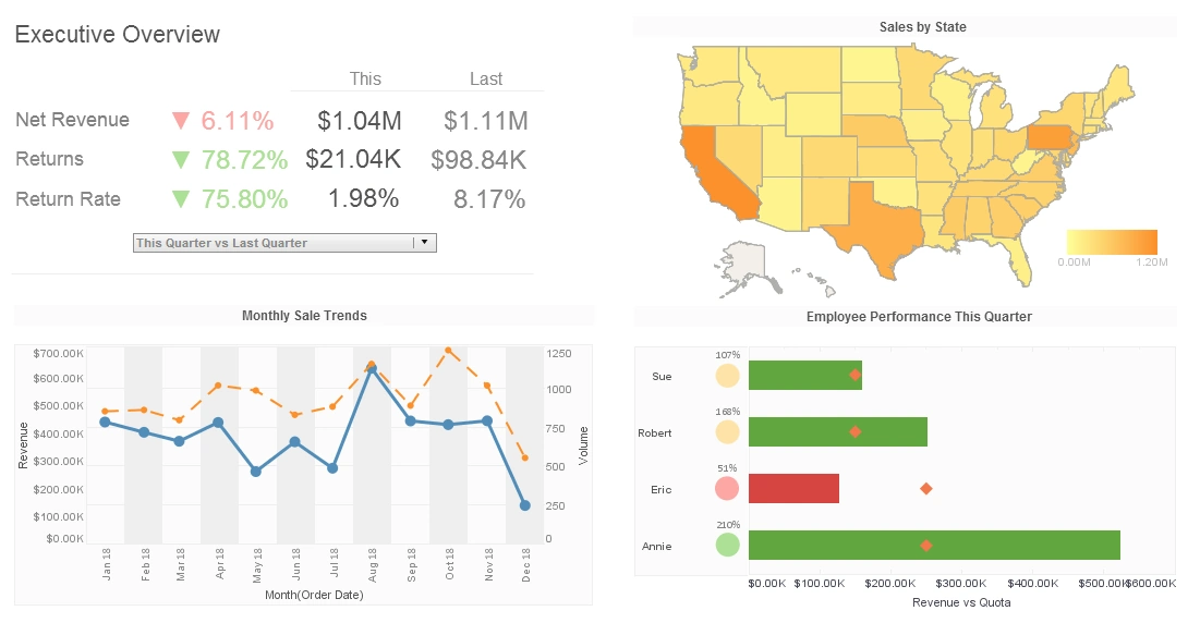
As you can see in this sample, dashboards are strong instruments for doing just that. The dashboard provided exposes many key performance indicators in a highly visual and coherent manner.
This is a deceptively simple dashboard. The top display is a simple bar graph displaying clients versus expected revenue. The graph underneath it is similar, showing expected revenue versus sales region.
The middle graphs, though, contain much more information. Displayed in those two small elements is the company's expected revenue, their manufacturing performance, information about kind of products make the most money and how well expected revenue matched up with actual revenue.

The InetSoft Way
The boxes and calendar located at the bottom of this dashboard coupled with the mixture of colors are what make InetSoft different. By checking different boxes or changing the date, users can instantly update their dashboard to display information relevant to their interests. In the top-left most display, clients and anticipated revenue are shown.
By utilizing a data mashup engine, InetSoft's software can compare these metrics against an infinite amount of user defined variables. A lot of data can be displayed in a small space with Style Intelligence.
StyleBI by InetSoft is an operational business intelligence platform that features a powerful data mashup engine for the production of dashboards, visual analyses, and reporting. The unified, easy-to-deploy, easy-to-use business intelligence solution maximizes self-service and serves both enterprises and solution providers.
InetSoft's BI software leverages a powerful patent-pending Data Block™ foundation for real-time data mashup and presents information through interactive dashboards, enterprise reporting, scorecards, and exception alerts.
Additional Operational Sales Metrics:
- Sell-through %
- % of client facing employees
- Bonus payout as a % of total possible
- Market Share %
- % of repeat business turnover/revenue
- Average sales per customer or transaction
- Conversion rate of marketing/sales campaigns
- Attrition or churn
InetSoft Articles on Sales
Here are some articles that provide additional information on sales dashboards and KPIs:
-
What KPIs and Analytics Are Used on Sales Coverage Analysis Dashboards?
This article explores how sales coverage dashboards leverage key performance indicators such as conversion rates, sales velocity, deal size, and customer segmentation to pinpoint coverage gaps and boost revenue. It guides on tracking efficiency at both team and individual levels, including metrics like customer lifetime value and churn rate. Ideal for organizations aiming to optimize territory coverage and improve forecasting through data‑driven sales strategies.
-
What KPIs Do Sales Operations Analysts Use?
This article outlines critical KPIs used by sales operations analysts, including sales revenue, pipeline health, conversion rate, customer acquisition cost, and lifetime value. It emphasizes how tracking these alongside metrics like sales cycle time and market share can identify bottlenecks and growth opportunities. Valuable for teams looking to align operations with strategic objectives and enhance sales efficiency.
-
Building a Sales KPI Dashboard
This resource provides a walkthrough for building self‑service sales KPI dashboards using InetSoft’s StyleBI. It demonstrates visualizing metrics such as revenue trends, product performance, pipeline health, and lead counts via interactive charts and mashups. It especially highlights the platform’s ease of use, enabling quick integration of CRM and marketing data without IT support.
-
How to Create a Sales Dashboard
This guide offers step‑by‑step instructions for crafting a sales dashboard in StyleBI, covering how to build charts like summary bars, gauges, scatter plots, multi‑style visuals, and tooltips. It explains adding KPIs, calculated fields, and drill‑down tooltips to enhance interactivity and insight. Perfect for users wanting hands‑on guidance in dashboard assembly and customization.
-
Interactive Sales Dashboard (Product Demonstration)
This product demo highlights a fully interactive sales performance dashboard where users can drill into individual rep data, apply filters like time periods or regions, and utilize brushing to explore data patterns. It showcases mobile exportability, chart brushing, and click‑through drilldowns for detailed analysis—ideal for managers wanting dynamic insight into sales execution.
-
Sales Dashboards (Sales & Salesforce Integration)
This article describes how InetSoft integrates CRM, order‑management, and social data to build self‑service sales dashboards that uncover opportunities and insights. It highlights features like ad‑hoc filtering, governed access, data mashups, and even machine‑learning enhancements for churn prevention and cross‑selling. A solid reference for teams seeking comprehensive, interactive sales intelligence solutions.
-
InetSoft's Sales Pipeline Dashboard Solution
This overview introduces InetSoft’s pipeline-oriented dashboards designed to monitor opportunity stages, identify stalled deals, and manage forecasts across web and mobile devices. It emphasizes rapid deployment in weeks, user self‑service capabilities, and flexibility in incorporating data from systems like Salesforce. Useful for firms seeking quick-to-launch, scalable pipeline analytics tools.