Healthcare Management Dashboard Examples
This hospital dashboard is an example of one of InetSoft's interactive web-based applications for healthcare companies. This particular chart allows users to monitor patient detail ranging from the Patient ID, Gender and Age, as well as being able to filter the age to better narrow down a desired Patient Detail.
This dashboard displays Staff to Patient ratios including department names and the number of doctors in those departments. Although our charts are simple to use they provide detailed fields and extensive results which will give you the most out of your data.

InetSoft's easy-to-use drag and drop design tools, healthcare companies can quickly build productive analytical tools like this one, that aid users in day-to-day operations, as well as help them keep track of and achieve long term goals and objectives.
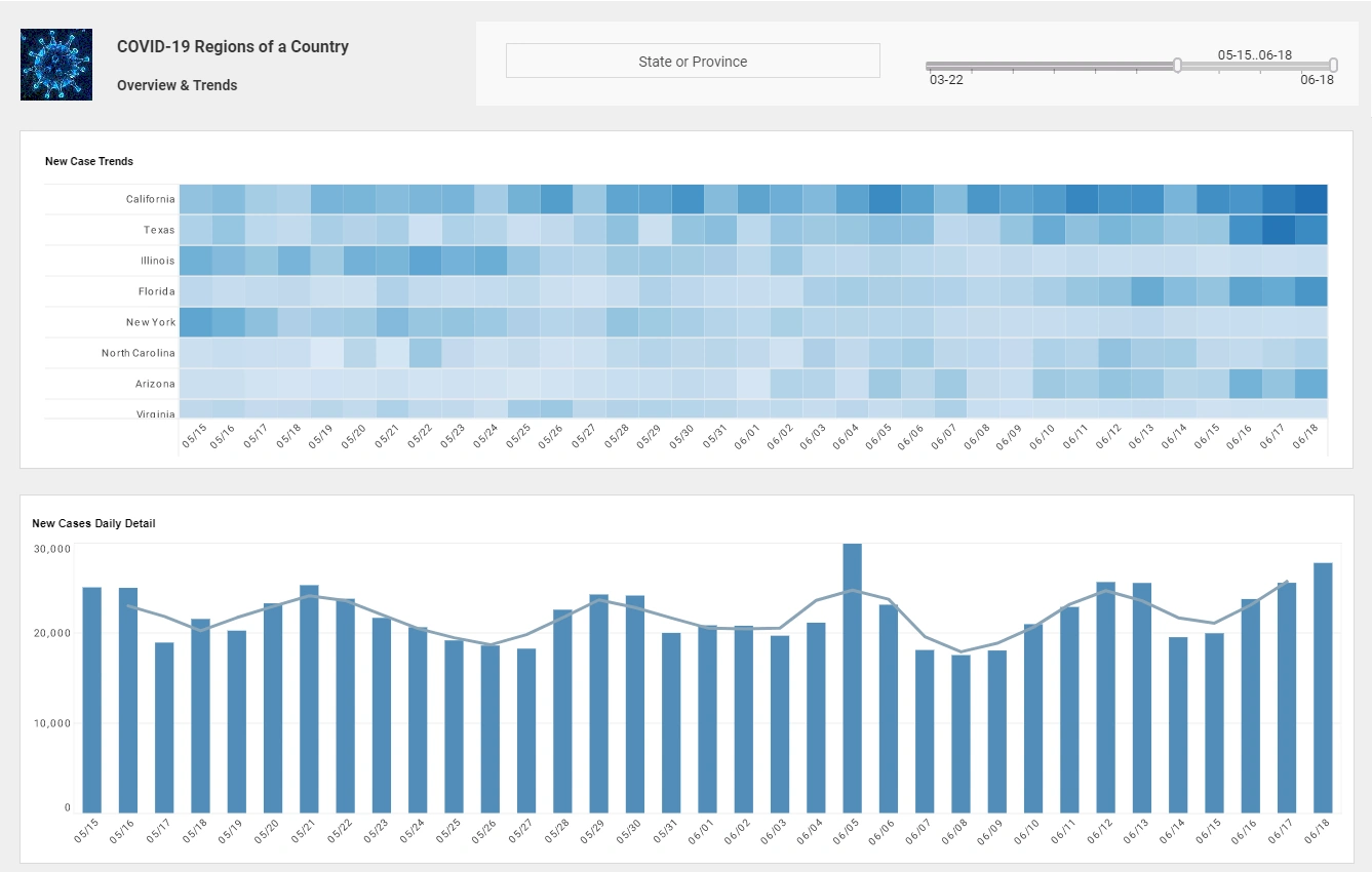
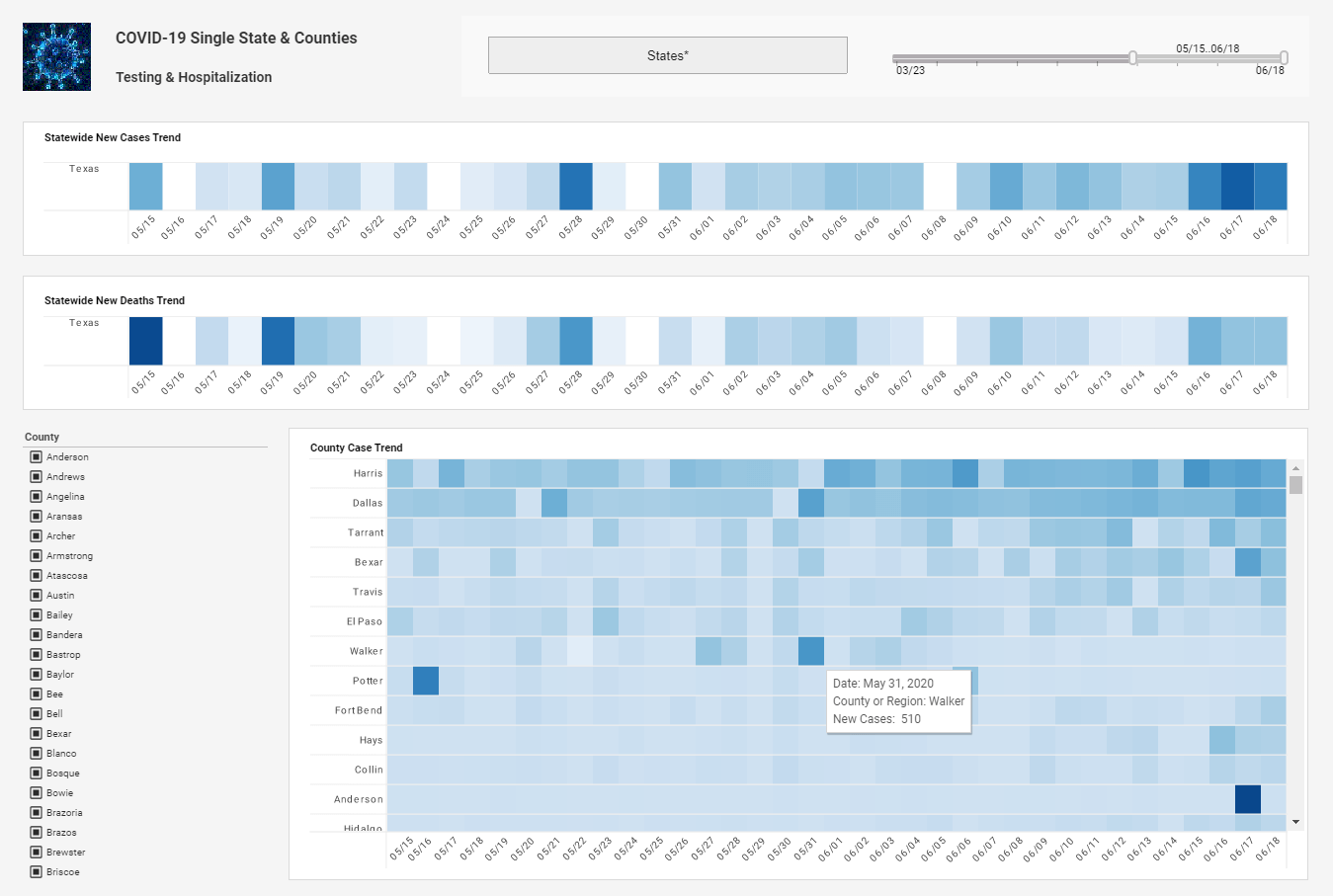
InetSoft has a library of charts and visualization types to choose from, including geographic mapping, heat maps, and scatter plots. Healthcare industry executives can cater any completed dashboard to specific needs at any given time and even access them from mobile devices such as smartphones and tablets.

Capabilities of InetSoft's Interactive Health Information Dashboard:
- Filter by state, population, or specific query.
- Analyze charts and graphs and then select other tabs to see other views or drilldown into details.
- View data from multiple sources and formats on one dynamic screen.
- Create bookmarks of favorite views.
This Home Health Provider Dashboard visually summarizes key operational metrics for a healthcare organization. At the top, there are six large, colorful tiles displaying major statistics: 78 Active Clients (green), 105 Active Caregivers (blue), 34 Physicians (gold), 57 Applicants (red), and 21 Payors (purple). Each tile includes an icon and label for quick recognition. Below these headline metrics, a date filter indicates the reporting period from March 1 to March 31, 2021, with options to filter by location and client type. A blue “Filter” button allows users to adjust the displayed data.
The lower section, titled “My Company At-A-Glance,” lists detailed categories with numeric counts in blue boxes, offering a snapshot of business components such as Referral Sources, Service Codes, Client Types, and Case Managers. Each row presents specific operational data points like 34 Active Clients, 7 Referral Sources, and 26 Attributes/Needs. The clean layout and color-coded sections make it easy for administrators to monitor performance indicators, staffing, and client engagement within the organization. Overall, this dashboard provides an at-a-glance view of key workforce, client, and operational metrics essential for decision-making in a home health care environment.


The Patient Engagement Dashboard centers on monitoring how effectively patient communications—primarily email—are reaching recipients: a prominent donut chart highlights a 99.6% delivery rate with raw counts showing 5,964 messages sent and 5,939 delivered, and an “EMAIL” label and envelope icon clarify the channel being measured.
This makes it immediately clear that deliverability is excellent and provides volume context for scale, which helps spot anomalies or list/infrastructure issues, but the view is narrowly focused on delivery only and lacks downstream engagement metrics like open rates, click-throughs, response or unsubscribe rates, as well as trend lines, benchmarks, or segmentation filters that would make the insight actionable over time—visually the donut plus counts communicates the single KPI extremely well, yet the dashboard would be stronger if paired with comparative targets, channel breakdowns (SMS/portal), and temporal or cohort filters so teams could diagnose whether delivered messages are actually prompting patient engagement or follow-through.
Visualize Free - Free Analytics On-Demand
The live healthcare dashboard has been created an deployed using Visualize Free, a free visual analysis tool based on the advanced commercial dashboard and visualization software offered by InetSoft. No download required.
Visualize Free permits anyone to upload and sift through multi-dimensional data to spot trends and aberrations or slice and dice data with simple point-and-click methods, and gives users the option to share their visual analysis with others or keep it private. To try Visualize Free, please visit www.visualizefree.com.
More Articles About Healthcare BI
-
Data Intelligence For Healthcare
Describes InetSoft’s healthcare-focused BI offering and how its interactive visual analysis helps combine clinical, operational, and fiscal data into actionable dashboards; highlights user-friendly filtering and point-and-click analysis that let non-technical staff explore datasets. The page emphasizes rapid drilldown, shareable visual analyses, and the ability to add multiple charts and data sets for deeper investigation. It positions InetSoft as a tool to make healthcare analytics accessible across departments for faster decisions.
-
Healthcare Reporting Software
Explains how StyleBI and InetSoft products deliver real-time reporting and dashboards tailored to healthcare providers, reducing dependence on IT and analysts for routine reporting. It stresses cost-efficiency and self-service capabilities that allow clinical and administrative users to build and monitor reports without heavy technical support. The page positions the software as a practical solution for operational reporting needs in hospitals and clinics.
-
Patient Care Report
Walks through the purpose and benefits of patient care reports, noting how these reports support improved diagnosis, performance evaluation of clinicians, and better staffing decisions. The article describes how historic patient records and KPIs inform clinical strategy and operational improvements to increase care quality. It also includes user feedback praising the product’s training and support for rapid dashboard creation.
-
Health Informatics Software
Outlines InetSoft’s capabilities for electronic health records (EHR) KPI tracking and how its analytics tools help maximize clinical productivity by monitoring key EHR metrics. The page details the types of clinical and operational indicators that can be surfaced for care teams and administrators. It frames the solution as a bridge between raw health data and meaningful operational dashboards.
-
Essential Healthcare KPIs
Describes essential KPIs and visualizations for healthcare institutions, explaining how combining clinical, medical, fiscal, and operational metrics reveals which programs are succeeding or failing. The article demonstrates how digestible visuals enable targeted innovation to improve diagnostics and therapeutics while measuring program impact. It also references InetSoft’s data mashup approach as a way to simplify BI asset delivery and maintenance.
-
Health Information Dashboard
Shows an example healthcare management dashboard that tracks staff-to-patient ratios, departmental doctor counts, and other operational measures useful for hospital management. The page emphasizes interactive charts and simple controls for drilling into department-level details. It’s presented as a practical demonstration of how the dashboard design supports operational oversight.
-
Patient Engagement Analytics
Focuses on KPI definitions and analytics used in patient engagement dashboards, explaining metrics like conversion rate, appointment scheduling effectiveness, and campaign performance. The content helps readers understand which engagement indicators matter for acquisition and retention and why they should be tracked. It frames engagement KPIs as core measures for evaluating outreach and patient experience programs.
-
Create A Healthcare Dashboard
Provides a step-by-step training-style walkthrough for building a healthcare dashboard using InetSoft’s tools, describing chart types and interface elements to include. The tutorial explains how to assemble charts, filters, and date selectors to make interactive dashboards that clinicians and managers can use. It highlights ease-of-use and the availability of working dashboard examples in the InetSoft gallery.
-
Healthcare Data Analytics Examples
Summarizes a webinar and examples showing how data science and ML can be applied to large-scale healthcare problems like Medicaid program analytics, fraud detection, and cost-reduction through better procedure utilization. The page includes discussion of use cases where rapid analytics enable timely interventions for chronic conditions and claims review. It positions InetSoft as a platform that can integrate big data and ML into operational healthcare analytics.
-
Healthcare Analytics In The Cloud
Discusses cloud-based healthcare analytics and the privacy, regulatory, and data-protection considerations when moving sensitive health data to cloud analytics environments. The article emphasizes approaches to secure data during cleansing, joining, and analysis while complying with audits and regulations. It also covers architectures and best practices for deploying ML and BI in cloud contexts for healthcare.
