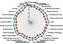
Departments that work directly with customers have a lot of available data to tell them how well they’re communicating, but so much of it is anecdotal and gut-feeling, unless you use data visualization. Data visualization tools can be used to help customer-facing teams increase their overall customer satisfaction and can pinpoint areas for improvement.
Data visualization makes complex data digestible for everyone and helps to highlight key points without needing detailed explanation. By using a data visualization tool, businesses can break down into manageable chunks their large amounts of data to reveal trends, display correlations, and tell a story.
Marketing managers, sales representatives, and customer service professionals need rapid information flow to reduce wait times, provide more up-to-date product information, and to understand what clients need in interactions. Aberdeen found that organizations with data visualization tools can obtain critical information within the decision window 78 percent of the time, 22 percent more often than organizations who are not using these tools. The same organization found that companies with real-time data visualization achieved a 26 percent increase in new pipeline accounts identified. Data visualization can take those gut feelings and turn them into actionable insights–instantly.
MVM: Most Valuable Metrics for Customer Experience Optimization
There is a benefit to companies who invest in productive data visualization tools, especially those who understand how these tools can display data that impacts the customer service experience.
To first understand which data visualization tools to use, leaders should work with their customer service and sales teams to understand the appropriate metrics to monitor within all the data made by customer relationship management (CRM) tools, project management tools, and the helpdesk software.. To improve customer communications, organizations should begin to collect information on these data points:
- Average Reply Time – How long does it take representatives to reply to customer inquiries? If the number is too high, then this could be an indicator that there is a problem with the product or there are not enough reps to handle the frequency of questions.
- Average First Response Time – This is the message that lets customers know their inquiry has been seen and it will likely give them information on when they can expect a custom reply.
- Time to Resolve – While communication is critical, it is important for representatives to handle and fix issues in a timely matter. Every situation is different, but if fix times are too long, then customers may seek services elsewhere.
- First Contact Resolution Rate – This is the average occurrence of representatives that were able to solve the problem in the initial reply. This shows how effective representatives are in finding ways to communicate with customers and solve problems in one correspondence.
- Replies Per Ticket – This metric is one of the best indicators of communications between representatives and customers. A significant amount of replies per ticket can reveal that representatives are not asking the best initial questions, or they may not be the most equipped to deal with the problems customers have. Something is getting lost in translation between both parties.
- Customer Satisfaction – This is more of a broad measurement, but one that is very significant. Survey responses can give teams more information about the overall communication process.
It is vital for management teams to identify the most important metrics to focus on to help marketing and customer service teams better communicate with customers. This will help organizations understand the best data visualization tools to help with this task.
Five Types of Data Visualization Tools for Customer Service Metrics
There are so many options for teams to use regarding types of data visualization graphs. The choices can seem overwhelming and confusing. However, there is a data visualization chart or graph for every situation and metric type.
- Slopegraphs/Line graphs – These graphs are excellent at comparing groups over time. If teams want to compare customer response times to the same time seven days prior, or departments want to compare performance with others, this is a great way to do it. Each line is a different color, so the data is readily distinguishable.
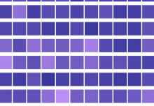
- Horizon Chart – This chart is perfect for tracking time-series data. Colors can reveal positive or negative values that are benchmarks for various variables. If resolve times are moving too high, or unanswered replies are piling up, then this graph will show it in real-time.
- Word Clouds – As customers finish surveys, teams can see which words they are associating with their experience. This will help leaders understand if the communication or long wait times are an issue.
- Bubble Charts and Pie Charts – These tools are great for showing percentages. Metrics like the number of tickets still outstanding, or the rate of first contact resolutions can be on display for the team to know how they are progressing.
- Gantt Charts – Throughout the day, it is so easy to forget that each communication with a customer is a mini-project. Gantt charts can help each representative stay organized in the actions they take to fix problems and interact with customers.
Three Best Practices for Incorporating Data Visualization to Optimize Customer Communication
Invest in a dashboard
Marketing and customer service teams should have a location where they can monitor this data in real-time. There should be a user-friendly and easy-to-use dashboard system where all crucial metrics are viewable. Complicated interfaces can thwart efficiency and can keep teams from improving their metrics.
Ensure that graphs can update in real-time
Even though data visualization is meant to make analysis more accessible, there can be complications in keeping the information up-to-date. It is essential for management to ensure that information is uploaded in real-time accurately. Having an IT team that is familiar with keeping this system operational is critical.
Identify customers with repeat issues
Many times, repeat customers are going to have recurring problems. To better the situation, teams can attach unique codes to these individuals to keep track of their issues throughout their interactions with the company. This will make it easier to communicate with these individuals individually and let them know about the status of their problems.
Data visualization is becoming the norm for displaying helpful data in companies. Nowhere is it more needed than in dealing with customer service complaints. If marketing and sales teams can have continuous real-time data about their interactions with customers, then they can better handle problems, take down response times, and provide more transparent communications.
Chanell Alexander is a writer for TechnologyAdvice. She is a freelance writer and digital marketing strategist. She has over seven years of experience in the nonprofit field, and enjoys blending innovative technology solutions with communications. When she is not writing, Chanell enjoys traveling, contributing to video game blogs, and embracing her inner foodie. See what else Chanell has been up to on her LinkedIn profile and Twitter page.


