Demonstration of Mobile BI
This is a continuation of the transcript of a Webinar hosted by InetSoft on the topic of "What's New in InetSoft's Business Intelligence Software" The speakers are Mark Flaherty, CMO at InetSoft, and Dolly Allevezatos, Principal Technologist at InetSoft.
Mark Flaherty: And so with that, we will start to move into the demo portion and the first area is mobile BI. Naturally, it doesn’t lend itself so well to demo live in a GoTo Webinar. So we’ll explain a little more about how it works, and then we will move into the actual live demo of the application. So Dolly, take it over.
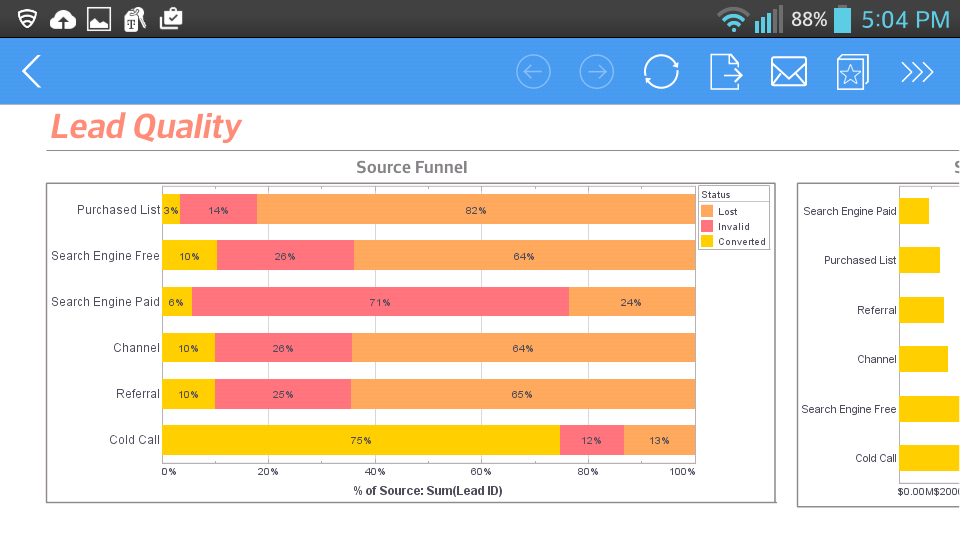
Dolly Allevezatos: So essentially what you are seeing here is a screenshot surrounded by the iPad interface itself. You can see the little toolbar that pops up that’s actually native within the browser interaction that is just using Safari that comes installed on the iPad. Basically, the one issue with our interactive dashboards as of last version was that it still required the Flash Player. And heretofore, there is still an issue between Apple and Adobe regarding use of Flash on iOS devices. And so instead of waiting for them to resolve their differences, we went ahead and re-implemented the dashboard viewer using HTML and JavaScript. So now you don’t need the Flash Player to be able to look at and interact with the view sheets and the dashboards that you would create.
I actually can show a little bit of the interaction within a standard browser. You can see, if I can share my browser. So here I am in my Firefox and essentially with a special URL, you can load up the viewsheet in HTML plus JavaScript instead of using the Flash client. This is automatically detected if you are accessing our portal through an iPad, and it will automatically use the correct URLs.
Simulating Mobile BI
You can also simulate it yourself in cases when you may not be allowed to install the Flash Player on the desktop, or you have a very strict control in terms of security of what plug-ins you are allowed in the browser. The interactions in terms of the range slider, the selection lists are all the same as you have gotten used to thus far.
Everything is still interacting and updating on the fly without a page reload. The one or two limitations here are chart modifications, in terms of actually changing the binding of the chart. This is not accessible through this interface, also the entire Visual Composer, so creating new dashboards, still has to be done on a Flash capable device like your laptop or desktop.
We are going to switch over now into my other browser window for the Visual Composer and talk a little bit about the post-aggregate expressions. So I am just going to create a new viewsheet based on an existing data block here. On the left here, I have got company information: time, quantity, total. This is one of our sample datasets.
If I add a chart in here then I can very easily. Say that I want to see the state on the x-axis and maybe the total revenue on the y-axis. Similarly, I could see the total quantity purchased, and it's going to show me both of those measures. If I wanted to answer a question like “Where am I getting good value from the quantity, where are my margins high, where is the unit price high?” I could attempt that by making a scatter plot of total and quantity.
Post-Aggregate Expressions
This is giving me a little too much detail information. So let’s see maybe break it down by states instead. So here we start to see a correlation for different states, but it's still not giving the answer to the question I want which is essentially which states have the highest unit value. That’s really where the post-aggregated expressions come in.
So I can simply right click on my block here and create a new calculated field and I will call this Average Value. Notice I have the option here, Calculate Field From Detail or Aggregate, okay. The Aggregate option here is very, very powerful. The Detail option is that the standard that we would expect to just multiplying two fields together or what have you. The post-aggregate expressions are here. I see the existing aggregates, and so I can simply divide my total by the quantity.
StyleBI offers robust aggregation and grouping capabilities that empower users to summarize and analyze large datasets with minimal technical overhead. At its core, StyleBI allows users to group data by one or more dimensions—such as region, product category, or time period—and apply aggregation functions like sum, average, count, min, and max. These operations can be performed directly within the dashboard interface, making it easy for business users to generate meaningful summaries without writing SQL or complex scripts.
One of the standout features of StyleBI is its support for multi-level grouping. Users can nest groupings to explore hierarchical relationships in their data, such as sales by country, then by state, and then by city. This is particularly useful for organizations with layered operational structures or multi-tiered reporting needs. The platform dynamically adjusts visualizations to reflect these groupings, enabling drill-down and roll-up interactions that reveal trends and outliers across different levels of granularity.
Aggregation in StyleBI is not limited to basic functions. Advanced users can define custom aggregations using calculated fields and expressions. These can include weighted averages, ratios, or conditional aggregations based on business logic. The system also supports real-time aggregation over streaming data sources, allowing users to monitor metrics like throughput, error rates, or inventory levels as they change. This flexibility ensures that StyleBI can adapt to both strategic reporting and operational monitoring scenarios.
Finally, StyleBI’s aggregation and grouping functions are tightly integrated with its filtering and visualization layers. Users can apply filters to grouped data, compare aggregated results across time periods, and visualize them using charts like heatmaps, bullet charts, and radar plots. This seamless integration ensures that grouped and aggregated data is not just computed—it’s communicated effectively. Whether you're building dashboards for executives or frontline managers, StyleBI’s aggregation engine helps turn raw data into actionable insights.

