A Solution to Design a Business Dashboard
Designing a dashboard can be challenging, but when done properly can be very beneficial for your business. It's important to know what the best dashboard practices are. The benefit of a dashboard is that everything is in once place therefore it allows the user to quickly understand information through well designed graphs and charts that make the data easier to see visually.
An effective dashboard allows the user to see the key facts, but also lets the user dig deeper and actually have the ability to understand why the data is what it is. It also allows for customization, so the dashboard can be utilized for whatever a company needs.
InetSoft's dashboard program is unique because of the ease of use and adjustability of design. Almost everything on the user's dashboard is customizable and flexible, with the ability to change colors, shapes, sizes, data, the list goes on and on.
The entirety of the software is based on what the user prefers to see in their dashboard. The software allows dashboards to be built and modified based on whatever the user's preferences are.


Dashboard Design Specifics
Placement is very important when it comes to dashboards. You want the viewers eyes to be drawn to the dashboard's most important elements. The top left corner of the dashboard is where the consumer's eyes tend to go to so the most relevant information first should be placed there.
Make sure that your dashboard isn't too cluttered with superfluous information either because that can distract the viewer from the more important information. Everything placed in your dashboard should be relevant to the dashboard's purpose. Don't add an unnecessary visual just because there's room on the dashboard. If too many elements are included the user will not be able to decipher what is important information and what isn't. With drag and drop technology InetSoft's software allows the easy movement of charts and information so they can be placed anywhere on the dashboard simply and moved based on the user's preference.
Choosing Chart Types
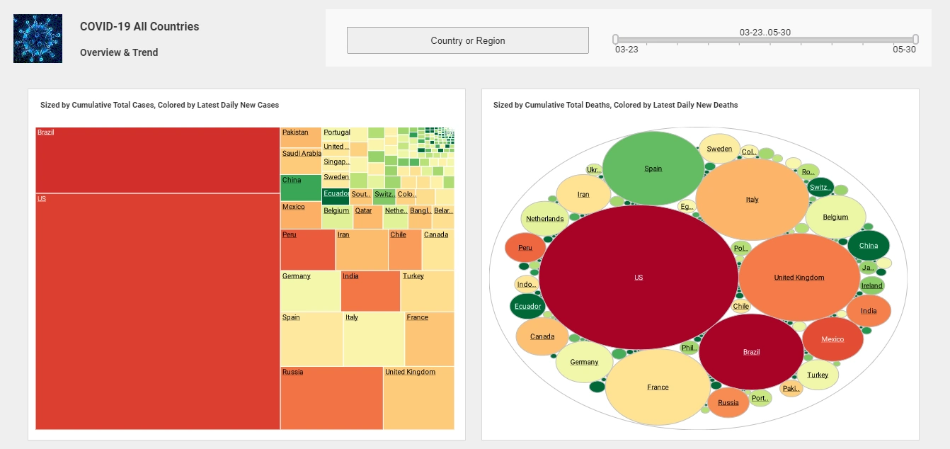
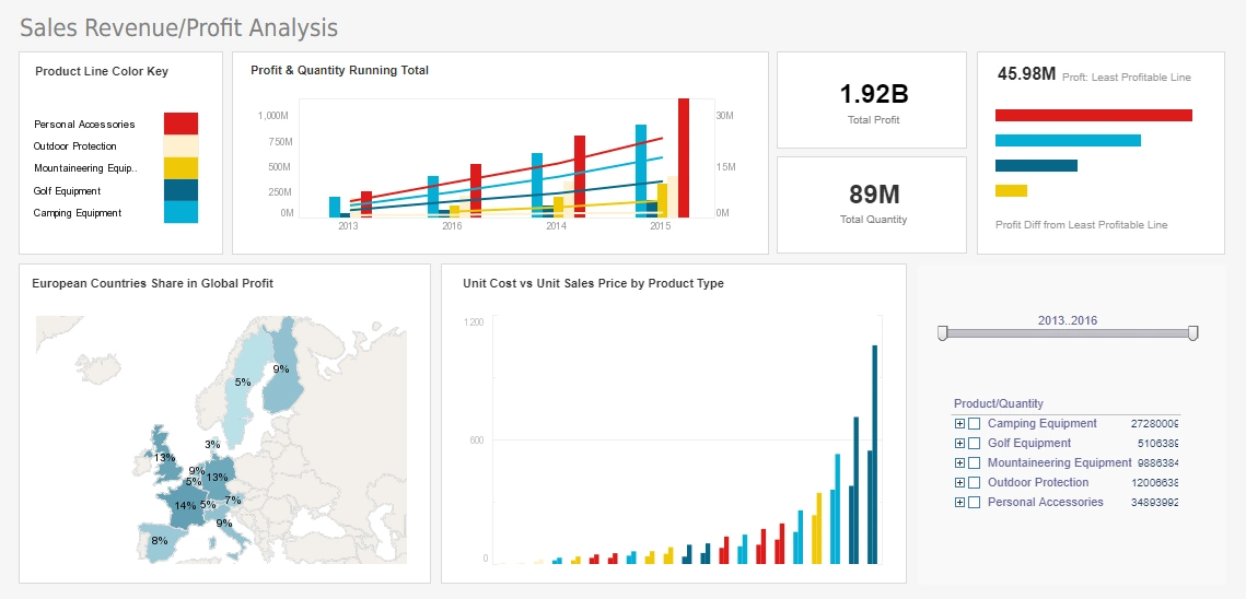
Specific charts are good for different purposes. The general rule of thumb is that different kinds of analysis come from different charts. InetSoft's StyleBI allows advanced visualization, like waterfall, bullet and bubble charts, multicharts, such as line and bar charts together in the same graphing area, and even complex national or global maps and heat mapping.
If you put a bubble and line chart together it becomes visually obvious if there is or is not a correlation between data sets, as correlations would have the bubbles closely follow the line chart trajectory. Heat mapping lends itself to emergency and customer service call centers or and on-the-road job organizations like pest control or electronic installation services. You can track customer satisfaction, call duration, and keep track of hundreds of employee objectives visually.
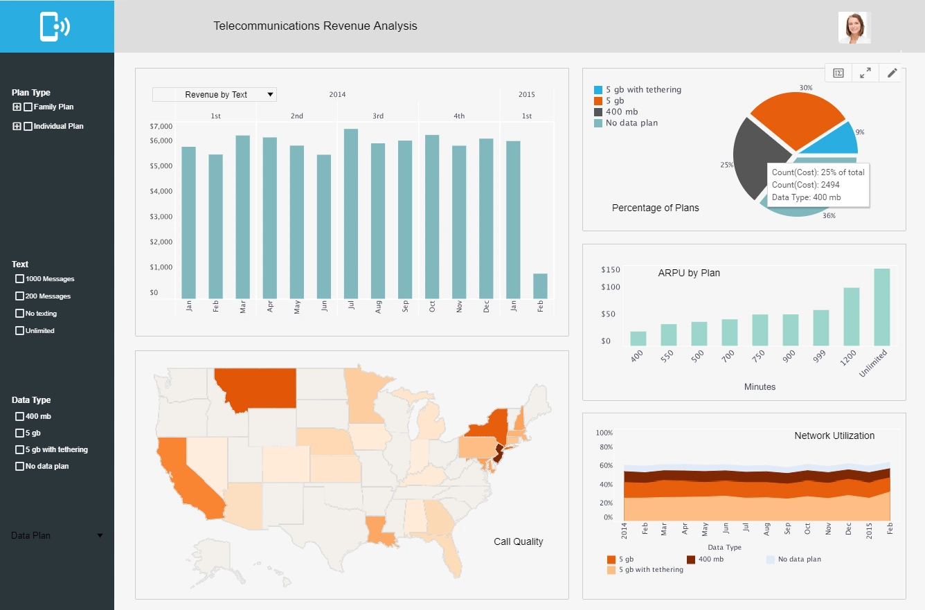
Throughout the dashboard users can create:
- Data selection drop-downs
- Tables
- Crosstabs
- Charts
- Maps
- Gauges
- Thermometers
- Sliders
- Calendars
- And many other useful visualizations
Data drop downs are useful for filtering different information so the user can see how one group performs compared to another. Tables, charts, maps, and thermometers are good visualizations that help show how data is spread over a specific group. Sliders and gauges help isolate specific ranges of data; for example, if the gauge or slider is for maximum speed for a car you could limit the range to cars that can only reach between 100-120 mph. Crosstabs give a more precise look at the data because instead of getting a visual of a group of data the user is getting exact numbers instead.
There are two main types of data a user could be working with. Those types are categorical and quantitative. Categorical data is sorted into specific groups while quantitative is actual numbers and quantities. While normally a user will be working with a combination of the two, it starts with whether or not the data is additive or non-additive. This refers to whether or not adding the data makes sense or only showing the difference between the data is the point. For example, a time series is non additive, so if data is being used to show a time series then points or lines should be implemented. An example of additive data would be data showing a groups grade or age, in which case then a bar chart should be used instead.

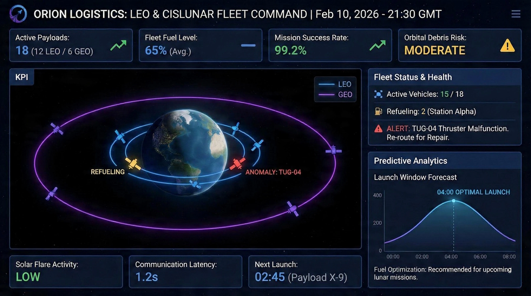
Before designing you should have a clear idea of whether your dashboard is an analytic dashboard or a monitoring dashboard. A monitoring dashboard is used for real time operations and can alert whomever on changes from normal output. This type of dashboard would be used with someone like a stockbroker who needs constant updates with the market's changes. An analytic dashboard helps provide users with the information needed to understand trends and why certain things are occurring by making comparisons across time and multiple variables. This type of dashboard can be used by pretty much any business but for example a bakery, because they could better understand why certain items are selling better than others.
They could see this with tools such as sliders and charts so that the information could be presented visually and could also be filtered depending on the user's preference. Both of these dashboard's follow different design principles. If the user was to create a monitoring dashboard the layout would be simple, with only a few charts showing the exact data that would be deviating from the norm. It needs to be a simple as possible so the problem can be fixed. If an analytic dashboard was created it would be much more complex with more information. The data included also needs to ability to be seen in detail so the use of charts and drill-down information must be prevalent. The use of sliders, gauges, and drop-down menus help even more so because large quantities of data can then be filtered making it easier for the user to discover information.

Overall, with InetSoft's revolutionary software creating a dashboard chock full of engaging visuals and information is easy. InetSoft is the solution when it comes to designing a dashboard, if you want a user-friendly interface and a quick and simple interactive program then this is the product for your business.
So come and try InetSoft today! You and your business will not regret it!