Graph Visualization Software
Looking for a graph visualization software application to plot your data in a visually comprehensible manner? InetSoft's dashboard software combines all common styles of graphing with interactive filtering, allowing you to comb your data for new insights into patterns and trends.
Since business users will often begin the data exploration process without a clear idea what their questions are, they require a flexible tool that encourages them to experiment with different methods of analysis and modify their analysis as they go along. InetSoft's graph visualization software is a powerful but flexible tool to meet the needs of any end user. Flexibility means maximum self-service for users, including an unlimited ability to customize and format the data that's being pulled in from external sources, in order to create new charts and visualizations.

InetSoft provides both free and enterprise versions of its easy to use graphing software. While other graph visualization software programs require hours of backend IT development and programming, InetSoft is designed around the idea of allowing business users with little to no IT training to design unique visualizations and even data mashups using real-time data.
With access to InetSoft's various data graphing tools, users have the ability to answer an unlimited amount of business questions. Trend lines can be used to see the progression of data and even project into the future using what-if analysis. Users can create dual-axis charts showing multiple dimensions, and calculated fields that allow users to create more intricate analyses. All of this can be accomplished with a few simple clicks, and with diverse graphing options such as scatterplots, bar charts, pie charts, and even geographical plots, the possibilities are endless.

Graph Customization
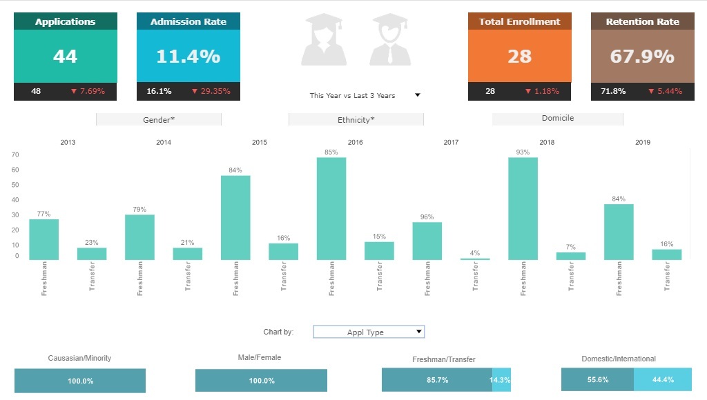
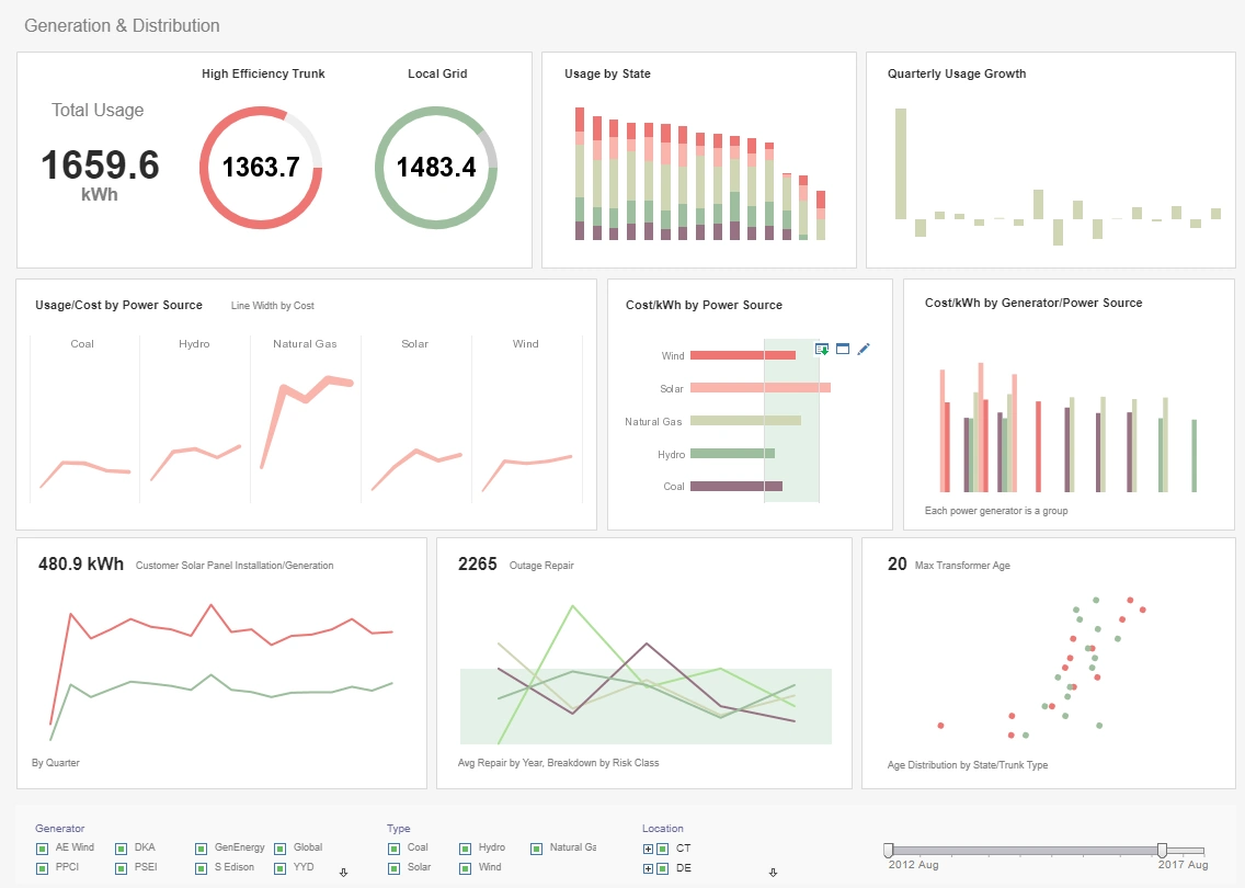
When using InetSoft's graph visualization software, it is evident that customization is the highest priority. Users are free to choose from various types of graphs and charts, as well as tables, crosstabs, and gauges. From there, users can manipulate the size, color, text elements, and layout of an element with unlimited design options.
Not only can users create a virtually unlimited number of graphs using their datasets, but InetSoft's graph visualization software also allows users the ability to filter data right on the dashboard in order to refine the data and display only the information that the user needs. Users can drag and drop measures or dimensions right onto the dashboard in order to create selection components, such as lists or range sliders, that will filter the data throughout the dashboard. This allows users to drill down on the information that they need more detail on without having to make separate charts.