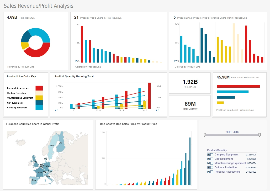
Interactive Map Visualization Example
Do you need a more efficient way to view your company's data by region? Using an interactive map visualization you can keep track of your company's performance in counties, states, nationally, or even globally. With InetSoft's program your company can use any kind of maps to visualize data. This page will show the benefits of using maps in dashboards and examples of what kinds of analysis and reports maps can enhance.
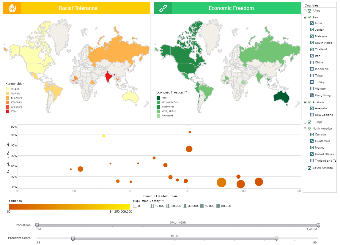
InetSoft's map visualization tool can help your company understand how specific areas differ from others, for example, the racial tolerance map below helps decipher which parts of the world are experiencing more xenophobia compared to others. On the green economic freedom map it can be seen which parts of the world have a higher percentage of economic freedom compared to other countries. On the bubble chart, economic freedom and racial tolerance are plotted together, allowing one to see how xenophobia and economic freedom relate to each other.
With these maps, researchers such as sociologists can easily see in which areas of the world racism and economic freedom are correlated, eliminating the need for tedious research. By comparing the maps to each other and isolating certain variables with tools such as brushing or filters, the user will be more likely to find patterns than he would by examining raw data.
Interactive Map Visualization Tools
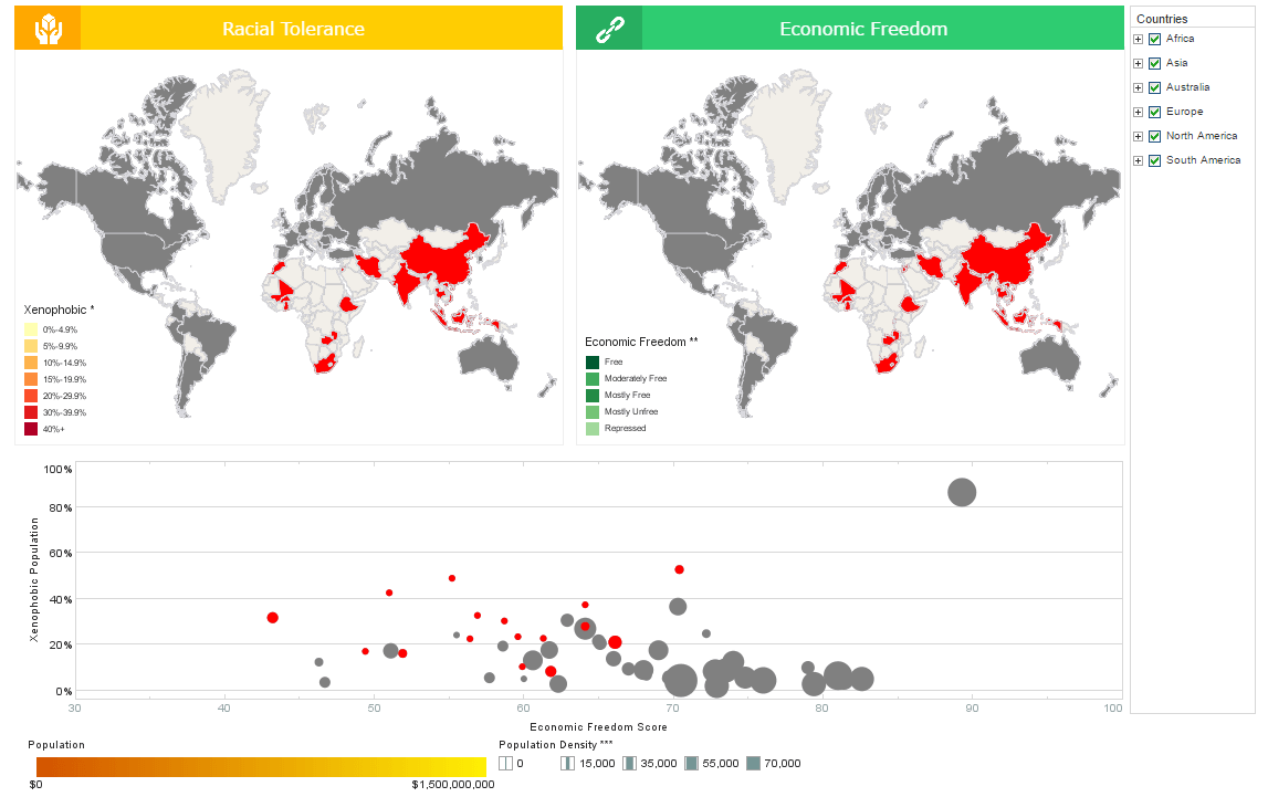
If the brushing tool is used, a cluster of countries can be selected on the bubble chart and they will highlight red in both maps, showing how countries that follow similar patterns are related geographically. Specific continents can also be selected from the side check boxes, and the sliding bars below the graph can be arranged to distinguish whatever specific population range or freedom score the user may be looking to narrow down the list of countries on.
All the various pieces of data are highlighted with specific colors or shapes to tell them apart. This can all be changed depending on the user's preferences. These tools allow the user to do an in depth analysis of the data. By being able to manipulate the data depending on specific variables, actionable information can be attained. For instance, if multiple countries are selected that have correlations between racial tolerance and economic freedom you can isolate that group of countries to further explore the pattern.
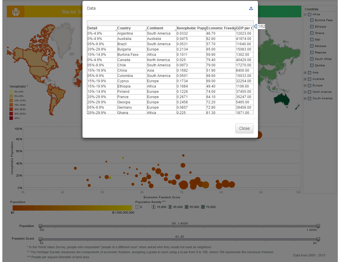
The show details tool is also very useful. When certain elements on a chart are selected it can show all the data that is being represented by those chart elements. This gives the user a more detailed look into why the visuals on the dashboard look the way they do. For this dashboard in particular, the show data tool is useful for keeping a wide array of data alphabetized and organized so the user can find what specific record they need.

Business Benefits of Interactive Map Visualizations
A business can utilize data plotted on a map for many reasons, but the most useful is to identify regional weaknesses. When those weakness are easily identifiable a business can then take steps towards improving performance in that particular region. Including maps in dashboards can provide whole new ways of analyzing data that were not available before with traditional chart types.
Instead of just seeing a normal bar or pie chart, maps tell the viewer exactly where certain data is present. For example, with a world map a business could see how sales in Mumbai compare to sales in Hong Kong. This creates information that a company can actually do something with. With these kinds of quick new insights, your company is able to see things never before possible. InetSoft will change the way your business looks at its data.
Register for a customized live demo with InetSoft service representatives.