Visual Analytics Software
Are you looking for a simpler, more effective way to explore data than traditional static reports? Visual analytics software from InetSoft provides insight into solving problems and answering data questions using interactive graphics and drill down reports.
Traditionally, data visualization has been a tool used mostly by data scientists and other professionals in order to identify trends and predict future outcomes by noticing patterns in the data. But with the unique, user-friendly interface of InetSoft's visual analytics software, even non-technical users can now manipulate and explore their data.
InetSoft's visual analytics software has changed all that by putting tools in the hands of non-technical users, giving any information seeker the ability to explore and ask questions of data with no outside help from IT. Maximum self-service is made possible by InetSoft's drag-and-drop interface, where users can drag out different data fields onto a spreadsheet like interface to create charts, tables, crosstabs, and gauges. From there, users can modify analytical parameters and isolate certain parts of data on the visualizations in order to get a closer look at relevant aspects of information.
By allowing for easy interactive exploration to non-technical users, InetSoft is giving business users the freedom to be inquisitive, thereby increasing the discovery of meaningful trends, opportunities, causes and effects that have not have been seen before.
Once useful new insights are found, users can save and bookmark their explorations and share them with other users. On the other hand, if a user's exploration does not lead to the desired information, the task can be restarted by simply clicking the "x" button, making for user-friendly exploration with no pressure.

Benefits of Visual Analytics Software
The right visual analytics software will offer many benefits to the user, including the reduction of lag time and overhead costs. Traditionally, when using information access systems, if a business person had a question in mind, they would have to submit a data or report request to IT in order to get an answer. It would often take a long time to get an answer to these questions, and, even worse, the question could be misunderstood or not worded correctly resulting in a need to repeat the whole process again. This led to unnecessary delays in business tasks and queries.
InetSoft's visual analytics software has changed all that by putting tools in the hands of non-technical users, giving any information seeker the ability to explore and ask questions of data with no outside help from IT. Maximum self-service is made possible by InetSoft's drag-and-drop interface, where users can drag out different data fields onto a spreadsheet like interface to create charts, tables, crosstabs, and gauges. From there, users can modify analytical parameters and isolate certain parts of data on the visualizations in order to get a closer look at relevant aspects of information.
By allowing for easy interactive exploration to non-technical users, InetSoft is giving business users the freedom to be inquisitive, thereby increasing the discovery of meaningful trends, opportunities, causes and effects that have not have been seen before.
Visual Analytics Charting Tools
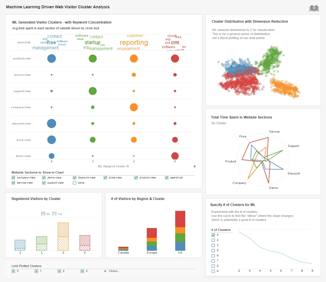
Increasing demands on businesses leads to increasing questions being asked of data, questions where traditional static reports will just not cut it. Users need to be able to interact with their data in order to get answers to their questions in a matter of seconds. InetSoft offers many tools that allow for data interactivity and manipulation, leading to more effective data discovery. These features include but are not limited to multidimensional charting, brushing, and filtering.
Multidimensional charting means being able to depict more than just two dimensions on a graph, which can be depicted on one or multiple axes. Traditional two dimensional graphs have an x and y axis and can be used to identify basic trends such as if a measure is increasing or decreasing over time, but it offers no insight as to why this might be happening.
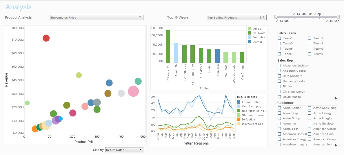
However, multidimensional charting also adds in the aspect of coloring and sizing options, which displays additional dimensions and measures in different colors or sizes.
For example, taking a chart that depicts sales opportunities, you could color the dots on the chart by salesperson and size the dots based on dollar amount. By doing this, at a glance you can see much more insight to where the increase or decrease in sales is coming from.
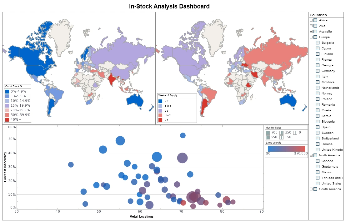
Another significant feature of InetSoft's visual analytics software is the brushing tool. Using this tool, users can "brush" or highlight data in one chart and immediately isolate corresponding data on accompanying elements of the dashboard, allowing for intuitive drill-down on data.
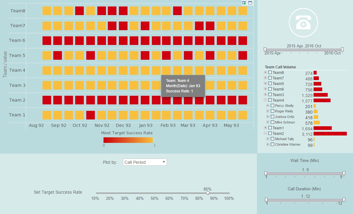
Users can also filter data by checking off selection boxes from criteria lists. These selection boxes are created by simply dragging and dropping the desired dimension or measure onto the dashboard. This can also be done to create date sliders or visual calendars that allow users to select the date ranges to include in the chart. Filtering allows for sifting through large amounts of data, zooming into the areas of interest, and noticing comparisons and trends along the way.
Interested in finding out more about visual analytics software? Request a personalized demo and get started with InetSoft's cloud-flexible software today!


