Product How-To: Dashboard Element Distribution
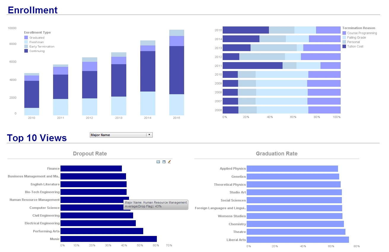
Having the full control over dashboard element distributions allows users to personalize data visualization to best fit individual needs. View the example below to learn more about the Style Intelligence solution.
A Selection Container can display all of the selections (filters) that are currently specified in the Viewsheet. These include selections in Selection List, Selection Tree, Range Slider, or Calendar components. To display all current selections within a Selection Container, follow the steps below:
1. Drag a Selection Container component from the Component tree onto the Viewsheet grid. This creates an empty Selection Container element.
2. Right-click on the Selection Container, and select ‘Properties’ from the context menu. This opens the ‘Selection Container Properties’ dialog box.
3. In the ‘Options’ panel, enable ‘Show Current Selections’.
4. Click ‘OK’. The Selection Container will now display the currently selected values for any Selection List, Selection Tree, Range Slider, or Calendar components in the Viewsheet.
More Resources About Dashboards
-
Common Sales Metrics Tracked
Discussion of sales-focused performance measures such as time-to-close, win rate, average deal size, and quota attainment, with examples of how dashboards surface those single-value KPIs. The article explains how filters and interactive controls let users slice campaigns and identify drivers of change. Visual indicators are recommended to make “the one thing you need to see” obvious for sales managers. Guidance is provided on combining multiple KPIs in a single report to support rapid, actionable sales decisions.
-
Analyst Role In Pet Supplies
A collection of industry KPI resources that shows how analysts across verticals pick which measures to monitor, including a dedicated example for a pet supplies company. The page outlines KPIs used to assess inventory turns, sales per SKU, customer retention, and margin by product family. Recommendations include choosing KPIs that align with strategic objectives and making them viewable in self-service dashboards. The resource library links to role-specific KPI articles and sample dashboards for quick adoption.
-
Overall Equipment Effectiveness Insights
Manufacturing KPI examples such as overall equipment effectiveness (OEE), production yield, and defect rates are described along with how dashboards reveal downtime drivers. The article illustrates continuous-improvement tracking through trend lines and exception highlighting to reduce unplanned stoppages. It highlights how combining production, quality, and maintenance KPIs gives a fuller picture of factory health. Suggestions include linking OEE to root-cause drilldowns so teams can prioritize improvement work.
-
Cost Per Available Seat Mile
Aviation-sector metrics such as net profit margin, cost per available seat mile (CASM), and revenue passenger kilometers (RPK) are explained as essential financial KPIs. The piece describes how air-carrier dashboards blend operational and financial measures to balance capacity, yield, and cost control. Visualizing CASM alongside utilization and fuel expense trends helps identify short- and long-term cost pressure. The article recommends linking ticketing and load-factor data to revenue KPIs for more accurate forecasting.
-
IT Service Performance Indicators
IT-focused KPIs such as mean time to acknowledge, mean time to repair, incident counts, and SLA compliance rates are listed with dashboard patterns for monitoring them. The article explains how technology teams use KPIs to track service availability, ticket backlog, and trend-based capacity planning. Recommendations include aligning KPIs to agreed service levels and surfacing alerts when thresholds are breached. Linking operational metrics to business impact is emphasized so IT decisions can be prioritized by risk.
-
Project Progress And Health Indicators
Project analyst KPIs covered include schedule variance, percent complete, earned value metrics, and issue aging to detect slippage early. The article shows how dashboards combine task-level details with summary KPIs to help stakeholders see progress at a glance. It suggests using trend and variance visuals to separate one-off delays from systemic problems. The piece also recommends correlating resource allocation KPIs with delivery outcomes to inform replanning decisions.
-
Billing Operations Throughput Metrics
Billing operations KPIs such as invoice cycle time, claims denial rate, collection effectiveness, and days sales outstanding are explained with dashboard examples. The article emphasizes tracking both throughput and accuracy KPIs so revenue leakage is visible early. It recommends combining operational KPIs with aging and trend analysis to prioritize collections or process fixes. Visual drilldowns into exceptions are highlighted as a key mechanism for improving billing outcomes.
-
Average Time To Acknowledge Explained
MTTA and MTTR dashboards are presented with KPIs like average time to acknowledge, average time to repair, and resolution rate to measure incident-response effectiveness. The article describes how combining those KPIs with incident priority and affected-service data helps teams improve responsiveness. It recommends threshold-based alerts and historical baselines so performance regressions are noticed quickly. Using layered KPIs—team, service, and customer impact—permits focused operational improvements.
-
Industrial Hygiene Exposure Monitoring Data
An article listing dashboard KPIs for safety and industrial hygiene discusses exposure concentrations, incident frequency, and control effectiveness. The content explains how exposure monitoring KPIs support regulatory compliance and worker-safety improvement programs. It recommends visualizing trend lines and alarm thresholds for exposures so early intervention is possible. Combining environmental, incident, and training-completion KPIs helps demonstrate continuous improvement to stakeholders.
-
Cloud-Flexible KPI Software Features
An overview of InetSoft’s KPI software highlights small-footprint deployment, self-service dashboards, cloud flexibility, and examples of industry KPI usages. The page outlines customer use cases and the practical benefits of delivering KPI dashboards without heavy BI developer dependency. It summarizes how the product supports rapid dashboard building, comparing actuals to forecasts and targets across departments. Advice is provided on selecting KPI tools that balance ease-of-use with integration and governance capabilities.

