Use Cases for Making Dashboards for Google Calendar
Dashboards built around Google Calendar offer a powerful way to transform raw scheduling data into meaningful visualizations and operational insights. While Google Calendar provides excellent tools for day-to-day time management, dashboards elevate that data into trend analysis, resource optimization, and strategic planning. Teams, executives, project managers, support staff, and operations leaders all benefit from transforming appointment-level details into aggregated patterns that expose opportunities for improvement. The most compelling use cases arise in environments where time allocation, meeting patterns, or resource availability directly influence productivity or cost. By consolidating calendar events into a visual interface, organizations gain faster comprehension and can make more informed decisions based on actual behavioral trends rather than assumptions.

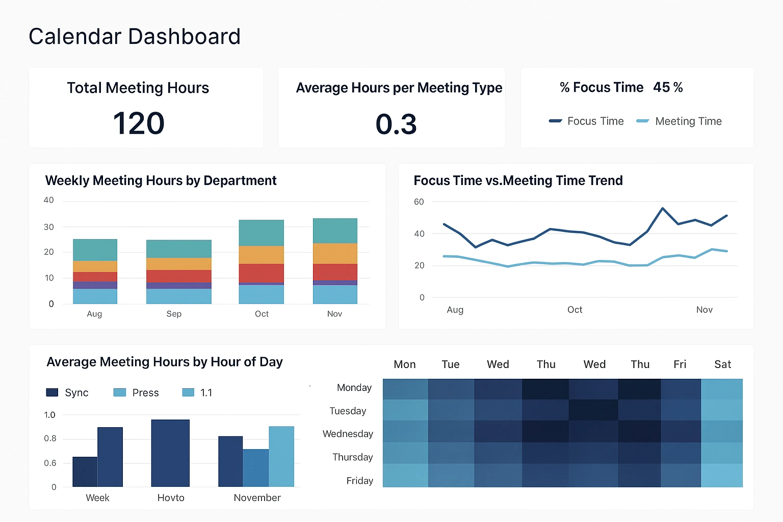
One of the strongest use cases lies in analyzing meeting load across departments or individuals. Many organizations struggle with excessive meeting culture, yet lack concrete visibility into how time is actually spent. A dashboard that aggregates Google Calendar events by duration, type, organizer, attendee count, or subject category can clarify which teams experience the heaviest meeting burdens. Trend charts expose cyclical spikes, outliers, or shifts over time, while heat maps highlight peak scheduling hours that might be optimized. By comparing meeting time against focus time, teams gain a clearer picture of workload distribution and can make targeted changes such as reducing redundant syncs, consolidating repeating sessions, or blocking shared focus time.
Another valuable scenario emerges in capacity planning and workload balancing. Organizations with distributed teams or complex project environments often need a clear view of how available hours map to commitments. Dashboards built from Google Calendar data can show planned vs. unplanned time, visualize scheduled workloads across teams, and forecast bandwidth based on recurring events and historical patterns. This becomes especially important for service-oriented groups like IT support, consulting, customer success, and creative teams where planned work and meetings can consume large portions of the week. A dashboard showing upcoming weeks with expected load helps managers avoid over-allocation and enables smoother project sequencing.
Additional Google Calendar Dashboard Applications
Resource scheduling is another area where dashboards provide strong value. Conference rooms, shared equipment, and specialized spaces are often reserved through Google Calendar, yet understanding usage patterns can be difficult through the interface alone. A dashboard can reveal which rooms experience the most demand, how booking patterns vary by time of day, and whether unused reservations are inflating perceived scarcity. Facilities teams can then determine whether room layouts need changes, whether additional spaces are required, or whether automated policies should reclaim unused bookings. Visualizing resource availability across buildings or floors helps streamline the planning process for future expansions or reconfigurations.
Dashboards also enhance project coordination by providing a unified view of milestone events, sprint schedules, review meetings, and deadlines stored in Google Calendar. Instead of scanning multiple calendars, teams can view an aggregated timeline showing phases, dependencies, and critical milestones. This is particularly useful in cross-functional initiatives involving marketing campaigns, product releases, regulatory deadlines, or onboarding waves. Color-coded calendars aligned with project categories make it easier to spot conflicts, identify bottlenecks, and reinforce accountability. Dashboards can even merge calendar data with project management systems to give a holistic view of planned activities versus scheduled deadlines.
A surprisingly impactful use case involves tracking operational rhythms such as shift coverage, employee availability, and rotation schedules. Organizations that rely on Google Calendar for staffing schedules can benefit from dashboards that present shift patterns, coverage gaps, overtime trends, and adherence metrics. This approach works for retail, hospitality, medical practices, security teams, and similar sectors where coverage continuity is essential. Managers gain immediate insight into staffing imbalances, allowing them to take corrective action before customer service is affected. Rotational patterns become clearer when aggregated visually, helping optimize fairness and reduce burnout.
Personal and Customer-Focused Calendar Dashboard Uses
Dashboards can also support event management teams responsible for coordinating meetings, workshops, conferences, or educational programs. Google Calendar often acts as the central repository for event timing, speaker sessions, room assignments, and support logistics. A dashboard can organize these details into visual blocks showing assignments, conflicts, setup times, and attendee flows. When multiple events run concurrently, a dashboard clarifies resource loads and ensures that scheduling does not unintentionally overlap or create bottlenecks. Event planners gain confidence knowing they have a comprehensive data-driven view that minimizes surprises on event days.
For executives and senior leadership, dashboards offer a high-level overview of time allocation across strategic categories. Leaders often divide time among internal management, client engagements, recruiting, planning, and administrative tasks. Visual breakdowns of calendar data can highlight whether time distribution aligns with organizational priorities. Pie charts and bar graphs display how much time is invested in activities that drive growth compared to time spent on operational or reactive items. Such insights help refine scheduling habits, shift efforts toward long-term goals, and reduce distractions that drain executive focus.
Sales teams represent another strong use case, as calendar activity often correlates closely with performance. Meetings, demos, training sessions, follow-ups, and internal syncs are all captured in Google Calendar. A sales activity dashboard can show appointment volume, meeting types, client touch frequency, and time spent per sales stage. When combined with CRM data, the dashboard can highlight relationships between meeting patterns and revenue outcomes. Sales managers can identify top performers’ scheduling habits, coach underperforming reps on activity levels, and detect trends that might predict pipeline health. Visualizing the rhythm of client engagement adds depth to traditional sales KPIs.
Industry-Specific Calendar Dashboard Benefits
Marketing departments also benefit from Google Calendar dashboards, particularly when coordinating campaigns, content calendars, editorial schedules, and promotional events. Dashboards can consolidate all campaign deadlines, launch dates, creative review cycles, and collaboration sessions into a unified interface. This helps teams avoid overlapping campaigns, reduce schedule collisions, and maintain consistent pacing across the year. Visual patterns reveal peak workload periods, allowing teams to distribute their efforts more evenly. By observing the relationship between calendar scheduling and campaign outcomes, marketing teams can refine planning and reduce last-minute scrambling.
Education environments can use Google Calendar dashboards to monitor class schedules, faculty availability, advisor meetings, and student events. Academic administrators gain insight into classroom utilization, instructor load balancing, and appointment booking trends. For tutoring centers or student support offices, dashboards clarify peak demand hours and assist in optimizing staffing. Patterns in office hours attendance or advising sessions can reveal student engagement trends that help inform academic planning. Dashboards become an essential tool for improving operational efficiency in highly schedule-driven environments.
Another powerful use case involves personal productivity optimization, especially for individuals managing complex schedules. Aggregated views of calendar data can reveal patterns such as excessive context switching, insufficient focus blocks, or poor alignment between daily time use and long-term goals. Visualizing recurring events and their impact helps identify habits that hinder productivity. This approach benefits entrepreneurs, consultants, creative professionals, and anyone balancing multiple responsibilities. While the Google Calendar interface supports basic planning, dashboards add depth by illuminating long-range trends.
Support and Healthcare Calendar Dashboard Applications
Customer support teams can also benefit from dashboards built on Google Calendar data. Support organizations often manage shifts, escalation schedules, training sessions, quality audits, and customer appointments through a shared calendar. Visual dashboards allow leaders to spot coverage gaps, evaluate training load, and track schedule adherence. When combined with ticketing metrics, these dashboards help correlate time allocation with performance indicators such as response time, backlog volume, and customer satisfaction. Support operations become more predictable and easier to scale when scheduling patterns are transparent.
Healthcare practices provide another fertile area for Google Calendar dashboards. Clinics and medical offices use calendar systems to coordinate patient appointments, provider schedules, equipment availability, and follow-up sessions. Dashboards can highlight no-show rates, booking density, patient wait times, and daily appointment flow. Understanding these patterns helps optimize scheduling strategies, improve staff utilization, and enhance the patient experience. Dashboards allow administrators to make data-backed decisions about staffing, appointment length, and load balancing among providers.
In all these scenarios, the value of dashboards lies in their ability to transform dispersed, event-level data into cohesive visual insights. Google Calendar contains an enormous amount of operational intelligence that often goes unused because it is not aggregated effectively. Dashboards unlock that potential, offering clarity, visibility, and strategic leverage across a wide range of industries and team structures. Whether the goal is improving productivity, balancing workloads, optimizing resources, or managing complex schedules, a visual dashboard built from calendar data delivers insight that makes daily operations smoother and more predictable.


