Interactive Visualization Dashboard Examples
Data dashboards allow you to quickly view KPIs for different departments within your organization. They're also useful when you need to compare how well each department is performing against its goals. Click on an image to open one of these live interactive dashboards in a new tab. These industry specific visualization dashboards allow you to get a feel for how easy it to use InetSoft's data dashboard software.
Marketing Campaigns
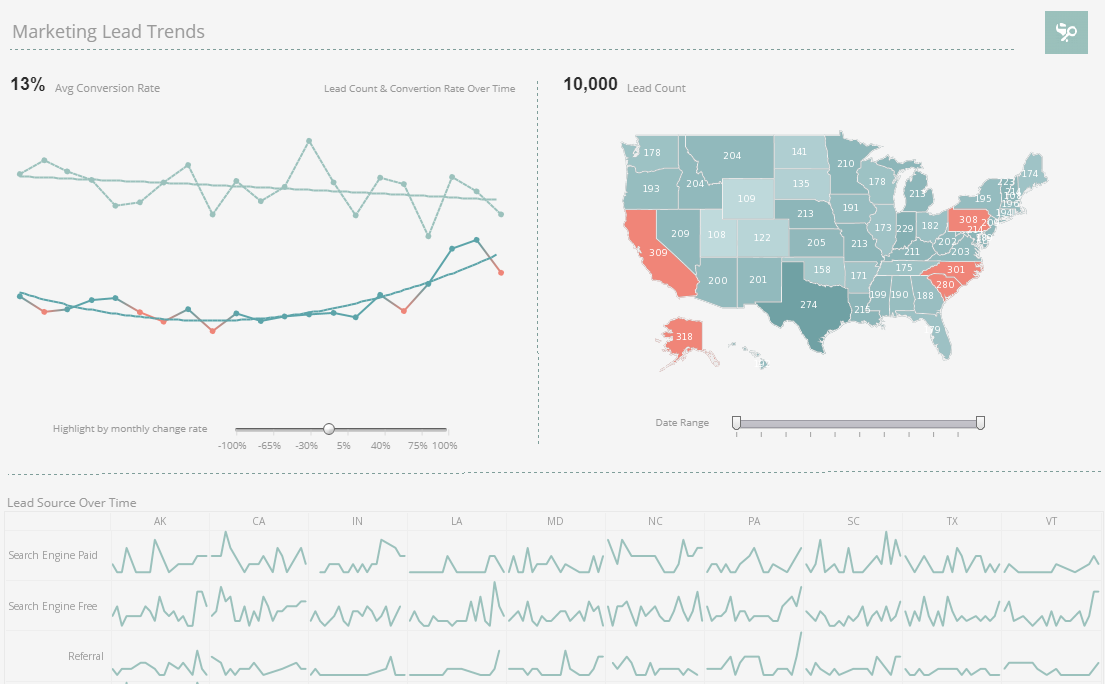
This marketing lead trend dashboard gives marketing managers the metrics they need to monitor sales pipelines and optimize strategy. Lead count and source are tracked as well as conversion rates, with monthly change highlighted based on slider selection.
Service Operations
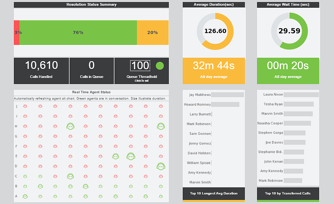
This operations dashboards lets customer service managers see who's handling the most calls and who might need some attention. This visualization refreshes with live data ever 30 seconds, giving an overview of current calls in real time.
Worker Safety
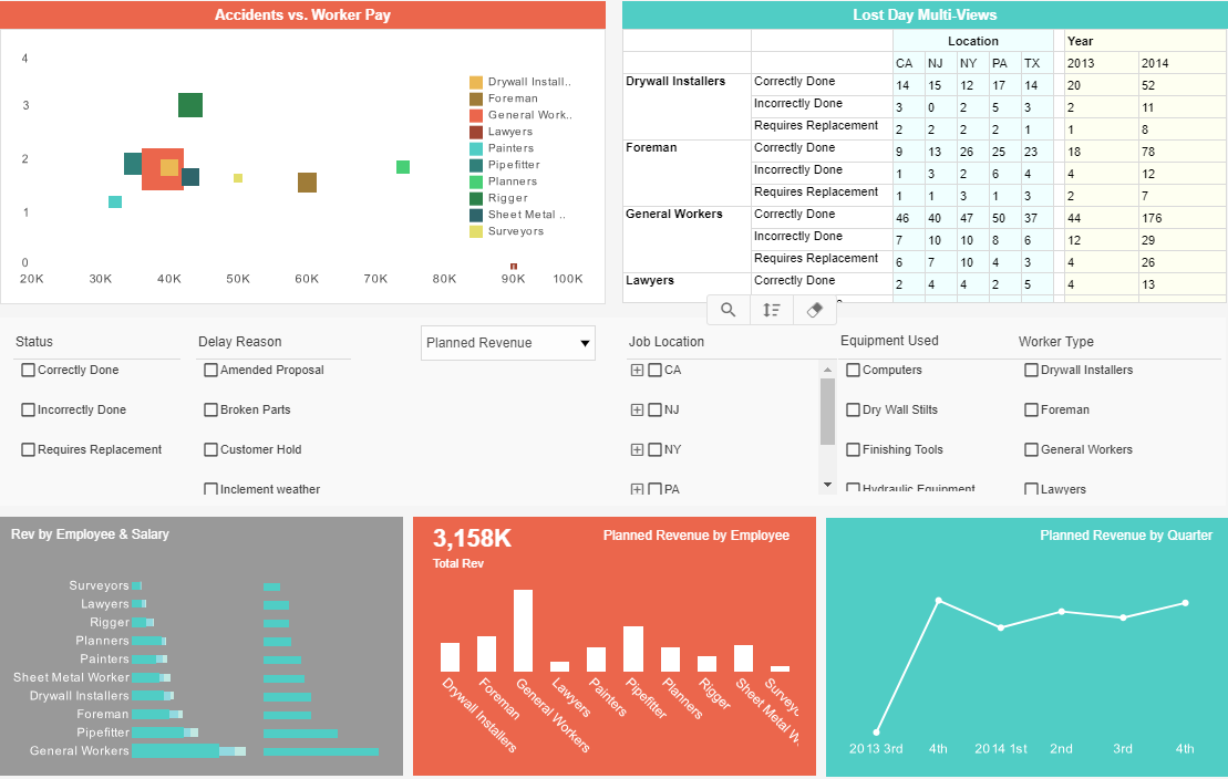
This worker safety dashboard gives a high level view of construction accidents as well as basic revenue and payroll. Accidents are broken down by company role as well as by state.
Healthcare Informatics
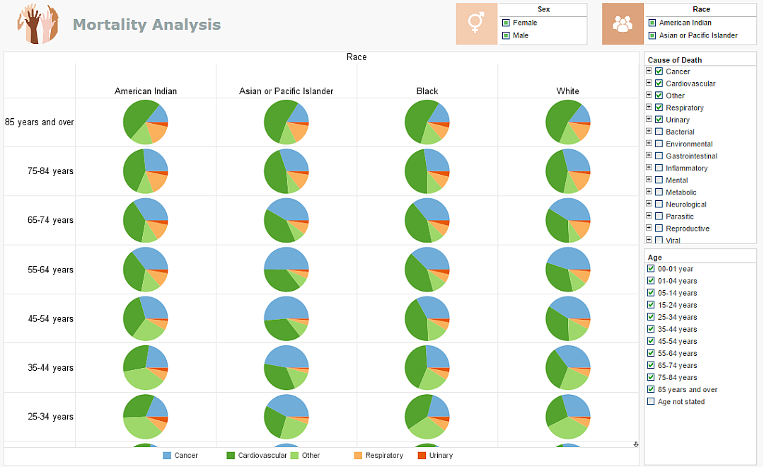
This healthcare informatics visualization details the most common causes of death for every demographic segment. Healthcare providers can use this visualization to supplement analysis of an individual's case history, weighing the patients symptoms against the most common mortality causes of their individual population segment, steering extended care.
NGO - Not for Profit
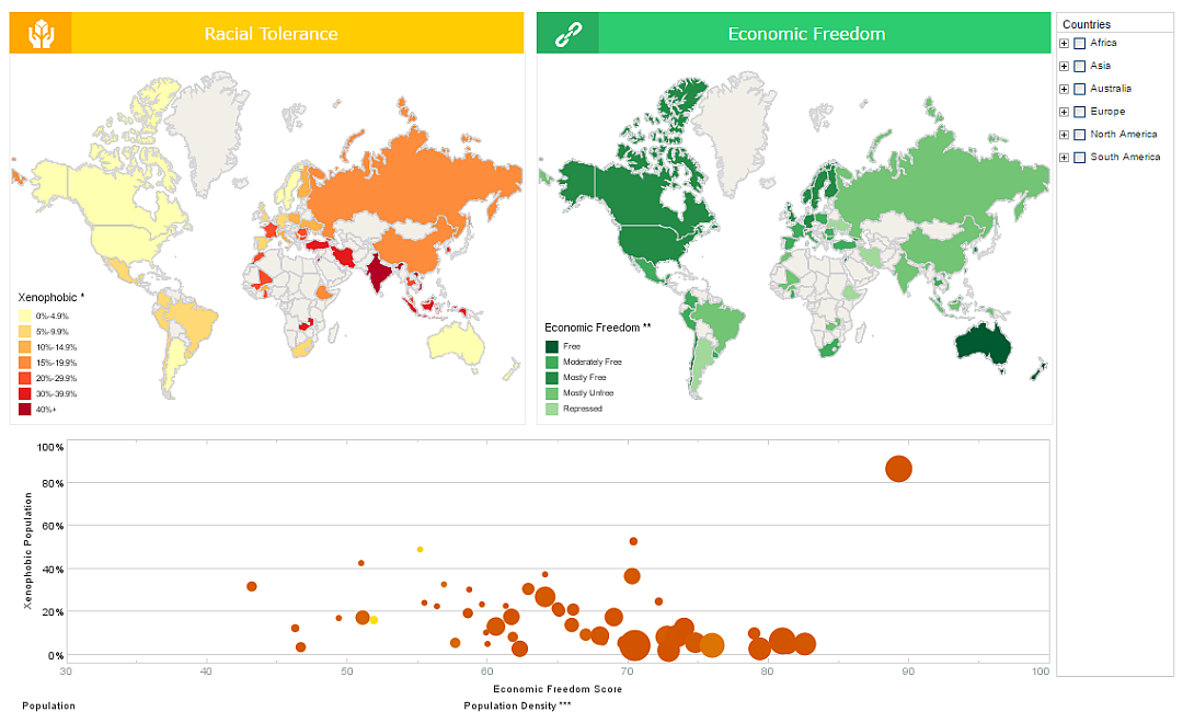
This visualized comparison of global tolerance and poverty is an example of the kind of research that nonprofits and NGOs can use visualization for. The dashboard also displays population and population density, allowing nuance to be brought into the sociological analysis.
Tech Support
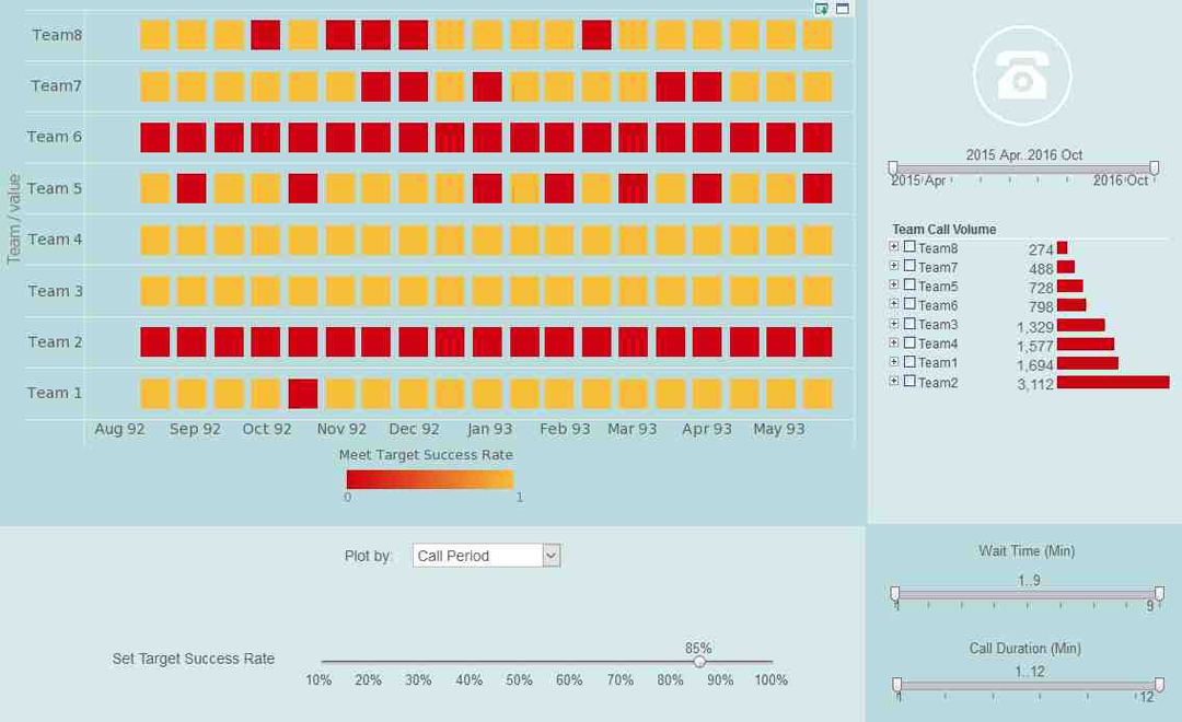
This tech center dashboard shows which teams are pulling their weight and which ones are lagging. A red highlight provides easy comparison to goals that can be adjusted via slider as initiatives progress.
Spatial Analysis
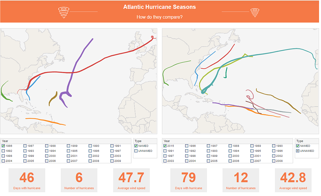
This storm tracking dashboard is an example of how map charts can provide insight into spatial phenomena. The two map charts operate independently with their own filters, allowing for easy comparison of year to year.
Sales Performance
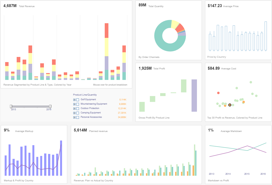
This sales performance dashboard gives a high level overview to executives monitoring inventory and sales performance. Profit and price are also detailed, covering basic accounting needs as well as sales.
Data Exploration

This visual exploration of United States census data demonstrates the flexibility offered by multidimensional charting. In addition to population and median income on the x and y axes, region and property value are displayed using color and fill.
Financial Management
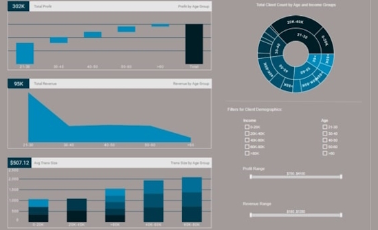
This interactive financial management report can help bank managers identify their most valuable customer demographics. The sunburst chart on the top right is an effective way to show how different customer segments relate to each other.
Claims Analytics
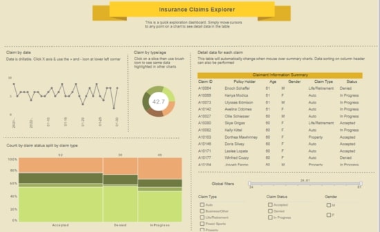
This insurance claims analytics dashboard helps insurance adjusters estimate risk based on demographic factors. Monitoring claims by date helps accounting keep sufficient liquid cash on hand for payouts.
Performance Analysis

This performance analysis of different car makes and models can help auto buyers make better decisions. The text KPIs displaying industry averages help add context to the stats of individual vehicles.
Examples of Interactive Visualization Dashboard Adoptions
Faster decision making with drilldown and filtering
Interactive dashboards let users move from summary metrics to granular detail in seconds. A regional retail chain replaced static weekly reports with interactive sales dashboards, cutting investigation time for anomalies from 3 days to 30 minutes per incident. Store managers used filters to isolate SKU-level performance by region and time-of-day, allowing them to reallocate inventory and staff within the same shift. The ability to slice and dice with a few clicks eliminated lengthy data requests and accelerated corrective actions.
Reduced reporting overhead and labor costs
Automating visual reports and enabling self-service reduces repetitive manual work. An ecommerce company eliminated a team of three FTEs who assembled ad-hoc Excel reports by making dashboards accessible to marketing and finance. Reporting cycle time dropped from 4 days to real-time dashboards, producing an annual labor cost reduction of roughly 25 percent while maintaining richer, more timely insights.
Improved sales productivity and pipeline conversion
Sales teams benefit from interactive opportunity and territory dashboards that surface at-risk deals and high-potential accounts. One B2B vendor used drill-to-contact features and integrated CRM filters to prioritize outreach; reps reported a 12 percent increase in conversion rate and a 20 percent reduction in average sales cycle. Managers used dashboard alerts to trigger coaching sessions for lagging reps, improving quota attainment across the team.
Operational efficiency through real-time monitoring
Operations teams use streaming dashboards to detect anomalies and reduce downtime. A logistics provider implemented real-time fleet and warehouse dashboards with map visualizations and live alerts; they reduced late deliveries by 18 percent and lowered expedited shipping costs by 23 percent. Real-time visuals allowed dispatchers to reroute drivers proactively rather than react after escalation.
Better product decisions with exploratory analytics
Product teams use interactive cohort analysis and funnel visualizations to understand user behavior. A SaaS company used drillable funnels to discover a 35 percent drop-off at a specific onboarding step. A/B test overlays and segmentation allowed product managers to roll out a targeted UX change that improved activation by 14 percent. Interactive dashboards accelerated hypothesis testing from weeks to days.
Cost savings from optimized resource allocation
Finance and operations use scenario modeling widgets and parameterized dashboards to simulate budget and capacity changes. A manufacturing firm ran interactive what-if scenarios to compare overtime, temporary hires, and machine upgrades; the dashboard showed a modeled 7 percent cost reduction by shifting to predictive maintenance and rebalancing shift schedules. These insights prevented unnecessary capital expenditure and optimized labor spend.
Enhanced customer success and retention
Customer success teams leverage account dashboards that combine usage, support tickets, and NPS trends. With interactive timelines and annotations, teams identify deterioration signals earlier. One subscription business used these dashboards to target outreach for accounts that showed declining feature adoption, reducing churn among high-value customers by 9 percent within six months.
Cross-team collaboration and governance
Interactive dashboards support comment threads, shared views, and scheduled snapshots so stakeholders collaborate around the same evidence. A health system standardized KPIs across departments with governed dashboards; this eliminated conflicting reports, reduced monthly review meetings by 30 percent, and shortened strategic planning cycles by enabling aligned, data-driven discussions.
