Application Usage Funnel Analysis Dashboard
An application usage funnel analysis dashboard is designed to explain how users move through an application, where momentum builds, and where friction causes drop off.
Unlike generic usage dashboards that focus on isolated metrics, a funnel dashboard provides a structured narrative of user behavior from entry to meaningful retention. When implemented correctly, it becomes a shared reference point for product, engineering, and operations teams.


Purpose of a Usage Funnel Dashboard
The primary purpose of this dashboard is to make user progression visible and measurable. It answers questions such as how many users begin using the application, how many complete critical actions, and how many return after initial exposure. The dashboard is not meant to catalog every event but to highlight the stages that matter most to application success.
A well-designed funnel dashboard also creates alignment. Stakeholders may disagree about features or priorities, but a shared view of where users abandon the product brings focus to real problems rather than opinions. This makes the dashboard a decision-making tool rather than a passive report.
Core Funnel Structure
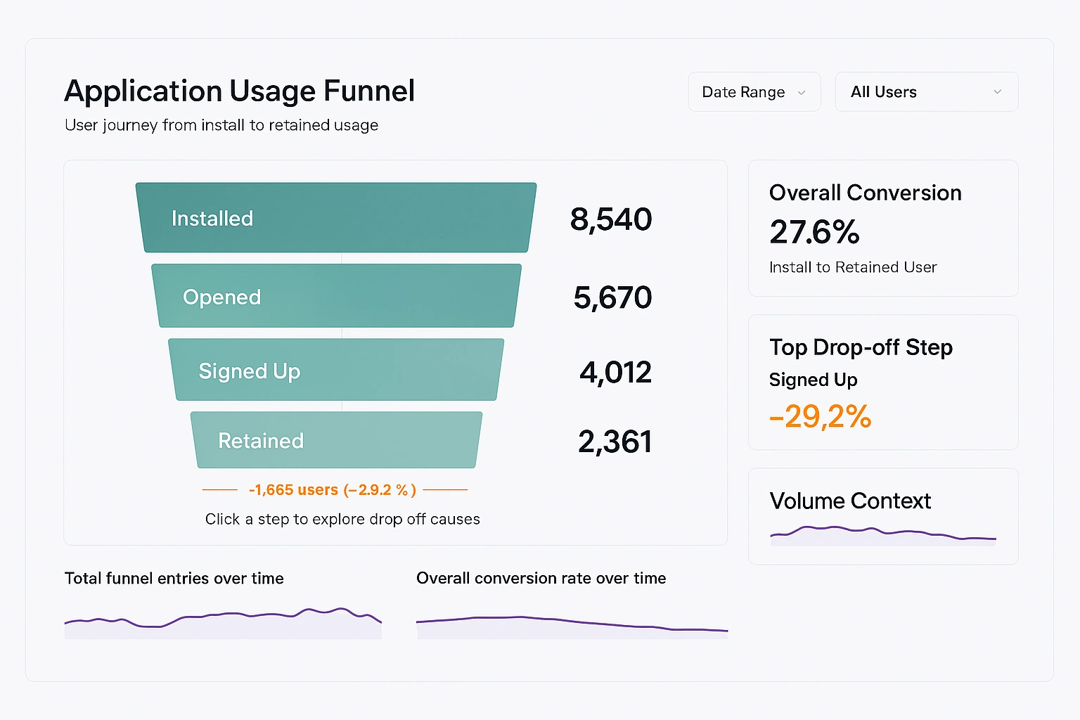
The funnel is composed of sequential stages, each representing a meaningful user milestone. Typical stages include application install, account creation, first successful action, repeat usage within a defined time window, and long-term retention. Each stage should be defined in plain language so that non-technical audiences understand exactly what qualifies a user to move forward.
Stability in definitions is critical. Once stages are defined, they should rarely change. Frequent redefinition undermines trust and makes historical comparisons unreliable.

Primary KPIs in the Funnel
Total Users per Step
This KPI shows the absolute number of users who reached each funnel stage during the selected time period. It establishes scale and provides context for all other metrics. A sharp decline in user count between two steps immediately signals a potential problem area.
This metric is best interpreted comparatively rather than in isolation. A small number at a later step may be acceptable if the initial population is also small, but alarming if upstream volume is high.
Step-to-Step Conversion Rate
The step-to-step conversion rate measures the percentage of users who progress from one stage to the next. This KPI isolates friction by focusing on transitions rather than totals. A low conversion rate usually indicates usability issues, unclear value, or technical failures at that stage.
Because it is relative, this metric often reveals problems that absolute counts hide. Even high-volume steps can perform poorly when viewed as a percentage.
Cumulative Conversion Rate
Cumulative conversion measures the percentage of users who reach a given step relative to the first step in the funnel. This KPI reflects the overall health of the user journey. It answers the question of how many initial users become meaningful users.
This metric is especially valuable for executive audiences because it summarizes the funnel into a single narrative number per step.
Drop-Off Count and Drop-Off Rate
Drop-off metrics quantify how many users fail to progress and what percentage of users are lost at each transition. These metrics deserve visual emphasis because they highlight where effort should be concentrated.
High drop-off rates that persist over time suggest structural issues, while sudden spikes often point to recent changes such as releases, outages, or policy updates.
Supporting KPIs Outside the Funnel
Funnel Entry Volume
This KPI tracks how many users enter the funnel over time. It provides context for interpreting changes within the funnel. A decline in conversions may be caused by poorer user quality rather than changes in the application itself.
Entry volume trends help teams separate acquisition problems from activation problems.
Overall Funnel Conversion
This KPI represents the percentage of users who progress from the first step to the final defined outcome. It is often displayed prominently as a headline metric. While simplistic, it is useful for tracking long-term improvement.
Because it aggregates multiple steps, it should never be used alone to diagnose issues.
How to Use the Dashboard Effectively
The dashboard should be used as a recurring reference during reviews rather than as a one-off analysis. Regular cadence encourages teams to notice trends rather than react to noise. Weekly or monthly reviews tend to strike a good balance between responsiveness and stability.
The first step in any review is to scan the funnel from top to bottom without filters. This establishes a baseline understanding of overall performance before segmentation introduces complexity.

Using Segmentation to Reveal Insights
Segmentation allows the same funnel to be viewed through different lenses such as platform, geography, acquisition channel, or user type. This is where many of the most actionable insights emerge.
Segments should be applied sparingly. Too many options dilute focus and increase the risk of misinterpretation. Each segment should exist because it supports a real decision or hypothesis.
When a segment significantly underperforms, the goal is not immediate optimization but understanding. Poor performance may reflect intentional trade-offs or external constraints.
Interpreting Trends Over Time
Trend charts beneath the funnel provide temporal context. They help answer whether performance is improving, deteriorating, or stable. Sudden changes should prompt investigation, but gradual shifts are often more important.
Comparing entry volume trends with conversion trends prevents false conclusions. A growing funnel with declining conversion may still produce more retained users overall.
How to Improve Funnel KPIs
Improving Early Funnel Conversion
Early steps are heavily influenced by clarity and expectation setting. Improving copy, onboarding flow, and initial performance often yields significant gains. Reducing friction at this stage has an outsized impact because all downstream metrics depend on it.
Technical reliability matters disproportionately early in the funnel. Even minor errors can permanently lose users before value is demonstrated.

Improving Mid-Funnel Conversion
Mid-funnel steps often reflect product comprehension. Users may understand how to use the application but not why they should continue. Improvements here usually involve better guidance, clearer value reinforcement, or simplified workflows.
Usage analytics and qualitative feedback are especially valuable at this stage, as drop-offs are rarely caused by a single obvious failure.
Improving Retention and Final Outcomes
Later funnel stages are influenced by habit formation and long-term value. Improvements typically come from feature depth, performance consistency, and alignment with user goals. These changes take longer to implement but create durable gains.
Retention improvements often appear modest in percentage terms but compound significantly over time.
Common Mistakes to Avoid
One common mistake is overloading the dashboard with too many steps. Each additional step increases cognitive load and reduces clarity. Only steps that represent meaningful behavioral transitions should be included.
Another mistake is chasing small percentage improvements without considering volume. A large percentage gain on a low-volume step may matter less than a small gain earlier in the funnel.
Finally, treating the dashboard as purely descriptive limits its value. It should actively inform prioritization and experimentation.

Operationalizing the Dashboard
The dashboard works best when paired with clear ownership. Each funnel step should have a team or role responsible for monitoring and improving it. This turns abstract metrics into actionable responsibilities.
Annotations should be used to document releases, experiments, and incidents. This builds institutional memory and reduces repeated analysis of the same anomalies.
Why This Dashboard Matters
An application usage funnel analysis dashboard creates a shared language around user behavior. It replaces anecdotal discussions with observable patterns and grounds decisions in measurable outcomes. Over time, it becomes less about reporting numbers and more about shaping how the organization thinks about users.
When maintained with discipline and restraint, the dashboard becomes a strategic asset that continuously guides improvement across the application lifecycle.