Live Data Dashboards
What Is a Live Dashboard?
A live dashboard is an interactive, continuously updated view of key metrics and events drawn directly from operational data sources. Instead of showing a snapshot that is refreshed manually, a live dashboard updates automatically as new data arrives, so users always see the most current information available.
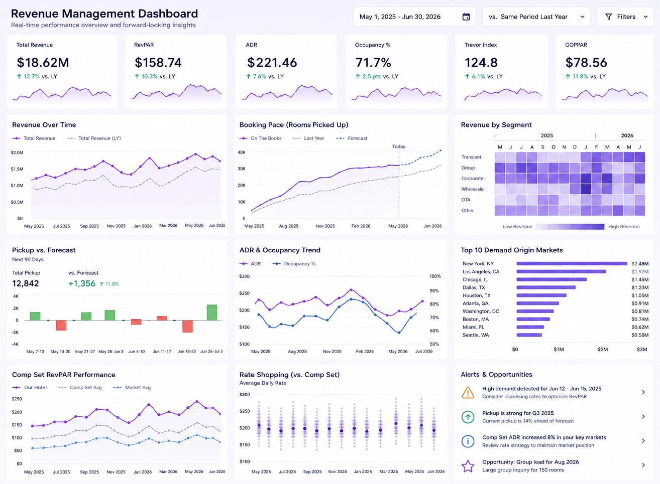
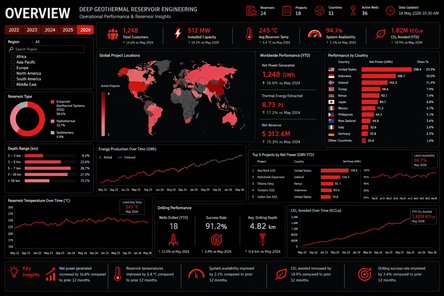
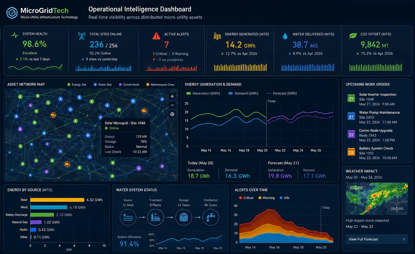
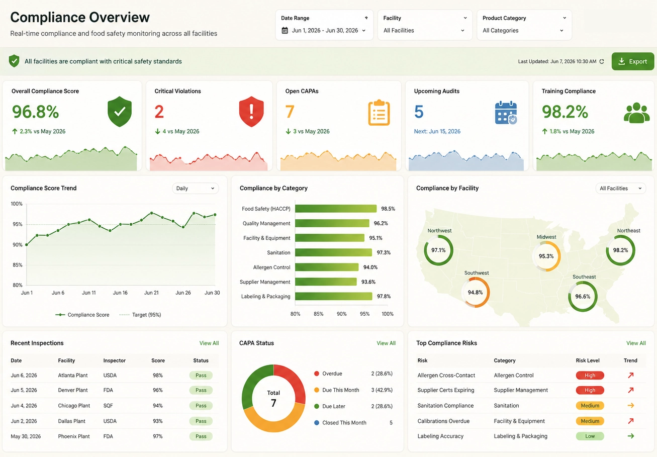
Live dashboards are typically used in business intelligence and operational analytics to monitor performance, detect anomalies, and support time-sensitive decisions. They combine visual elements such as charts, gauges, KPI tiles, and alerts with real-time data feeds, giving decision-makers a single place to track what is happening right now across systems, teams, or processes.
Compared to static dashboards, live dashboards emphasize low data latency, continuous refresh, and responsiveness to events. They are especially valuable in environments where conditions change quickly and decisions must be made based on the latest data rather than periodic reports.
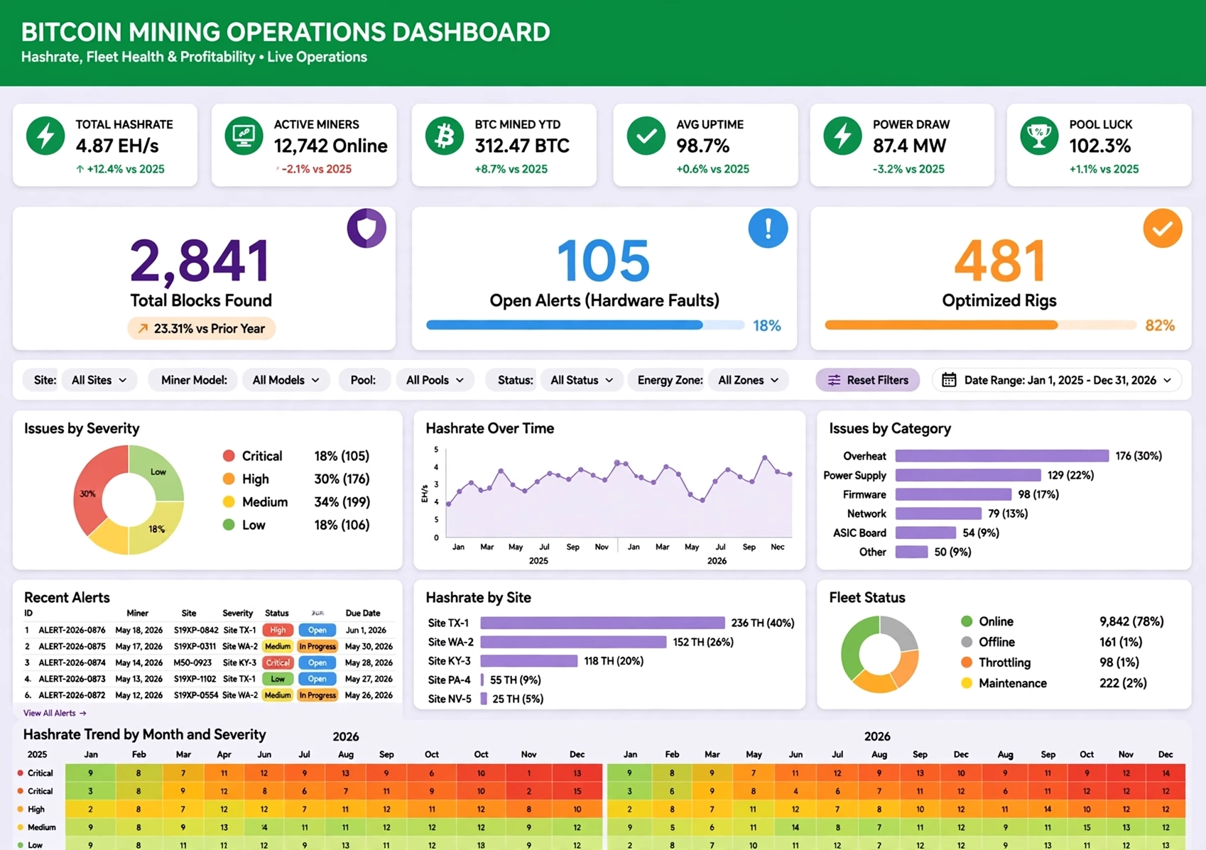
How Live Dashboards Work
Live dashboards operate by connecting visual components to data sources that support frequent or continuous updates. Each chart, KPI tile, or indicator is bound to queries, streams, or feeds that can be refreshed on a schedule or triggered by events. When new data is available, the dashboard automatically redraws or updates the relevant elements without requiring user intervention.
Under the hood, live dashboards may use a combination of polling and streaming. Polling periodically requests new data from databases, APIs, or services at defined intervals. Streaming uses push-based mechanisms, such as message queues or event hubs, to deliver data as soon as it is generated. Some implementations also support hybrid models, where critical metrics are streamed while less time-sensitive data is polled.
To maintain performance and reliability, live dashboards often rely on caching layers, incremental updates, and efficient data queries. Security controls ensure that only authorized users can access live data, and scalability features allow the dashboard to handle increasing volumes of events and users. The result is a responsive, real-time view that stays aligned with the underlying operational systems.
Live Dashboard Use Cases
Live dashboards are used across industries wherever real-time visibility is critical. They provide a single, actionable view of operations, helping teams respond quickly to changes and opportunities.
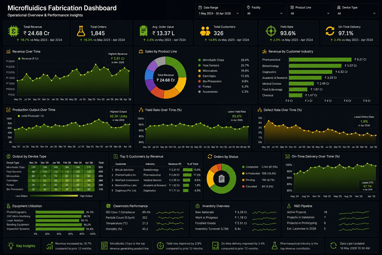
Manufacturing Line Monitoring
Track production rates, machine status, downtime, and quality metrics in real time. Operators can see bottlenecks, equipment failures, and yield issues as they occur, enabling faster intervention and reduced downtime.
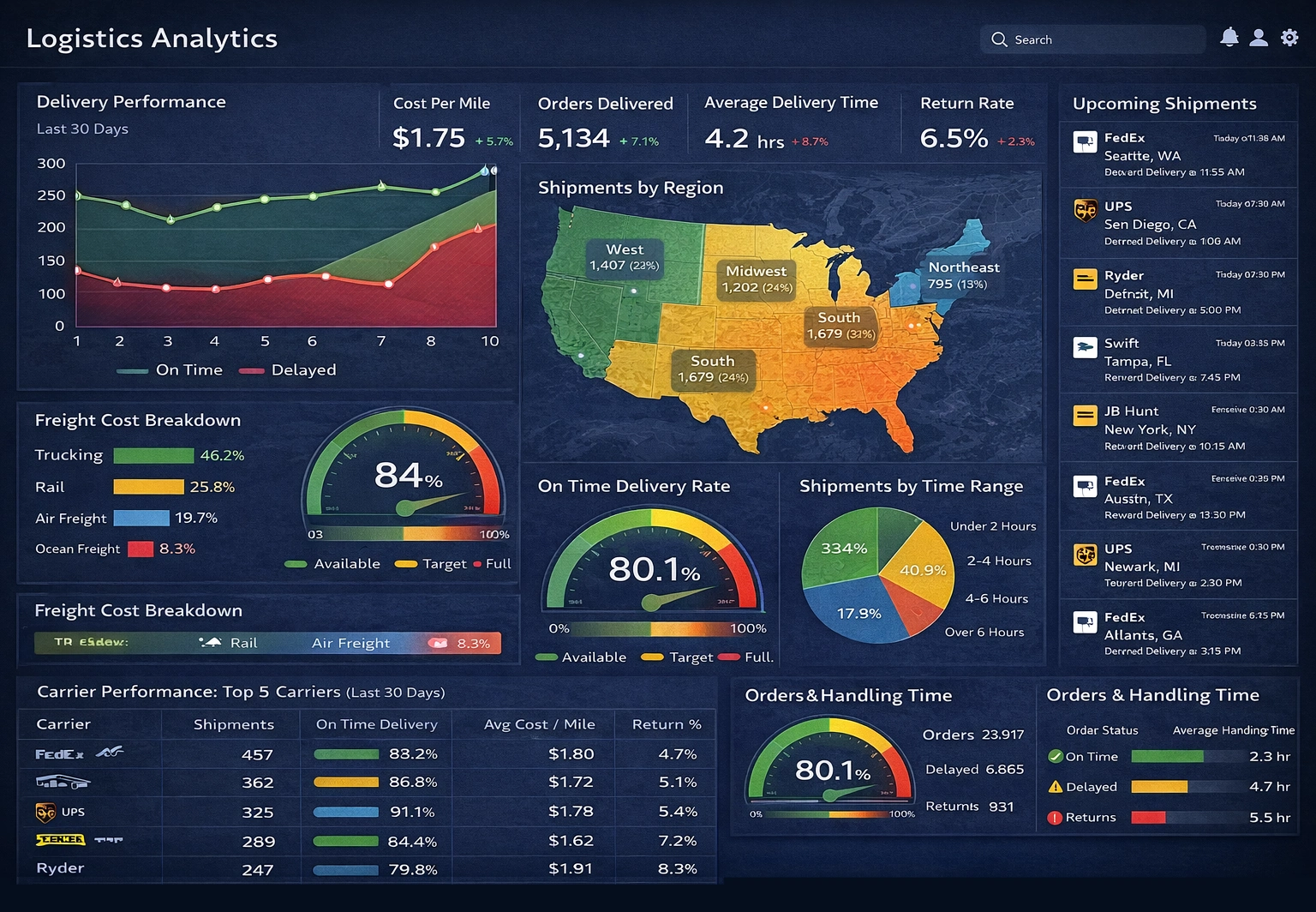
Supply Chain and Logistics
Monitor shipments, inventory levels, order fulfillment, and transportation status. A live dashboard can highlight delays, stockouts, and capacity constraints, allowing planners to reroute shipments or adjust inventory strategies before problems escalate.
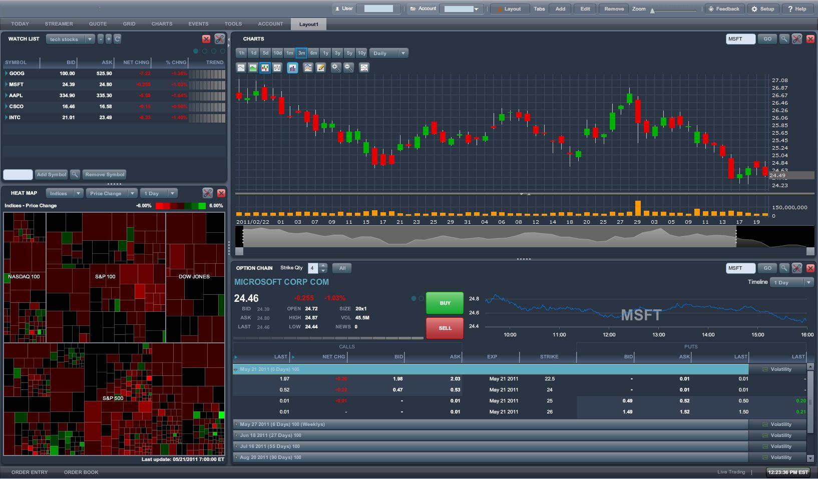
Financial Market Tracking
Display live prices, spreads, volumes, and risk indicators for portfolios or trading desks. Real-time dashboards help analysts and traders react to market movements, manage exposure, and identify emerging trends.
IT Operations and Infrastructure
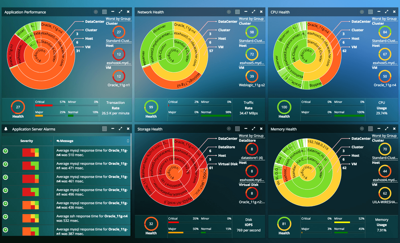
Show server health, application performance, network latency, and incident status. Operations teams use live dashboards to detect outages, performance degradation, and security events, improving response times and service reliability.
Retail and E‑Commerce
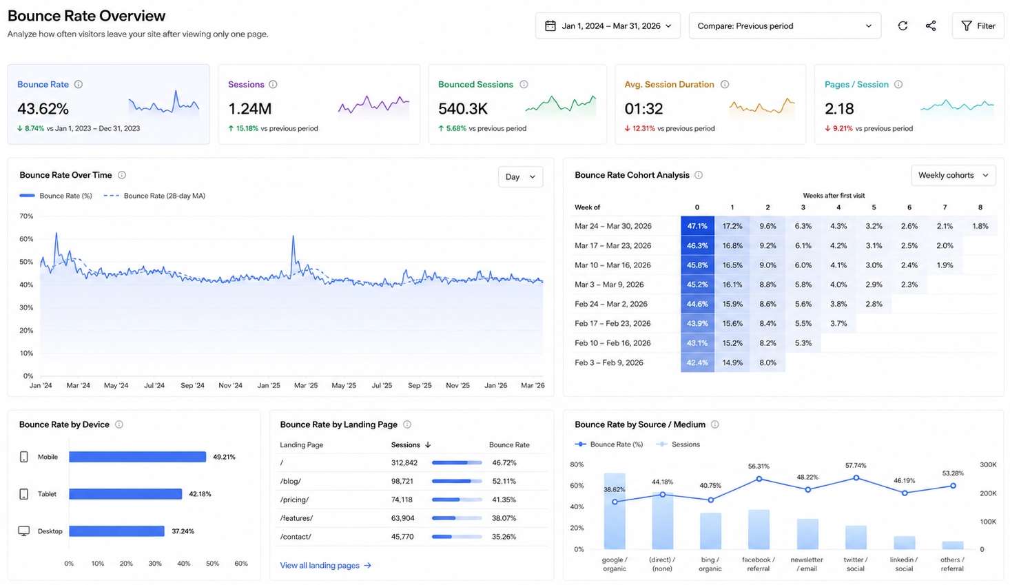
Visualize sales, conversions, inventory, and customer behavior as they happen. Live dashboards support dynamic pricing, promotion adjustments, and inventory allocation based on current demand.
Healthcare and Patient Monitoring
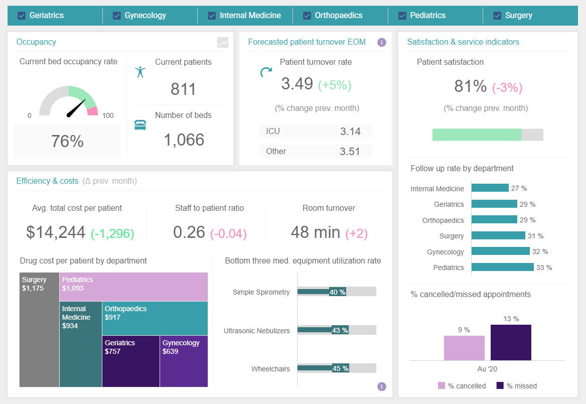
Present vital signs, bed occupancy, lab results, and workflow metrics in real time. Clinicians and administrators gain immediate insight into patient status and resource utilization, improving care coordination and outcomes.
InetSoft Live Dashboard Features
InetSoft’s live dashboards combine flexible visual design with robust real-time data connectivity. They are built to support both business users and technical teams, providing a platform that can adapt to diverse data sources and use cases.
- Real-Time Data Binding: Visual components such as charts, gauges, and KPI tiles can be bound directly to live queries, streams, or feeds, ensuring that each element reflects the latest data.
- Streaming and Refresh Controls: Dashboards support streaming connectors and configurable refresh intervals, allowing teams to balance data latency with performance.
- Interactive Exploration: Users can filter, drill down, and pivot live data without breaking the real-time connection, making it easier to investigate anomalies and trends.
- Alerting and Thresholds: KPIs and metrics can be configured with thresholds and rules that trigger visual alerts when conditions are met, highlighting issues that require attention.
- Flexible Data Integration: InetSoft connects to databases, APIs, cloud services, and enterprise systems, enabling live dashboards that span multiple data domains.
- Scalable Deployment: Dashboards can be deployed across teams and environments, with security and governance controls that protect sensitive data while supporting broad access.
Live vs Static Dashboards
Live and static dashboards serve different purposes in analytics and reporting. Understanding the differences helps organizations choose the right approach for each scenario.
Architecture Overview
A live dashboard architecture connects data sources, processing layers, and visualization components in a way that supports continuous updates and reliable performance. The design must handle data ingestion, transformation, security, and delivery to end users.
At the data source layer, the architecture integrates with operational systems such as databases, ERP platforms, CRM systems, IoT devices, and external APIs. Data is ingested through connectors that support streaming, polling, or hybrid approaches. These connectors feed into processing layers that may include data pipelines, transformation services, and caching mechanisms.
The visualization layer hosts the dashboard application itself. It binds charts, KPIs, and other visual elements to live queries or streams, manages refresh logic, and enforces access controls. Load balancing and scalability features ensure that multiple users can view and interact with the dashboard simultaneously without performance degradation. Logging and monitoring components track data flows and system health, supporting maintenance and optimization.
Security is woven throughout the architecture, with authentication, authorization, encryption, and auditing controls protecting data in transit and at rest. This combination of data connectivity, processing, visualization, and security creates a robust foundation for enterprise-grade live dashboards.
Best Practices for Live Dashboards
Designing effective live dashboards requires attention to both technical and user experience considerations. The goal is to present real-time information in a way that is clear, actionable, and reliable.
- Prioritize Critical Metrics: Focus on the KPIs and events that truly require real-time visibility, rather than trying to make every metric live.
- Optimize for Clarity: Use simple, well-labeled visuals that highlight trends and exceptions. Avoid clutter and excessive detail that can overwhelm users.
- Set Meaningful Thresholds: Configure alerts and color coding based on business-relevant thresholds, so users can quickly see when conditions are normal or problematic.
- Balance Refresh and Performance: Choose refresh intervals and streaming strategies that provide timely data without overloading systems or networks.
- Design for Different Roles: Tailor dashboards to the needs of operators, managers, and executives, ensuring each audience sees the information most relevant to their decisions.
- Test Under Real Conditions: Validate dashboards with real data volumes, user loads, and operational scenarios to ensure they remain responsive and accurate.
FAQ
What is a live dashboard?
A live dashboard is a visual interface that displays metrics and events using data that is updated automatically and continuously. It is designed to show what is happening right now, rather than only historical summaries.
How often can data refresh on a live dashboard?
Refresh frequency depends on the data sources, infrastructure, and business requirements. Some metrics may update every few seconds, while others refresh on longer intervals. Streaming data can appear almost instantly as events occur.
What data sources can be used for live dashboards?
Live dashboards can connect to databases, APIs, message queues, IoT devices, cloud services, and enterprise systems such as ERP and CRM platforms. The key requirement is that the source can provide data frequently or continuously.
How do live dashboards improve decision-making?
By providing real-time visibility into operations and performance, live dashboards help teams detect issues early, respond faster, and make decisions based on current conditions rather than outdated reports. This reduces risk and improves outcomes.
Which industries benefit most from live dashboards?
Industries with dynamic operations and time-sensitive decisions benefit the most, including manufacturing, logistics, finance, IT, retail, and healthcare. However, any organization that needs up-to-date insight into key processes can gain value from live dashboards.
Do live dashboards replace static dashboards?
Live dashboards complement rather than replace static dashboards. Static dashboards remain important for historical analysis, trend reporting, and strategic planning, while live dashboards focus on real-time monitoring and operational decisions.
Why Choose StyleBI Over MetricFire for Live Dashboards
When evaluating analytics and monitoring solutions, StyleBI and MetricFire serve very different use cases, and choosing the right one depends on your core business needs and team priorities. StyleBI is a business intelligence platform designed for data exploration, dashboarding, and self-service analytics across varied data sources, whereas MetricFire is focused primarily on infrastructure and application performance monitoring using time-series metrics with hosted Graphite and Grafana dashboards. This means StyleBI is built around analyzing business data for insights and decisions, while MetricFire is optimized for real-time systems and operations monitoring.
StyleBI stands out for business intelligence tasks because it is a full BI stack in a single platform. It offers schema-less data mashups that let teams combine and blend data from spreadsheets, databases, APIs, and other sources without requiring a centralized data warehouse, which reduces the need for heavy ETL pipelines or specialized data engineering upfront. This flexibility makes it easier to explore key performance indicators and prepare reports directly within the tool. Its intuitive drag-and-drop designer and interactive visualizations mean non-technical users can build dashboards and explore metrics without writing SQL, while power users still have access to advanced customization. By contrast, MetricFire’s strength is in collecting and visualizing time-series metrics for servers, networks, and applications, and although you can visualize business metrics through Grafana as part of its stack, it isn’t designed as a BI platform with data transformation and exploration as core capabilities.
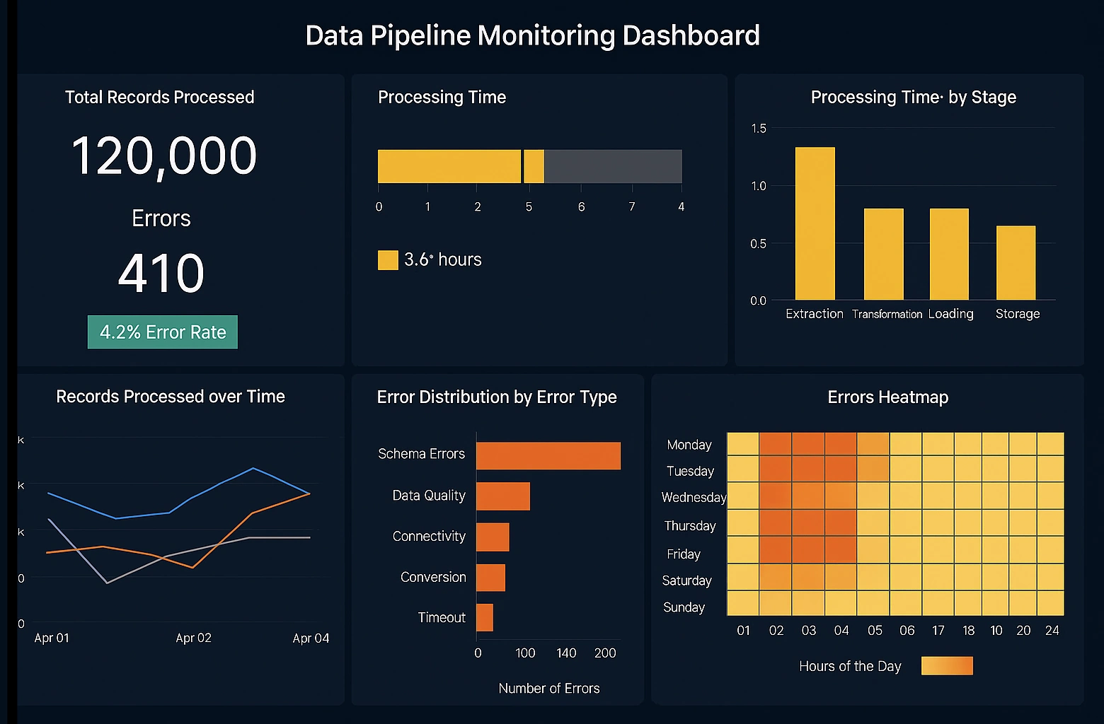
Another advantage of StyleBI for business analytics is cross-platform accessibility and effortless deployment. It runs in a web browser, requiring no bulky desktop software, and can be deployed on premises or in the cloud, supporting teams with diverse infrastructure needs. Its open architecture and extensibility allow businesses to embed dashboards into internal portals or client applications, white-label analytics under their own branding, and tailor the analytics experience end-to-end. This level of customization is generally beyond what you'd get from a hosted monitoring service like MetricFire, which offers ready-made Grafana dashboards optimized for monitoring but not deep data exploration or enterprise BI embedding.
StyleBI's self-service analytics capabilities also reduce reliance on IT teams. Users can mash up multiple data sources and transform data visually within the platform, enabling faster insights without a separate data preparation layer. This supports a more agile analytics workflow where stakeholders across departments can build and share meaningful dashboards without IT bottlenecks. MetricFire, while excellent for infrastructure and time-series monitoring, assumes you already have metric streams flowing in and does not replace a BI tool for multidimensional analysis of business data, historical performance, and cross-department reporting.
From a cost and scalability perspective, StyleBI’s licensing model is predictable and usage based in embedded scenarios, which can be advantageous for independent software vendors or teams embedding analytics into their products. Unlike many traditional BI platforms with complex tiered pricing that scales with users or features, StyleBI offers transparency and elasticity, helping organizations control expenses as they grow. It also provides comprehensive documentation and APIs that empower developers to deepen integrations and tailor analytics solutions for unique use cases.
In contrast, MetricFire’s hosted monitoring service excels at providing infrastructure visibility with minimal setup. It packages open-source tools like Graphite and Grafana into a managed service so teams can start collecting and visualizing time-series data quickly, and its support for alerting and integrations with popular notification channels makes it a strong choice for DevOps, SRE, and operations teams. If your primary goal is to monitor infrastructure health, performance metrics, or application behavior in real time and get alerted on anomalies, MetricFire is more aligned with that technical monitoring use case.
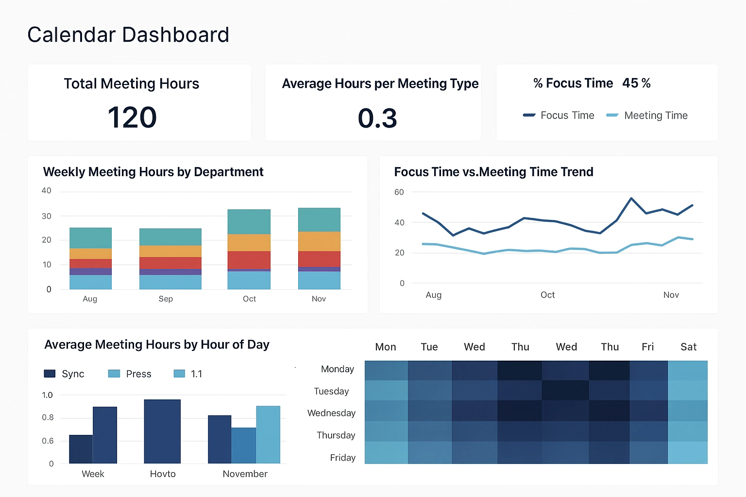
However, for data teams focused on business performance, operational reporting, and interactive dashboards that help executives and analysts explore trends across varied datasets, StyleBI is designed specifically for that purpose. Its ease of use, designer tools, and robust visual analytics capabilities make it easier for broader business users to engage with data without having to build custom monitoring stacks or rely on developers to configure dashboards. When teams want a unified BI platform that supports data exploration, reporting, embedded analytics, and flexible deployment options, StyleBI offers a more comprehensive solution geared toward business insights rather than only operational observability.
In summary, StyleBI should be considered over MetricFire when your priority is business intelligence, flexible analytics across varied data sources, and empowering non-technical users with visual exploration and dashboarding tools. Its architecture, self-service analytics, embedded capabilities, and developer-friendly APIs make it well suited for organizations that need a full-featured BI platform without heavy dependency on data engineering. MetricFire, on the other hand, is ideal for infrastructure and application monitoring where real-time metric collection, alerting, and performance dashboards are the key requirements. Choosing StyleBI means choosing a platform built for business analytics impact, while choosing MetricFire means selecting a powerful hosted monitoring system for operations and DevOps needs.
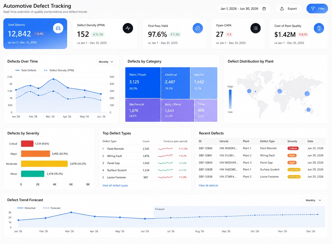
More Resources and Articles about InetSoft's Live Dashboard Product
Airports This Analytical Map - Rather than discuss this some more let's just take a look at Style Intelligence in action. Airports are geographical entities so map is a logical way of summarizing airport information. By using the latitude and longitude information of airports this analytical map now has marked the location of all the airports in my data...

Analytics Tool for the Utility Industry - Nowadays more and more data is collected than can be easily analyzed with traditional analytical tools. Daily operational dashboards become outdated when they cannot be easily updated or connect to new data. InetSoft's business intelligence software offers the ability to create wide-ranging reports, attractive visual utility dashboards and real-time interactive dashboards. The interactive dashboard shown is just one example of how data can be used to visualize essential information...
API for Graph Data - InetSoft provides an API for developers to control every aspect of chart generation and user interfaces. This example below illustrates how the JavaScript-like API can be used to draw a chart dynamically... Call Display Visualization Tool /business/solutions/categories_of_data_visualization_tools/ - So on those two axes we can start plotting categories of data visualization tools. And the first category is what I would call display visualization tool. And this are what I would say are very simple dashboards that divide one or two layers of data, that will allow objects on the screen to synchronize with each other, update each other...
Choosing the Best Data Visualization Tool - What do business decision makers look for when choosing the best data visualization tool for their company? Factors to consider are the ability to mashup different types of data sources, the ability to import data, integration with data warehousing, options for prototyping new data, accessibility, and user-friendly features that speed up decision making...
Cloud-Native Dashboards - Cloud-Native Technology, Easy-to-Use Dashboard. Cost-Efficient, Cloud Computing Expense Aligned Pricing. Explore the Live Dashboard Gallery in the Cloud. InetSoft's cloud flexible business intelligence solution delivers the benefit of cloud computing and software-as-a-service while giving you the maximum level of control. In terms of software-as-a-service, BI software is unique because it inherently depends on the data not being embedded in the application...

Creating a BI Data Model - Once a data source is defined, you can proceed to creating a data model. Data models are logical abstractions of database schemas, similar to Entity-Relation Models. The full Style Intelligence data model includes the following four components: Physical view, comprising database tables, fields, and joins Logical model, a logical mapping to meaningful business units Virtual private models, data-level security for controlled access OLAP overlay hierarchical model, a mapping to dimensions/measures...
Creates Live Data Dashboard - This Covid-19 tracker mashes up data from a few different sources to give views that aren't found in the other dashboards already available. Especially helpful is the inclusion of the number of tests performed with detail down to the state level. Data from Italy is also included, to provide a comparison to the western location that is chronologically in the forefront of fighting the curve. https://www.inetsoft.com/info/us_covid_test_tracker_dashboard/...
Data Management Problem - Here is something we've found frequently with our larger enterprise customers. They choose our software with a certain dashboarding project in mind driven by business need. They install our business intelligence platform on premise and create their pilot dashboard in a matter of hours. As they prepare to roll it out and ask us about best practices, we find that their data environment and usage profile could lead to challenges. They have a data management problem that they hadn't realized until they embarked on this project...
Dashboarding Tool for FreshBooks - Looking for a good solution for FreshBooks dashboard reporting? InetSoft's pioneering BI application produces great-looking cloud-based dashboards with an easy-to-use drag-and-drop designer. Mashup your finance data with other enterprise sources for a complete picture of performance. View a demo and try interactive examples. InetSoft's solution is true Software-as-a-Service for hosted and self-hosting, not a combination of client developer tools and a web-based delivery platform. All new clients and partners get free one-on-one business intelligence expert help to accelerate deployment...

Data Modeling Plus Viewing - A data driven business needs to empower everybody, from C-level executives to frontline workers, with intelligence from data to make smart business decisions. Recent advances in business intelligence (BI), particularly the wide adoption of visualization technology, have greatly expanded and simplified accessibility of data. However, visual dashboards are still just one step forward in the pursuit of self-service BI because they are limited to pre-designed interactivity for end users...
Delivering Mobile Business Intelligence Dashboards - With one BI application, serve mobile business intelligence dashboards to iPhones, iPads, Android-based tablets, smartphones, as well as full dashboard reporting to PCs, Macs, and laptops. Since 1996, InetSoft has been delivering mobile business intelligence and reporting solutions to developers and enterprises worldwide. As a server-based solution, requiring only a browser to access interactive dashboards and drill-down reports, InetSoft's Style Intelligence has always been mobile friendly...
Documentation About a Dashboard Table Query - InetSoft's award-winning dashboard software gives users sophisticated table query controls that help to enhance the creation of reports and creates a truly custom user experience. View the example below to learn more about the Style Intelligence solution. You can change various properties of a Data Table, such the table description, maximum number of rows retrieved and displayed, and the handling of duplicate rows. To change table properties, follow these steps...
Dozen Key Business Questions - We like to say that this stuff helps key business people see stories and solve problems. So back to Mark and Rich, this involves you to have a defined problem somebody is trying to solve and then second, we like to make sure we understand the half a dozen, dozen key business questions that are trying to be answered. But then the third thing is, we also like to try to understand why those questions can't be answered today and there is usually a reason. But when those things align, it's a very, very powerful tool and helps people make better decisions...

Enterprise Data Management Plus Dashboards - Looking for enterprise data management software? InetSoft offers Web-based BI software that includes a powerful and flexible data mashup tool with direct access to disparate data sources of almost any type. Below are articles related to InetSoft's software. Data Provides Insight into Forecasting - As far as other companies, yes, I do think that all of that historical data provides insight into forecasting. We have used the information that we are pulling in for planning and not only for your typical annual budgets or your cash flow forecasting, but we have used it to really look at the products that we are offering and determine what the best strategy will be for the upcoming year. So for instance...
Education Dashboard Software Example - Searching for education dashboard software with automated data monitoring and report generating functionality to use with existing systems? InetSoft's dashboard software is easy to deploy and use and offers a highly interactive and customizable design. InetSoft's dashboarding software is robust enough to...
Flexible Enterprise Data Management - Looking for an enterprise data management application that also includes dashboards and reporting? InetSoft offers Web-based BI software that includes a flexible data access engine. No need for a data warehouse with direct access to disparate operational data sources of almost any type. Below are articles about InetSoft's software. Structured and Free-form Queries - Queries are written for specific data access purposes and contain logic beyond the generic data model. Queries typically utilize advanced or proprietary database features. The idea is similar to relational database views, except that queries are normally not generic enough to be created as permanent database objects or views. In the Data Modeler, queries can be quite flexible...
Focus on Which BI Tools - The only other mega BI vendor I want to single out there is probably SAP with MIRO. So they are trying to build out a visualization and memory-based data discovery tool called Lumira. You will probably see it at SAPPHIRE which is next week, SAP's major conference. You will probably see Lumira focused on very heavily. Probably the biggest only concern here many people already complain that there are so many tools in the Business Objects and SAP portfolio, and there's been some shifting focus on which tools to use in which situations...

Free Dashboard Evaluation - Evaluating dashboard solutions for your organization's internal use or to embed in a commercial application? Deploy a small-footprint, easy-to-use Web-based data dashboard application from InetSoft. As an innovator in reporting software since 1996, InetSoft has pioneered the evolution from static reporting towards interactive visualization of data via dashboards...
How to Embed a Dashboard Table - The award-winning InetSoft dashboard software application offers embeddable dashboard solutions that lead to high end user adoption and significant increases in productivity. View the example below to learn more about the Style Intelligence solution. To convert a regular Data Table to an embedded table, follow these steps: 1. In the table title bar, click the 'Show Live Data' button. This will populate the table with data. 2. Right-click the title bar of the table, and select 'Convert to embedded Table'...
InetSoft Powered Dashboards for Agribusiness - While some AgKnowledge clients are happy with simple reports that they can filter and export raw data from, AgKnowledge's more involved clients enjoy learning how to build their own agribusiness dashboards. This hands on approach is enabled by the InetSoft data worksheet interface. Data tables in the Agknowledge database often have an overwhelming number of fields, with names that are not very descriptive. DID data scientists rectify this issue by creating data worksheets with only columns included that the client will want to use, with descriptive names assigned to the columns...
Make the Most of Visualization Software - And that kind of gets back to these slider bars, which I always find to be the most -- some of the most compelling, at least because you can get that, you can put one of those dimensions on the slider, right, you can even put two dimensions or more I suppose on a slider. I guess for closing comments, let's go around the room and just offer our best advice to folks. Mark, what's your most useful advice you can offer to people to make the most of their data visualization software...
Many Key Performance Indicators Examples - Below are key performance indicators examples displayed in dashboards designed using InetSoft's drag and drop dashboard solution, some of which can be tested with the free downloadable evaluation copy of Style Intelligence, while others can be seen in the free visualization tool, Visualize Free. Many SaaS BI vendors have created a cloud platform where you must transfer and update all data. This can create severe new issues because of bandwidth limits and updating-logic complexity. Even though some might offer a traditional install-your-own option, you will lose the benefit of SaaS that offloads the infrastructure management to the BI vendor. InetSoft's BI allows you to choose the platform and the location that is best suited for you...
Old Model of BI - And so the old model of BI was this publishing, saying, well here it is and then PowerPoint and Excel and things like that became the means to deliver it. And that environment was really great for explanation. It was great for things where you have known bounds because the exploration was already done for you by some IT analyst, who modeled the data and built a metadata layer in a particular way so, the known question, known bounds of the data for the answer. Then we get into the exploration which you didn't really touch on there where visualization can enable that. And then you explore it. You explain it. You have got to educate people going from here it is to here is how it works and why we need to take an action, to persuasion: to this is the action I think we should take...
Project Metrics Dashboard Example - Looking for tools to build a dashboard to track project metrics? InetSoft offers Web-based dashboard software with a drag and drop designer to create whatever dashboard you need. View a demo. Embedded Dashboard Table - InetSoft's dashboard software offers an embeddable dashboard table that facilitates the creation of interactive multidimensional reporting. Instead of creating a regular table from a query or data model, you can create a Data Table by manually typing values into the Worksheet. Such a table is called an Embedded Table...
Pre-aggregate Dashboard Filtering - Using InetSoft's award-winning dashboard software, users can unite complex and disparate data formats into one cohesive report by performing advanced dashboard data filtering. View the example below to learn more about adding filters to dashboards with the Style Intelligence solution. To specify conditions on both pre-aggregate and post-aggregate data, as well as group rankings, use the 'Advanced Conditions' dialog box. Advanced conditions can additionally be joined using both 'AND' and 'OR' operations. If you only need pre-aggregate conditions and 'AND' operations, you can use simple conditions instead...

Real Estate Agent Dashboard Example - Though real estate agents serve under a broker, their day-to-day work - i.e., networking, generating leads, working with clients - is carried out independently. When you take on this role, you're not only working as an agent but as a one-person digital marketing team. A dashboard is a data hub that takes all of your important analytics and presents them in the form of graphs, tables, and charts. This allows you to keep the wide view - we're talking big picture growth - even as you work one-on-one with your clients in the here and now...
Report Bursting Monthly Statements - In a large enterprise reporting deployment, it is important to handle both a large amount of data and a large number of users. Imagine a scenario where a single report such as a monthly statement needs to be delivered to thousands of users. The same queries are run multiple times, taxing the database, and the same report is regenerated for each user to ensure data security...
Restaurant Chain Dashboards - The management dashboard shows the crucial data expected to deal with an association in a single place. The dashboard mainly lists the objects, important actions, projects and items that need action. A restaurant manager can use a preferred dashboard vendor to help him or her get the right information consistently. The solution to this is the use of a sales dashboard that visually represents all the restaurant's sales information. The sales information is stored in the dashboard and can be retrieved anytime when there is a need...
Sales Opportunity Discovery Dashboards - Management and sales professionals normally depend on professionally-built visualization dashboards and reports for their known business needs. However, no design can anticipate all business questions. Flexible interactivity and ad hoc customization by end users becomes essential for quick business decisions. InetSoft's solution allows not only visual manipulation but also governed access to underlying data...

Scaling Up for Accessing Massive Databases - So this is the label we're giving to the technology that we're introducing in this release to deliver performance improvements and establish a path for scaling up for accessing massive databases while we're providing service to a large number of simultaneous users, and Mark is going to add a little more description to this for you. Traditionally, our software has always defaulted to accessing your operational data sources directly. We really espoused the idea of traditional BI, where you're required to build a data warehouse. The only problem with that, and it only comes up some of the time, is that operational data sources tend to be attuned more for data entry and writing...
Scripting for Controlling Data Tables - Below you will find scripting instructions for controlling data tables. With InetSoft's flexible data intelligence software, casual end users can drag and drop a data table onto a visual report or dashboard, and power users and developers can control virtually every aspect of a data table. Tables offer a number of special properties that allow you to access the data values from script, and to add visual style to rows, columns, and individual cells. The following sections explain how to use these properties...
Semantic Layer BI Tool - The Data Modeler is used to connect to various data sources, define semantic layers, and create queries. These semantic layers (logical models) and queries are atomic data blocks that can be manipulated and combined in a data worksheet, InetSoft's term for where database fields are selected and transformed. Data Block architecture makes InetSoft's approach to meta-data modeling different from other business intelligence platforms. Instead of focusing on pre-purposed business intelligence needs, we concentrate on designing data blocks that represent data in a way that is understandable to business users. These data blocks can then be assembled for different needs as those needs arise...
Several Database Dashboard Examples - Is your business using database dashboards? These dashboards offer companies a unique way of representing their data. From sales projections, to employee statistics, and even inventory stock, database dashboards are able to easily represent all of the numerical data that your company can hold, into a visually appealing dashboard. Dashboards come in various different styles and presentations, and choosing the correct one can greatly affect your business. All dashboards will be able to present your data in some well formatted visual display, but database dashboards can integrate specific data from your company database that you need to present to employees or clients...
Show More Dashboards - Let me show you some more dashboards. These are our services, and this is what they are right now. They are all running perfectly. Let's look at our downloads for our software packages. What we are looking at here. This is product page hits, basically people shopping. What are they looking at? This is actual downloads...
Trucking Management Dashboards - The purpose of a dashboard in the trucking industry is to provide real-time results and showcase logistics performance. These real-time results become the key performance indicators (KPIs), which helps you streamline the operations, especially logistics and travel based plans. As a result, you get the chance to simplify processes and make them more manageable. To make operations more streamlined and effective, trucking companies prefer to reach out to a well-recognized software development company for creating internal dashboards. These dashboards help them to manage their operations effectively...
Try InetSoft's Key Performance Indicators Software - Looking for key performance indicators software? Since 1996 InetSoft has been making KPI dashboard software that is easy to deploy and easy to use. Build self-service oriented dashboards quickly. View a demo and read customer reviews...
Using a Dashboarding Product - Learn to use dashboarding tools that make multidimensional data simple to view. View the example below to learn more about the Style Intelligence solution. In this example, you will use a Spinner control to display only values in a table that exceed the specified Spinner value. 1. Create a new Worksheet. 2. In the following steps, add a new Embedded Table containing a single numeric data cell...
Utilize Non-Relational Data for BI - In today's business environment, data is stored in many different formats. Java Objects and EJB are present in legacy systems, but Web Services and XML are the new standards for sharing information over the internet, and Excel is a popular data analysis and manipulation tool. With InetSoft products, you can leave this data in its native format and still utilize it for BI purposes...
View a Dashboard Web App - Looking to view and/or build dashboards via a web app? InetSoft's dashboard web application can be installed either on-premise or in the cloud, on a remote server provided by Amazon web services or any other provider A dashboard is a visual display of the most important and relevant information in reference to one or more objectives, displayed on one screen so it can be viewed easily at a glance. Dashboard software has been proven to be a highly effective business intelligence tool for business users and casual users alike. Whether examining future business trends or looking for a way to analyze...