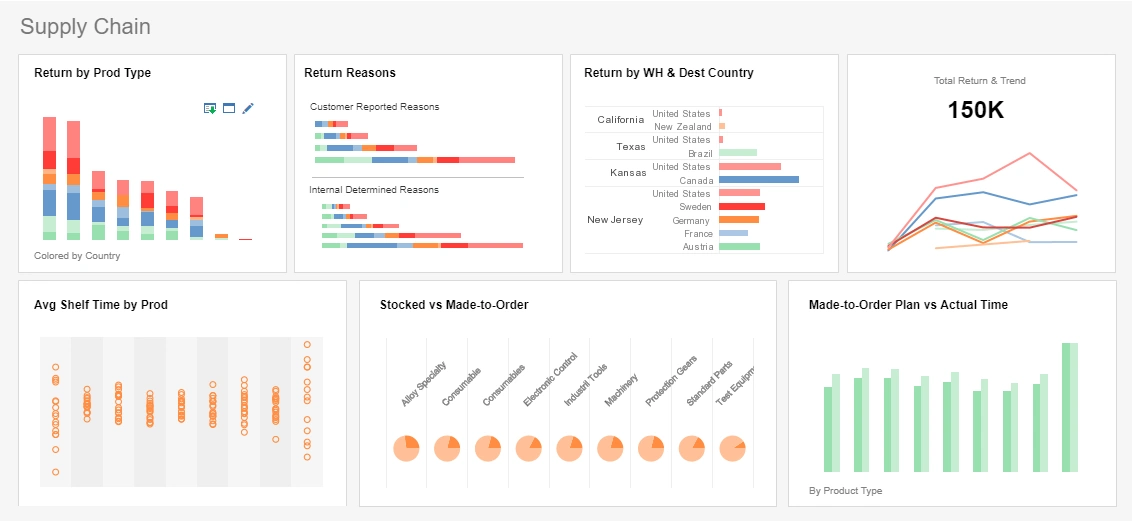
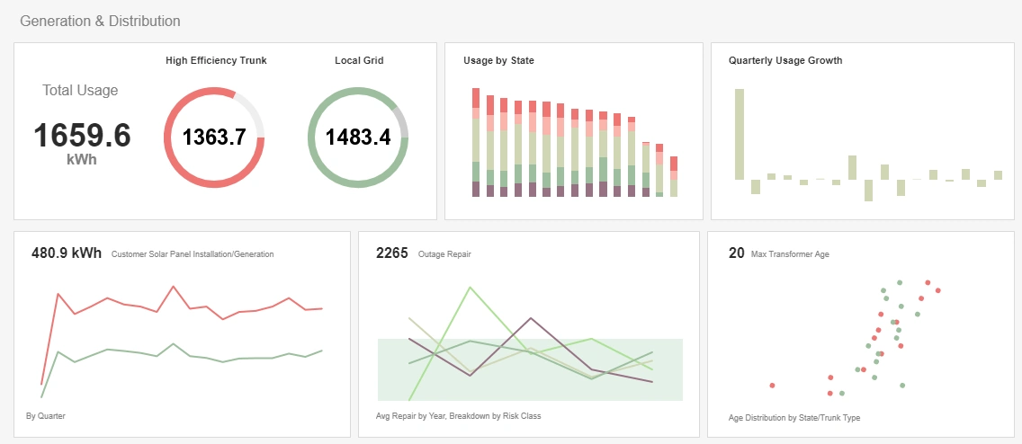
Database Dashboard Examples
Dashboards offer companies various ways of representing their data. From sales projections, to employee statistics, and even inventory stock, database dashboards are able to easily represent all of the numerical data that your company can hold, into a visually appealing dashboard.


Dashboards come in various different styles and presentations, and choosing the correct one can greatly affect your business. All dashboards will be able to present your data in some well formatted visual display, but database dashboards can integrate specific data from your company database that you need to present to employees or clients.

Database dashboards are agile enough to allow for managers to implements any data metrics they need for their company, yet robust enough to handle all of the computing needs necessary. This combination has allowed database dashboards to be found in nearly every business that uses some sort of Business Intelligence Software.
How Database Dashboards Help a Business Grow
Database dashboards combine the use of metrics and key performance indicators to produce a visually appealing chart or design. These lead to easy understanding and analysis of performance, quality assurance, and even crisis for a single department, or overall for whole companies.
Database dashboards can organize data into cubes that contain measures and dimensions, and are sometimes based on relational databases within a company. This allows access for a more in depth look into exactly which components are working and which are not.
With InetSoft's easy drag and drop dashboard design, you are able to fully customize reports geared toward your specific business. You have full control over with metrics and key performance indicators (KPI) that you wish to choose, and are able to combine and conform them to your growing business.
Near-Earth Objects (NEO) Dashboard
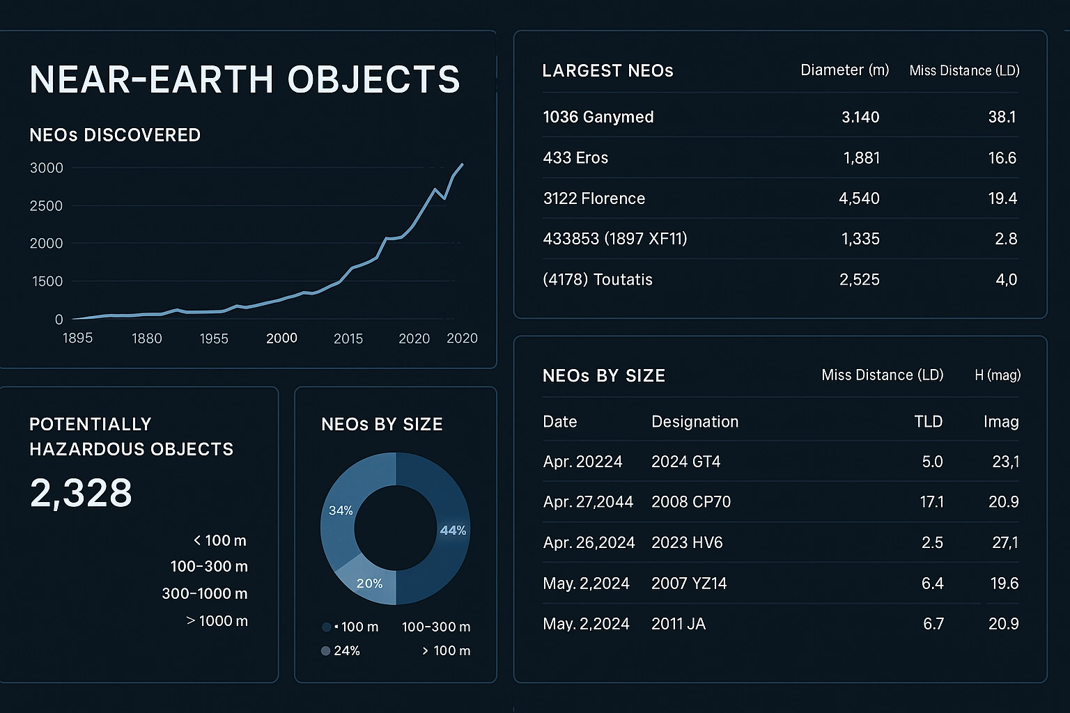
A Near-Earth Objects (NEO) dashboard is a specialized, interactive visualization platform designed to help scientists, policymakers, and the public monitor and analyze celestial bodies—primarily asteroids and comets—that orbit close to Earth.
The primary purpose of such a dashboard is to provide real-time insights into objects whose orbits may pose potential threats, as well as those that pass harmlessly within Earth’s neighborhood. An effective NEO dashboard blends astronomical data with user-friendly visualizations to support planetary defense efforts, outreach, and scientific exploration.
Orbital Visualization
At the heart of a typical NEO dashboard is a dynamic map or orbital diagram displaying the current positions and trajectories of near-Earth objects. This includes animated orbits of Earth, nearby planets, and monitored asteroids, using color-coded paths to distinguish between safe flybys and objects under watch.
Data Table and Metrics
A searchable, filterable data table includes key metrics such as object name or ID, date of closest approach, estimated size, velocity, distance from Earth, and risk category. This helps astronomers prioritize targets for observation or mission planning.
Risk Assessment and Alerts
Dashboards incorporate scoring systems like the Torino Scale or Palermo Scale to represent impact probability and potential damage. Objects with non-zero risk are highlighted with contextual warnings and evolving probabilities.
Time-Based Analytics
Graphs show trends such as the number of detected NEOs per year, discovery rates, and distribution by size or orbit type. Users can toggle between discovery telescopes to explore global collaboration in planetary defense.
Educational Tools
Many dashboards integrate videos, 3D simulations, and glossary terms to make orbit mechanics and impact prediction accessible to the public and students.
Data Sources and Infrastructure
Modern NEO dashboards are powered by APIs from space agencies and observatories. Data from the Minor Planet Center, JPL’s Horizons system, and space telescopes are continuously ingested and processed in real time or near-real time.