InetSoft Product Features & Benefits: A Flexible and Powerful Business Charting Solution
Looking for a business charting solution? InetSoft offers commercial and free Web-based charting applications for developers, enterprises and ISV's. Free eval download. View a demo. Read customer reviews.
Java Graph - LegendSpec.setBackground(value) specifies the legend background color. LegendSpec.setBorder(value) Specifies the legend border style. LegendSpec.setBorderColor(value) Specifies the legend border color...
Server-based Web Graph Generator - InetSoft offers both a free and a commmercial server-based Web graph generator. View a demo and try them out for free. The CategoricalShapeFrame object contains a shape style for visual chart objects, rendering a unique shape for each discrete value. To create a CategoricalShapeFrame object, call the CategoricalShapeFrame constructor. You can pass the name of a field (e.g., 'State') to the constructor, or specify this later using the inherited VisualFrame.setField(field) property. Bind a point-type chart to the sample 'All Sales' query, with 'Company' (top 5) on the X-axis, and Sum(Total) on the Y-axis. Add the following script in the onLoad Handler. CategoricalShapeFrame.setShape(val,shape) Assigns a shape to the specified value. Bind a point-type chart to the sample 'All Sales' query, with 'Company' (top 5) on the X-axis, and Sum(Total) on the Y-axis. Add the following script in the onLoad Handler. The StaticShapeFrame object contains a shape frame defined by explicit shape data in the VisualFrame.setField(field) column, or by the fixed shape in StaticShapeFrame.setShape(shape). To create a StaticShapeFrame object, call the StaticShapeFrame constructor...
Usage of Aggregates in a Chart - The grouping of these aggregates is dependent on its usage in the chart. So simply create this division here. It is going to group by State. So now I can put State on the ‘x’ axis. Let’s bring total and quantity back to the ‘y,’ and let’s add my average value. Here this is not exactly what you would expect, that Nevada here actually has the highest unit value. It has relatively low sales, relatively low quantity, but in relation to each other the value is higher when compared with the quantity, it is more than any of the other states. So that’s useful to see, and it wasn’t easily done before. Yes you could have modified the calculations at the worksheet level, but that’s less dynamic and less flexible. Here I can easily switch my grouping instead of by state to be by company and the aggregate updates appropriately. And let’s do something else here. Let’s ask the question which state has the highest value based on the number of customers within that state? Okay so again I can create a new aggregate expression. And let’s call this Customer Revenue. I don’t currently have an aggregate for account of my customers...
Visualization and Data Mashups - In May 2010, InetSoft's Product Manager Navish Javed participated in Information Management’s DM Radio Webcast, “The Last Mile: Data Visualization in a Mashed-Up.” The following is a transcript of that Webcast, which was hosted by Eric Kavanagh and included BI consultants William Laurent and Malcolm Chisholm. The topic for today is really interesting stuff. We’re talking about mashups. We’re going to find out what a mashup is all about. We had a little chat before the show, and there was some bantering going back and forth about a Business Week article back in 2007, perhaps, that said this is the year of the mashup, and well, it really wasn’t. But it’s not the first time the press has been a bit ahead of the game. But we’re going to find out from several experts what is going on in the field of data visualization and how mashups can really help you get a strategic view of enterprise data. So several great guests on today’s show, goodness gracious. We have several great guests. We have a couple expert guest hosts who are going to help us out today: William Laurent of William Laurent Advisors and Malcolm Chisholm of Ask Get, are in our New York studio, and then we’re going to hear from Navish Navish Javed of InetSoft. So we’re going to hear the consultant perspective and the vendor perspective, and of course, we’ll have our exciting roundtable discussion...
Visualization Graph - InetSoft makes Java-based BI software that includes an API for creating visualizations and graphs. LegendSpec.setTextSpec(spec) Specifies the legend body text attributes, such as color, font, format, etc.. LegendSpec.setTitle(value) Specifies the legend title. LegendSpec.setTitleTextSpec(spec) Specifies the legend title text attributes, such as color, font, format, etc..
Visualize Graph - LegendSpec.setPartial(boolean) specifies whether legend items can be ignored when there is insufficient space. Drag the Chart handles to a make the chart smaller. Note how the contents of the legend are abridged. LegendSpec.setPosition(value) Specifies the position of the legend's bottom-left corner (in pixels or proportion) for cases when “in place” layout is used. (Positive values specify distance from left/bottom. Negative values specify distance from right/top.) LegendSpec.setTextFrame(frame) Specifies the TextFrame containing a mapping between legend values and replacement text...
Web Based Charts and Graphs - StyleBI is a commercial business intelligence software package with dashboarding, reporting, and real-time access to almost any data source. TriangleShapeFrame The TriangleShapeFrame object contains the shape styles for isosceles trapezoid elements with varying width ratios. To create a TriangleShapeFrame object, call the TriangleShapeFrame constructor. You can pass the name of a field (e.g., 'Total') to the constructor, or specify this later using the inherited VisualFrame.setField(field) property. Bind a point-type chart to the sample 'All Sales' query, with 'Company' (top 5) on the X-axis, and Sum(Total) on the Y-axis. Add the following script in the onLoad Handler. TriangleShapeFrame.setfill(boolean) / TriangleShapeFrame.fill Specifies whether the triangular elements should be filled. Bind a point-type chart to the sample 'All Sales' query, with 'Company' (top 5) on the X-axis, and Sum(Total) on the Y-axis. Add the following script in the onLoad Handler. Bind a point-type chart to the sample 'All Sales' query, with 'Company' (top 5) on the X-axis, and Sum(Total) on the Y-axis. The CategoricalShapeFrame object contains a shape style for visual chart objects, rendering a unique shape for each discrete value. To create a CategoricalShapeFrame object, call the CategoricalShapeFrame constructor. You can pass the name of a field (e.g., 'State') to the constructor, or specify this later using the inherited VisualFrame.setField(field) property...
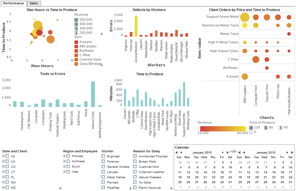
Work Order KPI Dashboard - The larger a company becomes the harder it is to manage work orders and ensure preventative maintenance is carried out. With InetSoft end users can create visualization and reporting solutions utilizing robust data mashup and unlimited data connectivity which supplements or obviates the need for IT-intensive ETL and data warehouses...


