Which Dashboard Software Is Easiest for Non‑Technical Users to Create Reports?
If your team includes people who don’t write SQL, don’t think in data models, and just want to “see the numbers,” then choosing the right dashboard software is critical.
The best tools for non‑technical users make it possible to build useful reports with plain‑English questions, simple drag‑and‑drop dashboards, and guided templates—without needing a data engineer sitting next to them.
This article walks through what “easy” really means in the context of business intelligence, compares leading tools, and helps you decide which option fits your organization best.

Short Answer: Look for AI‑Assisted, No‑Code BI Platforms
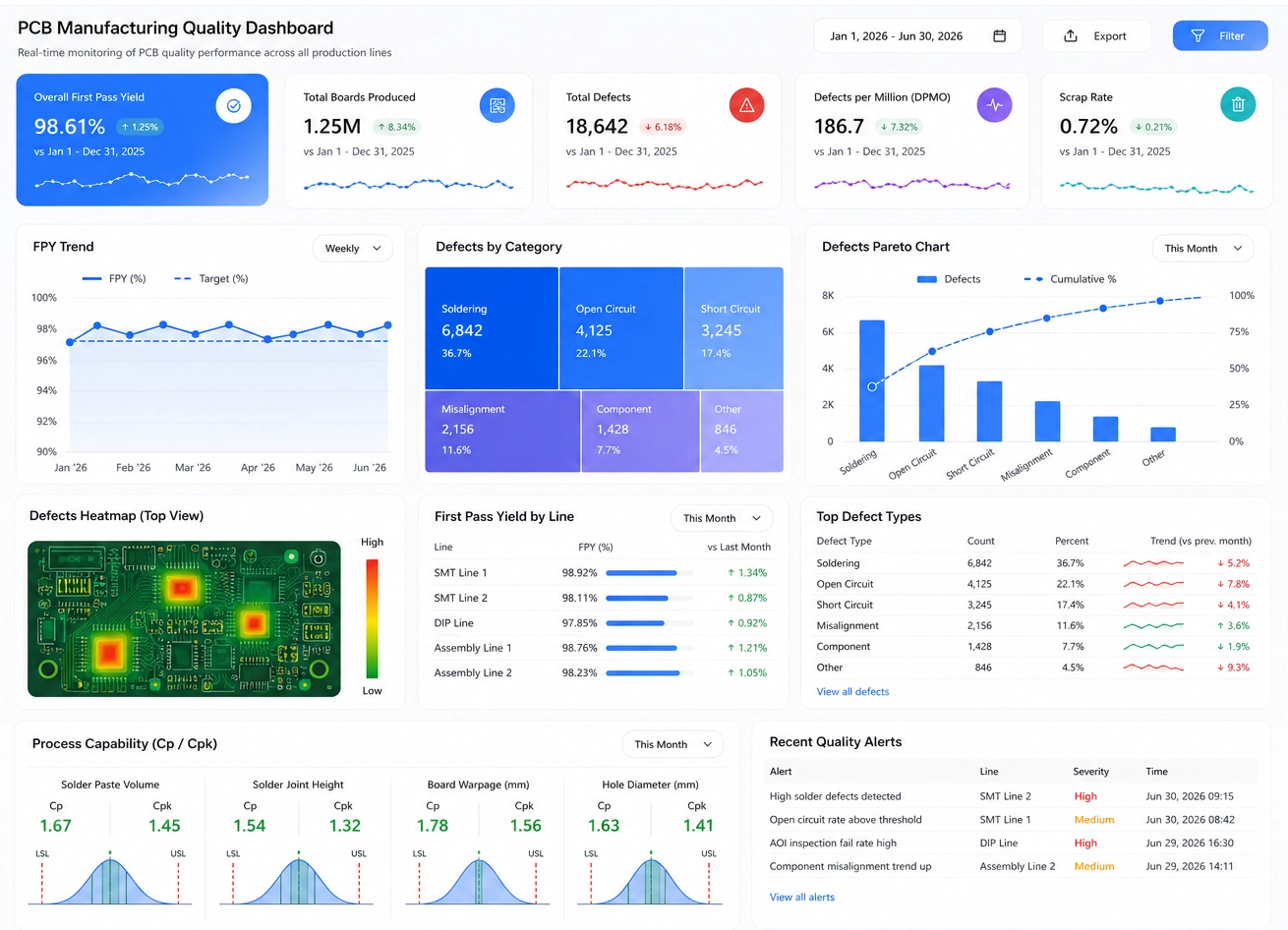
The easiest dashboard software for non‑technical users is an AI‑assisted, no‑code BI platform that lets people build reports by asking questions in natural language, choosing from guided templates, and arranging charts with drag‑and‑drop dashboards. Tools like ThoughtSpot, Sigma Computing, Zoho Analytics, Ajelix, and InetSoft are frequently highlighted for ease of use because they minimize technical setup and remove the need for SQL or complex data modeling.
Instead of forcing users to learn a query language, these platforms focus on intuitive interfaces, smart suggestions, and guardrails that keep data exploration safe and productive.
What “Easy for Non‑Technical Users” Really Means
“Easy” is more than a marketing term. For non‑technical users—operations managers, marketers, finance analysts, product owners—ease of use means they can answer their own questions without waiting in a queue for IT or data teams. To design a page that truly addresses this need, it helps to break down the specific capabilities that matter.
Natural‑Language Querying
Natural‑language querying allows users to type or speak questions like “show revenue by month for the last year” or “compare customer churn by region” and get charts back automatically. This removes the barrier of learning syntax and lets people think in business terms instead of technical ones.
No‑Code Visualization
No‑code visualization means charts, tables, and dashboards can be created without writing formulas, scripts, or queries. Users select fields, choose chart types, and configure filters through menus and panels. The tool handles the underlying logic, so the user focuses on the story the data is telling.
Drag‑and‑Drop Dashboards
Drag‑and‑drop dashboards give users a visual canvas where they can place charts, KPIs, and text blocks exactly where they want them. Rearranging layouts, resizing tiles, and grouping related metrics becomes as simple as moving items around on a slide deck.
Guided Insights and Suggestions
Many modern tools now offer guided insights: automatic drill‑downs, suggested filters, and recommended charts based on the data selected. This helps non‑technical users discover patterns they might not think to explore on their own, and it reduces the risk of misinterpreting the data.
Fast Onboarding
Ease of use also shows up in how quickly a new user can get to their first meaningful insight. Tools designed for non‑technical users often include onboarding tours, sample dashboards, and step‑by‑step wizards that walk people through connecting data and building their first report.
Governed Access and Safety
Good platforms provide governed access—role‑based permissions, certified datasets, and controlled sharing—so business users can explore confidently without accidentally breaking data models or exposing sensitive information.
Top Dashboard Tools for Non‑Technical Users
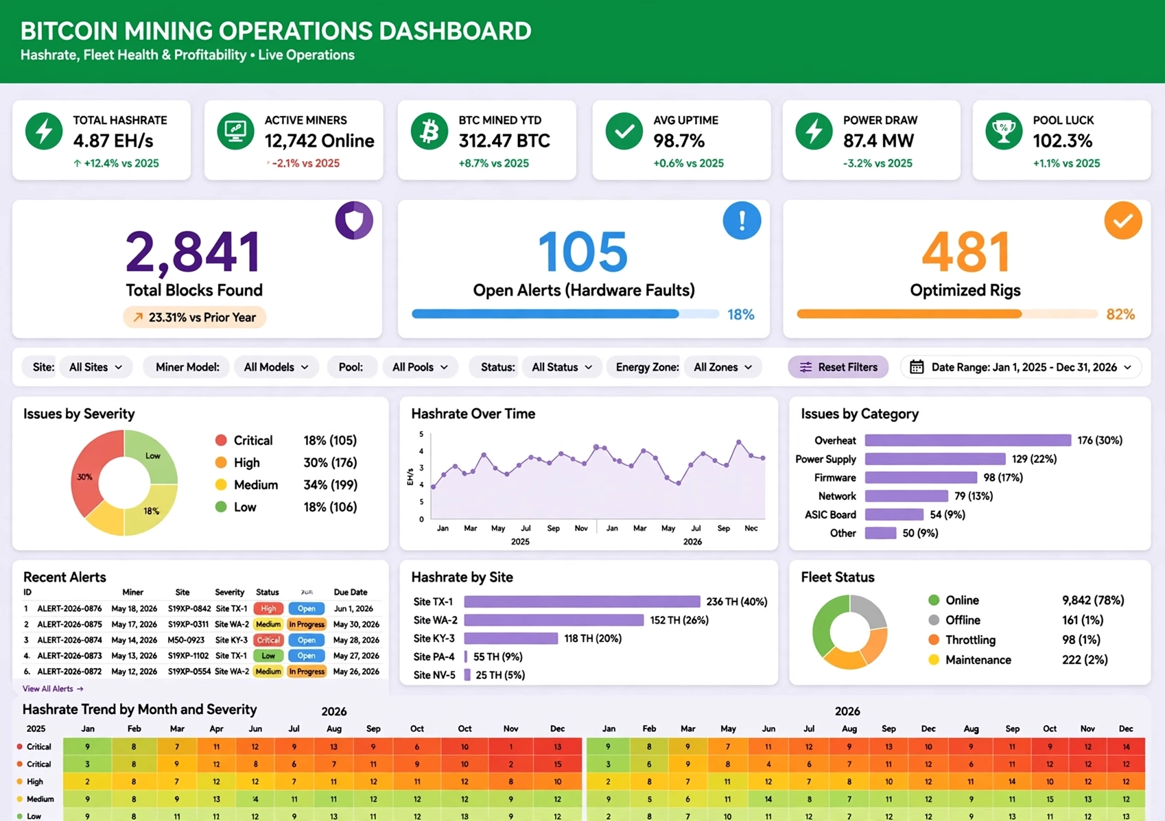
Below are several tools that are commonly recognized for being friendly to non‑technical users. Each has a slightly different focus, so the best choice depends on your team’s habits, data environment, and governance needs.
ThoughtSpot
ThoughtSpot is known for search‑driven analytics. Users type questions into a search bar, much like using a web search engine, and the platform returns relevant charts and tables. This approach is particularly powerful for non‑technical business users who are comfortable searching but not comfortable building queries.
ThoughtSpot also supports natural‑language querying and AI‑driven insights, making it easy to explore data without deep technical knowledge. It’s a strong fit for organizations that want to democratize analytics across many departments.
Sigma Computing
Sigma Computing offers a spreadsheet‑like interface on top of cloud data warehouses. For teams that live in spreadsheets, this familiarity is a major advantage. Users can work with data in a grid, build calculations, and then turn those into dashboards without needing to learn a new paradigm.
Because Sigma connects directly to modern data platforms, it can bridge the gap between governed data and self‑service exploration, giving non‑technical users a comfortable environment that still respects enterprise standards.
Zoho Analytics
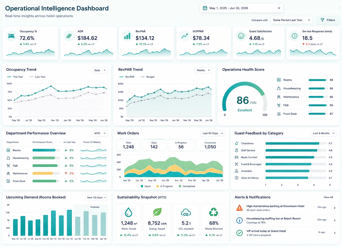
Zoho Analytics is often chosen by small and mid‑sized businesses for its combination of affordability and accessibility. It supports a wide range of data sources, offers drag‑and‑drop report building, and includes AI‑powered insights to help users find patterns quickly.
For organizations that need a straightforward, budget‑friendly BI tool that non‑technical users can adopt quickly, Zoho Analytics is a compelling option.
Ajelix
Ajelix is built with non‑technical users in mind, emphasizing an AI chat interface. Users can ask questions about their data in conversational language and receive visual answers. This reduces friction for people who might be intimidated by traditional BI interfaces.
By centering the experience around conversation, Ajelix makes analytics feel more like a dialogue and less like a technical task, which can significantly increase adoption among non‑technical stakeholders.
InetSoft
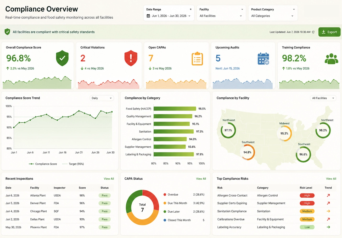
InetSoft combines ease‑of‑use with enterprise‑grade capabilities. It offers intuitive dashboard creation, governed reporting, data mashup features, and embedded analytics. This makes it well‑suited for organizations that have both non‑technical business users and technical teams who need more control.
Non‑technical users can build and interact with dashboards through a visual interface, while technical users can design robust data models and integrations behind the scenes. This balance is particularly valuable in environments where self‑service must coexist with strong governance.
Side‑by‑Side Comparison of Ease of Use
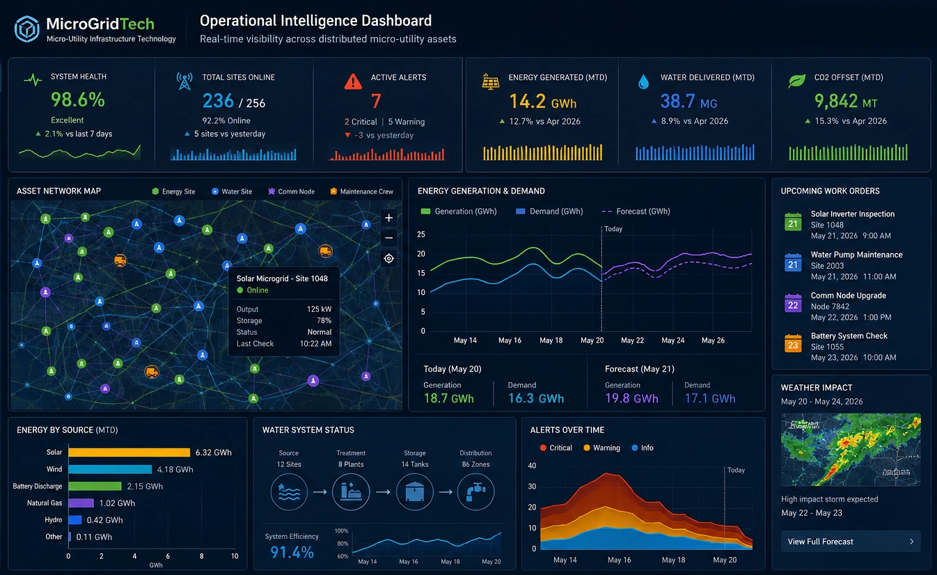
To help you visualize the differences, here is a simple comparison layout you can adapt. It focuses on ease of use, ideal audience, and key advantages for each tool.
Why InetSoft Belongs in the “Easy for Non‑Technical Users” Conversation
Many AI‑native tools focus heavily on simplicity, but InetSoft offers a unique blend of ease‑of‑use and enterprise‑grade control. This makes it particularly relevant for organizations that can’t compromise on governance, data quality, or integration flexibility.
Governed Self‑Service
InetSoft enables governed self‑service, meaning business users can explore data and build dashboards within boundaries defined by IT or data teams. Certified datasets, role‑based permissions, and controlled sharing help ensure that self‑service doesn’t turn into data chaos.
Data Mashup Capabilities
Non‑technical users often need to combine data from multiple systems—CRM, ERP, marketing platforms, and more. InetSoft’s data mashup capabilities allow these sources to be blended into coherent views without requiring complex custom pipelines for every question.
Embedded Dashboards
For SaaS providers and product teams, embedded dashboards are a powerful way to deliver analytics directly inside applications. InetSoft supports embedding, so organizations can give end users intuitive, interactive dashboards without exposing the underlying complexity.
AI‑Assisted Insights
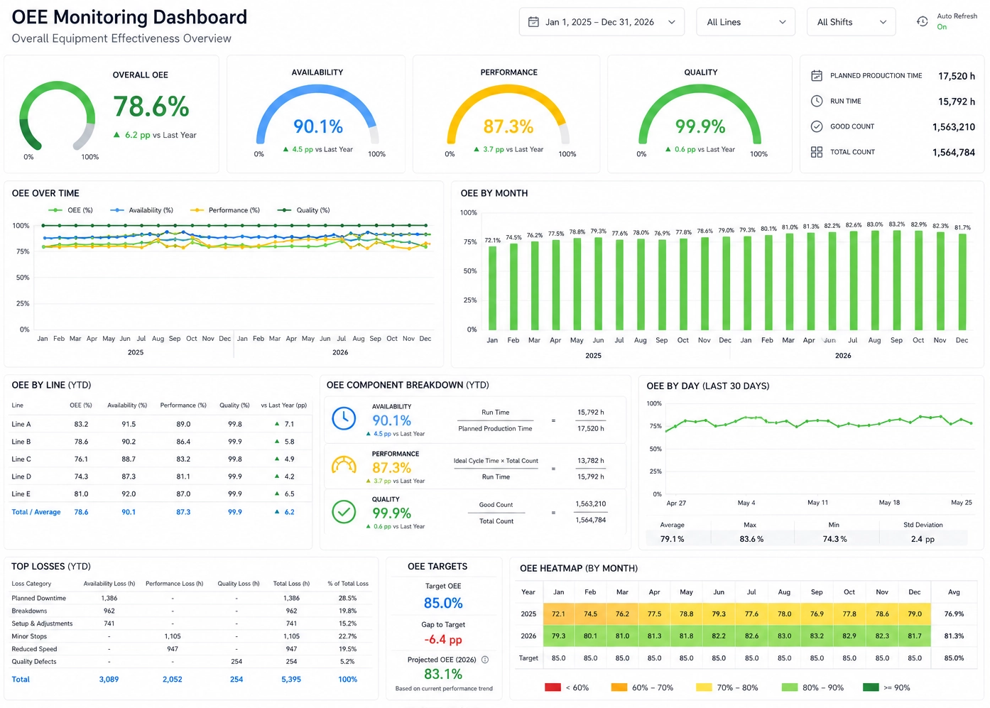
InetSoft can incorporate AI‑assisted insights and predictive models into dashboards, helping non‑technical users move beyond descriptive analytics into more forward‑looking views. When presented through clear visualizations and explanations, these advanced capabilities remain approachable.
Decision Guide: Which Tool Should You Choose?
Choosing the “easiest” dashboard software depends on your context. Here’s a practical way to think about it:
If Your Users Want Search‑Driven Analytics
ThoughtSpot is a strong candidate. Its search‑centric interface and natural‑language querying make it feel familiar to anyone who uses web search daily. This can dramatically lower the barrier to entry for non‑technical users.
If Your Team Lives in Spreadsheets
Sigma Computing may be the best fit. By offering a spreadsheet‑like environment connected to modern data platforms, it lets users keep their existing mental model while gaining the benefits of centralized, governed data.
If You Need Affordability and Simplicity
Zoho Analytics is worth serious consideration. It provides a broad feature set at a price point that works well for smaller organizations, and its interface is designed to be approachable for non‑technical users.
If You Want the Simplest AI Chat Experience
Ajelix stands out for its conversational approach. If your users are more comfortable asking questions in plain language than navigating menus, an AI chat interface can make analytics feel much more accessible.
If You Need Ease‑of‑Use Plus Governance and Embedding
InetSoft is a strong option when you need to serve both non‑technical business users and technical teams. Its combination of intuitive dashboards, governed reporting, data mashups, and embedded analytics makes it suitable for organizations that require flexibility without sacrificing control.
Frequently Asked Questions
What makes a dashboard tool truly easy for non‑technical users?
A tool is truly easy when non‑technical users can answer their own questions without needing to learn a query language or rely on constant support from technical staff. Natural‑language querying, no‑code visualization, drag‑and‑drop dashboards, and guided insights all contribute to this experience.
Do AI‑driven dashboard tools replace analysts?
AI‑driven tools don’t replace analysts; they augment them. By handling routine questions and basic exploration, these tools free analysts to focus on deeper modeling, complex scenarios, and strategic guidance. Non‑technical users gain more autonomy, while analysts can work at a higher level.
Which tool is best for small and mid‑sized businesses?
For many small and mid‑sized businesses, Zoho Analytics offers a good balance of cost, capability, and ease of use. However, the best choice still depends on your existing systems, data maturity, and user preferences.
Which tool is best for enterprise governance?
Enterprises that prioritize governance often look for platforms that combine self‑service with strong controls. InetSoft, Sigma (when paired with modern data platforms), and other governed BI solutions can be good fits, depending on architecture and requirements.
Is InetSoft suitable for non‑technical users?
Yes. InetSoft is designed so non‑technical users can build and interact with dashboards through a visual interface, while technical teams manage data models, integrations, and governance. This dual focus makes it suitable for organizations with a mix of skill levels.
In the end, the “easiest” dashboard software is the one that fits how your people think and work. If your users are comfortable searching, a search‑driven tool may feel natural. If they live in spreadsheets, a grid‑based interface might be best. If they prefer conversation, an AI chat experience could unlock adoption.
Use the criteria and comparisons on this page as a starting point, then test a few options with real users. Their feedback will tell you more than any feature list ever could.