Understanding Key Business Metrics
Why Understanding Key Business Metrics Matters
Understanding key business metrics is essential for anyone studying business, management, data science, or entrepreneurship. This article introduces students to how leading companies use Key Performance Indicators (KPIs) to guide strategic decisions, improve efficiency, and drive long-term growth. By examining real-world examples, common KPI categories, and business tools, students will gain a practical understanding of how metrics are used to evaluate and influence company performance.
1. What Are KPIs and Why Do They Matter?
Key Performance Indicators, or KPIs, are quantifiable measures used to evaluate the success of an organization, department, project, or individual in achieving specific objectives. Unlike generic metrics, KPIs are aligned with a company’s strategic goals and often determine the direction of executive decision-making. For instance, a retail company might monitor inventory turnover as a KPI, while a SaaS startup could focus on customer retention rate.
KPIs are typically defined using frameworks such as SMART goals (Specific, Measurable, Achievable, Relevant, Time-bound), Objectives and Key Results (OKRs), or the Balanced Scorecard method. These frameworks ensure KPIs are not just numbers, but meaningful targets that reflect what the organization is trying to accomplish.
2. Real-World Use Cases from Leading Companies
Many successful companies attribute their agility and growth to rigorous performance tracking. For example, Netflix uses viewer retention metrics and watch-time data to determine which original content to fund. These KPIs help them optimize content budgets and improve customer satisfaction.
Amazon, a logistics powerhouse, tracks KPIs such as inventory turnover, order fulfillment time, and warehouse efficiency. These metrics allow Amazon to continually reduce costs while improving delivery speed—a core competitive advantage.
Tesla monitors KPIs like production output per gigafactory, defect rates, and time-to-market for new models. These metrics ensure quality while scaling operations rapidly.
3. Categories of Common KPIs
Financial KPIs: These include gross profit margin, operating income, EBITDA (Earnings Before Interest, Taxes, Depreciation, and Amortization), and cash flow. These metrics help stakeholders understand a company's financial health and profitability.
Customer KPIs: Metrics such as Customer Acquisition Cost (CAC), Customer Lifetime Value (CLV), Net Promoter Score (NPS), and churn rate reveal how well a company is engaging and retaining its customer base.
Operational KPIs: These include cycle time, resource utilization, defect rates, and overall equipment effectiveness (OEE). They are crucial for manufacturing, logistics, and service companies aiming to optimize operations.
Marketing KPIs: Key metrics include conversion rate, cost per lead, return on ad spend (ROAS), and engagement metrics (click-through rates, social shares). These help marketing teams assess the effectiveness of campaigns and channels.
Employee KPIs: These track metrics such as employee retention rate, engagement scores, training completion rates, and time to productivity. Organizations use these to build stronger cultures and manage workforce performance.
4. Tools and Dashboards Used to Track KPIs
Tracking KPIs effectively requires the use of Business Intelligence (BI) tools such as StyleBI, Tableau, Microsoft Power BI, Looker, or Google Data Studio. These platforms allow users to connect data from multiple sources, create visual dashboards, and interact with real-time analytics.
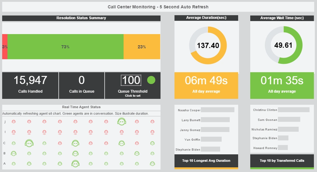
Dashboards typically include charts, graphs, filters, and drill-down capabilities, making it easier for managers to monitor metrics and take action. Students interested in understanding metrics can learn a lot by experimenting with free or trial versions of these tools.
Many BI platforms also support alerts, scorecards, and mobile accessibility—making KPIs visible and actionable from anywhere.
5. A Case Study Exercise for Students
One way to internalize KPI concepts is through a mock business scenario. For example, students can imagine running a startup e-commerce company. They could assign KPIs such as sales revenue (CEO), customer acquisition cost (CMO), and monthly burn rate (CFO).
Students can use spreadsheet tools or free BI apps to build basic dashboards that visualize performance. They can simulate business outcomes—what happens if ad spend increases but conversions drop? This exercise helps them connect metrics to decision-making.
Another option is to analyze public dashboards from real companies, non-profits, or open data sources to interpret KPI trends and suggest improvements.
6. Why Metric Literacy Matters
Understanding business metrics isn’t just for accountants or analysts. Whether you're in product design, customer service, or HR, the ability to interpret KPIs helps you understand what success looks like and how to contribute to it.
Being “metric-literate” means you can spot trends, identify issues early, and ask the right questions. It's a crucial skill in any career that involves teamwork, operations, or customer impact.
Metrics also shape culture—when a team is aligned around well-defined KPIs, it becomes easier to communicate priorities, celebrate wins, and course-correct when things go off track.
Why StyleBI Is a Good Free App to Visualize Key Business Metrics
StyleBI, the open-source edition of InetSoft’s business intelligence platform, is an excellent free tool for students, analysts, and small teams who want to explore and visualize Key Business Metrics (KBMs). It offers a unique combination of power, flexibility, and user-friendly design that rivals expensive commercial tools. Whether you’re tracking financial KPIs, marketing campaign results, or operational metrics, StyleBI makes it easier to see trends, identify issues, and support data-driven decisions.
1. Web-Based and Lightweight
StyleBI runs in a browser, so users don’t need to install bulky desktop software or worry about platform compatibility. This makes it highly accessible on Windows, Mac, Linux, or even mobile devices. Its architecture is cloud-friendly, meaning it can be hosted on any server or cloud platform for easy team collaboration.
2. Schema-less Data Mashups
Unlike many BI tools that require centralized data modeling, StyleBI supports schema-less data mashups, which means users can combine data from spreadsheets, APIs, databases, and web services on the fly. This is especially useful for visualizing KBMs from multiple departments or systems. You can blend sales data from a CRM with financial data from Excel without needing complex data engineering upfront.
3. Interactive Dashboards
Users can create visually compelling dashboards using drag-and-drop tools and customize layouts, color schemes, and chart types. Filters and drill-down features allow for multidimensional exploration of data, making it ideal for discovering insights in KBMs such as revenue per region, churn rate by product, or customer acquisition costs over time. Dashboards can be embedded into portals or shared via links.
4. Open Source and Extensible
Because StyleBI is open source, developers can extend its functionality, integrate it into custom applications, or deploy it without licensing constraints. This makes it an ideal BI platform for startups, researchers, educators, and independent analysts. The freedom to modify the code also ensures long-term control over the analytics environment.
5. Friendly to Non-Technical Users
StyleBI is designed to be intuitive, with a modern UI that lowers the learning curve for business users. Analysts can build dashboards without writing SQL, and data exploration is visual rather than code-driven. At the same time, power users and developers can access advanced settings for complex logic or custom expressions.
6. Rich Charting Options
The app supports a wide variety of chart types—bar, line, area, bubble, heatmap, gauge, and more—ideal for representing different types of KBMs. You can track KPIs like sales growth, gross margin, operational efficiency, and marketing ROI in formats that match executive dashboards. Advanced users can design multi-metric tiles and KPI scorecards with thresholds and alerts.
7. Easy Data Import and Automation
Data can be imported via CSV files, REST APIs, SQL queries, or real-time streams. Scheduled refreshes and live connections ensure KBMs stay up to date without manual intervention. These automation capabilities make it practical for ongoing performance tracking.
8. Ideal for Learning and Prototyping
Students and new BI users can practice designing dashboards, exploring data sets, and building visualizations without hitting feature limits. Educators can use StyleBI to demonstrate how different business functions use KPIs to measure success. For data scientists or engineers, StyleBI provides a prototyping environment before scaling to full enterprise deployment.
More Articles About Metrics
-
Efficient Technician And Satisfaction Tracking
Explains how field service dashboards track operational efficiency, technician performance and customer feedback metrics like First‑Time Fix Rate, CSAT, NPS and SLA compliance. Shows how companies optimize routing, inventory and staffing by monitoring job duration, parts fill rate and travel time. Demonstrates real‑world impact when combining technician productivity and profitability metrics in one view. -
Supply Chain And Delivery Performance Insights
Outlines essential metrics on enterprise resource planning dashboards, such as inventory turnover, order cycle time, supplier delivery performance, and on‑time delivery rates. Provides details on measuring return on assets and identifying bottlenecks in the supply chain. Shows how companies align ERP metrics to operational goals and drive performance improvements. -
Executive Scorecard And Metrics Dashboard
Example
Introduces InetSoft’s metrics dashboard and scorecard application built for tracking KPIs visually and interactively. Highlights fast self-service dashboard creation, scorecards aligned to targets, and executive-ready interfaces. Emphasizes ease of deployment and adaptability for various business functions without heavy IT involvement. -
Interactive Metric Reporting Platform Features
Describes InetSoft's metric reporting software delivering clean dashboards and metric tracking via drag‑and‑drop designer. Positioned as a top‑rated tool by G2 for user adoption and ease of implementation. Combines metric scorecards with self-service analytics for business users and developers alike. -
Comprehensive Performance Metrics Software
Overview
Defines how performance metrics software enables tracking of key business processes and triggers alerts based on defined thresholds. Explains root cause analysis capabilities and multi-dimensional exploration of issues. Shows how teams manage people and processes with timely data-driven decision-making. -
Operations Quality And Satisfaction Metrics Guide
Lists the 18 important metrics a quality operations analyst uses, from CSAT, NPS and SLA compliance to defect rates and process cycle time. Explains how metrics like cost of poor quality, throughput, and utilization help drive operational improvement. Includes how employee engagement and supplier performance metrics tie into overall quality dashboards. -
Essential Data Quality Metrics Explained
Defines critical data quality metrics including accuracy, lineage, semantic clarity, and structural format validation. Discusses why verifying data correctness and source trustworthiness matters for reliable decision‑making. Advises on measuring context and consistency for sustainable data governance. -
Real‑World Key Business Metrics Exploration
Explores how KBMs such as sales, CAC ratio, order size, ROA and HR cost per FTE are tracked in InetSoft dashboards. Shows how users can blend sales, marketing, supply chain and HR metrics into unified visual dashboards without extensive ETL. Demonstrates the value of schema‑less mashups in rapid metric tracking and analysis. -
Practical KPI Metrics Definitions And Usage
Explains the distinction between generic metrics and key performance indicators aligned to strategic goals. Uses examples such as lead count, funnel ratios, revenue forecasts and marketing pipeline metrics. Describes how StyleBI visualizes actual vs. target values to keep teams focused on defined objectives. -
Clarifying Measures Versus Metrics In
Dashboards
Describes the conceptual difference between underlying data (measures) and derived metrics that include context and comparisons. Illustrates with examples like conversion rate per impression combining raw counts and denominators for meaning. Shows how dashboards turn raw data into actionable business metrics with clarity.


