Visual Analysis Software That is Easy to Deploy and Easy to Use
Don't rely on static data visualization software that just sits on your desktop. InetSoft has dynamic visualization tools that will integrate with your current performance goals.
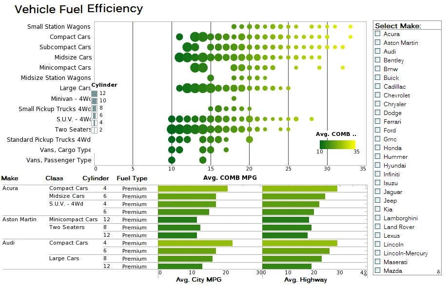
InetSoft's data visualizations are constructed in real-time by dropping data items into visual elements such as charts, metrics and selections. The resulting view reveals the intrinsic relationships among the data. And visual analyses are shareable in interactive mode with just a web browser no matter the device.
Try InetSoft for free.
Visualization and analysis features include:
- Unlimited multi-dimensional charting
- Views assembled from sub-level views
- Use gauges, thermometers, and other familiar objects
- OLAP data source mashup and visualization
- Drag and drop in a web browser, spreadsheet-like design
- Brushing for data exploration
- Monitoring and analysis oriented views
- Use charts, maps, and other advanced visual displays
- Dual purpose input/output elements
- Drag and drop in a web browser, spreadsheet-like design
- Brushing for data exploration
- Monitoring and analysis oriented views
- Use charts, maps, and other advanced visual displays
- Dual purpose input/output elements
Unusual and Fascinating Uses of Visual Analysis
-
Paleoclimatology (Studying Ancient Climates):
Scientists use visual analysis of ice cores, tree rings, and sediment layers to uncover climate patterns across millennia. These visualizations reveal shifts in CO₂, temperature, and extinction events not evident in raw data. -
Wildlife Migration and Conservation Mapping:
GPS and satellite tracking data are visualized to show how animals like elephants or seabirds adapt to threats and climate shifts. Dashboards support real-time conservation strategies. -
Archaeological Excavation and Artifact Mapping:
3D visual dashboards map artifact locations and simulate ancient structures, integrating soil layers, carbon dating, and historical texts to explore human history. -
E-Sports Performance Analytics:
Competitive gamers use heatmaps and reaction dashboards to fine-tune strategies and training. These tools rival traditional sports analytics in sophistication. -
Scent Profiling in Perfume R&D:
Perfume companies visualize scent chemistry, volatility, and mood association to guide fragrance development. Heatmaps compare ingredients based on customer emotion and longevity. -
Sound and Music Cognition Research:
Brainwave and emotional response data from music listening are visualized to study therapeutic or productivity effects. Composers use this data to craft emotion-driven music. -
Wastewater Epidemiology:
Public health officials visualize viral load in sewage to detect disease outbreaks by neighborhood. Dashboards enable early intervention for viruses like COVID-19 and polio. -
Beehive Health Monitoring:
Smart hives collect data on temperature and bee activity, visualized in dashboards that alert beekeepers to disease or queen loss, protecting critical pollination systems. -
Volcanic Tremor Prediction:
Seismic dashboards display tremor patterns and gas emissions to help predict volcanic eruptions. These tools assist geophysicists in making timely alerts for local populations. -
Antique and Art Fraud Detection:
Museums use visual tools that layer infrared scans, chemical data, and provenance to detect forged artwork. Dashboards present forensic evidence of authenticity with clarity.
Read how InetSoft was rated as a top BI vendor in G2 Crowd's user survey-based index.
InetSoft Articles on Visual Analysis
-
Evaluating Multi‑Dimensional Analytics
This piece introduces visual analysis capabilities that let users explore data interactively, using color, size, and position in multi‑dimensional charts. It explains how these dashboards support rapid decision making and self‑service analytics. Great for evaluating the power of InetSoft’s visual analysis engine. -
Exploring Dashboard‑Driven Data Discovery
Discusses visual exploration via dashboards where business users can filter, drill‑down, and explore KPIs without IT support. Shows how geographic mapping and data mashups enrich visual stories for operational insight. Ideal for illustrating real‑world interactive dashboard use. -
Benefits Of Interactive Analysis Tools
Describes how non‑technical users gain speed and autonomy through visual analysis, eliminating delays from static reporting workflows. Covers how visual tools reduce overhead, enable insight discovery, and support bookmarkable exploration. Emphasizes business and IT benefits in a single platform. -
Toolset For Rich Visual Analytics
Outlines the advanced charting, brushing, filtering, and mashup tools that power visualization experiences. Includes insurance claim dashboards and interactive sliders for data exploration in context. Demonstrates how visual analysis tools support intuitive business use cases. -
Defining Visual Data Investigation
Explains visual data analysis as a method of revealing hidden trends and relationships more effectively than raw reports. Shows how users can interact via charts, gauges, and cross‑tabs for immediate exploration. Focuses on increasing understanding and reducing dependency on IT. -
Deploying Interactive Visualization Quickly
Highlights visual analysis software that combines drag‑and‑drop dashboard creation with real‑time data relationship visualization. Covers features like brushing, multi‑dimensional visual objects, and browser‑based delivery. Suitable for rapid deployment with minimal technical setup. -
Building Visual Analytics Dashboards Easily
Showcases a dashboard platform that supports multidimensional charting with geographic and map overlays for visual analysis. Includes brushing that lets users highlight points in one visual to filter others instantly. Emphasizes intuitive design and minimal technical dependencies. -
Understanding Visual Analytics Software
Covers how interactive graphics and drill‑down reports enable problem solving and data-driven insights. Explains how non-technical users can perform sophisticated visual analysis without coding. Highlights benefits such as greater exploration and reduced overhead. -
Comparing Visual Analysis Platforms
Reviews visual analytics evaluation criteria like chart richness, interactivity, mashup capability, and self‑service discipline. Explores how StyleBI dashboards support multi‑chart layouts and dynamic filtering. Good for assessing vendor capabilities in visual analysis. -
Accelerating Insight with Data Visualization
Highlights how compressing multiple static reports into a single interactive dashboard speeds up analytical workflows. Describes how brushing and dynamic parameter changes accelerate data discovery. Designed to show how visual analysis leads to faster decision cycles.

