StyleBI for Salesforce - SaaS BI
Would you like to improve your visual analysis and interactive dashboard capabilities for your salesforce.com deployment? InetSoft's BI application will take your analysis and dashboarding to the next level. In addition to giving you flashier, more interactive and easier-to-use views of your data, you can mashup your salesforce.com data with other enterprise data sources, web services, and even spreadsheets.

Optimize Current Performance
Because all of your salesforce.com history is now analyzable, you can spot trends or problems more quickly and take action. Now you can:
- identify outliers in your sales funnel
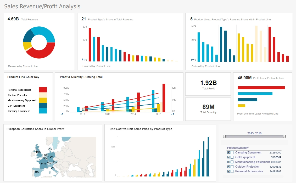
- track if year-to-date sales are on track to hit plan using historical patterns
- determine what stages of the sale cycle are lengthening by sales rep
Upgrade Your Reporting Capabilities
The reports that come with Salesforce are great, but there are plenty of things you wish you could do with them that now you can with StyleBI for Salesforce:
- schedule reports for email distribution
- combine multiple views in a single report
- give more options for printing and exporting reports, including Excel, PDF, PowerPoint, and more
- build parameterized reports which allow you to select the data you want to view, or automatically see the appropriate data based on security and sharing
- organize your reports with sub-folders

Expand Your Dashboarding Power
The dashboard is the hub of your salesforce.com application, but the one that comes standard out of the box isn't the best for everybody, and allows limited interactivity. Let everybody on your team customize their own so that they get the most value out of your investment.
With a HTML5-based interface, StyleBI for Salesforce lets anybody create their own dashboard in minutes by simply dragging your fields into charts, gauges, and other objects. Even not-so-technical people will be able to serve themselves by analyzing data within a completed dashboard, minimizing the support overhead for your dashboard and reporting solution.
Limitations of Salesforce Dashboards and Reports
Salesforce is a powerful CRM platform that offers a suite of tools for managing customer relationships, sales pipelines, and marketing efforts. Among its many features, the platform provides dashboards and reports to help users visualize and analyze their data. However, despite its strengths, Salesforce dashboards and reports come with several limitations that can impact their effectiveness in certain scenarios.
1. Dashboard Component Limits
Salesforce imposes strict limits on the number of components that can be included in a dashboard. Specifically, a dashboard can have up to 25 components, including a maximum of 20 charts and tables, 3 images, and 25 rich text widgets. This limitation can be restrictive for users who require more comprehensive dashboards with a greater number of visual elements to represent complex data sets effectively. Additionally, each dashboard filter can have up to 50 values, which may not suffice for organizations with extensive data filtering needs.
2. Data Row Limits in Reports
Salesforce reports are subject to data row limits, which can hinder users from accessing and analyzing large datasets. In the Lightning Experience, reports display a maximum of 2,000 rows in run mode. While users can export up to 100,000 rows, this limitation can be problematic for organizations that need to analyze extensive data sets directly within the platform. The inability to view and manipulate large volumes of data within Salesforce can lead to inefficiencies and the need for external tools to perform comprehensive analyses.
3. Limited Customization in Standard Reports
Standard Salesforce reports offer basic customization options but lack the flexibility required for advanced data analysis. Users may find it challenging to create highly customized reports that meet their specific business needs without resorting to complex formula fields or custom report types. This limitation can result in increased time and effort spent on report creation and maintenance, potentially leading to user frustration and decreased adoption of the reporting tools.

4. Performance Issues with Large Dashboards
As dashboards become more complex and include numerous components, performance can degrade. Salesforce recommends allowing at least one minute between dashboard refreshes to avoid performance issues. However, even with this precaution, users may experience slow load times, especially when dashboards contain multiple filters or are pulling data from various sources. This performance lag can hinder timely decision-making and reduce the overall user experience.
5. Limited Support for Historical Data Analysis
Salesforce dashboards and reports primarily focus on current data, offering limited capabilities for historical data analysis. While users can create custom reports to analyze past performance, the platform lacks robust tools for trend analysis over extended periods. This limitation can be a significant drawback for organizations that rely on historical data to forecast future trends, set benchmarks, and make strategic decisions.
6. Restrictions in Dynamic Dashboards
Dynamic dashboards in Salesforce allow users to view data tailored to their specific access rights. However, there are restrictions on the number of dynamic dashboards an organization can have. For instance, Enterprise Edition allows up to 5 dynamic dashboards per organization, while Performance and Unlimited Editions permit up to 10. Developer Edition is limited to 3 dynamic dashboards. These constraints can limit the flexibility and scalability of dashboard solutions in larger organizations with diverse user roles and data access requirements.

7. Limited Integration with External Data Sources
While Salesforce integrates with various external data sources, the process can be complex and may require additional tools or middleware. The native integration capabilities may not suffice for organizations that need to pull in data from a wide array of external systems for comprehensive analysis. This limitation can lead to fragmented data views and the need for manual data consolidation, increasing the risk of errors and inconsistencies.
8. Lack of Advanced Analytical Features
Salesforce dashboards and reports provide basic analytical capabilities but lack advanced features such as predictive analytics, machine learning integration, and sophisticated statistical modeling. Organizations seeking to leverage these advanced analytics tools may find Salesforce's native offerings insufficient, necessitating the use of third-party applications or external analytics platforms to meet their needs.
9. User Interface Complexity
The user interface for creating and managing dashboards and reports in Salesforce can be complex, especially for new users or those without a technical background. The learning curve associated with mastering the platform's reporting tools can be steep, potentially leading to underutilization of these features and a reliance on external tools that users find more intuitive.
10. Limited Mobile Reporting Capabilities
While Salesforce offers mobile applications, the reporting and dashboard functionalities on mobile devices are limited compared to the desktop experience. Users may encounter difficulties in viewing complex dashboards or interacting with detailed reports on smaller screens, which can hinder the accessibility and usability of critical business data when on the go.

Most Requested Dashboard and Report Features and Capabilities
Given the limitations outlined above, users have expressed a strong demand for enhanced features and capabilities in Salesforce dashboards and reports. Some of the most requested features include:
1. Enhanced Customization Options
Users seek greater flexibility in customizing dashboards and reports to better align with their specific business needs. This includes the ability to add more components, customize layouts, and create more dynamic and interactive visualizations without the need for complex configurations or third-party tools.
2. Improved Performance and Scalability
There is a significant demand for improved performance, especially as dashboards become more complex. Users request faster load times, the ability to handle larger datasets without degradation in performance, and more efficient data processing capabilities to support real-time decision-making.
3. Advanced Data Analysis Tools
Organizations are increasingly looking for advanced analytical tools within Salesforce, such as predictive analytics, machine learning integration, and sophisticated statistical modeling capabilities. These tools would enable users to gain deeper insights from their data and make more informed strategic decisions.

4. Enhanced Mobile Reporting Capabilities
Given the growing reliance on mobile devices, users request enhanced reporting and dashboard functionalities on mobile platforms. This includes optimized views for smaller screens, improved interactivity, and the ability to access and analyze data seamlessly while on the go.
5. Streamlined Integration with External Data Sources
Users desire more straightforward and robust integration capabilities with external data sources. This would facilitate the consolidation of data from various systems, providing a more comprehensive view and reducing the need for manual data entry and reconciliation.
6. Improved Historical Data Analysis Tools
There is a call for more robust tools to analyze historical data, including features that support trend analysis over extended periods, benchmarking, and forecasting. These capabilities would enable organizations to make more informed decisions based on past performance and future projections.
7. Simplified User Interface
To enhance user adoption and efficiency, users request a more intuitive and user-friendly interface for creating and managing dashboards and reports. Simplifying the process would reduce the learning curve and encourage more widespread use of these features across the organization.
8. Greater Flexibility in Dynamic Dashboards
Organizations seek increased flexibility in dynamic dashboards, including the ability to create more than the current limit of dashboards per organization. This would allow for more tailored and role-specific data views, enhancing the relevance and utility of the dashboards for different user groups.
9. Enhanced Security and Data Privacy Controls
With the increasing importance of data security, users request more granular security and data privacy controls within dashboards and reports. This includes the ability to set more detailed permissions and access levels to ensure that sensitive information is adequately protected.
10. Improved Collaboration Features
Users desire enhanced collaboration features within dashboards and reports, such as the ability to share insights, annotate visualizations, and collaborate in real-time. These features would facilitate better communication and decision-making across teams and departments.