Looking For a Good Set of Reporting Tools?
InetSoft’s StyleBI features a state-of-the-art reporting engine that allows for the easy creation of pixel-perfect paginated reports that can draw on data from virtually any desired source.
Additionally web-based dashboards can be designed with the same drag-and-drop designer that enable data exploration to satisfy all your ad hoc reporting needs.


Options For Perfect Formatting
The flexibility offered by StyleBI is perfect for producing both regular and ad-hoc reports; for internal and external use. The report designer comes complete with over 30 chart styles, for ultimate flexibility. Add elements such as icons, images, donut gauges, large formatted KPIs, and selection lists.
Reports can be exported via Excel, Powerpoint, or PDF and can also be embedded into web pages and accessed via mobile devices. InetSoft’s web-based platform enables reports to be easily and securely accessed from any location, via a standard web-browser.
Unlimited Data Mashup
StyleBI also gives your users almost unlimited flexibility in the selection of data for their reports. Style’s robust data mashup engine enables data to be extracted from almost any source, and combined with other sources to produce a report that conveys the full scope of what viewers are looking to learn.
With InetSoft’s Data Block, user’s can assemble their own data mashups with a simple drag-and-drop tool, without needing a predefined data model. This kind of flexibility enables new datasources to be integrated easily without help from IT; a capability unheard of with traditional BI tools.
Automated Reporting with InetSoft's Report Scheduler
With InetSoft’s report scheduler, users can set reports to automatically run at regular intervals, or be triggered by business conditions.
When a weekly, monthly, or annual report is created, it can be set not only to run at whatever desired interval, but also can be automatically exported to it’s recipients.
What about when certain conditions arise that require immediate attention? The report scheduler can be programmed to automatically produce and export an ad-hoc report whenever a certain business-rule is triggered. With these protections in place, you can be sure that no early warnings or early opportunities slip by management’s attention.
How Do EHS Managers Use Reporting Tools?
EHS (Environmental, Health, and Safety) managers rely on reporting tools to effectively manage their organization's safety, environmental, and regulatory compliance programs. The functions they do are:
- Communicating Safety and EHS Performance: Effectively communicating EHS performance to management, employees, and external stakeholders.
- Compliance Management: Tracking regulatory requirements, monitoring compliance status, and generating compliance reports.
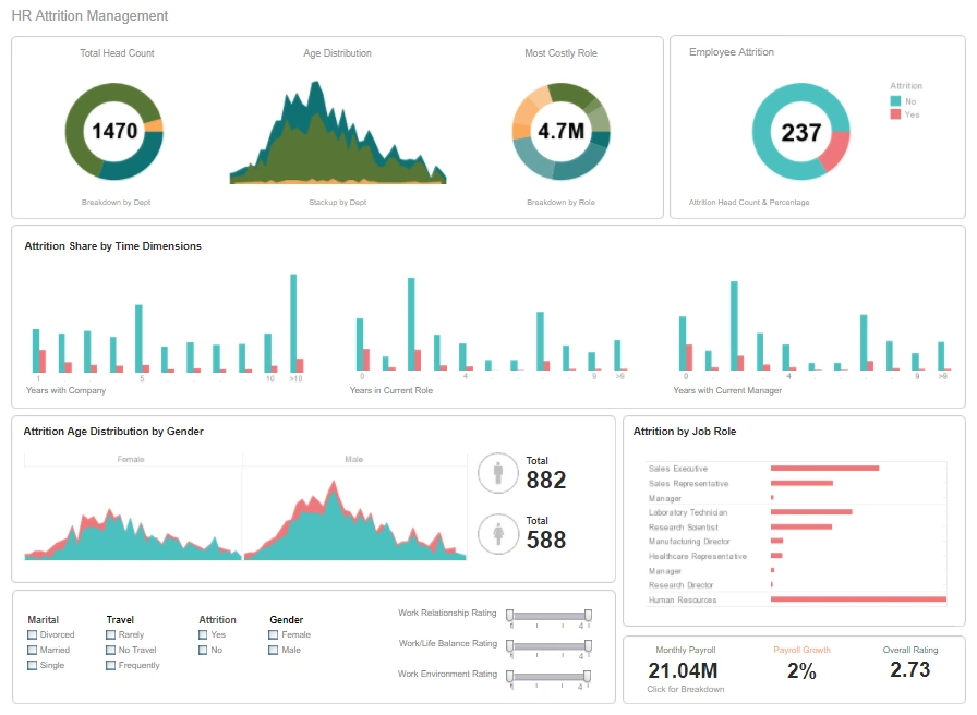
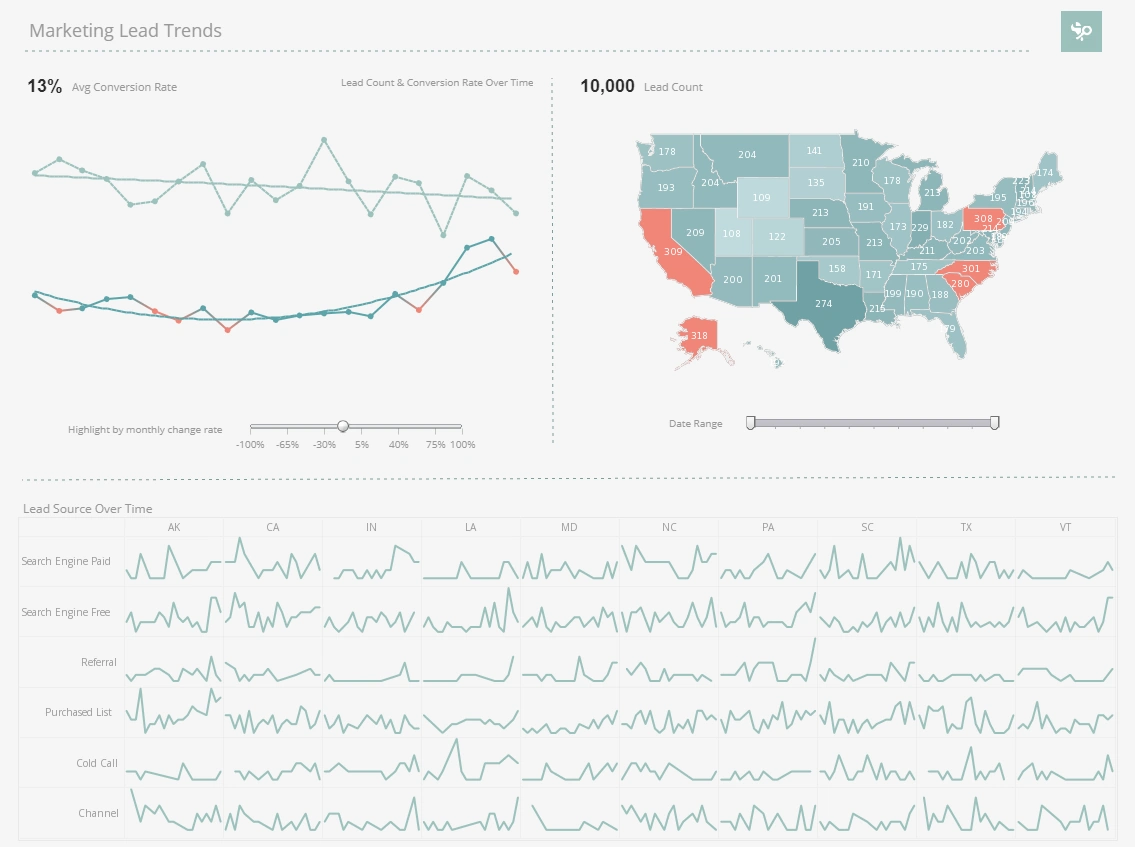
- Data Visualization: Creating charts, graphs, and dashboards to visualize EHS trends and identify areas of concern.
- Enhancing Regulatory Compliance: Demonstrating compliance with environmental and safety regulations to stakeholders.
- Hazard Identification and Assessment: Logging and documenting hazard identification findings, risk assessments, and corrective actions.
- Identifying Safety Trends: Recognizing patterns in EHS data to identify potential hazards or risk factors.
- Incident Investigation and Root Cause Analysis: Utilizing incident data to investigate root causes and develop preventive measures.
- Incident Management: Capturing and tracking incident reports, including injuries, near misses, and environmental releases.
- Performance Measurement: Collecting and analyzing data on EHS metrics, such as safety metrics, environmental performance indicators, and regulatory compliance rates.
- Proactive Safety Planning: Utilizing data insights to develop proactive safety plans and initiatives.
- Reporting and Analytics: Generating reports for internal stakeholders, external regulators, and insurance providers.
- Tracking Safety Performance: Measuring and monitoring safety performance against established goals and objectives.

Key EHS Metrics
- Total recordable incident rate (TRIR): The number of recordable incidents per 100,000 worker-hours. A lower TRIR indicates a safer workplace.
- Lost workday case rate (LWCR): The number of lost workdays per 100,000 worker-hours. A lower LWCR indicates that workers are spending less time away from work due to injuries or illnesses.
- Days away, restricted, or transferred (DART) rate: The number of days away from work, restricted work activity, or transferred light duty work per 100,000 worker-hours. A lower DART rate indicates that workers are experiencing fewer work-related injuries and illnesses.
- Fatality rate: The number of fatalities per 100,000 worker-hours. A fatality rate of zero is the safest outcome.
- Air emissions: The amount of pollutants released into the air, such as greenhouse gases, particulate matter, and nitrogen oxides.
- Water discharges: The amount of pollutants discharged into water, such as chemicals, metals, and sediments.
- Waste generation: The amount of waste generated, such as hazardous waste, municipal solid waste, and industrial waste.
- Energy consumption: The amount of energy consumed, such as electricity, natural gas, and propane.
- Employee participation in health and wellness programs: The percentage of employees who participate in health and wellness programs, such as health screenings, flu vaccinations, and ergonomic training.
- Employee absenteeism rate: The percentage of employees who are absent from work due to illness or injury. A lower absenteeism rate indicates a healthier workforce.
- Employee turnover rate: The percentage of employees who leave the organization each year. A lower turnover rate indicates that employees are more satisfied with their jobs and the work environment.
- Employee engagement rate: The percentage of employees who are engaged in their work and feel connected to the organization. A higher engagement rate indicates a more productive and motivated workforce.
About InetSoft
InetSoft is a pioneer in delivering easy, agile, and robust business intelligence software that makes it possible for organizations and solution providers of all sizes to deploy or embed full-featured business intelligence solutions. Application highlights include visually-compelling and interactive dashboards that ensure greater end-user adoption plus pixel-perfect report generation, scheduling, and bursting.
InetSoft's patent pending Data Block™ technology enables productive reuse of queries and a unique capability for end-user defined data mashup. This capability combined with efficient information access enabled by InetSoft's visual analysis technologies allows maximum self-service that benefits the average business user, the IT administrator, and the developer.InetSoft solutions have been deployed at over 5,000 organizations worldwide, including 25% of Fortune 500 companies, spanning all types of industries.

More Articles for Searchers of Good Reporting Tools
Add a Ranked Chart to a Churn Dashboard - Finally, add a Bar Chart that displays "importances" determined by machine learning. Drag a new Chart component above the Pie and Scatter Charts, and open the Chart Editor. For this Chart, use the 'importances' data block as the data source. Right-click on the 'importance' field and select Convert To Measure. Then drag it from the Measures folder to the X region. Press the Edit Measure button and set...
Collection of Data Analytics Software Samples - This revenue analytics sample breaks down revenue by plan type, state, and date. A dropdown selector changes fields displayed in the bar chart, helping to cut down on the overall number of elements in the dashboard...
Define Grouping And Data Aggregation Columns - To define grouping and data aggregation columns (summary columns) for a Data table, follow these steps: Right-click the table's title row and select 'Group and Aggregate'. This opens the 'Aggregate' dialog box. Select the grouping columns by clicking the 'Group' check box next to one or more column names...

Example of a Circle Packing Chart - This chart, which will be featured in the how to instructions below, is an example of how how Circle Packing charts use series of circles within circles to represent dimension hierarchies, with size used to represent a measure. In this example, sales are divided by state, city, and company name. Circles representing individual cities are nested within larger circles representing the states that those cities are in...
Examples of Departmental KPI's - The Marketing Department of any products or services company needs to track leads as one of its KPIs. This screenshot shows the weekly count of the number of new leads generated. In addition, thanks to mutli-dimensional charting of the source of leads by colors in the vertical bars, the reasons for a KPI's increase or decrease can be seen. The checkboxes to the right...
How to Make a Pareto Chart in InetSoft - To create a Pareto chart, follow the basic steps below. Configure your data, and open a chart for editing. Press the 'Select Chart Style' button. Choose the Pareto style. Press the 'Apply' button. From the 'Dimensions' folder of the Data Source panel, drag a desired dimension to the 'X' or 'Y' region...
Looking To Evaluate A Dashboard Solution? - InetSoft offers Web-based dashboard reporting software that enterprises can deploy quickly, and ISV's can embed easily into their own applications. Free eval download. View a demo. Read additional resources below. Integrated into the application is a pre-built KPI dashboard that monitors eleven key metrics...