KPI Reporting Tools
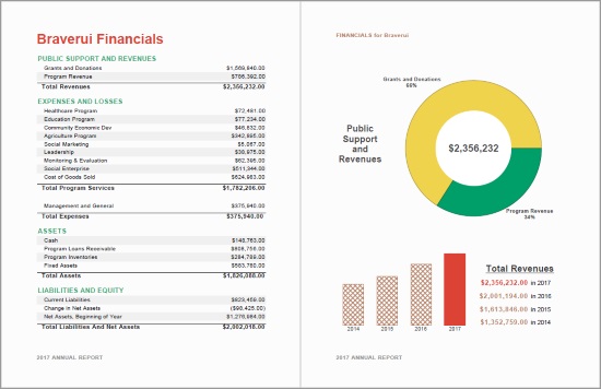
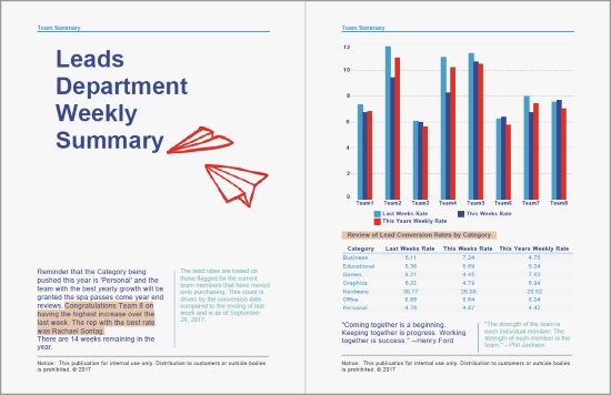
Looking for an intuitive flexible reporting tool for tracking your KPI's? InetSoft offers both free and enterprise versions of its award winning KPI reporting tool, Style Report.
See what's going on in your organization - with live connections to whatever your sources are. Modify KPI reports yourself for your own tailored view, or even build new ones yourself - no technical training is necessary. Since informational needs are always changing, Style Report allows the easy integration of both new data sources and new metrics to track, allowing you to keep ahead of the curve.
Interactive KPI Reporting Tools
Once a business has selected their most critical KPI's to track, InetSoft's reporting software allows users to display this information in multiple visualizations such as charts, tables, and crosstabs which are fully customizable and easy to manipulate, even for non-technical users.
With InetSoft's KPI reports, bare data turns into actionable information that provides insight as to where the business stands and where improvement is needed. For example, if it seems that there is a disparity from where the company should be in an area, InetSoft's reporting software allows for interactive drill-down on data so that users can pinpoint exactly where the issues are coming from so that they can be fixed.
A good KPI reporting tool could be the difference between success and failure in business as these reports allow users to spot patterns, trends, and potential problems that a spreadsheet simply could not capture.
When selecting a tool to create KPI dreports, consider InetSoft's award-winning technology to meet all of your company needs. Interested in finding out more? Request a personalized demo today!
How Are KPI Reporting Tools Used in Professional Sports
Key Performance Indicator (KPI) reporting tools play a crucial role in professional sports organizations by helping them track and analyze various performance metrics to improve team performance, player development, and fan engagement. Here are some KPI reporting tools commonly used in professional sports:
-
Sports Analytics Software: There are various sports analytics software platforms that cater to different needs, such as Catapult Sports and Sportscode. These tools allow teams to collect and analyze data on player performance, game strategy, and injury prevention.
-
Player Tracking Systems: Tools like Zebra Sports Solutions and Second Spectrum provide real-time tracking of players' movements during games. This data is used to analyze player positioning, speed, and distance covered, helping teams make data-driven decisions.
-
Performance Analysis Software: Companies like Sports Insights and Instat provide software that helps teams break down game footage to analyze player and team performance. Coaches can use these tools to review specific plays and make tactical adjustments.
-
Injury Monitoring Systems: Systems like Catapult's PlayerTek monitor player workload and movement to help prevent injuries. They track metrics like acceleration, deceleration, and changes in direction to assess the risk of injury.
-
Fan Engagement Platforms: In addition to on-field performance, professional sports teams use KPIs to gauge fan engagement. Tools like Nielsen Sports, KORE Software, and Salesforce provide insights into ticket sales, merchandise sales, social media engagement, and other fan-related metrics.
-
Data Visualization Tools: Tools like InetSoft, Tableau, and Power BI are used to create visually appealing dashboards and reports that summarize key performance metrics. These tools make it easier for coaches, analysts, and executives to understand complex data.
-
Wearable Technology: Wearable devices like WHOOP and PlayerTek are used by athletes to track their own performance metrics, such as heart rate, sleep quality, and recovery. Teams can use this data to monitor player health and optimize training regimens.
-
Statistical Analysis Systems: Tools like R and Python with libraries like pandas and scikit-learn are used by data analysts and scientists to perform advanced statistical analysis on player and team performance data. These tools can uncover insights that inform coaching decisions.
-
Video Analysis Software: Programs like Sportscode and Dartfish help teams break down game footage frame by frame, allowing for detailed analysis of player movements, ball trajectories, and game strategies.
-
Financial and Business Analytics Tools: To assess the financial health and business performance of sports organizations, tools like SAP BusinessObjects and IBM Cognos provide KPIs related to revenue, expenses, and profitability.
-
Scouting and Recruitment Software: Tools like Scout7 and Wyscout are used by scouts and recruiters to evaluate potential talent by tracking player statistics and performance across different leagues and competitions.
-
Social Media Analytics: Tools like Hootsuite and Sprout Social are used to monitor and analyze social media engagement, sentiment, and follower growth, helping teams understand their online fan base better.
Why Is a KPI Report Superior to a Spreadsheet?
Key Performance Indicator (KPI) reports offer several advantages over using spreadsheets for tracking and analyzing data, particularly when dealing with complex or dynamic data sets in professional sports or other fields. Here are some reasons why KPI reports can be superior to spreadsheets:
-
Real-Time Data Integration: KPI reporting tools often have the capability to integrate with various data sources and APIs, allowing for the automatic and real-time updating of KPIs. In contrast, spreadsheets typically require manual data entry and updates, which can lead to errors and delays in analysis.
-
Automated Calculations: KPI reporting tools can perform complex calculations automatically. They can aggregate, summarize, and visualize data in real-time, eliminating the need for users to create and maintain complex formulas in spreadsheets.
-
Data Visualization: KPI reports are designed for data visualization, making it easier to understand and interpret data trends and patterns through charts, graphs, and dashboards. In contrast, spreadsheets may require users to create and format charts manually.
-
User-Friendly Interface: KPI reporting tools often have user-friendly interfaces that are specifically designed for data analysis. This can make it easier for non-technical users to access and understand data compared to navigating a spreadsheet.
-
Accessibility: KPI reports can often be accessed and viewed remotely through web-based interfaces, making it easier for team members to collaborate and access the data they need from anywhere, whereas spreadsheets may require file sharing and manual updates.
-
Security and Version Control: KPI reporting tools often offer robust security features and version control, ensuring that sensitive data is protected, and changes are tracked. Spreadsheets may have limitations in this regard and can be prone to versioning issues.
-
Scalability: KPI reporting tools are designed to handle large and complex datasets efficiently. Spreadsheets may become slow and unwieldy as data volumes increase.
-
Automated Alerts: Many KPI reporting tools offer automated alerting systems that can notify users when specific thresholds or conditions are met. This is helpful for proactive decision-making, whereas in spreadsheets, users often need to monitor data manually.
-
Data Integration: KPI reporting tools can integrate data from various sources seamlessly, providing a holistic view of performance. Spreadsheets may require manual data consolidation, which can be time-consuming and error-prone.
-
Customization and Templates: KPI reporting tools often come with pre-designed templates and the ability to customize reports to specific needs. Spreadsheets may require users to build templates from scratch.
-
Collaboration Features: KPI reporting tools often offer collaboration features that allow multiple users to work on and interact with data simultaneously, facilitating teamwork and decision-making.
-
Data Governance: KPI reporting tools often include features for data governance, ensuring data quality, consistency, and compliance with industry standards and regulations.
Recommended Reading about KPI Reporting Tools
What KPIs Should a Report Development Team Use? - Do you want to make KPI reports that compare current performance data against goals, quotas, and target trends? Looking for a simple way to report KPIs that isn't time consuming? InetSoft's award-winning reporting software allows users to track multiple KPIs in a single report. As an innovator in BI products since 1996, InetSoft's award-winning software has been deployed at thousands of organizations worldwide and integrated into dozens of other application providers' solutions serving vertical and horizontal markets of their own...
More Departmental KPI's - Key Performance Indicators, or KPIs, are business metrics that are used to track an organization's performance. Any industry, government agency, or non-profit organization needs to measure its performance on a daily, monthly or quarterly basis, and key performance indicators are those statistics that are deemed important to track in order to meet business goals or organizational objectives...
Commonly Reported KPIs - This dashboard is the prototypical executive sales dashboard designed for both the executive who is managing multiple sales teams as well as the sales team manager keeping track of just his own sales team pipeline. In one screen you have an individual view of the performance of all of your sales teams, broken down by team as well as individual salesperson, and their performance compared to their quotas. Checking off one or more of those sales teams refreshes all of the other charts to show information associated with their sales or lack thereof. For organizations with dozens or hundreds of sales representatives, the heirarchies of selection trees give a dashboard user the power to analyze performance without being overwhelmed with information...
Selecting the Right KPIs - The key to creating an effective KPI dashboard is selecting the right tool, and InetSoft offers a simple and powerful way for users to create a KPI dashboard in order to meet the needs of any business. Key Performance Indicators, or KPI's, are measurable values that indicate how effectively business goals are being met. It is crucial for businesses to keep track of their most important KPI's to ensure ongoing quality performance and overall efficiency...
How to Add Annotations to Key Performance Indicators - You can add annotations to a Dashboard, to an individual Dashboard component, and even to an individual data point. The following sections explain how to do this. NOTE: This feature is available both to designers and end-users. To add annotations to the body of the Dashboard, follow the steps below: 1. Select the bookmark in which you want to save the annotation. (See Bookmark a Dashboard for information on selecting a bookmark.) 2. Right-click in an empty region of the Dashboard, and select 'Add Annotation' from the context menu. This opens the annotation in the Annotation Editor. 3. Enter the desired annotation text into the Editor, and use the toolbar to visually format the text. Read more about how to edit an annotation. To edit an existing annotation, first make sure the annotation is visible. (Press the 'Show Annotations' button in the toolbar.) Then follow the steps below...
Upgrade Your Reporting Capabilities - The reports that come with Salesforce are great, but there are plenty of things you wish you could do with them that now you can with StyleBI for Salesforce: Schedule reports for email distribution, combine multiple views in a single report, give more options for printing and exporting reports, including Excel, PDF, PowerPoint, and more, build parameterized reports which allow you to select the data you want to view, or automatically see the appropriate data based on security and sharing, organize your reports with sub-folders...
Common Capabilities of an Airline Dashboard - Technologies have a huge impact on businesses and help them to interact with customers, make weighted decisions, and build efficient environments. And aviation is not an exception. Nowadays, you don't have to go to a travel agency to buy a ticket, as well as airport management doesn't have to wait for weather forecasts from side organizations. Four types of analytics, descriptive, predictive, evaluative, and prescriptive, help airlines to build an effective routine and improve revenues. Do you remember essay writing at college, when you had to collect lots of data? The same happens with management tools: they gather, analyze, and process data to give airlines information about every aspect of the business...
Executive Marketing Dashboard with a KPI Report - This dashboard is the prototypical executive marketing dashboard designed for both the executive who is managing many marketing managers as well as the marketing manager keeping track of just his own marketing activities. In one screen you have eight charts multiplied by as many employees in your organization thanks to a selection list. Checking off one or more of those employee name refreshes all of the other charts to show information associated with their roles. For organizations with dozens or hundreds of staff, the selection lists can be organized hierarchically, and view permissions by user are also hierarchical...
Deal with Poor Performance Problems - So what we're going to look at now is the idea of the day-to-day thought leadership forum. This forum is very fond of talking about the opportunity that performance management has to help drive the creation of self-actualizing organizations. So this is a very simple comparison chart that talks about reactive performance management when it's implemented in many organizations because it's relatively simple and it’s easy to understand versus proactive performance management for places where we want to take organizations and make them more effective...
Spotlight on Construction Industry Applications - An increasing number of construction companies are needing information that is spread across multiple data formats in databases for employee payrolls, job hazards, csv files for current orders, reports sent out to stakeholders merged into single reports. InetSoft's business intelligence software offers a customizable security management system at the user and data levels that allows different users (foremen, project managers, company executives and stakeholders) with different data access privileges to view the appropriate information. Construction analytics and dashboard features allow company executives to perform analytical operations that 'slice and dice' data from summary company statistics to the each employee type to perform cost benefit analysis...
Main Advantages of KPI Reporting Dashboards? - The way that firms can utilize and learn from the vast amounts of data about their company and consumers is changing thanks to business intelligence (BI) software and solutions. The KPI dashboard is one of the most helpful tools businesses can use to visualize the performance of many different parts of their organization. Dashboards are visualization tools that gather data from a variety of sources and show the results in a way that is simple to understand and tells the narrative the data is trying to tell. Dashboards may provide a quick overview of a company's performance by highlighting the most significant patterns and trends in data using objects like graphs and charts...
Field Report Options for the User - Whether building field reports on your own or having an InetSoft professional help you along the way, InetSoft's online field reporting software allows for the creation of reports that will grab the attention of executives and make the data more understandable by using visuals, text, colors, shapes, and selection components to allow for simple drill-down on data. Interactivity allows users endless opportunities for data exploration and drill-down in order to find new trends and answers to various business queries. The goal of InetSoft's online reporting software is to alleviate the headache and disorganization associated with previously number-laden reports and spreadsheets, by using dashboards that are much more pleasing to the eye, as well as by making setup as seamless as possible for users by adapting to any needs they may have...
Commonly Reported KPIs
- Year-to-date sales versus last year's for the same period
- Size of the current sales pipeline versus the same period last year
- Sales opportunity close ratio, this year compared to last year
- Monthly closed-won sales
- Dollar-sizes of all opportunities in the sales pipeline by sales stage
- Number of new leads created by month
- Top sales opportunities in the pipeline - you can drill through the account names to get to the specifics of the opportunity.
- Exception reporting - you can see a count and drill through to the list of leads that have not been touched in the last x days that you specify as inactive, as well as the number of opportunities deemed inactive.


