How to Build a Visual Dashboard That Tells a Story
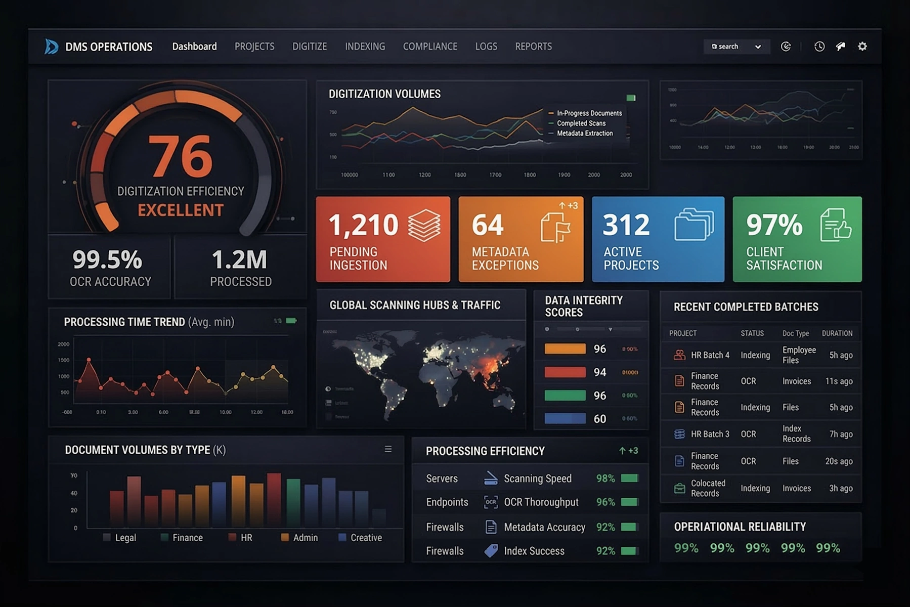
Most dashboards are built to “show the numbers.” The best dashboards do something more ambitious: they tell a story. Instead of dumping charts on a screen, they guide the viewer through a narrative—what is happening, why it is happening, and what should be done next. A visual dashboard that tells a story doesn’t just inform; it drives decisions.
Building this kind of dashboard requires intention. You need to think like a storyteller, not just a report builder. That means defining your audience, clarifying the central message, and arranging visuals in a way that leads the eye and the mind through a logical sequence.
Start with the core question, not the data
Storytelling dashboards begin with a question. What is the one thing your viewer needs to understand when they open this dashboard? Is it “Are we on track to hit our monthly revenue target?” or “Where are we losing customers in the onboarding journey?” or “Which production lines are at risk of downtime?”
Once you have that core question, everything else becomes easier. You can:
- Choose relevant KPIs: Only include metrics that help answer the question.
- Decide on the right time frame: Daily, weekly, monthly, or real-time, depending on the decision cycle.
- Filter the noise: Remove charts that are interesting but not essential to the story.
A dashboard without a clear question is like a book without a plot. It might contain useful information, but it won’t be memorable or actionable.
Design a narrative flow from top to bottom
A storytelling dashboard should read like a page, not a collage. Most viewers scan from top to bottom and left to right, so use that natural pattern to structure your narrative.
One effective layout pattern is:
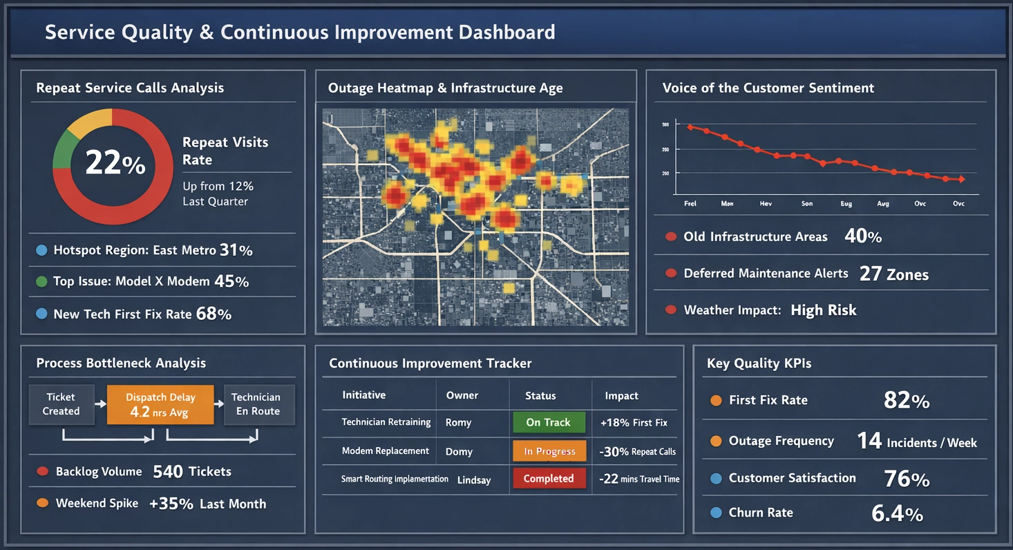
- Top row: High-level KPIs that answer “Are we winning or losing?”
- Middle section: Trend and breakdown charts that explain “Why is this happening?”
- Bottom section: Detailed tables or drill-down views that support “What should we do next?”
For example, a revenue dashboard might start with total revenue vs target, then show trends by region and product line, and finally list key accounts that are underperforming. The viewer is gently led from overview to diagnosis to action.
Use visual hierarchy to emphasize what matters most
Storytelling is about emphasis. Not every chart deserves equal weight. Use visual hierarchy to make the most important elements stand out.
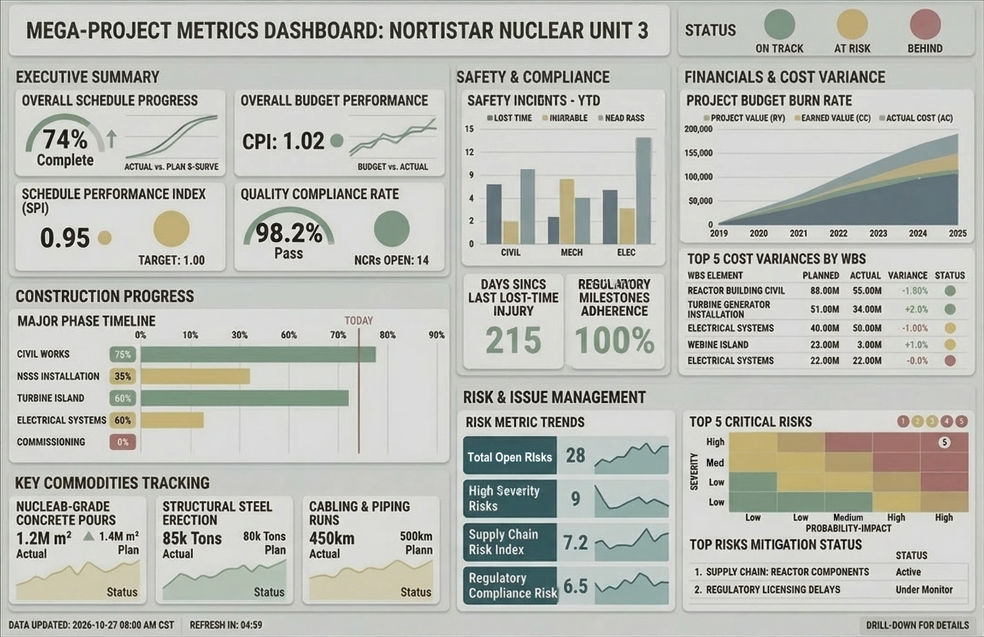
- Size: Make primary KPIs larger than supporting charts.
- Position: Place critical metrics at the top or in the upper-left area.
- Color: Use color sparingly to highlight exceptions, alerts, or key trends.
- Whitespace: Give important visuals room to breathe so they are easy to read.
If everything is bold and bright, nothing stands out. A good storytelling dashboard uses restraint so that the viewer’s attention is naturally drawn to what matters most.
Provide context, not just numbers
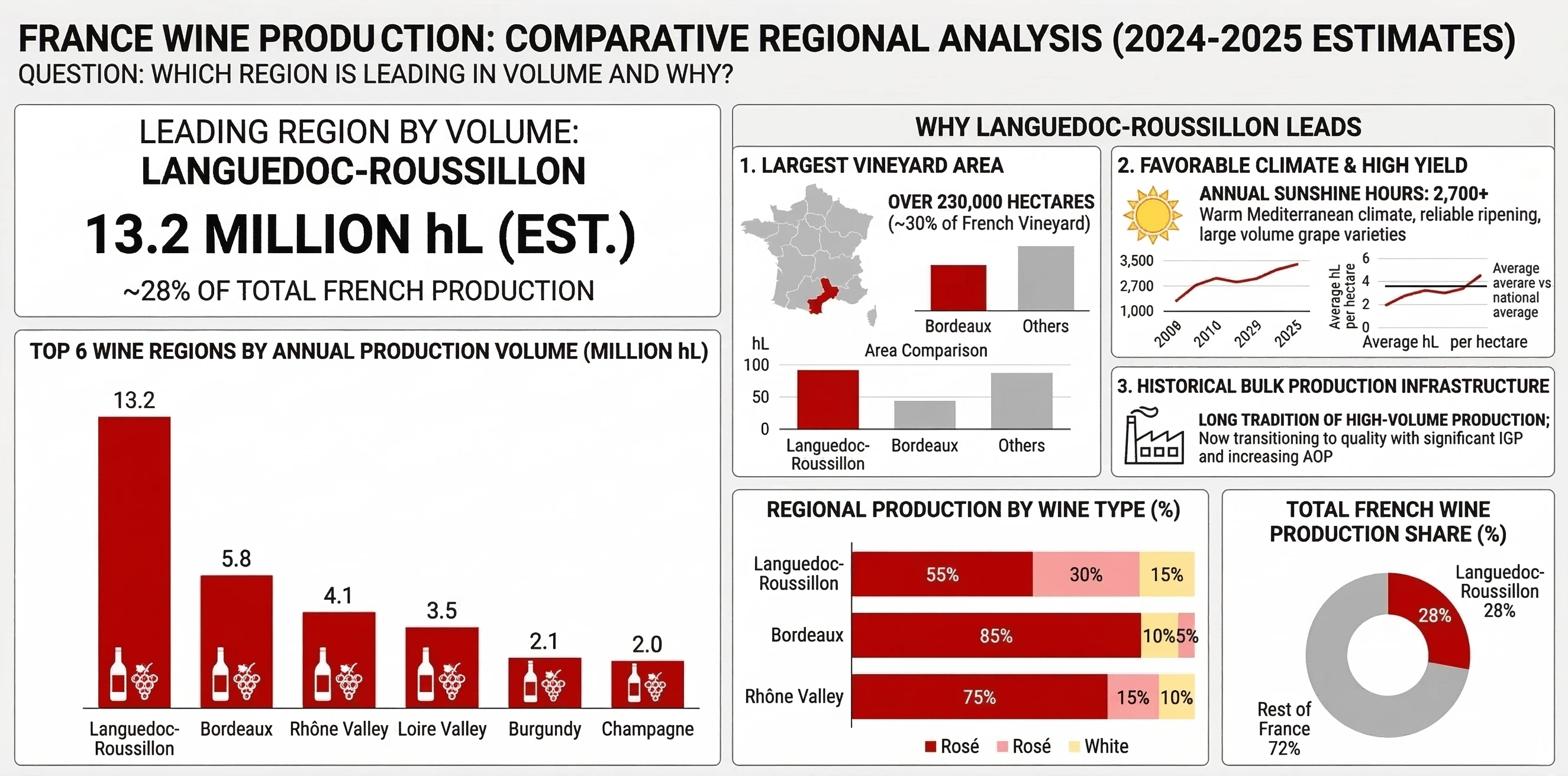
Numbers without context are hard to interpret. A dashboard that tells a story always answers the question, “Compared to what?”
You can add context in several ways:
- Targets and benchmarks: Show goals, thresholds, or industry averages alongside actuals.
- Prior periods: Compare to last week, last month, or last year to reveal trends.
- Segments: Break down results by region, product, channel, or customer type.
- Annotations: Add short notes explaining spikes, dips, or unusual patterns.
A chart that simply shows “Revenue: $4.2M” is less powerful than one that shows “Revenue: $4.2M vs $4.5M target, down 7% vs last month.” The second version tells a story of underperformance and urgency.
Align the story with the audience and their decisions
The same data can tell different stories depending on who is reading it. Executives, managers, and frontline staff each need a different lens.
- Executives: Need a concise story about performance, risk, and strategic priorities.
- Managers: Need to understand drivers, bottlenecks, and where to intervene.
- Frontline teams: Need clear guidance on today’s actions and priorities.
A storytelling dashboard should be designed with a specific role in mind. If you try to serve everyone with one screen, you end up with a generic, overloaded view that doesn’t truly help anyone.
Use interactions to reveal deeper chapters of the story
Not every detail needs to be visible at first glance. Interactivity—filters, drill-downs, tooltips, and toggles—lets users explore deeper “chapters” of the story without cluttering the main narrative.
Some powerful interaction patterns include:
- Click to drill: Click a region, product, or segment to see its detailed breakdown.
- Time filters: Let users switch between daily, weekly, and monthly views.
- Scenario toggles: Compare actuals vs forecast, or baseline vs promotion periods.
- Hover details: Use tooltips to show extra metrics without adding more charts.
Think of the initial dashboard view as the “headline” and interactions as the supporting paragraphs. Together, they form a complete story.
Avoid common storytelling dashboard mistakes
Even with good intentions, it’s easy to build dashboards that confuse rather than clarify. A few common pitfalls undermine the story:
- Too many KPIs: When everything is tracked, nothing feels important.
- Inconsistent definitions: If metrics are defined differently across views, the story breaks.
- Random chart placement: Charts scattered without logic force users to assemble the story themselves.
- Overuse of color: Rainbow dashboards distract from the narrative and hide real signals.
- No clear call to action: The viewer should know what decisions or actions the dashboard supports.
A storytelling mindset helps avoid these mistakes. Every element should earn its place by contributing to the narrative.
Bringing it all together
A visual dashboard that tells a story is more than a collection of charts. It is a carefully structured experience that leads the viewer from question to insight to action. By starting with a clear question, designing a logical narrative flow, using visual hierarchy, adding context, aligning with the audience, and leveraging interactivity, you can transform dashboards from static status boards into living decision tools.
When done well, your dashboards stop being “just another report” and become something people rely on, return to, and share. That is the real power of a visual dashboard that tells a story.
Decision Support System Dashboards - Looking for good decision support system dashboards? InetSoft's pioneering dashboard reporting application produces great-looking web-based dashboards with an easy-to-use drag-and-drop designer. View a demo and try interactive examples...
Deal Analysis Dashboard for PipelineDeals - Looking for a good solution for PipelineDeals dashboard reporting? InetSoft's pioneering BI application produces great-looking sales team dashboards that give sales manaagers more self-service analytic capabilities. Get a personalized demo and free evaluation assistance...
Defining Dashboard Variables - Users can summon data and define variables for report creation using InetSoft's comprehensive real-time analytical reporting solution dashboard software. To create a new Variable, follow these steps: 1. Click the 'New Object' button in the top toolbar, and select 'Variable'. This opens the 'Variable Properties' dialog box. 2. Enter a 'Name' for the new Variable asset. This is the name that appears in the title bar of the Variable...
Defining Data Governance Dashboards - Organizations are increasingly realizing the necessity for efficient data governance as the relevance of data continues to rise. To guarantee that data is accurate, dependable, and secure, rules, processes, and standards must be established. One of the key tools in any data governance program is a dashboard, which provides an overview of key metrics and indicators related to data quality, usage, and compliance. In this post, we'll look at what a data governance dashboard is and how it may assist enterprises in efficiently managing their data. Defining Data Governance Dashboards A data governance dashboard is a tool that businesses use to monitor and manage their data assets. It offers a thorough overview of an organization's data environment, including data sources, definitions, provenance, metrics for data quality, and consumption trends. To make sure that data is maintained consistently, uniformly, and securely, data governance teams, data stewards, and other stakeholders often utilize the dashboard...
Definition of Dashboard Embedding - The idea of dashboard embedding has been rather popular in the last several years, especially in the fields of business intelligence and data analytics. It lets enterprises convey vital insights and visualizations by integrating interactive data dashboards into external apps, websites, or portals. This article will examine the many facets of dashboard embedding, as well as its advantages, applications, and enabling technology. Dashboard embedding easily integrates business intelligence (BI) or data visualization dashboards into other software, websites, or platforms. Users may see and interact with dashboard charts, graphs, and reports without leaving the host application or website using this integration. In essence, it broadens the use of data analytics by providing insightful information to a larger group of people, such as partners, clients, or staff. By offering a single interface, dashboard embedding improves user experience. Users can obtain vital data without having to go between programs, which makes workflow more streamlined and effective...
Demo of Creating a Dashboard with SurveyMonkey - Now this is actually looking to do a live connect to the SurveyMonkey, so it might take a moment for it to retrieve the metadata and pull that back. I'm just going to go ahead and close out, that way we're not waiting for my connection to SurveyMonkey to finish authenticating. But it's going to give you a really great way to create new data sources and create new data worksheets, just direct from this listing here with leveraging the new APIs for more rapid development where you don't necessarily need to go back to Style Studio to do so. Now the big feature that is coming with this version is our new viewsheets relabeled at dashboards, currently the new dashboard recommender or wizard. When you actually go to create a new dashboard, you can always do it the more traditional way where you just select the particular data set that you want to work with, and go to okay and get the standard dashboard editor that you've been getting in visual composer with the minor enhancements around that. However, you can also enter into open wizard...
Demographic Analysis Examples - Explore interactive dashboards and demographic analysis examples. The highly interactive dashboard allows you to see into US Census data. View poverty lines, property values and more. You can take a granular approach and gather data state by state or region by region, or you can use a broader frame to explore national trends or weigh the differences in demographics from disparate states. If you want to see the demographic differences between Alabama and Wyoming you can click those two states's selection boxes and all the other states will be filtered out of the main charting graphic. Then at the bottom you can choose a variety of options that fill each bubble...
Department Dashboard Solutions - Looking for department dashboard solutions? InetSoft's industry pioneering BI platform can support any department's dashboard needs. View examples in the gallery, read articles about its capabilities below, and Request a Demo...
Describing Our University Dashboards - What I am trying to do is help you understand here that this dashboard is really a management tool for you to use, but it is only as effective as the use to which it is put. Information can be out there, but you really have to be able to interpret the clues, know that data, know what is going on, and then act on it.You also need to have date that is representative so that it tells you something like that there is a gauge that saying something is changing versus just a light saying, ok, you have a hot engine. Something changed, and now you are really in trouble. You want some indicators to know that you have something that is starting to go wrong, and then you take action. Let me show you what our dashboard looks like. This is my university user support dashboard. This is our master report. These are all of my organizations and the top things I need to know every day. So I can go in here and look and say "does this look normal or not?" This is our residential services. This is our operators, our call centers. You see that they get about 4 to 5,000 calls every weekday. These are weeks. These are on different campuses. I have trained myself so that I know when the graph looks like this, it's about right. Nothing is really happening to worry about. These are the contacts for the support center. You can see Monday and Tuesday are the biggest days, and we'll look at the data a little bit more...
Design B2B Dashboards - Looking for a good B2B dashboard reporting application? InetSoft is a pioneer in self-service dashboarding and offers an easy tool for B2B marketers. View a demo and try interactive examples...
Designing a Dashboard - There's more to designing a dashboard than you may realize. Designing a dashboard requires one to become both an artist and a scientist, and neither one would be able to do their work without the right tools. Check out InetSoft's dashboard designing tools and create some true works of genius. To set the properties of a Container component, right-click in an empty region between the components in the group, and select ‘Properties’ from the context menu. This opens the ‘Properties’ dialog box for the Container component. Many of the properties in the ‘Properties’ dialog box are common across components. The following sections discuss these common properties. Properties that are unique to a particular element are discussed in the section for that element. 1. The General tab of the ‘Properties’ dialog box is common to many components. It has five standard properties: Name Primary Assembly, Visible, Enabled, and Title. 2. The Data tab in the ‘Properties’ dialog box is common to many components. This tab allows you bind the component to the data source that supplies the data displayed by the component. It has five standard properties: Table, Column, Aggregate, Width, and Value. 3. The Advanced tab of the ‘Properties’ dialog box is common to many components, but options presented vary for different components. 4. The Pre-Aggregate tab is common to all Output and Data View components (excluding Table and Embedded Table). This tab allows you to specify which aggregates are pre-computed to improve Viewsheet performance...
Design a Dashboard - Designing a dashboard can be challenging, but when done properly can be very beneficial for your business. It's important to know what the best dashboard practices are. The benefit of a dashboard is that everything is in once place therefore it allows the user to quickly understand information through well designed graphs and charts that make the data easier to see visually. An effective dashboard allows the user to see the key facts, but also lets the user dig deeper and actually have the ability to understand why the data is what it is. It also allows for customization, so the dashboard can be utilized for whatever a company needs.
Designing a Good Dashboard - What is some advice for designing a good dashboard? Start by understanding what you really need to be looking at, because the speedometers, thermometers, and gauges are just a bunch of green lights or red lights, et cetera, and they don’t mean much at all if you don’t have the context around them. It starts with the selection of the right KPIs to watch and ensuring the data is there to calculate them and report on them in a timely fashion. I think there is such a thing is too many green lights. For instance, you might be killing your sales goals for your next quarter, because you are cramming all your sales upfront. So you need a lot more conceptual understanding to keep from jumping to the wrong conclusion. You need to include other metrics that give you the whole picture. The real power of a good dashboard comes when you start to think that “All right. I don’t necessarily need to report on the decision I have already made. I actually want to be informed when the condition is met that caused me to make that decision...
