Department Dashboard Solutions
Are you looking for department dashboard solutions? InetSoft's industry pioneering BI platform can support any department's dashboard needs. View examples in the gallery, read articles about its capabilities below, and Request a Demo.
Accounting Department Reporting - Now, let's run this accounting report. We'll extract the financial data, and this example is running live. Here's all the data for company 100. Now, you can perform analysis on this data. This is the high level. If you'd like to drill down to show more information, you can create a drill that would show you the detailed journal entries. Or you could do what's called a break out. Now, for a break out, you click the icon for break out and then select how do you want to break this information out. Well, in this case go and use the reporting segment to grab reporting segment 2, which I said earlier that's a location. Reporting segment 3 is department. Click ok, and now it's going out and retrieving the information. You just saw in 30 minutes how to create simple summary reports and detailed reports. We showed you how you can add some filters, add some graphs, create some cross tab reports, and pivot tables. We also walked through how you can schedule your reports to run on demand and then we wrapped it up with interactive analysis reports. The bottom line is, everything is designed to be quick and easy. This is giving you instant access to your financial and ERP data. You need to run reports that you're being asked to on a daily basis. Now one thing we haven't discussed is security. Is there integration with our existing security policies, and how do we set it up? Well, this has been set up for you. It absolutely is leveraging your existing security protocols. From a financial side, the integration is at a company level. In human resources, or human capital management, security integration is on the employer, the employer group, your level and security group. Now in addition to this, the reporting tool comes with a security wizard. This allows you to create new users if you want, and create additional security. If there's something else that you want to add on, that can be done in the administration console. So how do you find out more information? After today's presentation which is being recorded, you will receive the recording so you can play it back on demand. You'll also receive a brochure that talks about InetSoft's BI query and analysis suite, plus the technical requirements....
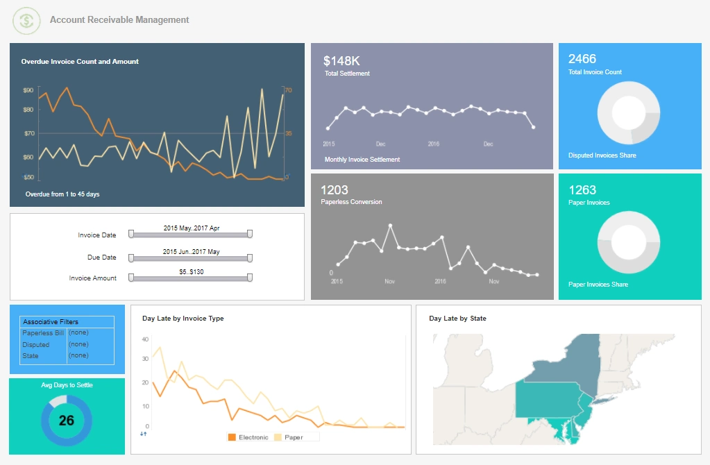
Accounts Receivable Department Dashboard - Searching for accounts receivable department dashboard designs? InetSoft provides many examples to learn from, demonstrating consistency across chart elements and pleasing color palettes...
Actuarial Department Dashboard - See an example in InetSoft's dashboard gallery...
Admissions Department Dashboard - Universities and higher education institutions are typically thought of as places where information and data disseminate from. However, from a business intelligence perspective, there is also a large influx of data at these types of institutions. For example, universities collect and store datasets regarding student demographics, academic performance, housing status, meal plans, academic departments, class enrollment levels, and other important information. To help manage all these variables, and make the best use of available resources, many universities deploy business intelligence tools. By leveraging business intelligence tools, university staff and administrators can convert all their raw data into visually intuitive dashboards. Universities can compare and monitor student performance and gauge the effectiveness of the educational process. The right business intelligence solution should be flexible enough to be used in an educational setting and robust enough to provide powerful data mashup and drill down capabilities. Data mashup enables users to compare disparate data sources and drill down capabilities allow users to pinpoint problem areas...

Agriculture Yields Improves Through Big Data Analytics - The agricultural sector is seeing major shifts in its supply chain, roles of different players and power relations between them, and the whole supply chain due to Big Data. Smart sensors and devices powered by the latest technologies like artificial intelligence, the Internet of Things, and Cloud Computing, accumulate massive volumes of data of different types that are revolutionizing the cyber-physical farm management cycle. Big Data is being used to: predicting the best practices in farming operations, supporting operational decision-making processes in real-time, and re-designing business processes to improve business models and develop innovative ones. Here are some of the latest trends in the world of agriculture that are emerging due to Big Data...
Airlines Are Using Management Dashboards - Technologies have a huge impact on businesses and help them to interact with customers, make weighted decisions, and build efficient environments. And aviation is not an exception. Nowadays, you don't have to go to a travel agency to buy a ticket, as well as airport management doesn't have to wait for weather forecasts from side organizations. Four types of analytics, descriptive, predictive, evaluative, and prescriptive, help airlines to build an effective routine and improve revenues. Do you remember essay writing at college, when you had to collect lots of data? The same happens with management tools: they gather, analyze, and process data to give airlines information about every aspect of the business. Airlines need the assistance of technologies, and below, we are going to tell you about the most important views on a management dashboard and why airline industry analysis is so beneficial...
Analytical Supply Chain Dashboard Example - As you can see to the right, dashboards are compelling tools for doing just that. The model dashboard provided tracks many key indicators of performance in a highly visual and comprehensive manner. The first chart shows man hours versus time produced for each type of material produced. Similarly the remaining three bar graphs track important metrics for running a successful business: tools, errors, workers, production time, and products. The bubble graph to the right shows client orders by price and time to produce. It utilizes a unique visual style to display this information in a compact manner. The boxes and calendar on the bottom portion of this display, coupled with the assortment of colors, are what make InetSoft's solution truly unique. By checking off various boxes or modifying the date, users can instantaneously update their dashboard to display information relevant to specific interests. In the top-left most display, man hours and production time have been mashed up in a diagram to provide correspond with specific materials. Employed properly, large quantities of data can be displayed in a meager space...
Application for Risk Management Reporting - Protecht's flagship enterprise risk management software is used by government agencies, regulators, financial service providers, fund managers, entertainment and retail companies, Protecht.ERM™ allows organizations to seamlessly integrate risk management into their day to day activities and obtain operating efficiencies through its flexible forms and workflow engine. Organizations can rapidly deploy and collaborate anywhere on risk and control assessments, compliance, key risk indicators, incident capture, compliance breaches, audits and more. Risk and Control Self-Assessment: Protecht.ERM accommodates a user's risk assessment methodology and enables linkage with the central risk event and control libraries for aggregation in reports. Compliance: Compliance Attestations can be created and scheduled for completion based on internal or external policies. Compliance attestations can be generated and scheduled to remind users of their compliance obligations on a regular basis. Compliance questions are able to be linked to risks, controls and obligations. Key - Risk Indicators: Enables users to enter and track their KRIs and KPIs. Intelligent KRIs can look at the value of one or more KRIs to calculate a new value. Quickly and easily see trends in risks and performance metrics. Internal Audit: Perform audits within the organization and enable auditors and auditees to communicate and agree on a mitigation plan. Actions Management: Track agreed Action plans within the system. Monitor progress through Worklogs and set Workflows to remind assignees or escalate to managers. Registers: Registers can be quickly and easily designed, built and deployed without the need for programming. Convert any paper or electronic forms into fully customizable registers...
App Developer Dashboard - Are you an app developer looking for dashboard software solutions to monitor your portfolio performance? InetSoft offers a easy-to-use performance monitoring tools that can be deployed in days not months. Like all service providers, mobile app developers need to track monthly and daily active users, ARPU, and churn. Other key metrics particular to application providers are downloads and conversion rates. InetSoft's lightweight dashboard application provides easy-to-use app developer tools to design whatever monitoring and analytical dashboards are desired by the marketing function, finance department, or c-suite. Cohort Churn Analytics Another key area for service providers like app developers is customer churn. Grouping by cohorts of app downloaders or periods of acquisition, comparing retention rates provides insights into application preferences, promotional drivers, and version improvements. This kind of dashboards allows monitoring the stickiness of apps, the ultimate key metric for a solution provider. Other important engagement metrics that can be compared across applications and acquisition periods include conversion rates...
Asset Management Dashboard Tool - InetSoft, an innovator in BI software since 1996, and AssetPoint, a leading provider of (EAM) Enterprise Asset Management and (CMMS) Computerized Maintenance Management Software solutions for over 30 years, have partnered to offer easy to use, interactive maintenance dashboard solution for tracking and managing predictive and preventive maintenance. AssetPoint's flagship product TabWare is an easy-to-use solution for managing all processes of maintaining manufacturing or industrial equipment and the operational facilities of any organization. As an upgrade option, enterprises can take advantage of InetSoft's complete BI application which allows for custom dashboard creation, visual analysis, and data mashups. A drag-and-drop design tool allows for quick dashboard development complete with interactive controls such as filter lists, range sliders, and combo boxes. Automatic point-and-click interactivity and personalization features make for easy self-service by end-users. For advanced analysis of problems, visualization options make spotting trends outliers easy. With powerful data mashup tools, data from almost any other source in the organization can be integrated into dashboards and analyses, from ERP systems to spreadsheets...
Assets Under Management Dashboards - For asset managers, wealth platforms, and multi-line financial institutions, Assets Under Management (AUM) is more than a vanity metric. It is a central indicator of scale, market relevance, and long-term revenue potential. Modern growth dashboards built around AUM give leaders a unified view of how assets are evolving across products, clients, and geographies, and how those trends translate into sustainable growth. A well-designed AUM and growth dashboard does not just show a single total. It breaks AUM down by business unit, investment type, and region, and overlays key growth metrics such as compound annual growth rate (CAGR) and performance over time. This combination of structural breakdown and temporal analysis helps executives understand where growth is coming from, where it is stalling, and which levers they can pull to improve outcomes. At the highest level, the dashboard should present a clear, reconciled AUM total, with the ability to drill down into more granular views. The most common dimensions are: Business unit: retail, institutional, private wealth, retirement, alternatives, or any internal segmentation that reflects how the firm is organized...
BI Dashboards for SCM - Help your organization run more efficiently with a supply chain management kpi dashboard created using InetSoft's Style Intelligence™. Effective supply chain management involves tracking shipments containing large amounts of goods and supplies from varied sources, as they travel across large distances. With InetSoft you can monitor all this information at a glance with an interactive dashboard that can be used on all devices. To receive a live custom demo for your organization click the orange button below to register. The model dashboard to the right provided tracks many key performance indicators at the global level, all in a highly visual and comprehensive manner. The boxes on the right portion of this display are a filter which would provide the live dashboard with interactivity and drilldown capability. InetSoft's StyleBI offers a variety of chart and display types, enabling you to employ unique visual styles to display information in a compact manner which communicates actionable insights. By selecting countries or modifying the date via a slider, users can instantaneously update the dashboard to display information relevant to specific interests and business questions. Since there are no limits or restraints on what kind of reports and visualizations can be built with the tool, users can use it to track any metrics which are important for running a successful business, including tools, errors, workers, production time, and products, all in one easy to view display if desired....
BI Systems and the Finance Department - We're switching gears now. That was our background on business intelligence. Now we're going to talk about BI systems and how they relate to finance. It's my attempt to depict what I think people in finance departments do as their finance system or the BI systems that they tend to interact with on a daily or weekly basis starting with operational systems. Those are the systems that run the business on a day to day basis, be it general ledger, your accounts payable, accounts receivable, sales, invoicing, things like that. Operational reporting is a confusing term. It means different things to different people and can be actually implemented in many different ways. But at a high level it's about running reports off of individual operating system. We have business intelligence which is all about generating reports off of a data warehouse or a data mart. It's obviously a little more than that, but that captures its essence in terms of the strategies and benefits of BI. And then there are other systems: the planning, the budgeting, the forecasting and the consolidation systems that Finance uses. Now, if I could draw a circle around the planning and budgeting square and the business intelligence square, I can't do that on this Web conference system, but if I could, and pull those two systems together, you get something that vendors today are touting as performance management. And performance management is now making a big difference, perhaps even bigger than BI...

Business Intelligence Financial Dashboard Software - Finance departments arguably face a wider set of information management challenges than any other department in an organization. Some of the challenges are common across functions, but several are specific to Finance. Finance Departments face many challenges that interfere with gaining Data Intelligence: 1. A Multitude of Disparate Data Sources – Finance owns the accounting and financials data, but also needs to access data from every other function, from the CRM system, to the supply chain system, to the transactional and operational databases, and even marketing and HR systems. Outside of these is staff generated data stored in spreadsheets, whether they are forecasts, performance trackers, or special analyses. Ultimately all of this information needs to be mashed up to get the whole picture. 2. Limitations of Tabular Reports – The first generation of information reporting has been the tabular report, whether structured as in financial statements or essentially print-outs of a database. These are useful for presenting the facts, but not for telling the story. Not until those data dumps are imported into a spreadsheet, massaged into metrics, and turned into charts can analysts begin to tell stories about the data. 3. Too Many Reports – Relying on reports also leads to ever growing libraries of static reports as new ones are requested for each new question that comes up during the course of running the business. The libraries become overrun and disorganized, leading to potential confusion and errors, and certainly inefficiency. 4. Too Much Manual Reporting – Without self-service access to data, staffers make their own reports, importing, or even worse, copying and pasting data into spreadsheets and creating their own reports. This leads to more inefficiency, and worse: errors. 5. Spreadmarts – With operational data stores being so hard to change and not suited to key metric calculations and aggregations, finance staffers often resort to creating their own spreadsheet "databases." No longer tied to the systems of record that might be updated over time, the result is competing versions of the truth. 6. Dependency on Data Scientists – the era of Big Data means there is an ocean of data that potentially could be analyzed, but most organizations don't have the expertise to tackle the challenge...
Call Center Dashboard Examples - Call center dashboards are needed in order to monitor key metrics that can change on a minute-to-minute basis. Therefore, data needs to be accessed in real time and be readily available to all team members throughout the day. InetSoft offers companies a comprehensive solution to tracking key metrics such as success rate, productivity, service level, and more in order to increase company efficiency and decrease overhead costs. When using a dashboarding software, it is important that all necessary information can be displayed in an understandable, comprehensive manner as it is in the call center dashboard example to the right. At a single glance, the user can clearly use the heat map visual to see where there have been successful or unsuccessful calls based on where there are yellow or red dots for each team and month. This gives the initial overall view so that the user can get a general idea of what is going on. With InetSoft's dashboarding software, users have the ability to create dashboards that are both compelling and informative at first glance as well as through multiple methods of data drilldown...
Claims Department Dashboard - The Insurance Claims Dashboard example here demonstrates InetSoft's user-friendly analytical dashboards, perfect for organizations in need of a customizable and interactive software to assist in everyday operations. The particular chart below portrays some of the many tools that InetSoft carries in addition to featuring a multi-dimensional view on the data. InetSoft's solution provides users with a large collection of visualizations and charts to create dashboards that meet their criteria or are easy to analyze. Simplifying the process even further, the point and click environment allows users to easily drill down into their data sets by claim type, claim status, gender, and age for a detailed analysis. With InetSoft's intuitive software, users can quickly build and analyze productive visualizations that sort, filter, and monitor the status of insurance claims and other relevant information while helping them keep track of and achieve long term goals and objectives....
CMMS Dashboard Solution - InetSoft, an innovator in BI software since 1996, and AssetPoint, a leading provider of (EAM) Enterprise Asset Management and (CMMS) Computerized Maintenance Management Software solutions for over 30 years, have partnered to offer easy to use, interactive maintenance dashboard solution for tracking and managing predictive and preventive maintenance. AssetPoint's flagship product TabWare is an easy-to-use solution for managing all processes of maintaining manufacturing or industrial equipment and the operational facilities of any organization. KPI for Maintenance Dashboards: Integrated into the application is a pre-built KPI dashboard that monitors eleven key metrics: Equipment downtime. Maintenance backlog. Percentage of planned work for prior month. Maintenance cost as a percentage of equipment replacement value. Percentage of Preventive Maintenance (PM) and Predictive Maintenance (PdM) worked in the prior month. Percentage of PM and PdM overdue in the past month. Estimating accuracy. Maintenance, Repair and Operations (MRO) inventory turns. MRO inventory as a percentage of equipment replacement value. Total value of outstanding purchase orders. Total value of receipts that have not been invoiced...

Creating a Report Showing Corporate Staff Performance - Maybe you just want to create a report showing corporate staff performance. You can unselect all of them. Hit corporate, and just get the corporate staff. Maybe you really want all of the organizations for the company, all the divisions, hit okay. Maybe you want to analyze certain plans, so you can unselect that, and say, hey, I just want to do dental, life, LTD, medical, hit okay and now you have got that. Similar to as in Excel, you can always comment, highlight, right mouse click format and make it currency, okay. Or, you can exchange the column headings, make them all the same, cool. Now as you're doing this, you can do all kinds of things. You have got this in a pivot table. You can do analysis, and again leveraging the power of the dashboard designer, you can go in and add a pivot chart if you want to. t's very simple. You simply choose the kind of chart you want to have, and now the chart represents the same data as above. And whether you start to filter above or below you can come down, it's synched up. You might say, hey, I want different benefit plan. I also want to include supplemental life. Hit okay and refresh both the charts and the pivot table. And you can do all that because the data came directly from the database. You didn't have to export it. You didn't have to save as. You can go and do your analysis, and there is even a way to make these charts and graphs automatically update whenever you rerun the reports. That's a really powerful, really powerful way to get to the data. So going back, I'm going to scroll down. You'll see now we are in a variety of different sheets at the bottom, and going back to my sheet one, I want to manipulate the report a little bit more...
C-Suite Management Dashboard Examples The best way to keep your finger on the pulse of your enterprise is with business intelligence dashboards. Top management face the challenge of making sure that day-to-day business activities are aligned with the company's long-term goals. One way to periodically and conveniently track performance is with dashboards displaying Key Performance Indicators (KPIs). In general, no software application is going to provide top management with KPI's ready-to-use, since KPI's are metrics that are often derived from formulae that are specific to an enterprise and need to be mapped into the software application. With this in mind, InetSoft designs business intelligence solutions that are easy-to-deploy and easy-to-use. InetSoft's dashboard tool provides top management with visual analyses constructed in real-time by dropping data items into visual elements such as charts, graphs and gauges...
Distribution Industry Dashboards - Is your distribution team using a data dashboard? If not, check out the advantages. It is an effective data management solution that provides the results of in-depth information analysis in the shape of visuals and displays KPIs necessary to make your business perform optimally. Distribution dashboards help to measure and assess different KPIs. The most important four key performance indicators are: Order lead time - Estimates the average period required for a product to be delivered to a customer. Perfect order rate - Calculates the order quantity obtained from the distribution center. Lost sales - Detects the number of quotes that don't lead to any income. Distribution dashboards can also help with improving packing cost, order cycle time, vendor performance, etc. Simplify Complex Data Distribution industry reps work with big volumes of data. Without dashboards, it would be hard to comprehend the information. Dashboards help to sort data, highlighting vital content. These tools allow accessing whatever employees need in a matter of seconds, without searching for the necessary results manually. Distribution dashboards allow transforming manufacturing info into data that makes sense. Such software uses visual elements like tables, graphs, and charts. It's enough to look at the image to get a clear insight into the production performance...