InetSoft Offers a Visual Data Tool That Is Easy To Deploy And Use
Since 1996 InetSoft has been offering business intelligence applications that are flexible and powerful, serving over 5,000 enterprises and solution providers worldwide.InetSoft's solution is an easy to use, interactive visual data tool that includes real time reporting capabilities.
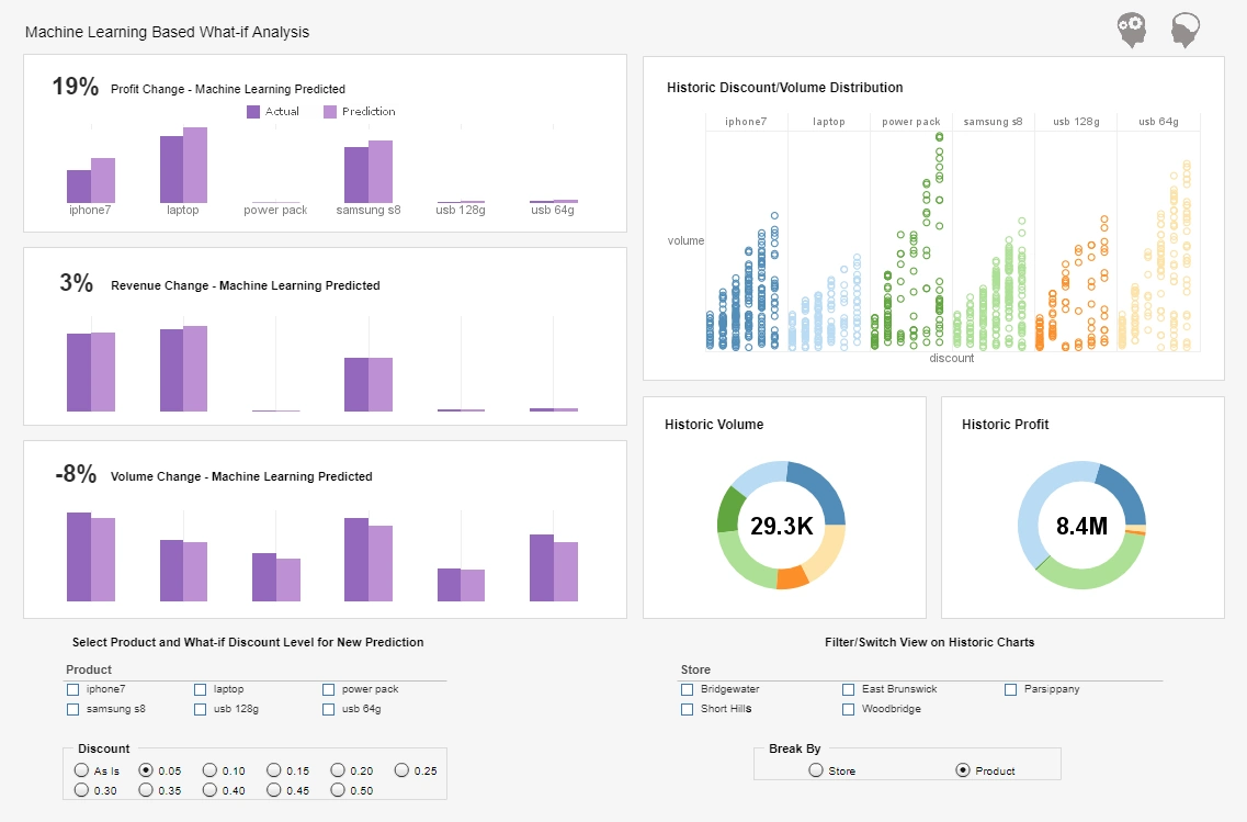
InetSoft's StyleBI™ focuses on business data exploration by combining Data Block technology with visualization. Visualized analysis is constructed in real-time by dropping data items into visual elements such as charts, metrics and selections. The resulting view reveals the intrinsic relationships among the data.
Visualization and analysis benefits include:
- Unlimited multi-dimensional charting
- Brushing for data exploration
- Drag and drop in a web browser, spreadsheet-like design
- Use gauges, thermometers, and other familiar objects
- Use charts, maps, and other advanced visual displays
- Dual purpose input/output elements
- Views assembled from sub-level views
- Monitoring and analysis oriented views
- OLAP data source mashup and visualization
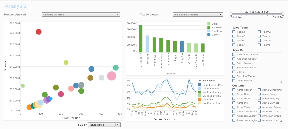
- Make multi-dimensional charts even more information-rich thanks to new coloring, shape, and sizing options that, for instance, turn a 3D bubble chart into a 4D or 5D chart
- Create multi-charts (aka trellis graphs, visual crosstab, or small multiples).
- Use brushing techniques where by selecting data points in one chart highlights corresponding data points in accompanying charts
StyleBI’s Role in Visual Analysis in Paleoclimatology
Paleoclimatology, the study of past climate conditions, relies heavily on analyzing data from natural recorders such as tree rings, ice cores, sediment layers, corals, and fossils. These proxies yield complex, multi-dimensional data that span millennia, often coming in fragmented or non-standard formats. Researchers in this field face enormous challenges in combining diverse datasets, discerning patterns, and visualizing how Earth’s climate evolved over time. This is where InetSoft’s StyleBI emerges as a valuable tool, offering scientists and data analysts a scalable, flexible, and intuitive visual analysis platform to manage, mash up, and understand this intricate data landscape.
Unifying Diverse Paleoclimate Data Sources
Paleoclimatic datasets often originate from a wide array of sources and formats, such as CSV exports from ocean drilling programs, netCDF files from ice core analyses, and satellite-derived reconstructions. StyleBI’s schema-less data mashup capabilities allow these heterogeneous sources to be harmonized without requiring extensive ETL preparation or database restructuring. Researchers can bring in datasets from both cloud-hosted repositories and on-premise storage, enabling seamless collaboration across institutions and research centers.
For example, a researcher could import CO₂ concentration data from Antarctic ice cores and compare it side-by-side with reconstructed global temperature anomalies from tree-ring chronologies. StyleBI’s data transformation layer enables re-indexing, interpolation, and joining of time series data, making it much easier to align datasets with differing temporal resolutions. The result is a more coherent and analyzable data model tailored for visual exploration.
Interactive Visualizations for Temporal and Spatial Analysis
A major strength of StyleBI lies in its advanced visualization capabilities. Paleoclimatology requires tools that can help make sense of changes over thousands to millions of years—detecting long-term cycles such as the Milankovitch cycles or shorter-term phenomena like the Younger Dryas. With StyleBI, scientists can construct time-series dashboards that offer zooming, panning, brushing, and filtering—key techniques to identify subtle fluctuations and abrupt transitions in paleoclimate records.
Furthermore, spatial analysis plays a significant role in understanding climate systems. StyleBI’s geographic mapping and heatmap overlays allow paleoclimate researchers to visualize global distributions of climate indicators. For instance, StyleBI can generate maps showing sea surface temperature reconstructions during the Last Glacial Maximum or regional variations in monsoon intensity based on lake sediment cores. By layering datasets, researchers can test hypotheses visually and uncover geographic correlations that may not be evident from numerical summaries alone.
Dashboards for Hypothesis Generation and Collaboration
StyleBI supports the creation of interactive dashboards that facilitate scientific collaboration and peer review. These dashboards allow researchers to package visualizations, parameter controls, and insights into a shared environment. Paleoclimatologists can construct dashboards that let colleagues interact with specific time frames, adjust temperature anomaly thresholds, or apply filters by proxy type or latitude.
This dashboard interactivity enhances collaborative interpretation, enabling new hypotheses to emerge through shared visual inquiry. For example, a team investigating past El Niño events can collaboratively explore dashboard filters that reveal teleconnections between Pacific SST anomalies and rainfall variability in South America or Southeast Asia. By using StyleBI, such collaborative workflows no longer rely on static graphs or offline spreadsheets but on dynamic, data-rich environments.
Handling Big Data in Paleoclimatology
As high-resolution paleoclimate data becomes increasingly available—through improvements in radiometric dating, satellite proxies, and deep-sea sediment coring—researchers must deal with growing data volumes. StyleBI is well-suited to handle big data scenarios thanks to its scalable microservices architecture and support for in-memory analytics.
For example, integrating over a million observations from global benthic δ18O records used to infer ocean temperatures and ice volume over 60 million years can be resource-intensive. With StyleBI, users can load this data into the mashup engine, apply custom filters and transformations, and visualize trends without waiting for batch processing or needing a high-end database server. This ensures that researchers maintain agility and responsiveness even as their datasets grow.
Embedding and Open Access for Education and Public Communication
One of StyleBI’s strategic advantages is its embeddability and support for multi-tenant deployment. Educational institutions and research programs can embed dashboards in their websites or learning portals to educate students and the general public about past climate changes. A public-facing dashboard showing CO₂ levels over 800,000 years with associated global temperature trends, enhanced with narrative annotations and explanatory tooltips, can powerfully communicate the science of paleoclimate.
Moreover, by using StyleBI’s role-based access and tenant-specific data filtering, organizations can manage different levels of content visibility and collaboration. Graduate students might access editable dashboards to conduct their own analysis, while external visitors view a read-only version for educational outreach. This approach democratizes visual analytics without compromising data governance.
More Articles About Visual Data Tools
-
Empowering Interactive Data Exploration
An introduction to visual data analysis and how interactivity transforms static reports into dynamic dashboards. Describes features like brushing, drill‑down, and multidimensional charting to reveal hidden trends. Explains how non-technical users can self-serve insights without relying on IT. -
Bridging Analytics and Visual Insight
Explores InetSoft’s visual analytics software that blends visualization with analytics for faster decision making. Highlights drag‑and‑drop dashboards, filtering, and user-driven exploration. Shows how complex relationships can be understood visually with minimal technical expertise. -
Simplifying Data Visualization Tools
Discusses user-friendly tools that convert raw data into clear visual dashboards with drag‑and‑drop ease. Covers benefits like reduced decision latency and enhanced comprehension. Designed for users transitioning from spreadsheet analysis to self-service BI. -
Unlocking Rich Visual Analytics Features
Outlines advanced visualization tools including brushing, filtering, and mashup supported within dashboards. Illustrates real-world use cases such as slider controls and geographic overlays. Demonstrates how these features support intuitive discovery and actionable reporting. -
Evaluating Visualization Impact in Industry Settings
Describes how data visualization tools are applied in industries like manufacturing and automotive for monitoring performance and quality. Highlights real-time dashboards, defect tracking, and supply chain oversight. Provides insight into visual analytics' operational value. -
Integrating Mining and Visual Data Displays
Explains how InetSoft combines data mining with visualization to spot patterns from clustered or predictive models. Shows how mining results can be displayed visually through dashboards and charts. Useful for analytics teams seeking actionable visual insight. -
Dashboard Visualization Software Guide
Provides guidance on selecting tools for visual dashboard design across industries. Explains criteria like usability, scalability, mashup ability, and interactive formatting. Emphasizes how visual dashboards support operational and strategic data needs. -
Accelerating Insight with Visual Data Interaction
Focuses on how visual data analysis accelerates insight discovery through interactive visuals. Discusses bookmarking, saving explorations, and collaborating on dashboard views. Encourages shared data understanding across teams. -
Discovering Trends via Visual Data Analytics
Highlights the ability to reveal correlations and outliers that static analysis misses using interactive visuals. Reviews multidimensional charting capabilities such as color, size, and axis variation. Demonstrates how visual-driven analysis enhances business agility. -
Maximizing Self-Service Visual BI Adoption
Focuses on enabling business users to access visual analysis tools without IT support. Describes how intuitive interfaces allow exploration of data via charts, tables, and gauges. Illustrates benefits like faster time to insight and reduced overhead.


