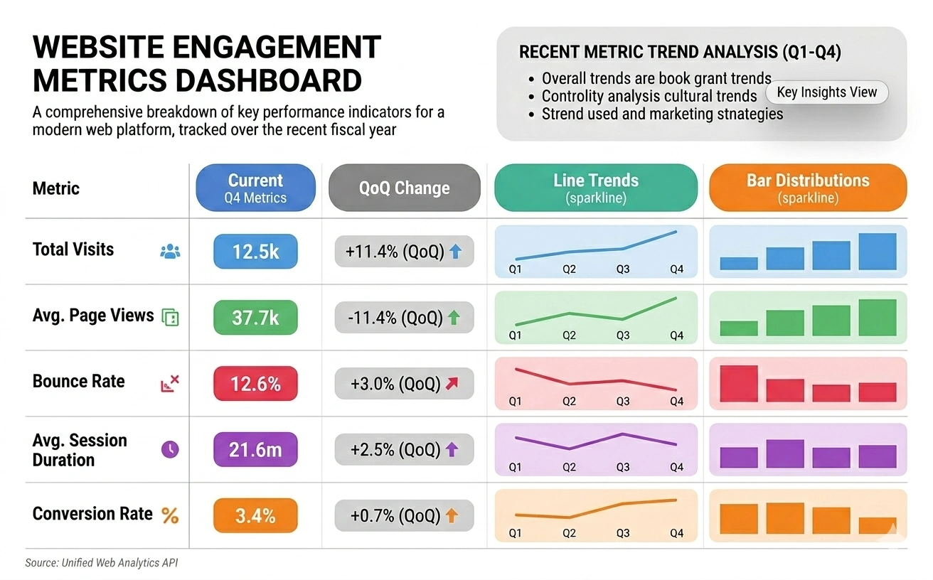
Solution for Graphic KPI Dashboards
Key Performance Indicators (KPI's) are business metrics used to track an organization's performance and determine whether business goals are being met. Every industry, agency, or organization must measure its performance on a daily, monthly, or quarterly basis to ensure health and sustainability.
The best way to capture graphic KPI's is through dashboard software. InetSoft's graphic KPI dashboards leverage KPI's by providing a dynamic, easy to understand visual display of an organizations most important metrics.
InetSoft's KPI dashboards are channels for all end users to focus on the information and measures that are most crucial to them. For example, it is important to know how much sales for the quarter are, but what if a manager needed to choose a sales person to make a pitch? With InetSoft's drill down capabilities, users can quickly spot who had the best sales consistently, or even compare quality of sales.

Build KPI Dashboards Easily
With InetSoft's StyleBI, a complete business intelligence solution, organizations will enjoy ease of use to access the most crucial measures on a single, sophisticated graphic KPI dashboard. It uses a simple drag and drop environment that requires minimal training and no IT aid and is easy to deploy in an organization of any size. The intuitive drag and drop features allow users to quickly create powerful monitoring and analytical dashboards. InetSoft also uses real time data mashup that combines data pulled from almost any location in any format to maximize a self-service environment.
Once an organization has selected their most crucial KPI's, InetSoft's dashboards will present each one in the best possible way. Nonetheless, each dashboard is fully customizable and easy to manipulate. Now, bare data turns into insightful and actionable information.
Gain New Insights with Graphic KPIs
KPI's help organizations quantify their business in traditional and novel ways by providing a deeper understanding of where their business stands, where they can improve, and how. A KPI dashboard could be the difference between succeeding and failing in business as they provide all users with real time information in a way they have not seen before. Visual graphs and pictures help users spot patterns, trends, or even potential problems that a spreadsheet simply could not capture.
Graphic KPI Dashboards allow users to visualize their goals and targets while keeping track of how far or close they are from reaching them. When applied, a KPI dashboard is a powerful tool to bring any organization to a new level of precision and success.
Case study: Aquaculture equipment manufacturer switches from Caspio to Style BI open source
Company: Midwater Systems, an aquaculture equipment manufacturer specializing in aerators, automated feeders, and water-quality sensors for fish farms and hatcheries.
Focus: Migrating from Caspio to Style BI open source for graphic KPI dashboards across operations, sales, and field service.
Background and context
Midwater Systems operates in a niche, data-intensive industry where equipment performance, service SLAs, and customer outcomes are tightly coupled to water quality and feeding schedules. Historically, the company used Caspio’s low-code platform to deliver KPI dashboards to internal teams. While this approach accelerated early reporting, it became increasingly limiting as the company expanded into IoT telemetry, multi-region distribution, and subscription-based maintenance contracts.
Leadership set a goal to unify dashboards, improve data modeling flexibility, reduce vendor lock-in, and standardize visual analytics for both internal and partner-facing portals. The analytics team proposed migrating to Style BI, an open-source BI platform selected for its extensibility, on-premise deployment options, and robust charting library.
Challenges with the existing setup
- Customization limits: Advanced visualizations (e.g., multi-axis time series and cohort retention charts for service calls) were complex to implement and maintain.
- Data silos: Integrating IoT sensor data with CRM and ERP required brittle connectors and manual exports.
- Cost scalability: As users and dashboards grew, licensing and usage costs became unpredictable.
- Governance gaps: Row-level security and version-controlled dashboard changes were difficult to standardize across teams.
Objectives for the migration
- Unified data layer: Centralize telemetry, service, and commercial data in a governed warehouse.
- Flexible visualization: Support custom KPI graphics (sparklines, small multiples, and map overlays) without heavy workarounds.
- Open ecosystem: Avoid lock-in, enable plug-in development, and manage costs transparently.
- Secure multi-tenant access: Provide partner portals with row-level filters and granular roles.
Implementation approach
Architecture and data modeling
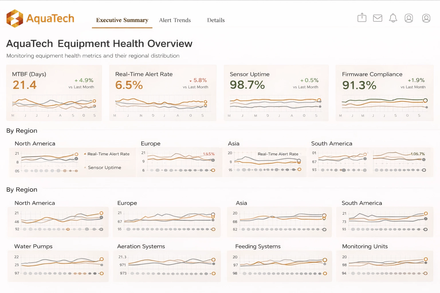
The team established a cloud data warehouse as the single source of truth, ingesting streams from water-quality sensors (pH, DO, turbidity, temperature), equipment telemetry, ERP orders, and CRM cases. A star schema was designed for core domains: Equipment, Customers, Service Events, Telemetry Readings, and Orders. Conformed dimensions ensured consistent definitions for regions, product lines, and service tiers.
Style BI deployment
Style BI was deployed in a containerized environment behind the corporate identity provider. The team configured role-based access, row-level filters for partner portals, and separate workspaces for operations, sales, and service. Custom themes and component libraries established a consistent visual language across dashboards.
Dashboard migration and governance
Dashboards were prioritized by business impact: operations KPIs first, followed by service reliability and commercial performance. Each migration included a definition review of KPI formulas, unit harmonization, and baseline validation against historical reports. Git-backed configuration repos and a CI pipeline introduced version control, automated testing of SQL queries, and peer review for dashboard changes.
Key dashboards and KPIs
- Equipment health: Mean time between failures (MTBF), real-time alert rate, sensor uptime, and firmware compliance; visualized with small-multiple line charts by region and product line.
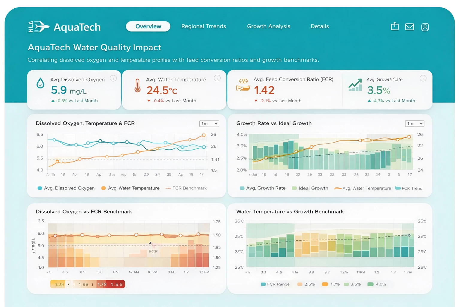
- Water quality impact: Correlating dissolved oxygen and temperature profiles with feed conversion ratios and growth benchmarks; displayed with dual-axis time series and heatmaps.
- Service performance: First-time fix rate, average resolution time, SLA attainment, and parts availability; monitored via funnel charts and percentile distributions.
- Commercial performance: Win rate by segment, renewal probability, churn signals, and margin contribution by SKU; tracked in cohort charts and contribution bar charts.
- Partner portals: Customer-specific dashboards filtered by farm, site, and equipment IDs, including maintenance schedules and advisory flags.
Results and benefits
- Faster insight delivery: Dashboard build time decreased by 40% due to reusable components and streamlined data models.
- Improved accuracy: KPI definitions standardized across teams reduced reconciliation issues and rework.
- Cost transparency: Open-source licensing and self-hosting eliminated unpredictable per-user costs and simplified budgeting.
- Extensibility: Plug-in capability enabled custom charts (e.g., oxygen saturation bands) and domain-specific calculations.
- Secure sharing: Row-level security and workspace isolation allowed controlled access for partners without duplicating dashboards.
Challenges and lessons learned
- Change management: Training and documentation were essential; the team built short “playbooks” for common design patterns.
- Data quality: Sensor drift and missing readings required robust validation rules and imputation strategies to keep KPIs trustworthy.
- Performance tuning: Pre-aggregations and cache strategies were needed for heavy time-series queries and map layers.
- Governance discipline: Version control and peer review prevented KPI definition drift as new stakeholders joined.
More Articles About Graphic KPIs
- Logistics KPIs Include
This article walks through how different functional areas define and use KPIs, showing examples from logistics, HR, and supply chain so readers can pick relevant measures. It emphasizes that KPIs must be mapped to business goals and supported by reliable data sources rather than chosen because they are easy to measure. Practical tips cover sensible thresholds, avoiding noisy signals, and exposing KPI context so operational teams can act on the numbers.
-
Free Downloadable Evaluation Copy
This page presents concrete KPI dashboard examples built with InetSoft’s visualization tools and points readers toward downloadable demos and free evaluation software. Each example shows how common KPIs appear in interactive visuals, demonstrating layouts for scorecards, trend charts, and drill-down tables. The goal is to help prospective users imagine templates they can adapt for finance, operations, or sales reporting.
-
Booking And Revenue Metrics
This resource collects industry-specific KPI lists and definitions so BI teams can jump-start dashboard design with sensible, domain-relevant measures. It covers categories such as booking and revenue metrics, operational KPIs, and customer-facing indicators, and recommends which metrics suit transactional vs. subscription businesses. The page is useful for benchmarking and for translating high-level strategy into concrete, measurable targets.
-
IT Key Performance Indicators
Focused on technology organizations, this article defines IT KPIs for service, support, and infrastructure teams — from availability and mean time to repair to ticket backlog and change success rates. It explains how to align these measures to user experience and business SLAs rather than treating them as raw engineering metrics. The guidance helps IT leaders choose KPIs that are actionable and that drive investments in reliability and automation.
-
Track An Organization's Performance
This marketing-oriented piece lists common marketing KPIs — conversion rates, CAC, LTV, and campaign ROI — and shows how to visualize funnel performance across stages. It stresses connecting marketing KPIs to downstream revenue and retention metrics so attribution is meaningful. Examples show how dashboards can help marketers iterate on offers and channels quickly using cohort and trend views.
-
Financial Reporting Tool
This article demonstrates how InetSoft’s dashboards and reporting tools support finance teams with interactive KPI scorecards, financial statements, and drillable variance analysis. It outlines practical templates for tracking revenue, margin, cash flow, and working capital and explains pagination and export needs for formal reporting. The content emphasizes accuracy, auditability, and the ability to serve both executives and accountants from the same dataset.
-
Asset Under Management
Targeted at investment firms, the fund-management article describes KPIs such as AUM growth, ROI, client retention, and benchmark performance and why each matters to portfolio decisions. It explains how dashboards surface risk-adjusted returns and client segmentation so managers can defend strategy and spot red flags early. The write-up also covers operational KPIs like fee realization and tax efficiency that influence net investor outcomes.
-
Average Response Time
This piece lays out the KPIs central to service-level monitoring — average response time, latency, and error rates — and how these metrics feed customer satisfaction. It describes visualization patterns that make degradation obvious (SLA bands, heatmaps, and alerting thresholds) and recommends combining real-time and historical views for root-cause analysis. The article highlights practical uses such as capacity planning and incident prioritization.
-
Cost Per Invoice
Aimed at billing and revenue operations, this article catalogs KPIs such as cost per invoice, billing cycle efficiency, and dispute rates, showing how they measure process health and cost-to-serve. It recommends analytics for fraud detection, audit trails, and vendor cost comparisons to reduce errors and improve margins. The guidance helps billing teams balance automation investments with risk and compliance needs.
-
Schedule Performance Index
Written for project analysts, this article explains schedule and cost KPIs — schedule variance, SPI, CPI, and deliverable completion — with advice on monitoring and escalation. It shows how dashboards can surface scope creep, coverage gaps, and quality metrics so stakeholders can intervene before deadlines slip. The piece also covers analytical techniques like trend analysis and root-cause investigations to drive continuous improvement.