How To Make Dashboards
The first thing to learn about any BI platform is how to make dashboards. InetSoft knows this and has designed the perfect dashboard builder. InetSoft's core philosophy has been create an application that is powerful but easy to use.
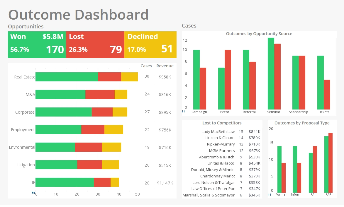
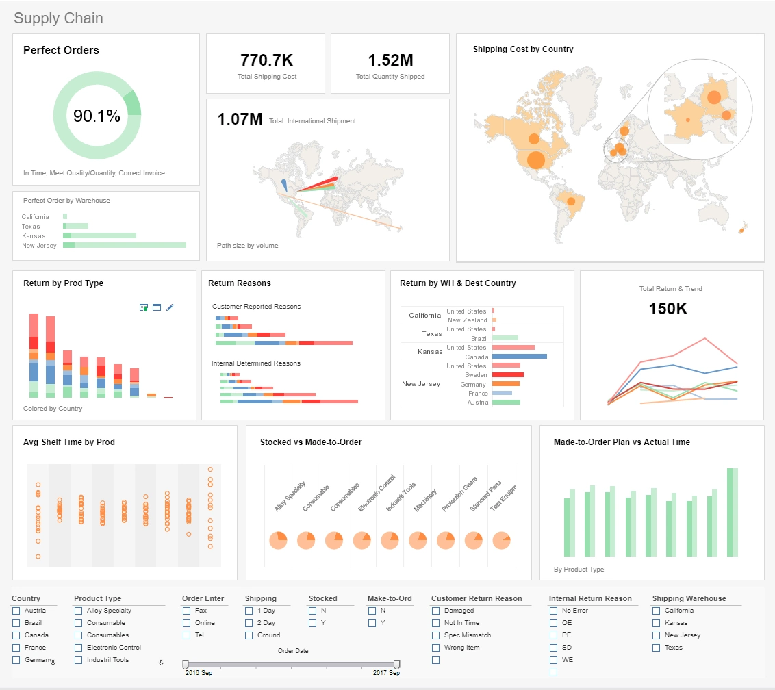
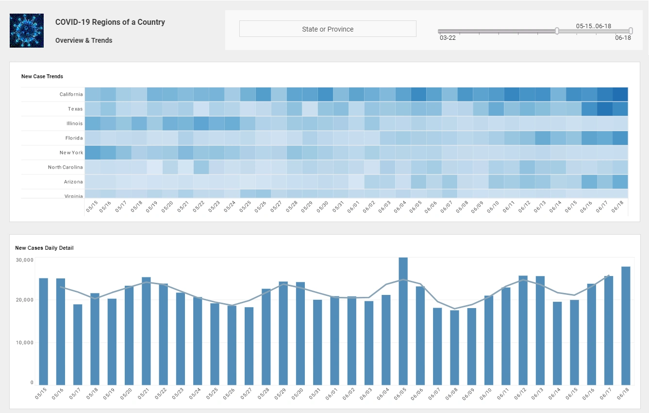
To the right here you can see one the fully interactive dashboards that was built using InetSoft software solution.
InetSoft believes the ideal BI visualization program should be interactive and accessible, it should be sophisticated but it should also be learnable. Following these tenets InetSoft was able to design StyleBI to be powerful, robust and agile visualization software that's capable enough for a data scientist but easy enough to be used by a BI novice.


Three Simple Steps to Start Dashboard Creation
To make dashboards using StyleBI the user has to follow three simple steps:
1). Load the Viewsheet, which is a software window that looks a lot like any familiar spreadsheet. Since StyleBI runs from the web using html5, installing StyleBI on a single computer at your enterprise allows any number of employees access to the program from their own desktop, in their preferred web browser, through CRM, or other connector portal.
Booting up the program and entering the Visual Composer, two clicks, will land a user in their blank viewsheet.
2). Upload your data. InetSoft offers tech help and training to get you started, connecting and linking up your data storage solution should only take two weeks (versus the industry standard of a month of getting your systems in sync with theirs). If you are employing spreadsheet software such as Excel it should only take minutes!
Data only needs to be uploaded once, and afterwards any change made to the source file that Style Intelligence is connected to is automatically and immediately reflected by the program, in its drag and drop icons as well as in any already made visuals based on the modified data set.
3). Drag and drop your uploaded data into the interactive and dynamic user interface. To make a chart drag the chart icon into the viewsheet, then drag a dimension and measure into the chart area. In less-than-a-moment StyleBI will display the data together automatically choosing the clearest way to communicate their relations.
But the user also has control and visual flexibility. For instance: if the program chooses a vertical bar chart, the user can still choose from over 30 combinations of chart types. Tables are even more simple: drag a column straight into the environment and the table fills itself with every available cell of data. Plus tables are fully customizable through preset templates or designs the user uploads.
Furthermore, the user can choose to build word clouds, completely customize coloring using presets or universal color codes that they can look up online. The user can experiment with sizing options, and customize display shapes (with the flexibility to upload their own shapes and patterns if they like!). This is all accomplishable using an intuituve and user friendly interface that helps the user along at every turn.
How a Truffle Cultivator Used the Open Source StyleBI to Make Dashboards
Truffle cultivation is a highly specialized and unpredictable agricultural process where precise monitoring of soil conditions, climate, and tree health is critical for successful yields. Traditionally, truffle farmers relied on manual observations and scattered records, which made it difficult to track trends or anticipate harvest opportunities. By adopting the open source version of StyleBI, a truffle cultivator can consolidate data from multiple sources—including soil moisture sensors, weather stations, irrigation systems, and historical yield records—into interactive, real-time dashboards. This centralization allows the farmer to monitor critical variables at a glance and make informed decisions about irrigation, fertilization, and harvesting schedules.
With StyleBI’s self-service dashboard capabilities, the cultivator can customize visualizations to meet the needs of different stakeholders. For example, a farm manager can track soil pH and moisture trends across different truffle plots, while harvest crews can monitor which areas are approaching optimal truffle maturity. The ability to create and adjust dashboards on the fly reduces reliance on IT support and accelerates decision-making, allowing the team to respond to changing environmental conditions quickly and efficiently. Users can also combine multiple datasets in a single view to detect patterns and correlations that would otherwise remain hidden, such as the relationship between rainfall patterns and truffle yield.
Additionally, StyleBI enables the truffle cultivator to perform ongoing performance analysis and reporting. By monitoring long-term trends and comparing year-over-year data, the cultivator can refine planting strategies, optimize resource allocation, and plan labor requirements more effectively. Dashboards can be shared across the farm team, providing a transparent view of operations and improving collaboration. In essence, using the open source StyleBI transforms truffle cultivation from a largely reactive process into a proactive, data-driven operation, enhancing efficiency, yield predictability, and overall farm management.


