From Kibana to InetSoft: How Riverside General Transformed Its Emergency Department Reporting
When the leadership team at Riverside General Hospital sat down to review their emergency department data strategy in late 2024, they faced a familiar but frustrating problem. Their Kibana dashboards, once praised as a modern leap forward from spreadsheet-based reporting, had quietly become a bottleneck. Clinicians were spending more time decoding visualizations than acting on them. IT staff were fielding constant requests to adjust index patterns and query strings that non-technical users simply could not manage on their own. Something had to change.
The decision to migrate to InetSoft's reporting and analytics platform did not come overnight. It followed months of staff surveys, workflow audits, and a competitive evaluation that included several enterprise business intelligence tools. But once the switch was made, the results reshaped how Riverside General's emergency department understood and acted on its own data.
The Limits of a Log-Centric Tool
Kibana was never designed with hospital administrators or clinical staff in mind. It was built as a companion to the Elasticsearch stack, optimized for log aggregation and infrastructure monitoring. Riverside General had adopted it several years earlier when the hospital's IT team was looking for a cost-effective way to visualize patient flow data pulled from their electronic health records system. At the time, it worked well enough.
But as the emergency department grew — handling over 68,000 annual visits by 2024 — the cracks became more visible. Charge nurses who needed to monitor bed turnover rates had to rely on IT-generated snapshots rather than live views. The Kibana interface, while powerful in the hands of a data engineer, presented a steep learning curve for charge coordinators and department directors who lacked a technical background. Filters required familiarity with Kibana Query Language, and any change to the underlying Elasticsearch index structure could break a dashboard without warning.
"We had beautiful dashboards that almost nobody on the clinical side could actually update themselves," said the hospital's Director of Emergency Services. "Every time we needed a new metric or a slightly different view, we'd put in a ticket and wait. In an emergency department, that kind of lag has real consequences."
Another challenge emerged around data freshness. Kibana's refresh cycles were tied to how often new log data arrived in Elasticsearch, which created inconsistent delays for users expecting real-time operational insights. When a bed became available or a patient's triage status changed, that information might not appear in Kibana for several minutes — an eternity in an emergency setting where decisions about patient placement happen by the minute.
The cost picture was also becoming harder to justify. While Kibana itself is open source, the infrastructure required to support it — high-capacity Elasticsearch clusters, index management, and dedicated engineering time to maintain query performance — had grown substantially. By 2024, Riverside General's total cost of ownership for their Kibana deployment had climbed considerably higher than anticipated when they first implemented it.

Why InetSoft
The evaluation team at Riverside General prioritized three criteria: ease of use for non-technical staff, flexibility in connecting to existing data sources, and the ability to support real-time monitoring without requiring deep Elasticsearch expertise. InetSoft's Style Intelligence platform addressed all three.
Unlike Kibana, InetSoft was built from the ground up as a business intelligence tool, with a drag-and-drop report designer that allowed department managers to build and modify their own dashboards without writing a single line of query syntax. Its data mashup engine meant that Riverside General could pull from their EHR system, their patient tracking software, and their staffing database simultaneously, presenting a unified view that Kibana's Elasticsearch-centric architecture could not easily replicate.
The platform's self-service model was particularly compelling. InetSoft supports role-based access so that a charge nurse can personalize her dashboard view — filtering by shift, triage category, or attending physician — without affecting the views used by department leadership or hospital administration. This kind of granular, user-driven customization had required significant IT involvement under Kibana.
"The first time our charge coordinator built her own report without calling IT, we knew we'd made the right call. She did it in about twenty minutes."
Implementation and Transition
The migration took place over approximately fourteen weeks, running in parallel with the existing Kibana setup to avoid any gap in reporting during the transition. InetSoft's professional services team worked with Riverside General's data engineers to map existing Kibana visualizations to equivalent InetSoft components, a process that surfaced several redundant metrics that the ER team had been carrying for years without realizing they were no longer actionable.
Training was organized in two tracks: a four-hour session for power users who would design and maintain dashboards, and a shorter ninety-minute orientation for staff who would consume and interact with reports day to day. Adoption was faster than expected. Within three weeks of go-live, the IT help desk reported a significant drop in dashboard-related support tickets from emergency department staff.
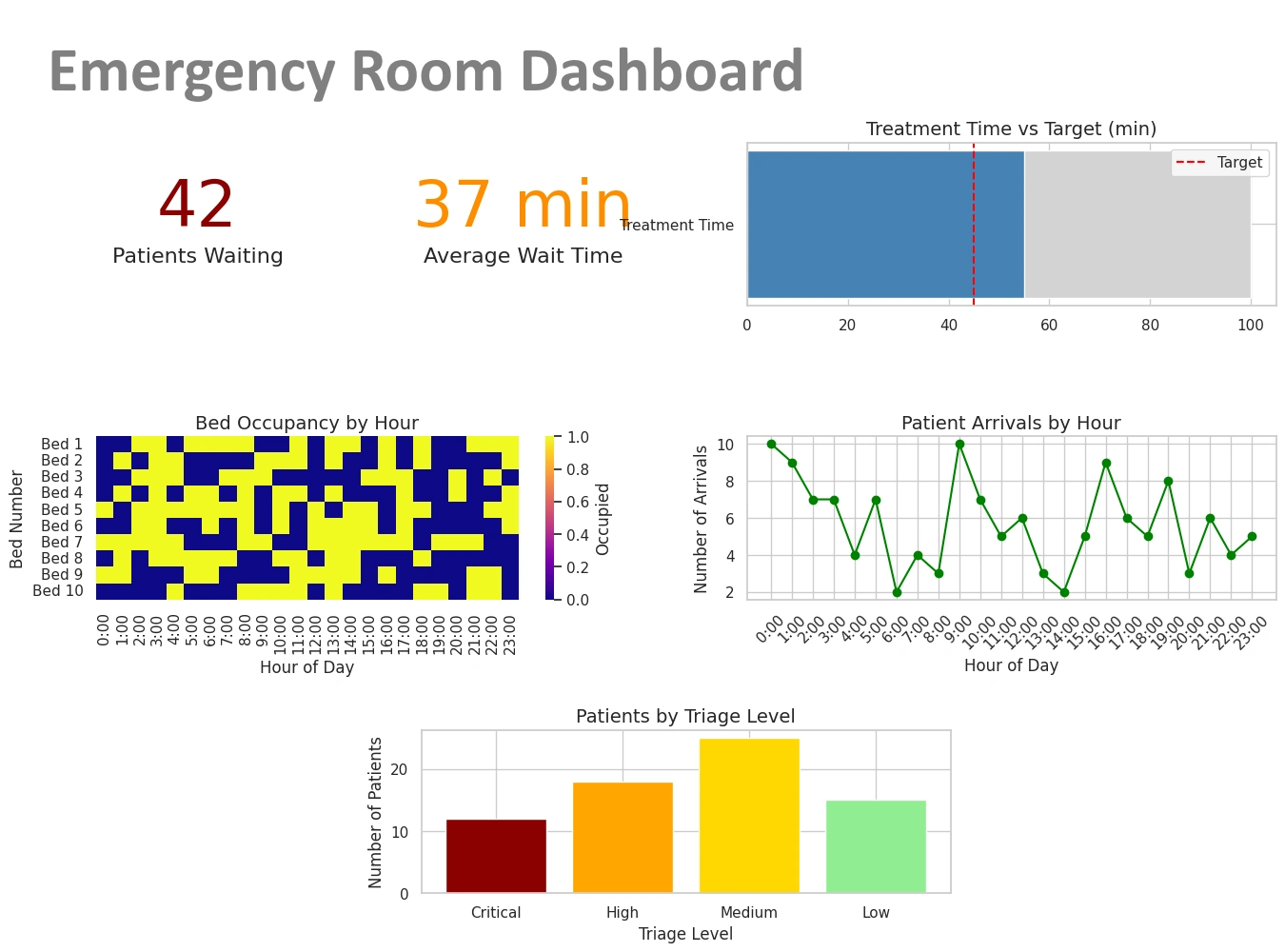
The new ER dashboard consolidated metrics that had previously lived in three separate Kibana dashboards: door-to-triage time, left-without-being-seen rates, bed occupancy by hour, and boarding duration for admitted patients. Seeing all of those figures in a single, refreshing view — designed by people who actually work in the department — changed how shift leaders made staffing decisions in real time.

Measurable Outcomes
Six months after full deployment, Riverside General reported meaningful improvements in several key ER performance indicators. Average door-to-physician time dropped by eleven minutes, attributed in part to faster identification of bottlenecks during peak hours. The rate of patients who left without being seen decreased by nearly a full percentage point — a significant figure in a department that sees more than 180 patients on a busy day.
Perhaps more importantly, the hospital's quality improvement team gained the ability to run their own ad hoc reports on ER throughput without waiting for IT involvement. That independence has accelerated their review cycles and made it easier to present data-backed proposals to hospital leadership.
Riverside General's experience is not unique. Across healthcare, organizations that adopted Elasticsearch-based tools for operational monitoring are discovering that the flexibility those tools promised often came with hidden costs in user adoption and cross-functional accessibility. As clinical data grows more complex and the demand for real-time decision support intensifies, the case for purpose-built business intelligence platforms — ones designed for the people making decisions, not just the people managing infrastructure — continues to strengthen.
For Riverside General's emergency department, the switch was less about abandoning a tool and more about finally finding one that fit the way their team actually works.

Explore More About Dashboard Reporting
Dashboard Scripting - InetSoft's dashboard software allows users to script their data so that trends and patterns can quickly be identified. In certain dashboard applications, you may require a greater degree of control and flexibility than the basic Viewsheet components can provide. For example, you may want to hide certain dashboard components when a particular condition occurs, such as when the user's selections return no data. Likewise, you could present a specific alert message to the user if a key indicator does not meet its target. In a Viewsheet, scripts are attached to individual components, and control the properties (e.g., visibility, color, etc.) of the host component. For example, you can attach a script to a gauge component in order to show or hide the gauge based on certain conditions. Viewsheets do not have a global script scope; rather, every script is attached to a particular component...
Dashboard Server Environment - The dashboard server environment provides with maximum self-service capabilities. InetSoft's dashboard software is a flexible and powerful performance monitoring solution. The 'Repository Servlet URL' property specifies the URL used to access the repository servlet, and must match the actual URL used by the application server. For most application servers, the URL can be relative or blank, so the servlet builds its own URL. However, some application servers may not return the correct URL to the servlet. In this case, the 'Repository Servlet URL' property must be used to supply the correct URL. The replet repository is the main server component, responsible for handling all report requests from a client. Select the 'Configuration' > 'Server' node under the Server tab to choose one of the repository server options: • Servlet with Embedded Report Engine: Servlet implementation of the repository for web-based reporting. • Servlet with server clustering: Servlet implementation of the repository for a load-balanced clustering. • RMI Server: RMI server object implementation of the repository. • CORBA Server: CORBA server object implementation of the repository. The 'Servlet with embedded report engine' is the most commonly used configuration of the reporting engine. In this configuration, clients access the report repository via a servlet which has the reporting engine embedded within it. With this configuration, users can view all the reports and Viewsheets within a web browser (Report Portal)...
Dashboard Server Software - StyleBI is a server-based enterprise visualization tool. This means that, unlike most of the competition, Style Intelligence is not a desktop-bound program. With that distinction comes many advantages: Desktop tools: need to connect directly to the data. Style intelligence allows users to connect remotely. develop a single view of the data to be published. StyleBI provides automatic data security, showing appropriate data based on the user. use either a single dataset or have pull multiple sources together using script. Style intelligence provides end-user data mashup, allowing users to combine many data sources through a simple drag-and-drop interface. are targeted narrowly at analysts who have advanced enough skills to handle the configuration and scripting necessary to build a dashboard. StyleBI: allows users to connect to data sources remotely. provides automatic data security, showing appropriate data based on the user. provides end-user data mashup, allowing users to combine many data sources through a simple drag-and-drop interface. is accessible by a broad range of users due to it's user interface and data mashup engine...
Dashboard Slider Properties - By having full control over the dashboard slider properties you can fully customize the information displayed in your visual analysis data. The Range Slider component’s ‘Properties’ dialog box provides General, Data, and Advanced tabs. The next sections discuss the component-specific properties available under these tabs. The Data tab in the ‘Range Slider Properties’ dialog box provides the following Range Slider-specific properties: Single Value - Filter data based on one field from the Data Block (default). Only numeric and date type fields are supported. Composite Value - Filter data based on the composition of two or more fields from the Data Block. The ‘Composite Value’ option allows you to filter data using the composite of two or more columns of any type. All data types are supported. To set the composite value option, follow the steps below. 1. Right-click on the Range Slider, and select ‘Properties’ from the context menu. 2. Under the Data tab, select ‘Composite Value’. 3. Select two or more columns to form the composite values for filtering. Click OK...
Dashboard Software Calendar - A dashboard software calendar allows you to compare information side by side according to month, day and time thereby facilitating information queries. A Calendar allows you to select data by time range, measured in weeks or months. It also facilitates comparative aggregation, for example, the side-byside comparison of total quantity purchased during the months of Dec. 2005 and Dec. 2006. To create a calendar, follow the steps below: 1. Drag a ‘Calendar’ element from the Component tree onto the Viewsheet grid. This creates a new Calendar element. 2. Drag a date column from a Data Block (on the tree) and drop it onto the calendar. This links the calendar to the data represented by the selected date field. The Calendar component’s ‘Properties’ dialog box provides General, Data, and Advanced tabs. The next sections discuss the component-specific properties available under these tabs. The General tab in the ‘Calendar Properties’ dialog box provides only the common general properties...

Dashboard Software Components - Dashboard software components are built in visual tools that allow you to modify data in innovative ways that move far beyond the days of plain old numbered grids. Graphical output components display summarized data using a familiar measurement device (Gauge, Cylinder, Thermometer, Sliding Scale, etc.). The highly graphical nature of these objects makes them ideal candidates for presenting key indicators. Like data views, graphical output components are controlled by selection and input components. Thermometers, Cylinders, Scales, and Gauges are identical in terms of data binding and functionality. They display a summarized value for a single column in a Worksheet Data Block. These output components differ only in appearance. To add an output component to a Viewsheet, follow the steps below: 1. Drag the desired component from the Component tree into the grid. 2. Drag a column from the Data Block (at the top of the Components tree), and drop it onto the output component. This binds the output component to the Data Block column, so that the component displays a summary of the values in that column...
Dashboard Software for Microsoft Access - InetSoft delivers intuitive dashboard software tailored to the needs of small and mid-sized businesses using Microsoft Access and other data sources. InetSoft offers two dashboarding solutions for the business user. StyleBI is InetSoft's complete business intelligence software for dashboards, reporting, and analytics. StyleBI is InetSoft's stand-alone dashboard software product. Both tools are equipped with a powerful blend of data analysis technology and sophisticated reporting techniques. Product features and capabilities include...
Dashboard Software for Network Managers - Are you looking for a good solution for NOC dashboards? InetSoft's pioneering dashboard application produces great-looking dashboards that cover the entirety of your network activity and performance. View a demo and try interactive examples. Get cloud-flexibility for your deployment. Minimize costs with a small-footprint solution. Maximize self-service for all types of users. No dedicated BI developer required. View a demo and try interactive examples...