Top 5 Data Discovery Software Vendors
Data discovery platforms allow analysts and business users to explore datasets interactively, model relationships, transform raw inputs, and drill into metrics without depending entirely on IT.
The strongest vendors combine visual exploration with governed modeling layers and scalable data pipelines.
Below is a technical review of five leading platforms, including InetSoft, evaluated across modeling, transformation, pipeline orchestration, semantic consistency, and drilldown capabilities.
1. InetSoft
InetSoft’s Style Intelligence platform focuses on interactive dashboarding and data mashup-driven analytics. Its architecture centers on a visual data mashup engine that allows users to combine disparate data sources — relational databases, cloud applications, flat files, and web services — into reusable analytic components. This approach minimizes the need for heavy pre-modeling before analysis begins.
Data modeling in InetSoft is pragmatic rather than deeply semantic. Users define joins, calculations, and aggregations directly within the mashup layer. While it does not enforce a centralized semantic modeling language, it supports hierarchical drilldown, calculated measures, and parameter-driven exploration inside dashboards.
Transformation capabilities include filtering, aggregation, blending, and computed fields within a browser-based interface. For organizations that prefer lightweight integration rather than full enterprise ETL orchestration, InetSoft provides sufficient pipeline functionality to support reporting and discovery workflows.
The platform’s strength lies in rapid deployment and interactive drilldown. Users can click through visual components to navigate hierarchies, filter contexts, and analyze outliers without rebuilding reports. This makes it particularly suitable for embedded analytics scenarios and operational dashboards where agility matters more than rigid governance layers.
2. Microsoft Power BI
Microsoft Power BI combines self-service analytics with enterprise-grade modeling. Built on the VertiPaq engine and tightly integrated with the broader Microsoft ecosystem, Power BI supports complex relational modeling, calculated measures via DAX, and reusable datasets shared across workspaces.
Its transformation layer, Power Query, enables robust data shaping through a functional query language (M). Analysts can ingest data from hundreds of connectors, clean and reshape it, and publish reusable dataflows. For larger environments, Power BI integrates with Azure services for orchestrated pipelines and incremental refresh strategies.
The semantic layer is embedded directly in its data model. Relationships, hierarchies, role-based security, and reusable measures provide governed consistency across reports. Drilldown is native within visuals, allowing hierarchical exploration and cross-filter interactions across report pages.
Power BI is particularly strong when organizations require centralized governance combined with distributed self-service. It balances ease of use with sophisticated modeling depth.
3. Tableau
Tableau emphasizes visual-first analytics. Now part of Salesforce, it is widely adopted for exploratory analysis and data storytelling. Its interface allows users to drag dimensions and measures into visual canvases, encouraging iterative discovery.
Data modeling in Tableau has evolved to include logical and physical layers, supporting relationships without requiring flattened joins. Tableau Prep extends transformation capabilities, enabling visual data preparation workflows outside the core visualization interface.
Pipeline orchestration typically relies on external ETL tools or Tableau Prep Conductor within enterprise deployments. Tableau’s semantic structure is lighter compared to Looker or Power BI but includes metadata management, calculated fields, and parameterized logic.
Drilldown is one of Tableau’s defining features. Users can define hierarchies and navigate from summary dashboards to granular transactional views with smooth cross-filtering and interactive tooltips. The platform is well-suited for teams prioritizing exploratory depth and presentation clarity.
4. Looker
Looker, part of Google Cloud, differentiates itself through a code-defined semantic layer called LookML. Rather than embedding logic solely in dashboards, Looker centralizes metric definitions within version-controlled model files.
This approach enforces governance across an organization. Business logic — including measures, joins, access controls, and derived tables — is defined once and reused everywhere. Data modeling is therefore strong and developer-oriented.
Transformation and pipeline execution are generally delegated to the underlying cloud warehouse (such as BigQuery or Snowflake). Looker operates primarily as a semantic and visualization layer on top of these systems, executing live queries against them.
Drilldown is query-driven and dynamic. Users can pivot, filter, and explore underlying records directly from dashboards without leaving the interface. For organizations standardizing around cloud data warehouses and prioritizing metric consistency, Looker offers a highly governed discovery framework.
5. GoodData
GoodData provides a composable analytics platform designed for both internal BI and embedded analytics. It supports flexible deployment models, including multi-tenant cloud architectures.
Data modeling capabilities include logical data layers that define metrics, relationships, and reusable datasets. Transformation processes can be managed within the platform or integrated through external ETL systems.
GoodData supports orchestrated pipelines and API-driven automation, making it attractive for SaaS providers embedding analytics into their products. Its semantic layer ensures consistent metric definitions across customer-facing dashboards.
Interactive drilldown and slicing are available across dashboards, with support for filtering, segmentation, and contextual analysis. Its developer-friendly APIs further extend its discovery capabilities into custom applications.
Feature Comparison Grid
Embedded Mashup Analytics
Each platform reflects a different architectural philosophy. InetSoft prioritizes agility and embedded mashup analytics. Power BI combines enterprise modeling depth with accessibility. Tableau emphasizes exploratory visualization. Looker centers on semantic governance over cloud warehouses. GoodData balances embedded analytics with developer extensibility.
Selection should align with infrastructure strategy, governance requirements, and the desired balance between centralized control and analyst autonomy.

Impactful Unstructured Data Analysis - Using data visualization in an organization to monitor progress makes a big impact on unstructured data analysis. They picked up on this and started responding to the Twitter feeds about coming over to their store to actually acquire those same goods that were out of stock in the first one. They were also suggesting other products that they may buy. I mean this is sentiment analysis. There was a lot of negative sentiment against this one store or one chain, and it came back, and it's not something that really comes up in metrics. It's Big Data. It's unstructured data. It's Twitter feeds. It's real time data, and they are making decisions for the customer, and that pulls revenue back to the second chain, and it was measurable revenue. That’s the kind of impactful decision making that can go on when I can actually visually start to look at the impact of what unstructured data means to my bottom line...
Increase the Data-Ink Ratio in Your Visualization - Another way you can increase the data-ink ratio your visualization is by eliminating some or all of the gridlines. So I’ve had a lot of customers say, “We want this report to look like our existing report and our existing report was done in Excel. So, put all these lines, horizontal and vertical lines on it, and that’ll help. It’ll be easier to line up. It’ll look like graph paper. Well, gridlines are not data. Gridlines are metadata. They help to show some context about where your data points are, but it’s the point’s data themselves that are actually representing the data. Gridlines do not represent data. So, we can reduce that data-ink ratio by reducing the number of gridlines, by lightening the gridlines—instead of making them black, make them gray. And this is what spreadsheet makers figured out a long time ago. The very first versions of Excel, and Lotus, and was it Borland Quattro Pro? Those gridlines were black and after a version or two the software makes decided, “You know what? That black is the same color as the numbers inside those cells and yet the numbers are way, way more important than the gridlines”. So, look at Excel today...
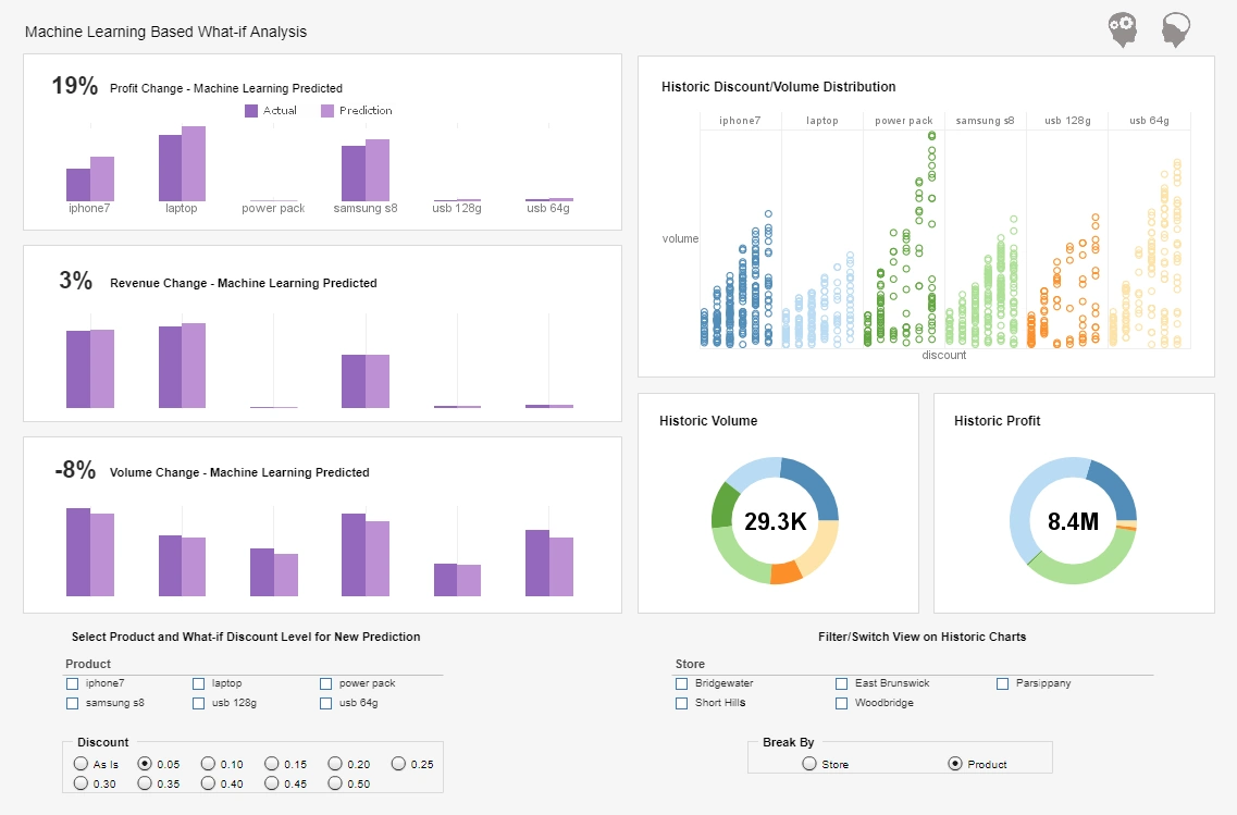
Interactive Visual Analysis Example - The Interactive Visual Analysis Example below portrays the rich and interactive nature of InetSoft's dashboard software. A web-based analytical dashboard, the chart below uses InetSoft's own Data Block patent technology for data mashup purposes, serving as an effective way to analyze multi-dimensional data. A powerful and effective capability of InetSoft's dashboard solution, demonstrated below, is the simple sorting mechanism that users have control over. Filtering and sorting is easily done with the radio buttons and color coordinated bar chart that includes an array of categories, causes of death, gender, age, and race. Users can take another step and add more charts, data sets, and/or filtering options for further analyzation. InetSoft's solution is geared towards a user-friendly interface that includes an arsenal of useful tools when creating, monitoring, adjusting, or analyzing. As a pioneer in business intelligence, InetSoft offers only the best tools for dashboard, report, or visual creating while focusing on user- friendliness, user-interactivity, and user objective...
Intro to Data Visualization and Machine Learning - In this digital era where troves of data are being collected every second, it is important to utilize tools and techniques that help understand this data if it is to inform better business decisions. Machine learning is a branch of artificial intelligence that is being widely used in analyzing data using algorithms to learn from the data. It then makes intelligent suggestions and predictions based on the data collected. Integrating data visualization with this data analysis technique brings in a suite of tools that help in finding a qualitative understanding of these massive amounts of data. Read on to understand how tapping into the possibilities of machine learning data visualization is important in improving data analytics...

Introduction to Data Visualization in Business Intelligence - Data visualization, according to Wikipedia, is the study of the visual representation of data. A closely related term, Information visualization, is defined as: visualization is a process of transforming information into a visual form enabling the viewer to observe, browse, make sense, and understand the information. In the context of Business Intelligence (BI), data visualization is applied in two ways. First, data visualization is a discipline that covers a complete theory of how to visually represent data. The concepts and systems can be applied in the design of visual interfaces for communicating information...
Introduction to Data Visualization Software - Like Object Oriented programming, while it’s possible to do without explicit language support, it’s much nicer if the programming language provides explicit support such as classes and inheritance. The same is true with data visualization. It is certainly true that most graphs could be created with a minimum set of graphing features, such as those available in Excel, it is very helpful if the software tool has many of the advanced graphing functions built-in. The following is a visualization of housing data...
In-Memory Beneficial Effects on Visualization - InetSoft's BI software employs a combination of in-memory database technology and disk-based access to scale up for big data applications using commodity-priced servers. InetSoft's proprietary term for this approach is 'Data Grid Cache.' Optimized, compressed indexes are loaded into memory while the data can either remain on the hard disk or be loaded in chunks into memory based on available memory and the data needed for a given dashboard or visualization. The data can either be accessed in real-time from a data warehouse, operational data store, or a mashup of several sources, or it can be configured to be cached on disk by InetSoft's Style Intelligence server application at specified time intervals. Incremental updates can be added on a scheduled basis or on demand, and cache re-writes can be scheduled for off-peak times...
Key Benefits of This Visual Reporting Solution - That’s one of the key benefits of this visual reporting solution. It breaks down the cycle of pain, and as in this case, a couple of people can bounce ideas around. This could be a manager. It happens all the time a manager is going into a meeting with his bosses or the board and needs to be able to answers on the fly. With this kind of tool, he or she has got the all data there so they can answer their questions on the fly with a whole set of data in memory. To summarize and conclude this portion of the demonstration, there’s five test of problems that we see visual reporting and analysis apply to. The first is list reduction which you saw several examples of that, certainly the university giving example on prospect identification. Next is portfolio analysis, the airline example, where you try to understand out of this portfolio of flights where do I need to focus. This could also be assets, people, projects, or proposals. We’re doing some work that identified performance, who are high paid low performers in a team of a couple of hundred thousand in a large company. It’s great for that because you can see what makes up that group. That gets into outlier detection where you found anomalies and unexpected behaviors, customer behaviors, staff performance, project progress, or medical claims issues, for instance...

Large Library of Interchangeable Visualizations - In the airline demo, we used a map and a graph matrix. StyleBI has a large library of interchangeable visualizations including bubble charts, area charts, heat maps, line charts, bar charts, and many others, and they are all designed to help you get the answers you need. Over time, we will continually add to this visualization library to deliver even more insights. With StyleBI, getting to the answer is simple and fast. As you saw in the demo, it's really a five step process. First, you pick your visualization type, second, you select the data objects, and third, you simply drop those into the analytical drop zones, and the data begins to appear. You conduct your analysis literally at speed of thought. Four, you can filter the data to refine your analysis to see just the information you want and five, your visualizations appear and change as you modify the analysis. It all happens so quickly that you can change your mind, rearrange the data, change your visualization and filter data all this without help from IT. The Style Intelligence experience is very empowering. Business people will finally feel like they are in control of getting the answers they need when they need them. StyleBI can be used to analyze data from any database. A business person can point StyleBI to any set of data and begin exploration. That data can be in a database. It can be in an OLAP cube, or just simply in an Excel spreadsheet...
Learning to Effectively Use Data Visualization - How can you use data visualization to your advantage? Knowing how to use data visualization effectively can only produce the best results. It actually comes to my third point about collaboration. So now you take this, and a couple of examples. We have an account where one of the managers was in a board meeting recently and had a bunch of different business trends up on a visual dashboard on the overhead projector. So the board can visually see the stories and patterns in a way that would be hard in their old binder books. But then they can ask questions and on-the-fly, in the meeting, the manager can click on things, the entire thing updates, and so they have this engaged drilldown discussion about why has this thing gone up like this. It’s unexpected. Okay this went up. Why did that go up? And this whole thought thread gets followed. And the board ends up with a much deeper understanding. The management team gets feedback. And before all this technology, that would have been a question out of the binder which would have gone back, somebody would have done something with the data, researched it and come back with an answer a week or two later. By then the board’s forgotten the question, and it's just moved on. So this coming together has just enabled these really fast collaborative facts-based decisions like that that just are incredibly powerful for an organization to be able to do...