Using Reporting Dashboards from InetSoft
Are you looking for examples of using reporting dashboards? Since 1996 InetSoft has been making BI software that is easy to deploy and easy to use. Build self-service oriented dashboards and visual analyses quickly. View a 2-minute introduction video and try online for free...


Why InetSoft?
InetSoft's reporting dashboard application is easy enough to be:- Deployed in just weeks
- Learned by end users with minimal training
- Used by any executive without the aid of IT
- Adaptable to changing data and business needs
- Used for data exploration through visualization
- Capable of maximum self-service
- Attract the attention of executives
- Meet the demands of power users
- Scale up for organizations of any size
Evaluate Style Scope from InetSoft. It's Easy. Agile. & Robust.
Register for more info and free software software
About InetSoft
Since 1996 InetSoft has been delivering easy, agile, and robust business intelligence software that makes it possible for organizations and solution providers of all sizes to deploy or embed full-featured business intelligence solutions. Application highlights include visually-compelling and interactive dashboards that ensure greater end-user adoption plus pixel-perfect report generation, scheduling, and bursting. InetSoft's patent pending Data Block™ technology enables productive reuse of queries and a unique capability for end-user defined data mashup.
This capability combined with efficient information access enabled by InetSoft's visual analysis technologies allows maximum self-service that benefits the average business user, the IT administrator, and the developer. InetSoft was rated #1 in Butler Analytics Business Analytics Yearbook, and InetSoft's BI solutions have been deployed at over 5,000 organizations worldwide, including 25% of Fortune 500 companies, spanning all types of industries.


Do Date Comparisons in a Dashboard
Charts and Crosstabs provide an easy way to compare data across different date ranges. For example:
- Compare this quarter's sales to the previous two quarters
- Compare this January's sales to each of the past five January's sales
- Compare each day last week to each day this week, showing percent change
To perform such date comparisons in a Chart or Crosstab, follow the steps below. NOTE: The Chart or Crosstab must contain a Date-type field. Date comparisons use color to distinguish date groups unless the original chart already uses color; in this case, the axis is used to distinguish date groups.
1. Press the 'More' button in the top corner of Chart or Crosstab, and select 'Date Comparison'.
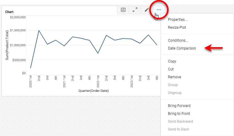
This opens the 'Date Comparison' dialog box.
2. Optional: To apply an existing date comparison from another Chart or Crosstab in the Dashboard, enable the 'Share Date Comparison With' option, and choose the component from which to share the date comparison. Then press 'OK' to exit the dialog box.
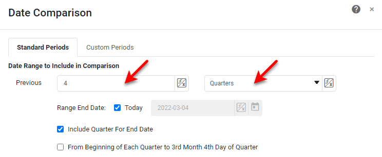
3. Under Date Range to Include in Comparison, set the span of time to consider in the comparison. You can do this by specifying either a number of previous standard periods to compare (e.g., "compare previous 5 years") or by specifying a set of custom periods to compare (e.g., "compare Jan. 5 through Feb. 10 with Nov. 5 through Dec 10").
Compare Standard Periods
a. Select the 'Standard Periods' tab if not already selected.
b. Enter the number of past periods to compare and the type of period. For example, enter '4' and select 'Quarter' to compare data from the past four quarters.
NOTE: You can also use Form components to set the number and period by pressing the 'Value Type' button and selecting the 'Variable' or Expression' option. See End-User Property Control for more information.
c. Specify the 'Range End Date'. This is the date that determines the most recent data to include in the comparison. Select 'Today' to use the current date as the cut-off, or deselect 'Today' and enter an arbitrary date as the cut-off. Optional: To include the end date period (the period in which the selected 'Range End Date' occurs) in the comparison, enable the 'Include Year/Quarter/Month/Week For End Date' option. Otherwise, the comparison will include data up to, but not including, the end date period.
d. Optional: Select 'From Beginning of Each Year/Quarter/Month/Week to … of Year/Quarter/Month/Week ' to include data only up to the 'Range End Date' (i.e., the same number of days) for all selected periods. For example, if the 'Range End Date' is Jan 21, and you select "previous four quarters" and enable 'From Beginning of Each Quarter to 1st Month 21st Day of Quarter', the current and previous four quarters will each only include the first 20 days of the quarter.
Compare Custom Periods
a. Select the 'Custom Periods' tab if not already selected.
b. Enter the desired period ranges by typing the dates in the indicated format or by pressing the 'Select a Date' button.
You must specify at least two ranges. To add additional ranges, press the 'Add' button. To remove a range, press the 'Remove' button next to the range. NOTE: You can also use Form components to set the dates by pressing the 'Value Type' button and selecting the 'Variable' or Expression' option. See End-User Property Control for more information.
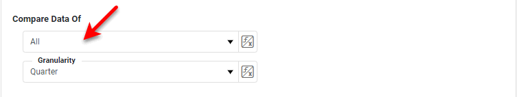
4. Under Compare Data Of, use the menus to set the desired comparison. You can perform the following three types of comparisons:
Compare All Periods in the Date Range
To compare all periods within the date range (e.g., all quarters, all months, etc.), select 'All' from the left menu. From the 'Granularity' menu, select the periods that you want to display on the Chart.
NOTE: You can also use Form components to set these options by pressing the 'Value Type' button and selecting the 'Variable' or Expression' option. See End-User Property Control for more information.

More Articles About Using Dashboards
Alternative to Apache Superset Dashboards - Are you looking for a good alternative dashboard solution to Apache Superset InetSoft's pioneering dashboard reporting application produces great-looking web-based dashboards with an easy-to-use drag-and-drop designer. Get cloud-flexibility for your deployment. Minimize costs with a small-footprint solution. Maximize self-service for all types of users. No dedicated BI developer required. View a demo and try interactive examples...
Budget Overspend Monitoring Dashboards - StyleBI is the easiest, most agile and robust platform to help you to quickly respond to over spending and budgeting issues before they becomes a problem. Overview dashboard: Use the financial visualization tools to track how your company is spending and what your supplier is doing to keep the goods rolling in...
Catalog of Department BI Dashboards - Looking for department BI dashboards? InetSoft's industry pioneering BI platform can support any department's business intelligence needs. View examples in the showcase, read articles about its capabilities below, and request a personalized demo. These customer executives make sure that every customer can present their queries and problems before the company. Most of the work takes place over the telephone, and in the majority of the cases, things get resolved easily...
Can I Compare Dashboards? - Looking to compare dashboard options? Start by viewing demos for each one. InetSoft offers Web-based dashboard software that is easy to use and quick to deploy. Read customer reviews. See examples. InetSoft has created three free visualization tools that offer productivity to business users and Web developers as well as provide a way to evaluate some of the technology included in the company's commercial business intelligence software for interactive dashboards, visual analysis, charting, and reporting...

Choosing Chart Types - Specific charts are good for different purposes. The general rule of thumb is that different kinds of analysis come from different charts. InetSoft's StyleBI allows advanced visualization, like waterfall, bullet and bubble charts, multicharts, such as line and bar charts together in the same graphing area, and even complex national or global maps and heat mapping...
Company Resource Planning Dashboard - Resource planning is an invaluable task that is a requisite undertaking in all industries. InetSoft's StyleBI makes resource planning far easier than in the past with interactive dashboards, embeddable reports, and a small Java footprint. View the example below and take the first step toward smart resource planning. You can apply conditional formatting to table columns, images, text elements, crosstab tables, and charts, so that the element formatting changes based on the data bound to the element. These conditional formats are called highlights. They are very useful for calling attention to an element when its associated data meets (or fails to meet) some specified condition...
Dashboard Solution for Higher Education - Universities and higher education institutions are typically thought of as places where information and data disseminate from. However, from a business intelligence perspective, there is also a large influx of data at these types of institutions. For example, universities collect and store datasets regarding student dem ographics, academic performance, housing status, meal plans, academic departments, class enrollment levels, and other important information...
Good Qlik Competitor - InetSoft offers a blank canvas to completely customize visualization design, whereas Qlik offers fewer options for controlling look and feel. Qlik's visualization capabilities mainly focus on output types like charts and tables. InetSoft's capabilities are comparable and add more options with a free-form dashboard layout. InetSoft includes a far richer input component selection such as a selection tree and calendars that allow on-the-fly data range comparisons. For an example of greater design options, the color palettes of data plotted in charts are limited. Data range coloring is limited to a couple of choices, whereas InetSoft permits any colors to be set as endpoints and the midrange is automatically generated...

InetSoft's Real Time Dashboard Builder - Are you looking for a good tool to build real time dashboards? InetSoft's pioneering BI application produces great-looking web-based dashboards with an easy-to-use drag-and-drop designer. Get cloud-flexibility for your deployment. Minimize costs with a small-footprint solution. Maximize self-service for all types of users. No dedicated BI developer required. View a demo and try interactive examples...
Option for DevOps Dashboard Tool - Are you looking for a good DevOps dashboard tool? InetSoft's pioneering dashboard reporting application produces great-looking web-based dashboards with an easy-to-use drag-and-drop designer. Get cloud-flexibility for your deployment. Minimize costs with a small-footprint solution. Maximize self-service for all types of users. No dedicated BI developer required. View a demo and try interactive examples...
Pioneering Intervals Dashboarding Tool - Looking for a good solution for Intervals dashboarding? InetSoft's pioneering BI application produces great-looking dashboards that mashup time tracking data with other enterprise data sources. View a demo and try interactive examples. Dynamic dashboarding is the next giant leap in the evolution of Business Intelligence Software. View the example below to learn more about the Style Intelligence solution...
Powerful Onboard Dashboard Controls - Users can flip through the many different views using simple but powerful onboard controls. Navigation is done using selective controls like tabs, drop down boxes, radio buttons, and sliders that are accessed directly on the dashboard screen. Workers instinctively know how to use a dashboard app, they just begin clicking. InetSoft dashboards can contain standard tables and graphs of data, but they also be made even more powerful through the use of advanced visualizations like heat maps, animated bubble grafts, micro charts, gauges and bullet charts...
Program for Report and Chart Building - Looking for a good report and chart building program? InetSoft's pioneering dashboard reporting application produces great-looking web-based charts reports. View a demo and try interactive examples. To create its comparison of InetSoft StyleBI and Analyzer, analyst firm G2 Crowd compiled reviews and ratings done by independent users of the two BI vendors...
Reporting Dashboards for the PMO Office - Looking for a good PMO reporting dashboard application? InetSoft is a pioneer in self-service dashboarding and offers an easy tool for project management. View a demo and try interactive examples. However, the dashboards must be able to go beyond core project management data to give a holistic view of all factors that can impact on-time, on-budget delivery...

Sparkline Charts Definition -A sparkline is a small line chart, usually with axes or coordinates removed. The point of styling a line chart this way is to present the general shape of the data's variation over time, in a simple and highly condensed fashion. Sparklines are small enough to be embedded among text, or are often grouped with several other sparklines in a line or grid. Unlike a typical chart, which often intends to show the maximum amount of information, sparklines are created to be succinct, and memorable in some measurement. Common candidates for sparklines are temperature or stock market price...
This Year's Top Dashboard Options - Looking for the top dashboard options? InetSoft is a pioneer in business intelligence offering a dashboard tools that are easy to set up and use. View a demo and try interactive examples. This means storing and compiling data and producing readable graphs and charts in a format that conveys meaningful patterns...