Reporting Software Chart Examples
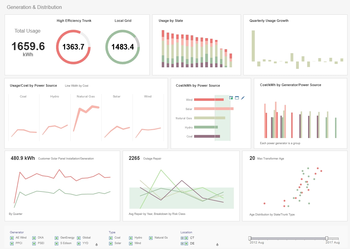
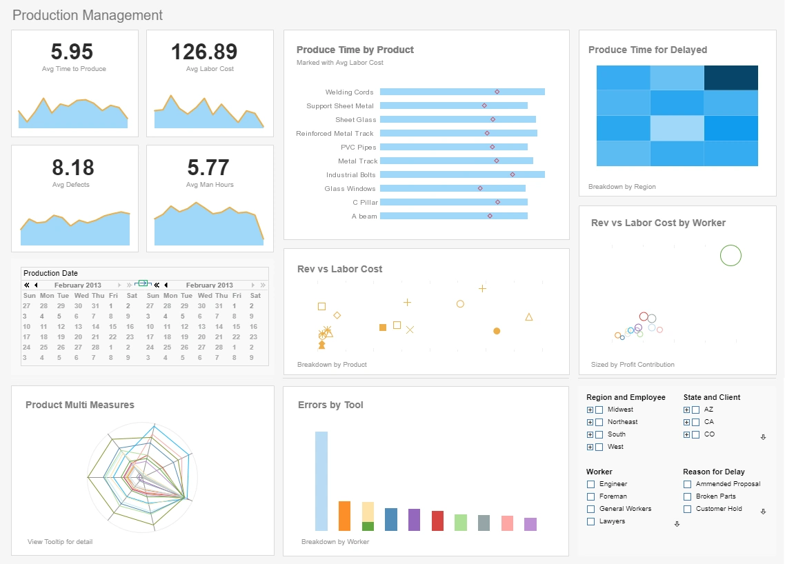
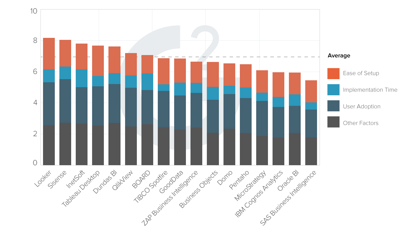
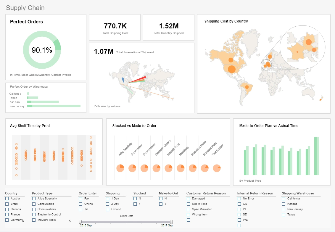
Have a look at several chart type examples made possible with InetSoft's Web-based reporting server software. Run the application on-premise or hosted by InetSoft to deliver fast, interactive charts to all devices. A free evaluation is always available with personalized mentoring to get up and running quickly.
Register for more information and a personalized demo
About InetSoft
Since 1996 InetSoft has been delivering easy, agile, and robust business intelligence software that makes it possible for organizations and solution providers of all sizes to deploy or embed full-featured business intelligence solutions. Application highlights include visually-compelling and interactive dashboards that ensure greater end-user adoption plus pixel-perfect report generation, scheduling, and bursting. InetSoft's patent pending Data Block™ technology enables productive reuse of queries and a unique capability for end-user defined data mashup.
This capability combined with efficient information access enabled by InetSoft's visual analysis technologies allows maximum self-service that benefits the average business user, the IT administrator, and the developer. InetSoft was rated #1 in Butler Analytics Business Analytics Yearbook, and InetSoft's BI solutions have been deployed at over 5,000 organizations worldwide, including 25% of Fortune 500 companies, spanning all types of industries.

Precautions and Safeguards for Enterprise Reporting
When you develop reports for an enterprise deployment, you should take precautions to restrict user actions that might negatively affect server performance. The following are some examples of potential problems:
- Most reports contain certain parameters that can be specified by the user at runtime. However, a user might unwittingly set a combination of parameters that retrieves a very large number of records, which could impact database performance.
- Users can create and modify reports using Ad Hoc reporting tools, which include the capability to modify filtering conditions. Again, a user might unwittingly change or remove a filter in such a way that the report retrieves an excessive number of records.
- Many reports make heavy use of scripting, and user modification of such reports (using the Ad Hoc tools) can have undesirable results.
To prevent these kinds of potential problems, consider taking the following precautions when you design your reports.
Limiting the Maximum Number of Rows
Set the 'Maximum Number of Rows' option in the Data Options tab of a component 'Properties' dialog box to limit the number of rows returned by the query. This limit overrides all other maximum settings defined in Style Studio or Enterprise Manager.
Setting a Query Timeout
Set the 'Query Timeout' option in the Data Options tab of a component 'Properties' dialog box to specify the amount of time (in seconds) allowed for query execution. If no response is received from the database within this time, the reporting engine will attempt to cancel the execution of the query by the database, and will then proceed to complete report execution. (It may not be possible to cancel the query in all cases.)
Limiting the Maximum Number of Pages
Specify a value for the 'Max Number of Pages' option in the 'Report Properties' dialog box to restrict the number of pages generated by the report engine. (See Setting Report Properties for more details.) Although you can also limit the number of records returned by a query (as discussed above), in some cases an Ad Hoc report user can make layout selections that nevertheless would generate a very large number of pages. Therefore, it is still valuable to set a maximum page limit. It is especially important to limit the maximum number of pages for prototype reports that will be used by the Ad Hoc Wizards.
Designing Reports for Section 508 Compliance
Consider the following points when designing reports for compliance with Section 508 of the federal Rehabilitation Act of 1973.
- Set the 'Tooltip' property for all Image elements.
- Set the 'Tooltip' property for all Form Elements.
- Do not convey information solely by using color. Augment color cues with other visual cues or text.
- Avoid complex table structures such as those created with Formula Tables. Complex tables may not be representable to users in an accessible manner.
- Avoid using components that cause the screen to flicker. For example, do not use animated images or background color changes with frequencies between 4Hz and 59Hz.
- Use Heading numbering in reports to comply with PDF export accessibility requirements.
- Set the 'Title' property for the report (under the Document Info tab of the 'Setting Report Properties' dialog box).
More Resources on Enterprise Reporting
Ad Hoc Chart Report How-To - The chart is a widely used element in data presentation. It presents data in a graphical form and is very useful to convey implications of certain data in a succinct manner. For instance, a corporate presentation may use a pie chart to show the market share of the industry leaders. This is more easily understood than a table of numbers. Choose 'Chart Wizard'. In Step 1, select 'Order details' within 'Orders'. Click 'Next' to proceed. In Step 2 you can select the desired chart style. Leave it as 'Auto'...
Cloud-flexible NOC Dashboard Software - Are you looking for a good solution for NOC dashboards? InetSoft's pioneering dashboard application produces great-looking dashboards that cover the entirety of your network activity and performance. View a demo and try interactive examples. Get cloud-flexibility for your deployment. Minimize costs with a small-footprint solution. Maximize self-service for all types of users. No dedicated BI developer required. View a demo and try interactive examples...
Consider InetSoft's Daily Dashboard App - Are you looking for a good daily dashboard app? InetSoft's easy-to-use dashboard reporting application produces great-looking web-based dashboards with an easy-to-use drag-and-drop designer. Get cloud-flexibility for your deployment. Minimize costs with a small-footprint solution. Maximize self-service for all types of users. No dedicated BI developer required. View a demo and try interactive examples...
Customizing Report Chart Elements - InetSoft's reporting software gives users full control of chart elements for the highest level of customization imaginable. View the example below to learn more about the Style Intelligence solution. A Chart is similar to a Crosstab, but displays the information graphically. Chart Properties To set chart properties, follow the steps below: 1. Right-click on the Chart element, and select 'Properties' from the context menu. This opens the properties dialog box...
Dashboards Combining Organic and Paid Web Traffic - Despite being marketing solutions offered by the same company, Google Ads and Google Search Console (GSC) are not unified at all. There is no way to make either of your Google dashboards simultaneously chart visitors from paid and organic search over time. With InetSoft's dashboard designer you have access to every single metric at every hierarchy, and you can mix and match them as desired...
Evaluate InetSoft's Maintenance Reporting Tool - Looking for a good maintenance reporting tool? InetSoft's pioneering reporting application creates great dashboards and reports for facilities maintenance with an easy-to-use drag-and-drop designer. View a demo and try interactive examples...
Examples from a Highly Rated Reporting Tool - Looking for a highly rated reporting tool? Since 1996 InetSoft has been delivering easy, agile, and robust business intelligence software that makes it possible for organizations and solution providers of all sizes to deploy or embed full-featured business intelligence solutions. View a demo and try interactive examples. InetSoft's comprehensive reporting platform can be used to create over 30 chart styles including bar, pie, line, curve, radar, waterfall, speedometer, pareto, candle, stock, stick, and bubble. These charts can be customized to show targets, provide desired x/y-axis formats and intervals, and even to show multiple datasets...
How to Make a Contour Chart in InetSoft - To create a Contour chart, follow the basic steps below. Prepare Your Data The data source for the chart (data block, query, or data model) should represent dimensions and measures as independent columns or fields, including a date column, as shown below. See Prepare Your Data for information on how to manipulate your data, if it is not currently in this form. (Note: A properly designed data model will already have the correct structure.)...
How to Write an Analytic Report - InetSoft is here to make your life easier. You don't need to master data science to learn how to build a visually compelling automated report. It takes only a few minutes to create an analytic report with InetSoft Connect your data sources Create a new report. Pick your desired key performance indicators (KPIs) InetSoft allows you to connect all relevant data in a single report...
Intelligent Graphical Reporting Solution - InetSoft Technology can help you. Style Intelligence, our flagship business intelligence tool, offers several powerful methods of performing visual analysis: Multi-dimensional charting - depict more than just two dimensions on a graph Drill-down reporting - interactive point-and-click data exploration Filtering - targeted data selection and viewing and more...
Necessity of Real-Time Reporting - Prior to the digital technological era we live in today, companies had ample amount of time to assemble, process, and package business data for executives. Businesses and their competitors moved at a slow steady pace, leaving sufficient time to calculate numbers and analyze reports. Today, with the development of high performance technologies and advanced communication channels, internal and external business affairs are moving faster than ever. Society has reached the point where annual budget cycles and monthly financial reports are no longer enough for investors. Fiscal information must now be available on-demand, at all times...
Reporting Tools in a Sales Environment - Users can use Style Intelligence to track employee performance, products, inventory, sales, returns, and countless other sales-related metrics stored in a database. Using the aforementioned dashboards, this data is displayed dynamically where it can be filtered and sorted to show information relevant to the interests of the user. While the chosen database may contain millions of data-filled rows, a dashboard will only display that which the user deems necessary...
Solve Reporting Problems - Style Report can solve all of these problems, offering a greater range of options such as flow and tabular report layouts --alternate layouts which treat elements and data differently than a traditional report layout. The Style Report flow layout is a format similar to a typical word processor document. When used in the report, it helps elements flow from one area to the next. The data can then be customized for the user's preference and can be put into columns or segmented areas...
Why Use a Candlestick Chart? - There are several benefits to using Candlestick charts, besides the fact that they are a standard representational device for many financial applications. They are easy to read and interpret: Candlestick charts are visually appealing and provide a lot of information at a glance. They can highlight trend reversals: Candlestick patterns, such as the "hammer," "inverted hammer," "doji," "double-bottom," and "double-top" can signal that a trend may be reversing. They can show the sentiment of the market: A candlestick chart can help traders understand whether buyers or sellers are in control of the market at a given time...
Wizard to Create Reporting Table - A table is a standard element used in most reports to display data. You can also group the data, and calculate subtotals and grand totals. There are also Crosstab and Section Wizards which provide similar results. Learn the difference between these three and understand when to use each. To create a report using the Table Wizard, follow the steps below: 1. Choose 'Table Wizard'. In Step 1, select 'Order details' within 'Orders'. Click 'Next' to proceed...
