Business Intelligence Design Examples
See below different examples of business intelligence designs made with InetSoft's easy to use, easy to deploy BI software.
Below are 30 of the most recently created web dashboard examples from the website image library.
Environmental Testing Dashboard
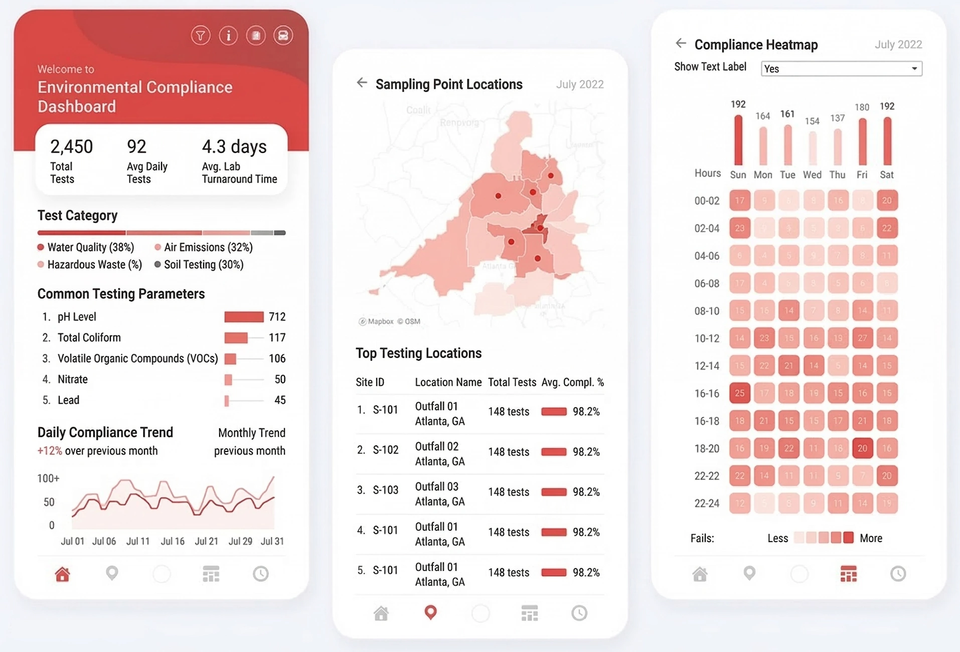
This dashboard design highlights environmental testing operations with a clear KPI-first layout. It combines trend visuals and operational summaries to surface quality risks quickly. Teams can use it to monitor throughput, compliance activity, and emerging exceptions in one place.
Enterprise Risk Incident Radar
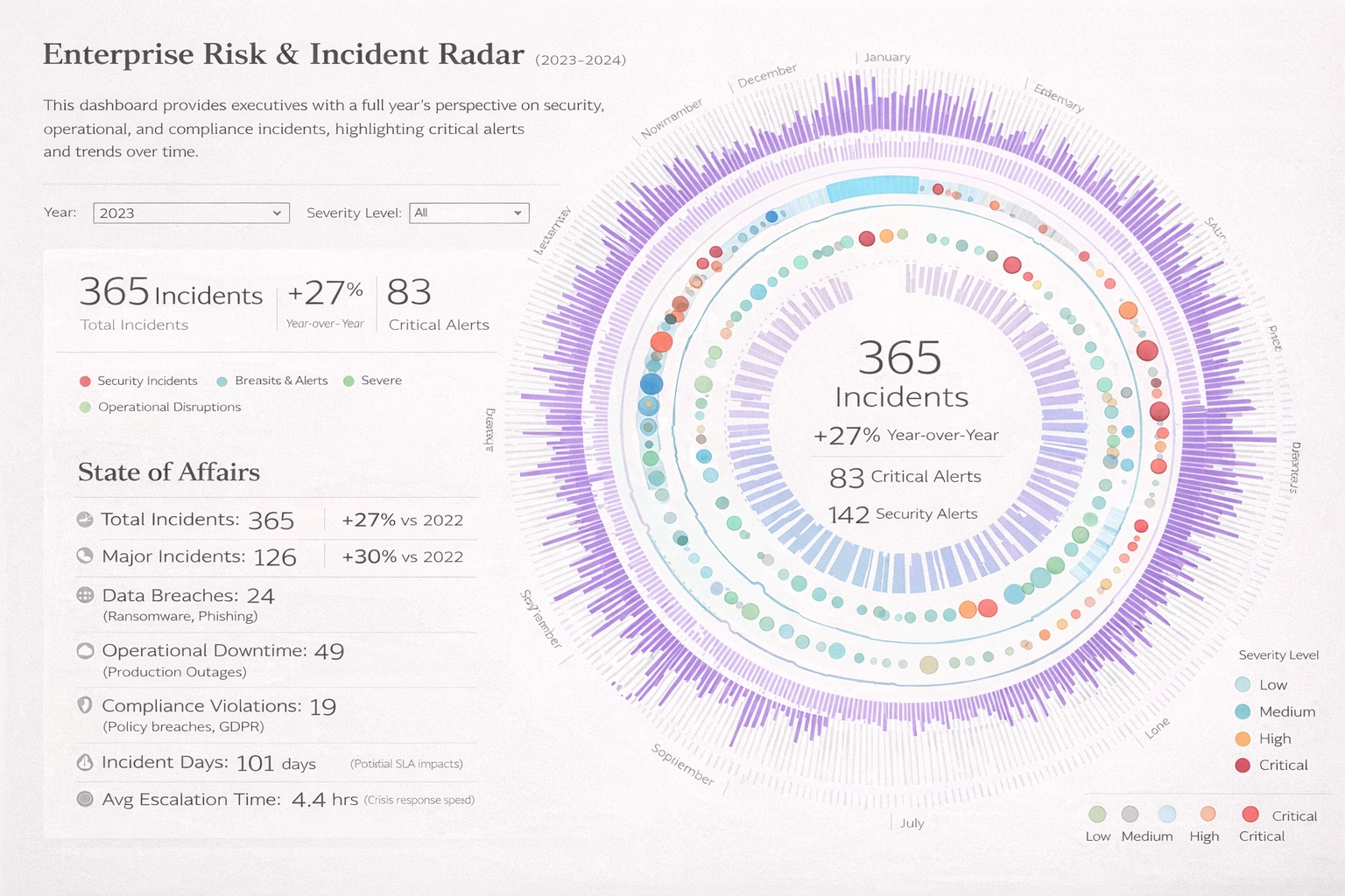
This dashboard design highlights incident exposure and enterprise risk concentration in one view. It combines radar-style summaries with operational context to prioritize mitigation actions. Teams can use it to reduce response time and improve risk governance.
Tulip Farming Dashboard
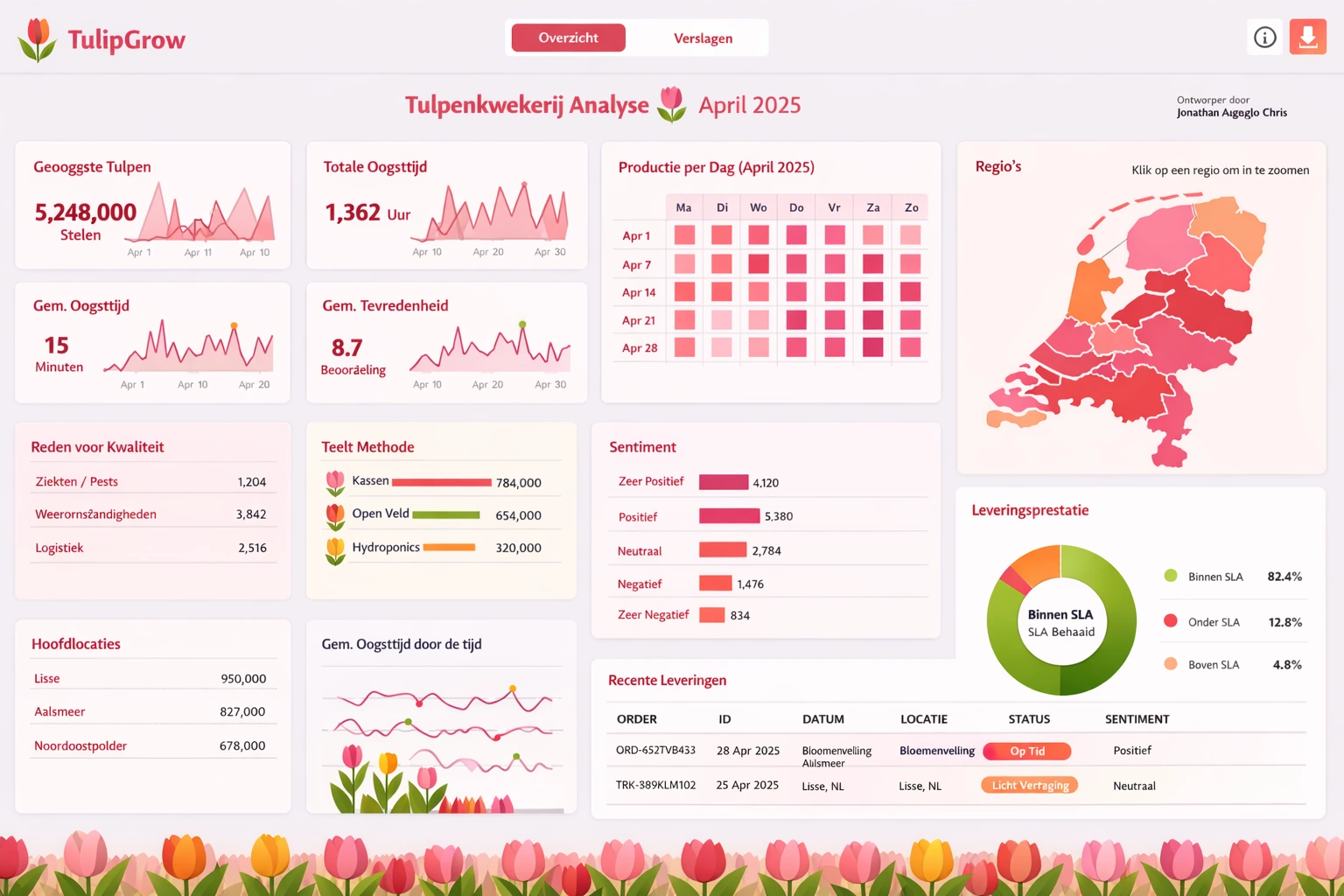
This farming dashboard design tracks production, quality, and seasonal planning metrics. It brings together yield indicators and operational KPIs for faster field-level decisions. Managers can balance resource use and output goals with better visibility.
Naval Dockyard Dashboard
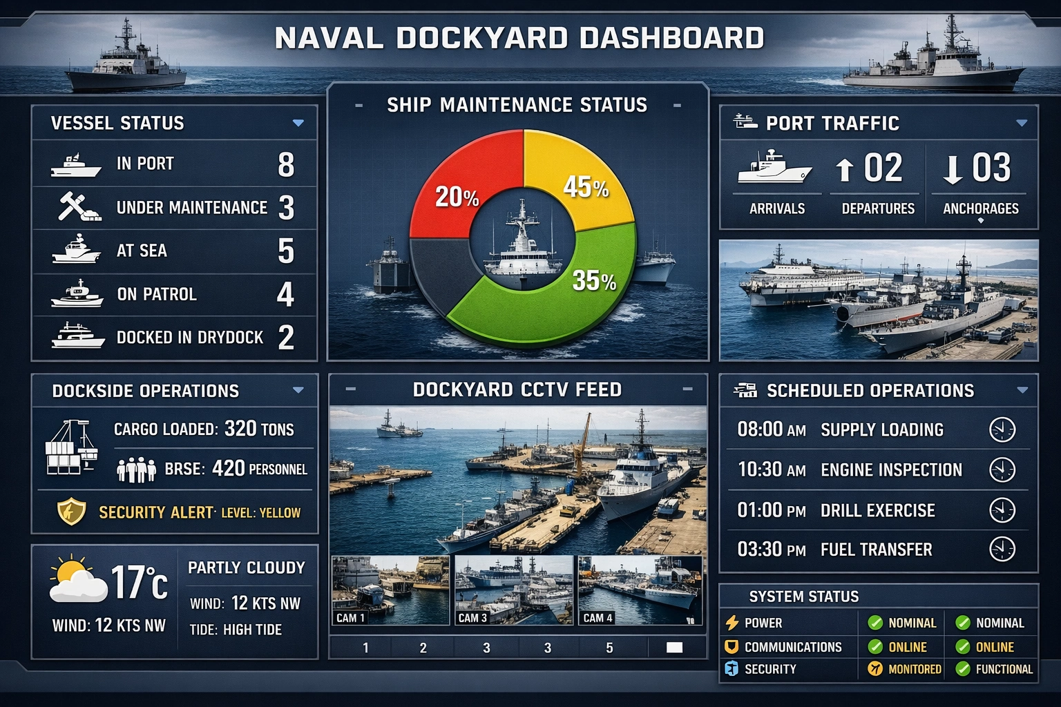
This dockyard dashboard design monitors maintenance schedules, fleet readiness, and throughput. It helps operations leaders coordinate workstreams across complex assets and teams. The layout supports rapid exception handling in mission-critical environments.
Flower Delivery Network Dashboard
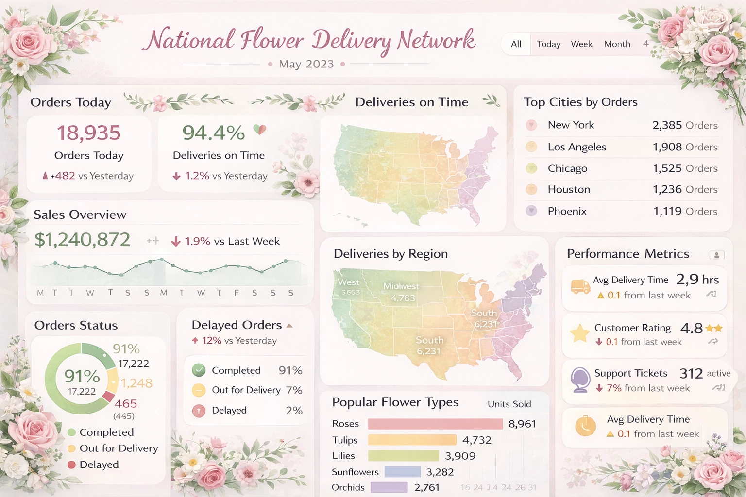
This logistics dashboard design tracks route performance, order status, and delivery timing. It provides dispatch teams with live insight into fulfillment bottlenecks and regional demand. Businesses can improve customer satisfaction by tightening delivery operations.
Capital Program Management Dashboard
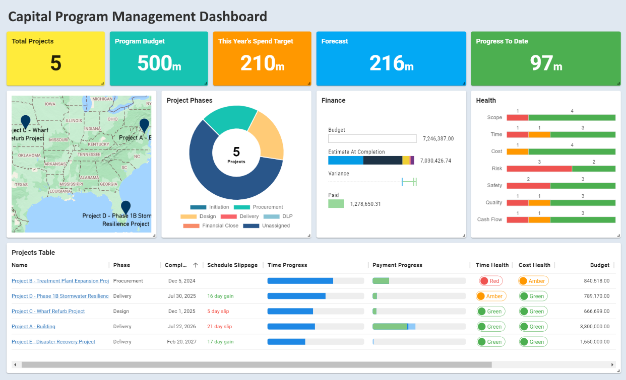
This program dashboard design gives stakeholders visibility into budget, schedule, and project risk. It surfaces key progress metrics across portfolios to support executive oversight. Teams can spot delays early and allocate resources more effectively.
Data Risk Analytic Dashboard
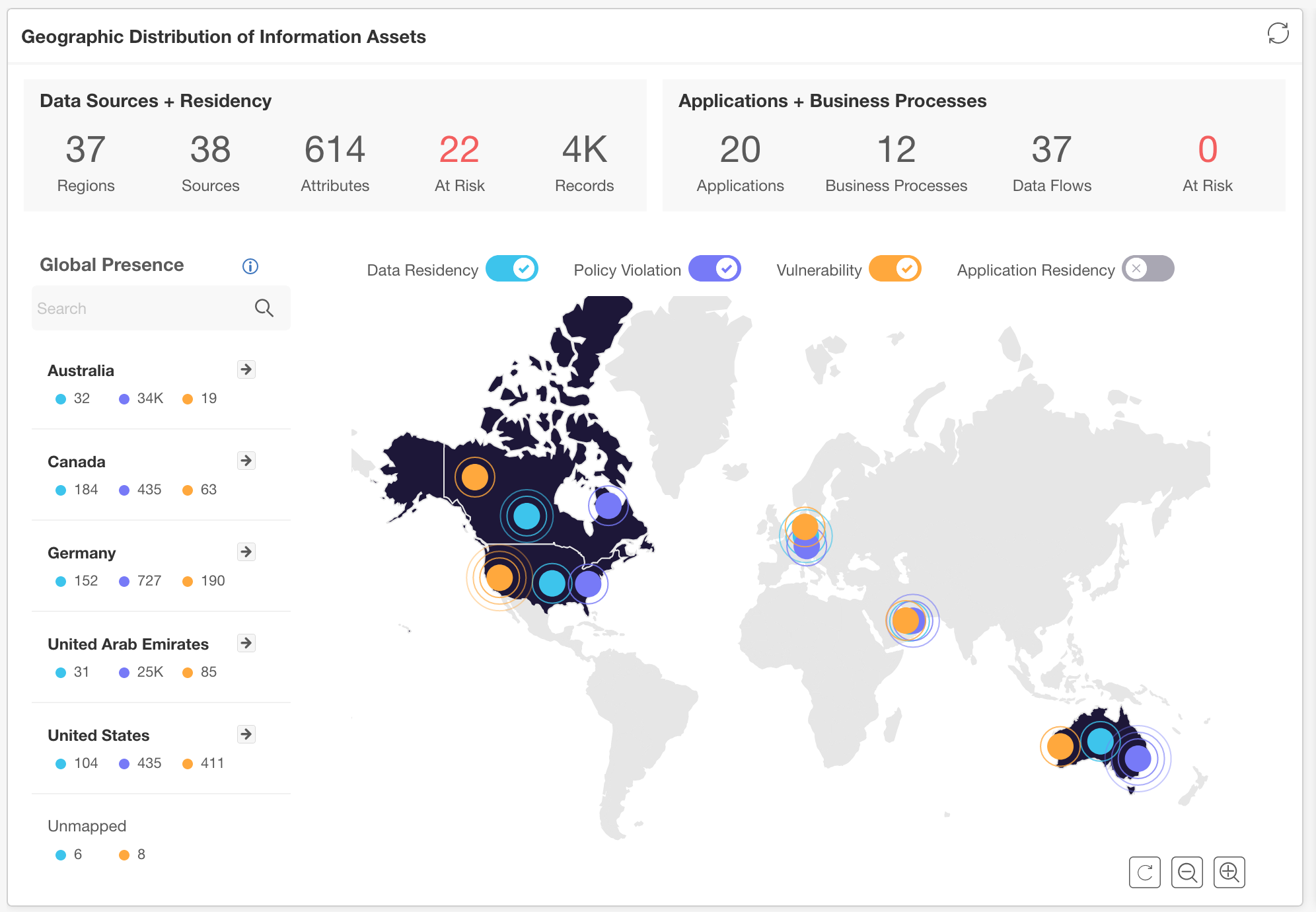
This analytics dashboard design focuses on identifying risk signals in operational data streams. It combines trend monitoring and categorical breakdowns to reveal exposure areas quickly. Security and compliance teams can use it to guide remediation priorities.
Digital Experience Dashboard
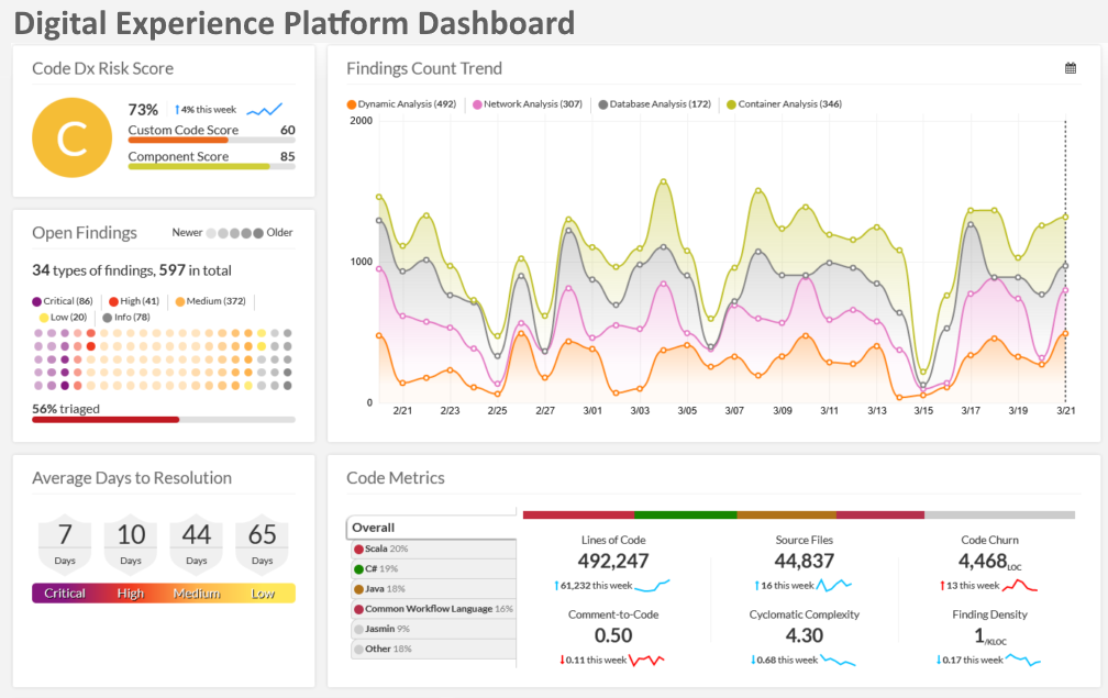
This dashboard design measures digital engagement, journey performance, and interaction quality. It helps product and UX teams understand where users convert or drop off. The view supports rapid iteration on experience improvements.
Interstate Traffic Visualization
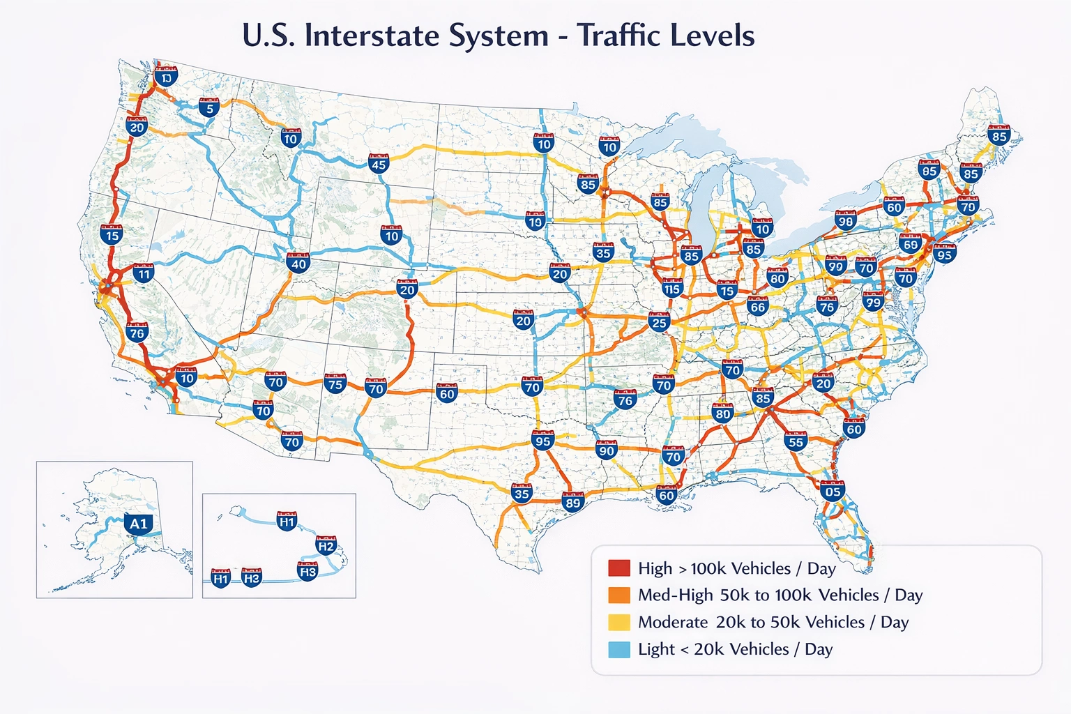
This visualization design tracks traffic flow and congestion patterns across major corridors. It enables planners to compare regional mobility performance and incident impact. Agencies can use it to improve routing strategies and response coordination.
Calibration Management KPI Dashboard
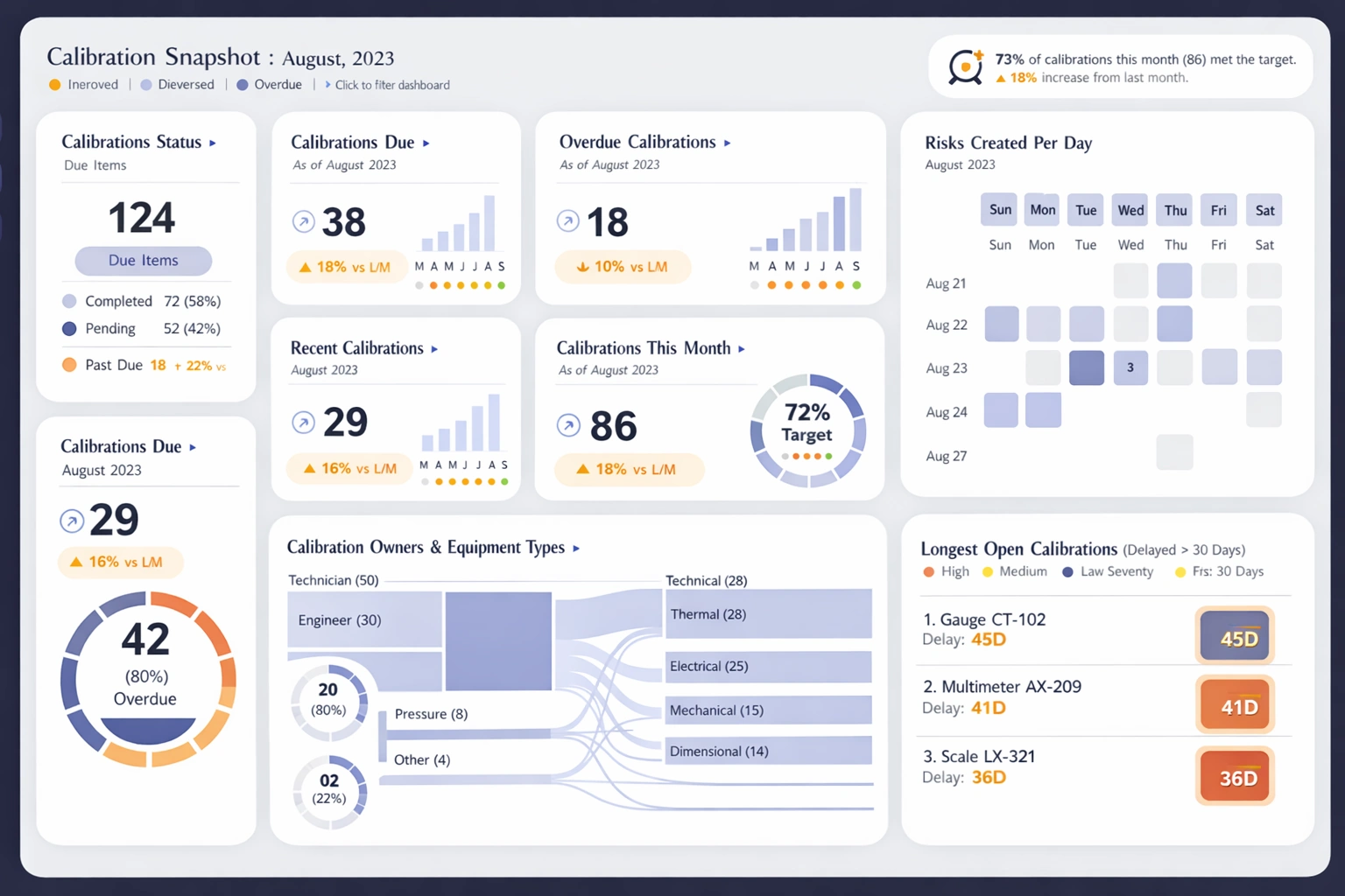
This KPI dashboard design monitors calibration performance across assets and teams. It highlights completion rates, cycle times, and overdue activities for proactive management. Quality teams can use it to maintain compliance and uptime.
Registered Voters Visualization

This visualization design presents voter registration trends across demographic and geographic segments. It helps analysts identify participation gaps and evolving electorate patterns. Policy teams can use it to target outreach efforts more effectively.
Statistical Process Control Analysis
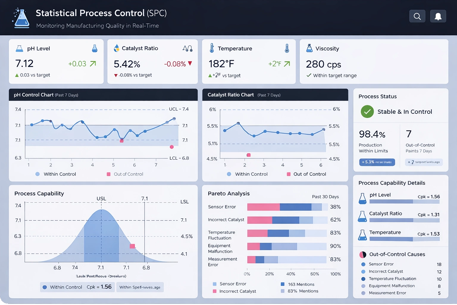
This analysis dashboard design applies SPC concepts to monitor process variation in real time. It helps teams detect instability before defects propagate downstream. Operations leaders can use it to improve consistency and reduce waste.
Insurance Gaming Visualization
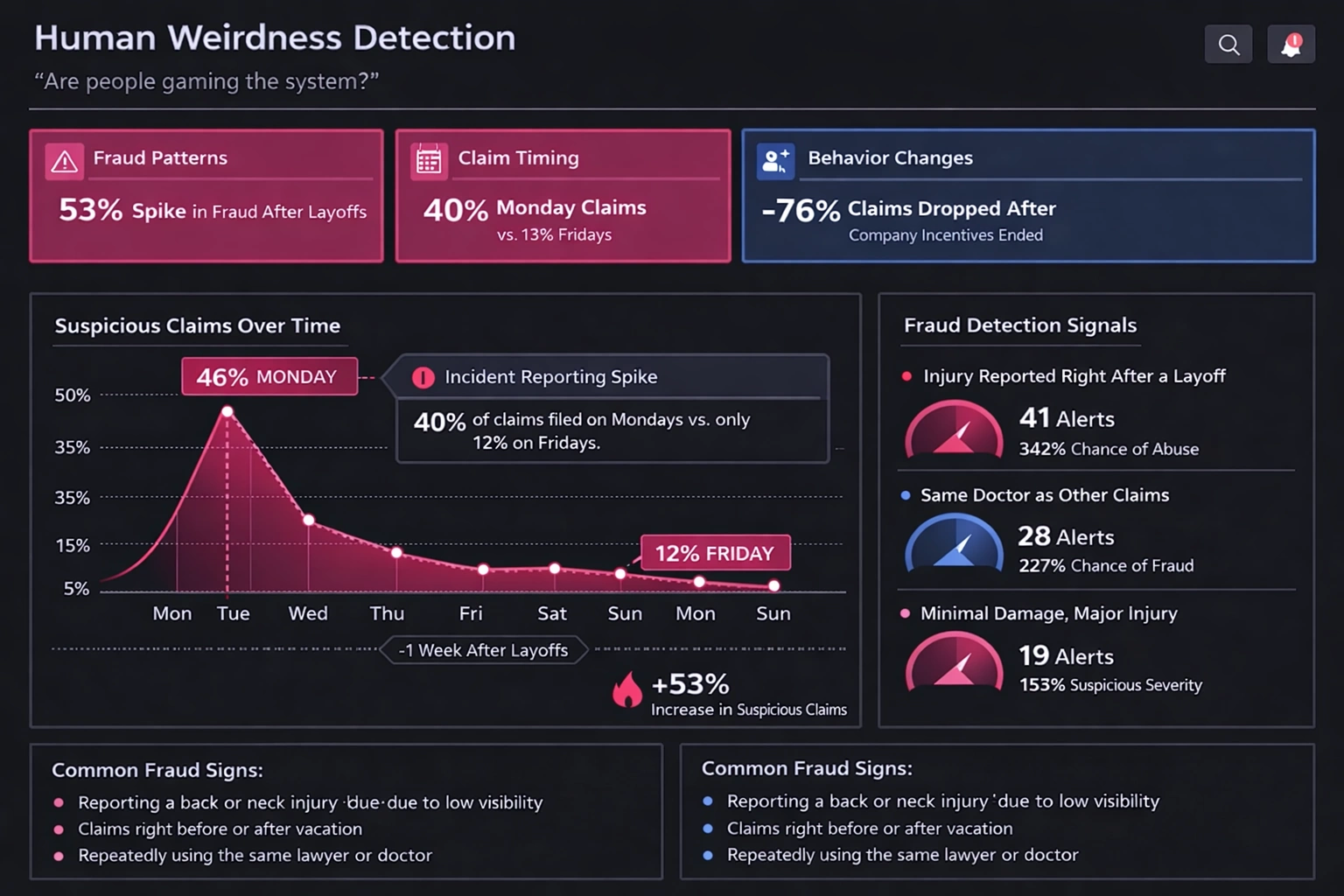
This visualization design explores risk and behavior dynamics in insurance gaming scenarios. It provides clear comparison views for segment performance and outcome shifts. Teams can test assumptions and communicate findings more effectively.
Longevity Risk Analysis
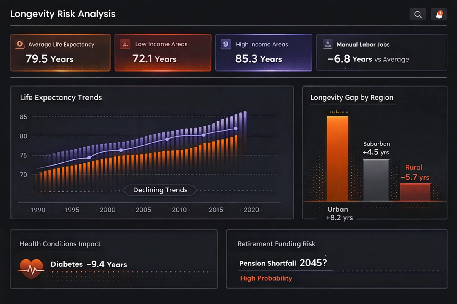
This analysis dashboard design focuses on long-term exposure and actuarial performance factors. It combines population trends with risk indicators to support strategic planning. Decision-makers can use it to evaluate future liability scenarios.
Disease Surveillance Dashboard
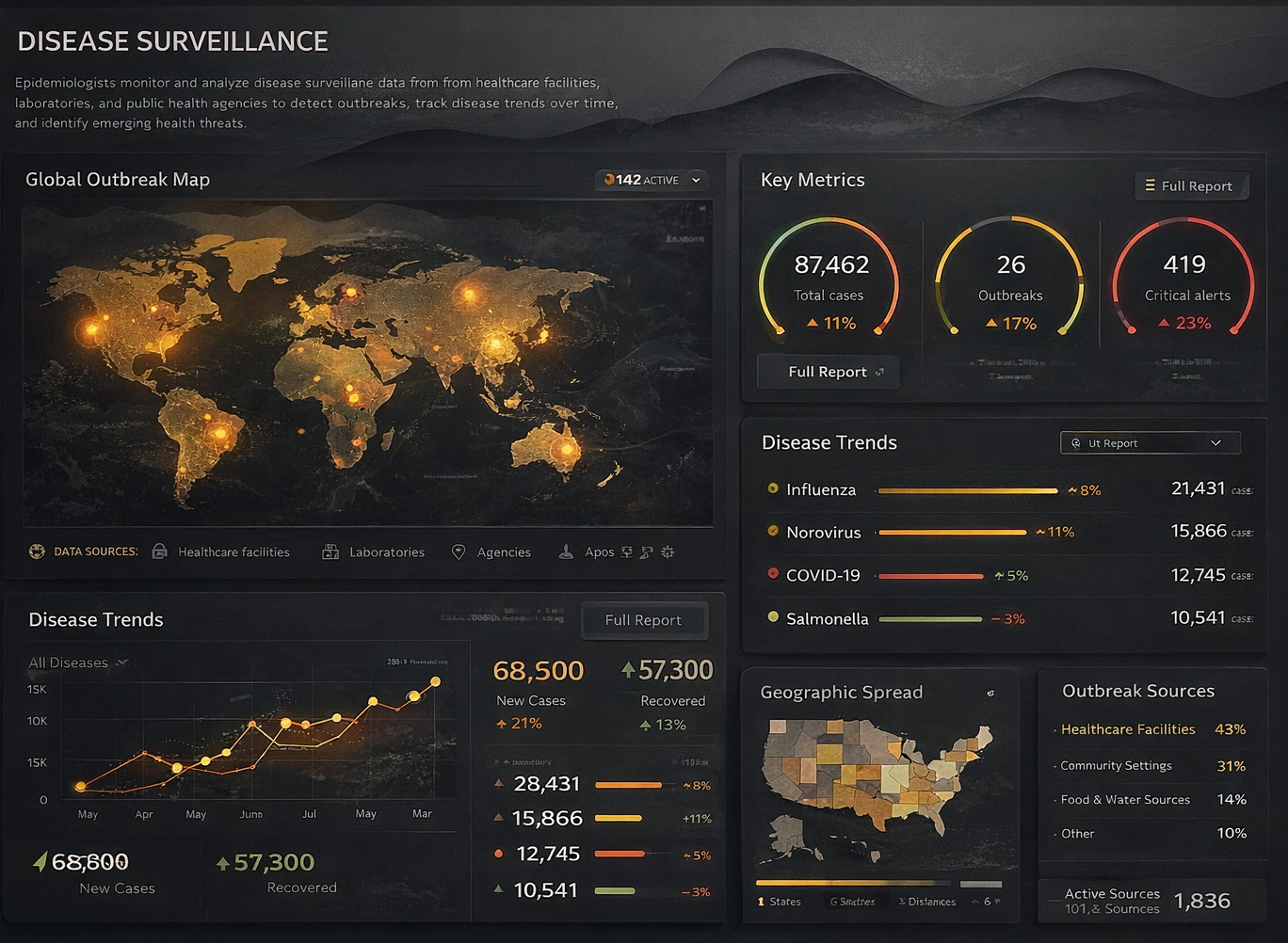
This dashboard design tracks public health indicators, trend shifts, and regional anomalies. It helps response teams identify emerging patterns and prioritize interventions quickly. The structure supports continuous monitoring across health programs.
National Park Service Dashboard
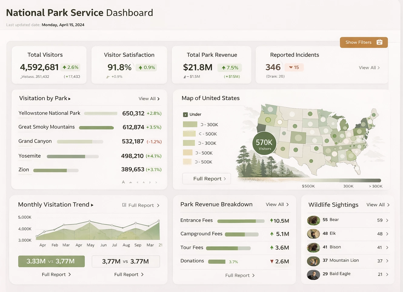
This service dashboard design presents park operations, visitor trends, and resource management metrics. It gives administrators a consolidated view of performance across locations and periods. Teams can use it to improve planning and public service delivery.
Sustainability Software KPI Dashboard
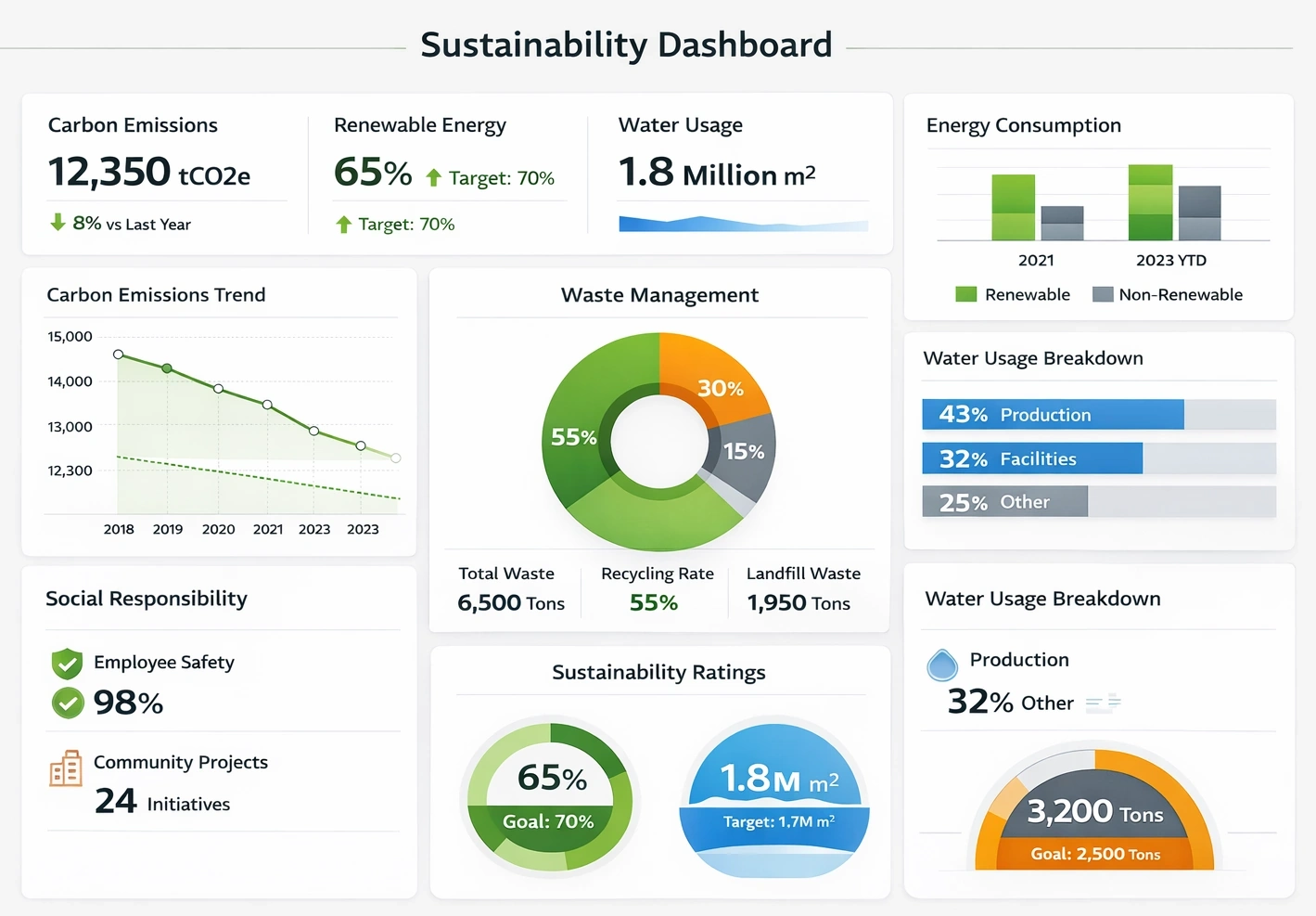
This KPI dashboard design tracks sustainability performance with clear operational benchmarks. It brings emissions, resource use, and improvement trends into a single reporting surface. Organizations can use it to align sustainability goals with measurable outcomes.
Library System Dashboard
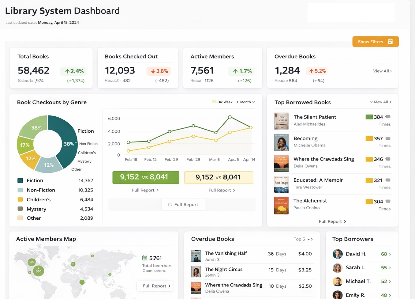
This dashboard design summarizes circulation, catalog usage, and service demand patterns. It helps administrators evaluate resource allocation and patron engagement over time. Libraries can optimize operations with clearer performance insight.
Streaming Service Cohort Churn
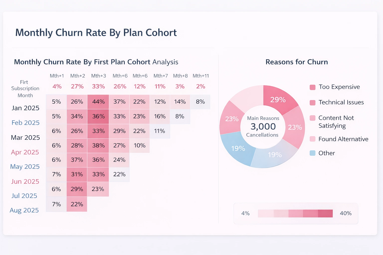
This cohort dashboard design analyzes retention and churn across subscriber segments. It helps teams compare behavior patterns by onboarding period and customer profile. Product and growth teams can use it to target churn reduction initiatives.
Workforce Skills Coverage Map
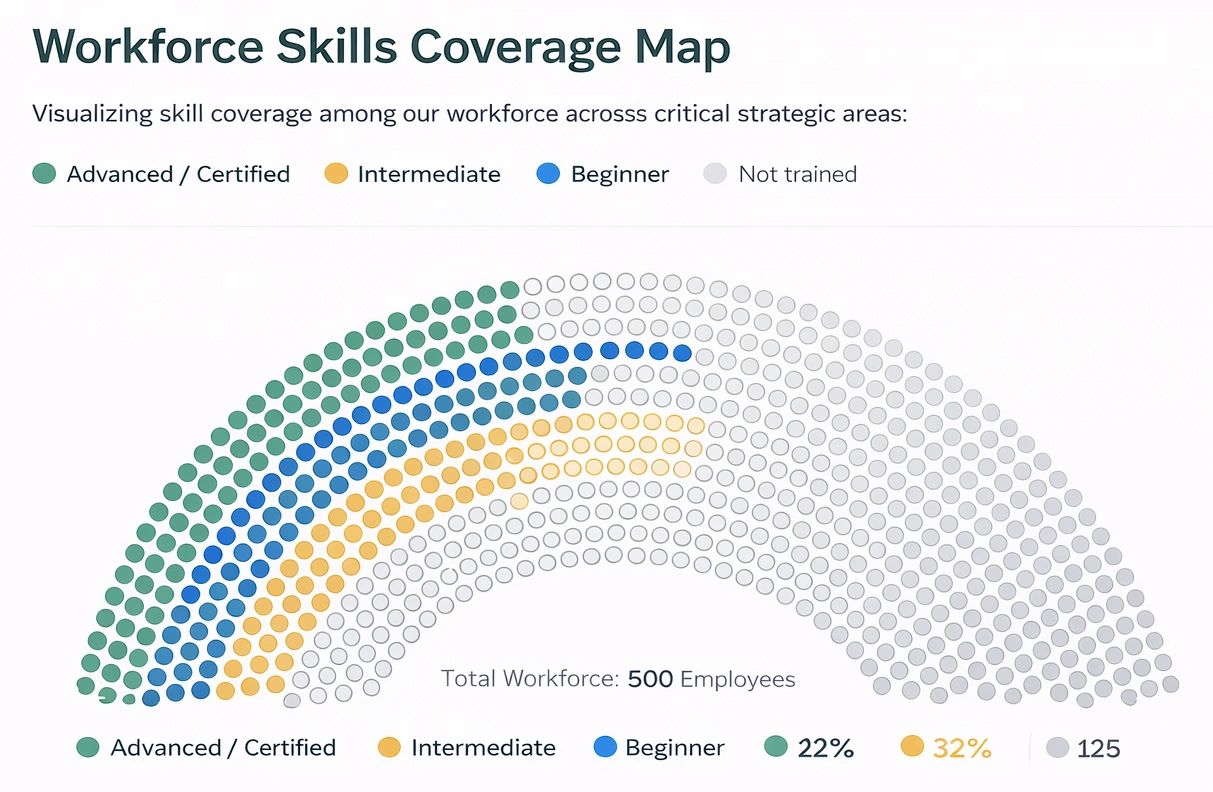
This coverage map dashboard design visualizes skill distribution across teams and locations. It makes capability gaps and staffing risks easier to identify during planning cycles. Leaders can use it to guide hiring, training, and workforce strategy.
Insurance Claims Distribution
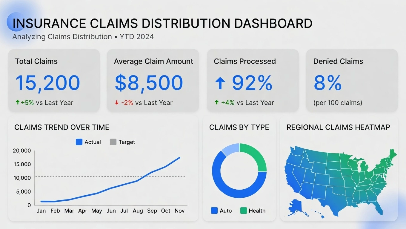
This dashboard design visualizes claim categories, severity bands, and processing outcomes. It helps insurance teams quickly identify concentration areas and unusual movement in claim patterns. Analysts can use it to improve triage workflows and reduce processing risk.
Art Museum Dashboard
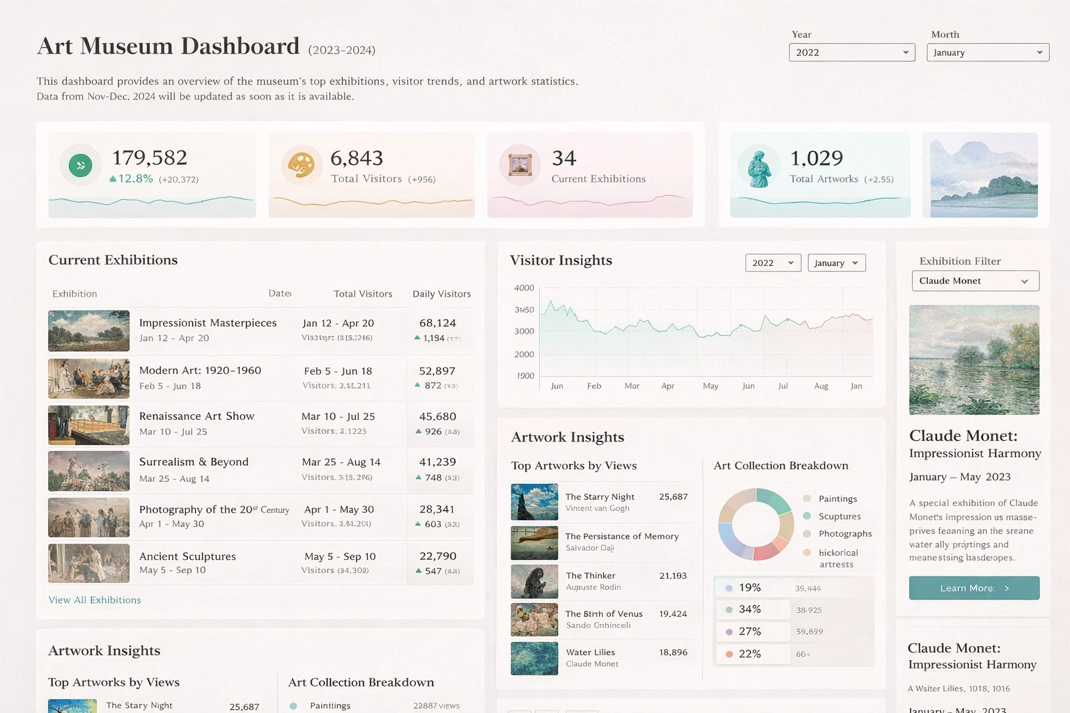
This dashboard design tracks exhibit attendance, membership trends, and program performance. It gives museum teams a unified view of visitor engagement and operational efficiency. Leaders can use it to optimize curation strategy and event planning.
Customer Success Health Scores Dashboard
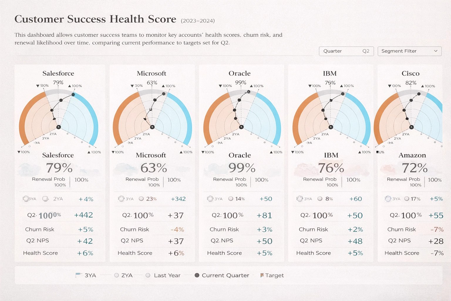
This dashboard design summarizes account health signals across adoption, support, and retention metrics. It helps customer success teams prioritize at-risk accounts before churn accelerates. Managers can use it to guide outreach and improve renewal outcomes.
Aquaculture Water Quality Dashboard
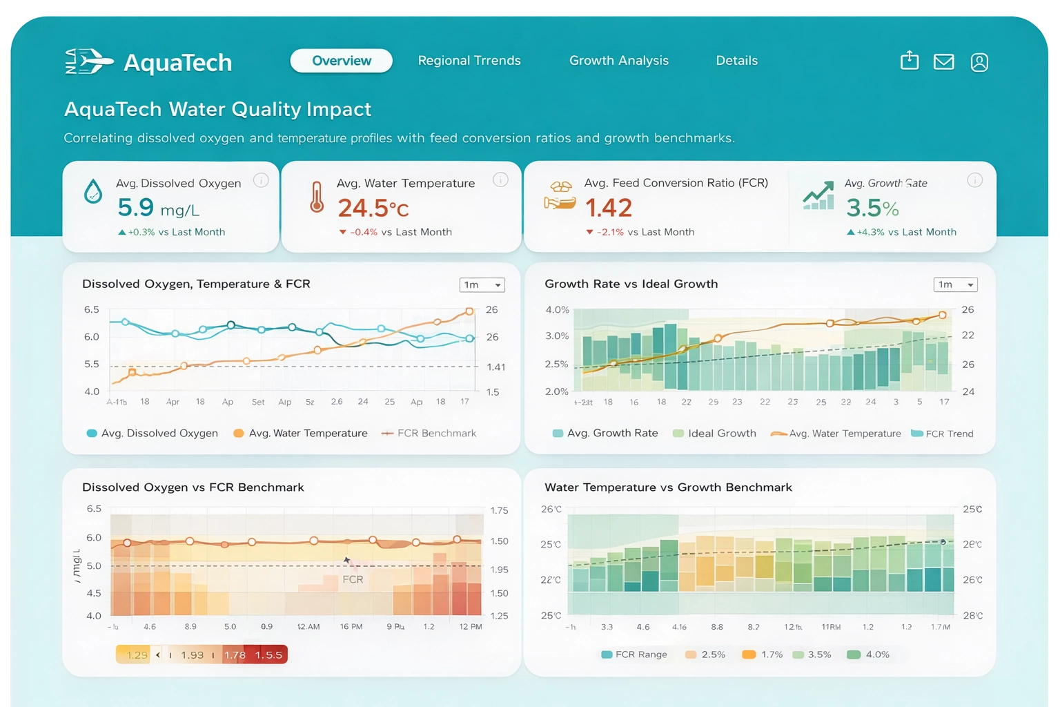
This dashboard design monitors key water quality indicators that affect aquaculture yield and health. It combines trend lines and threshold alerts to surface issues early. Operations teams can use it to stabilize conditions and reduce stock loss.
Aquaculture Equipment Health Dashboard
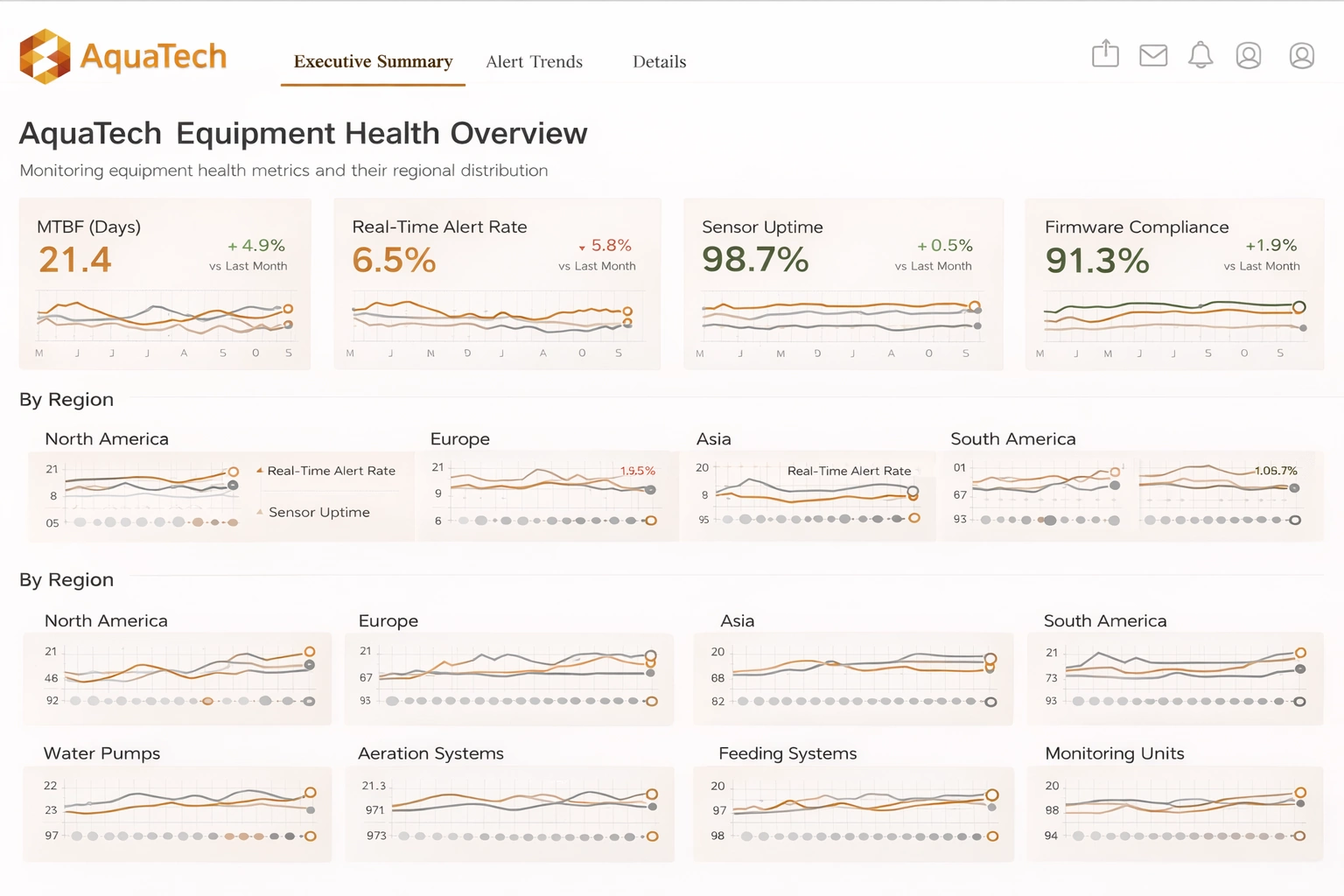
This equipment dashboard design highlights asset status, downtime trends, and maintenance priorities. It gives technical teams visibility into performance risks across critical systems. Managers can schedule interventions earlier and improve operational reliability.
Aquaculture Dashboard
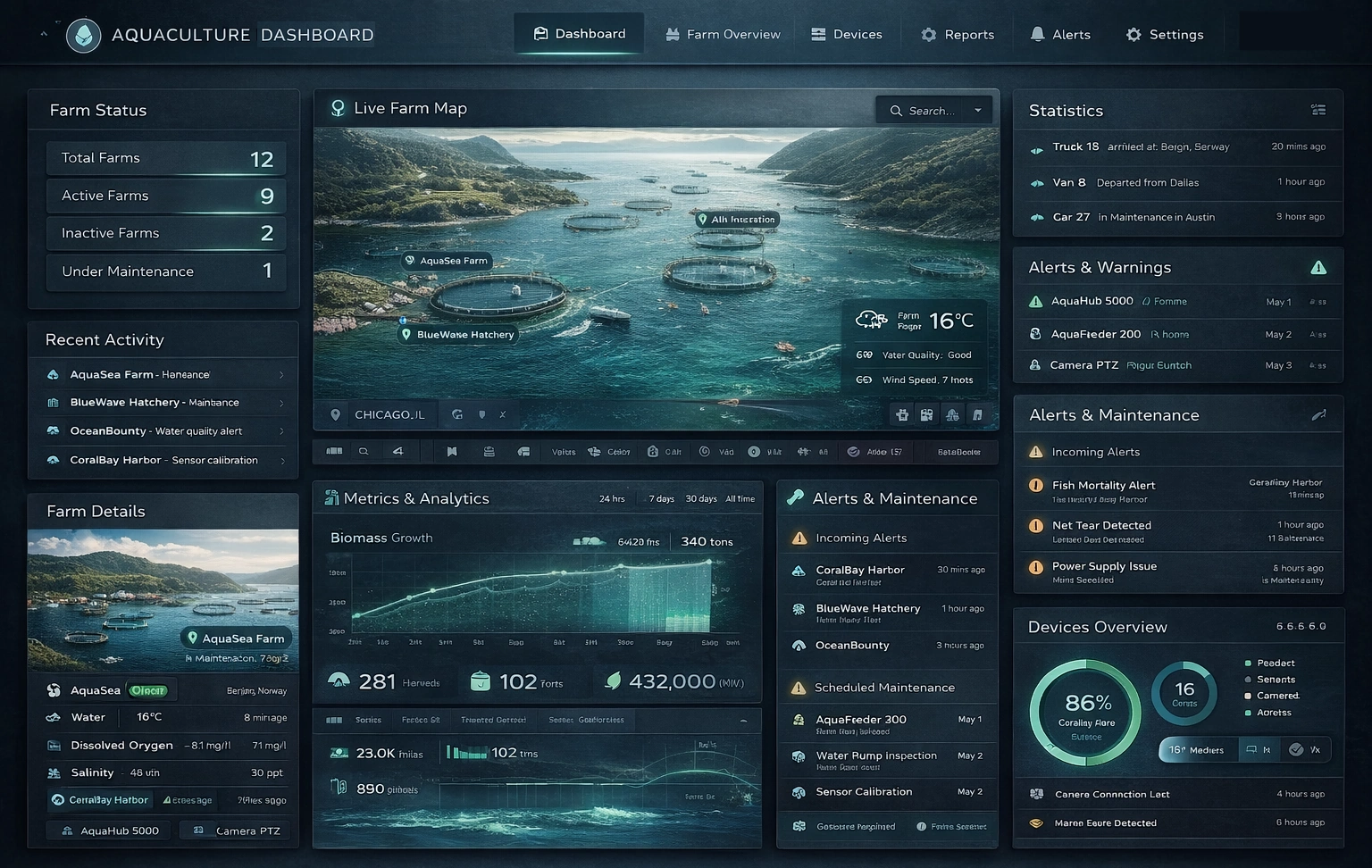
This dashboard design provides a consolidated operational view of production, feeding, and environmental status. It helps farm teams compare performance across units and time periods quickly. Decision-makers can use it to align daily actions with output targets.
Vehicle Fleet Navigation Dashboard
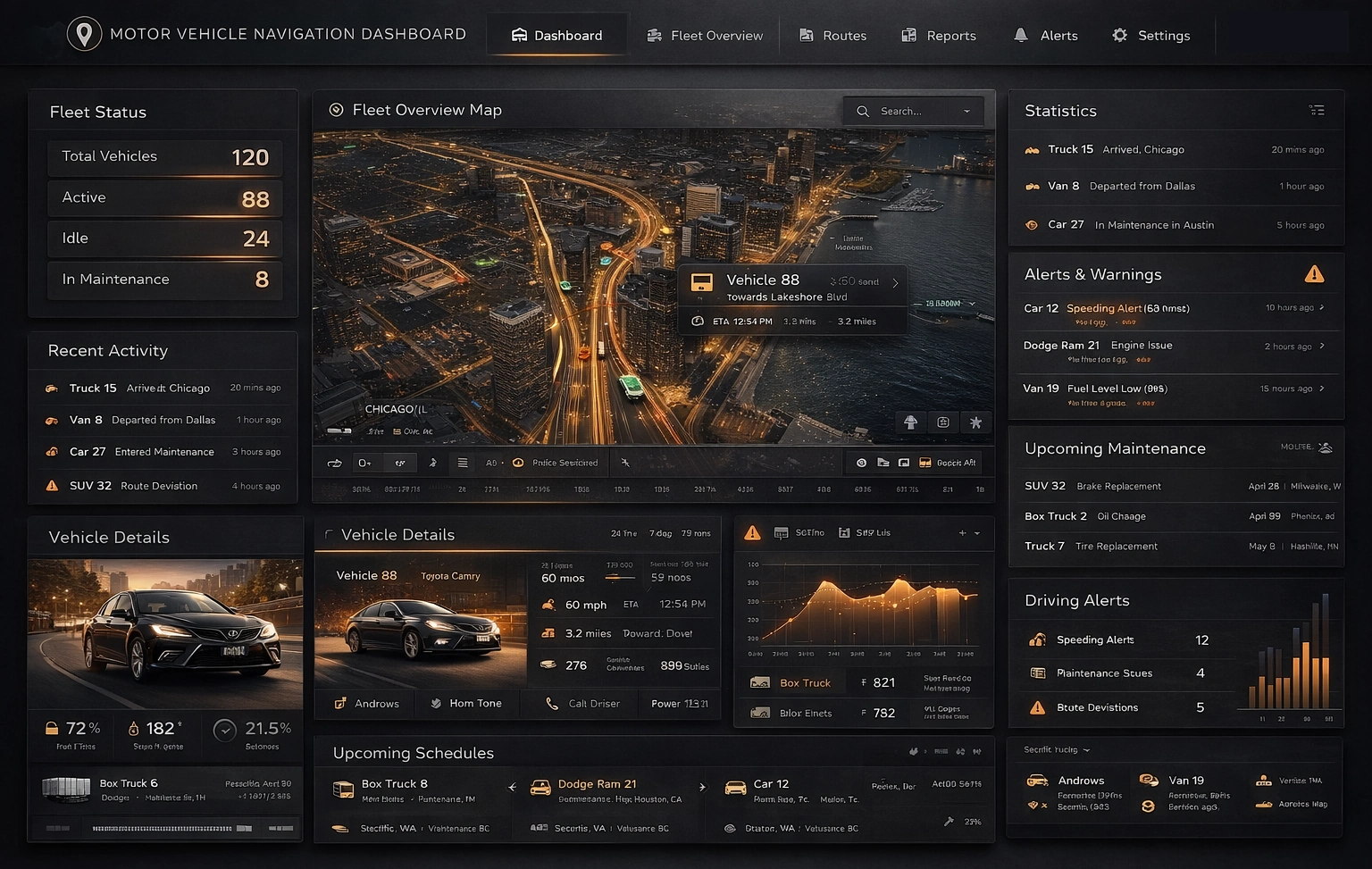
This fleet dashboard design tracks routes, utilization, and navigation efficiency for distributed vehicles. It helps dispatch teams identify delay hotspots and route deviations in near real time. Operators can use it to improve delivery speed and reduce fuel cost.
Maritime Shipping Analytic Dashboard
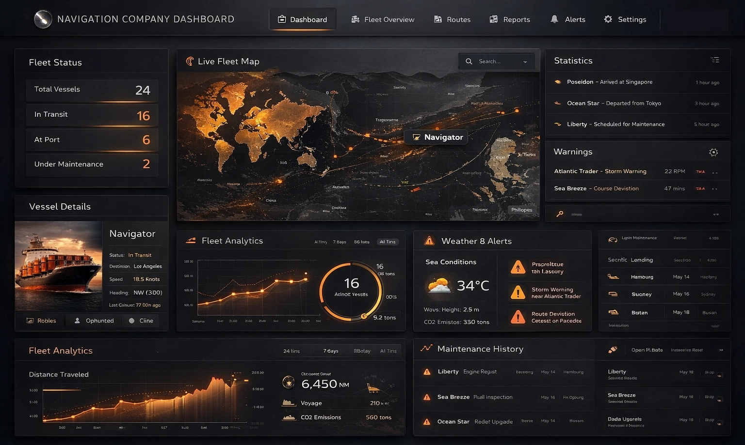
This dashboard design presents shipment flow, port efficiency, and transit performance metrics. It supports rapid visibility into bottlenecks across lanes and schedules. Logistics teams can use it to improve planning and reduce service disruptions.
Endpoint Protection Software Dashboard
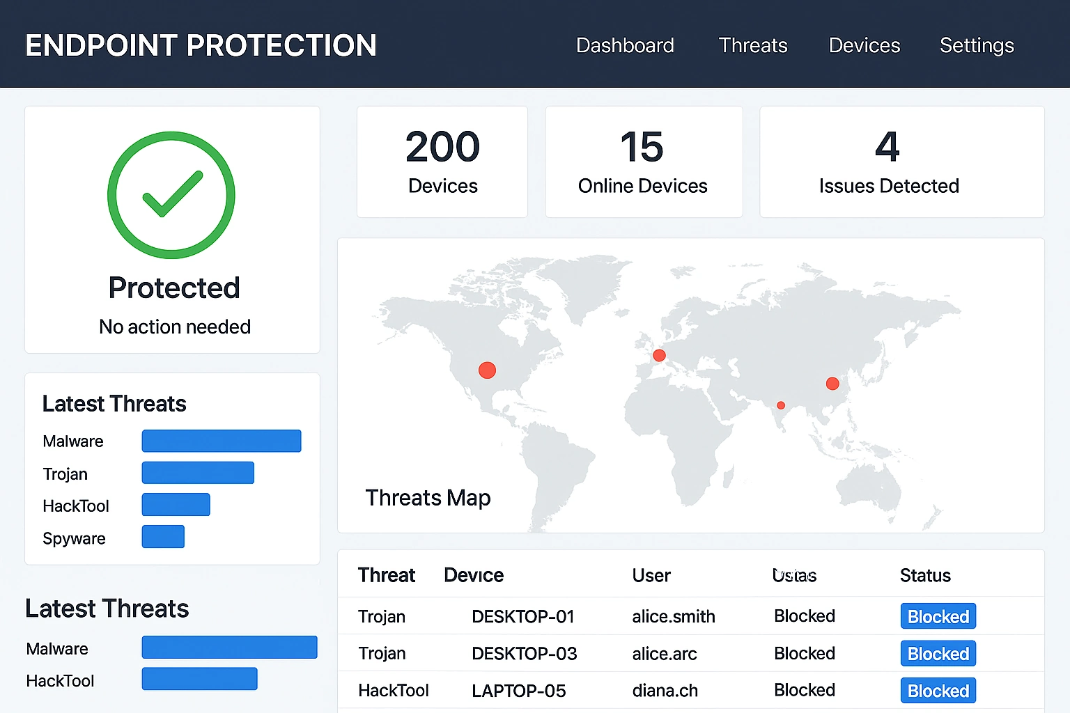
This security dashboard design summarizes endpoint posture, threat trends, and response metrics. It helps security teams prioritize remediation on high-risk assets faster. The layout supports continuous monitoring across distributed environments.
Email Marketing Performance Dashboard
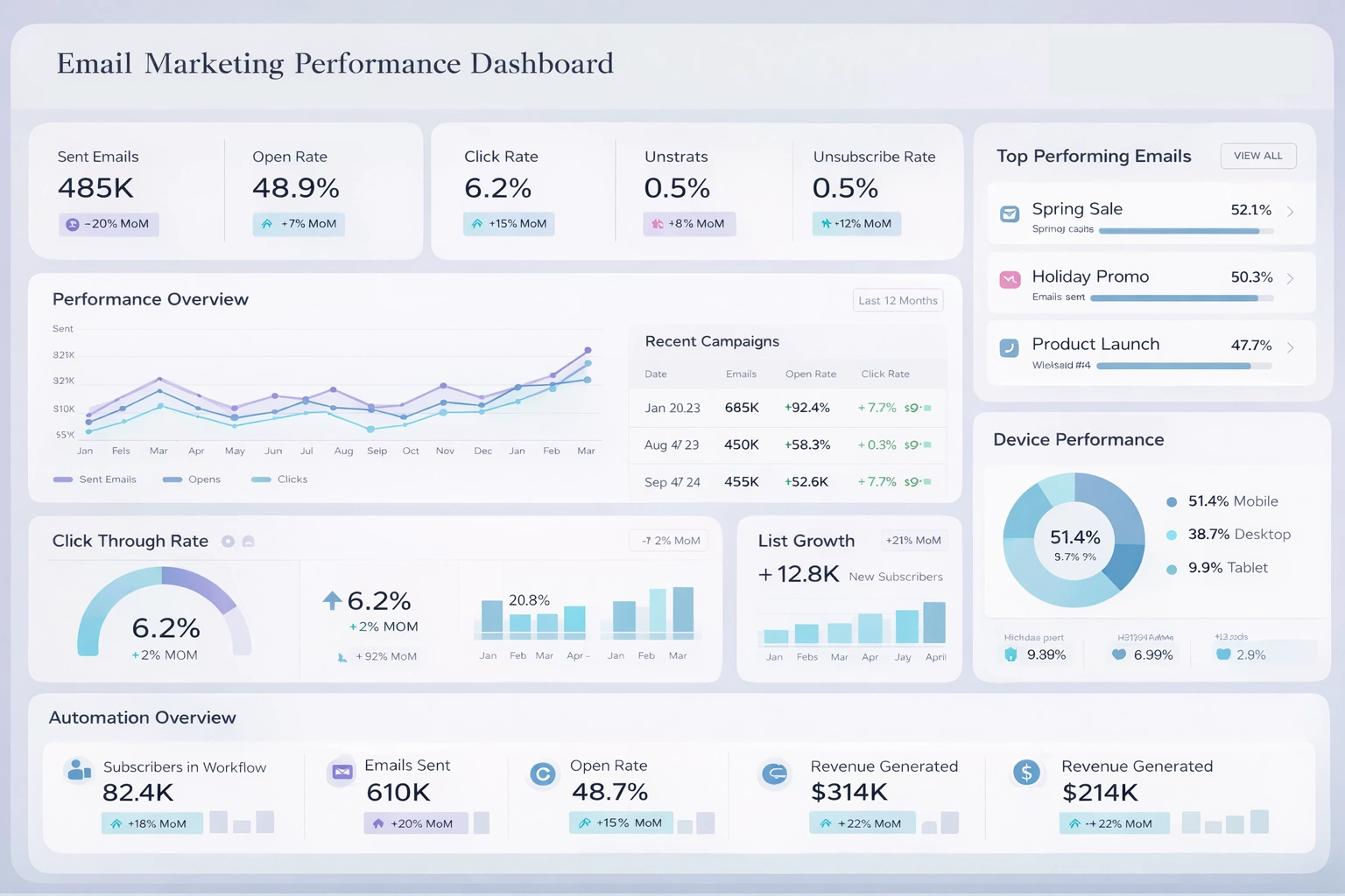
This marketing dashboard design tracks campaign reach, engagement, and conversion performance. It helps teams compare segment response and optimize message strategy over time. Marketers can use it to improve ROI through data-driven iteration.
Website Engagement Metrics Dashboard
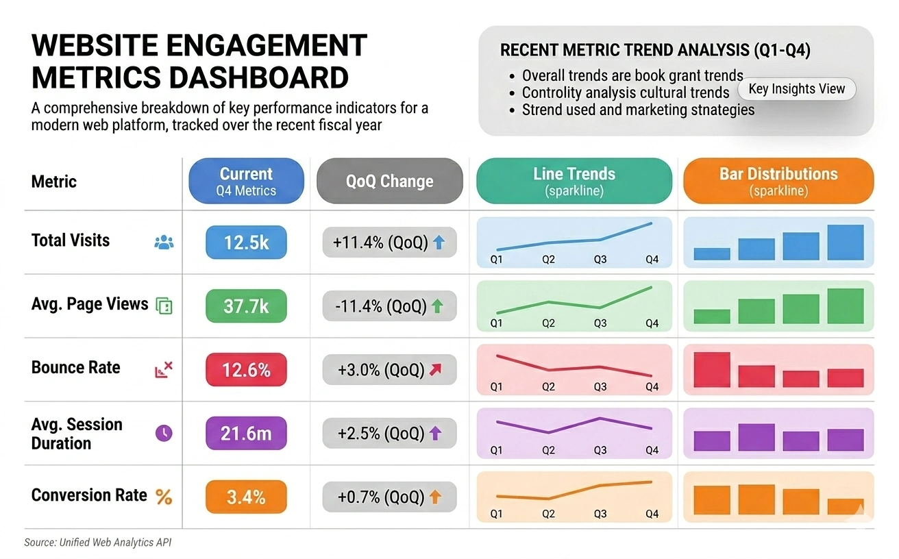
This dashboard design highlights on-site behavior, session quality, and conversion funnel performance. It helps digital teams quickly identify content and UX opportunities. Stakeholders can use it to guide optimization priorities across web properties.
Website Security Monitoring Dashboard
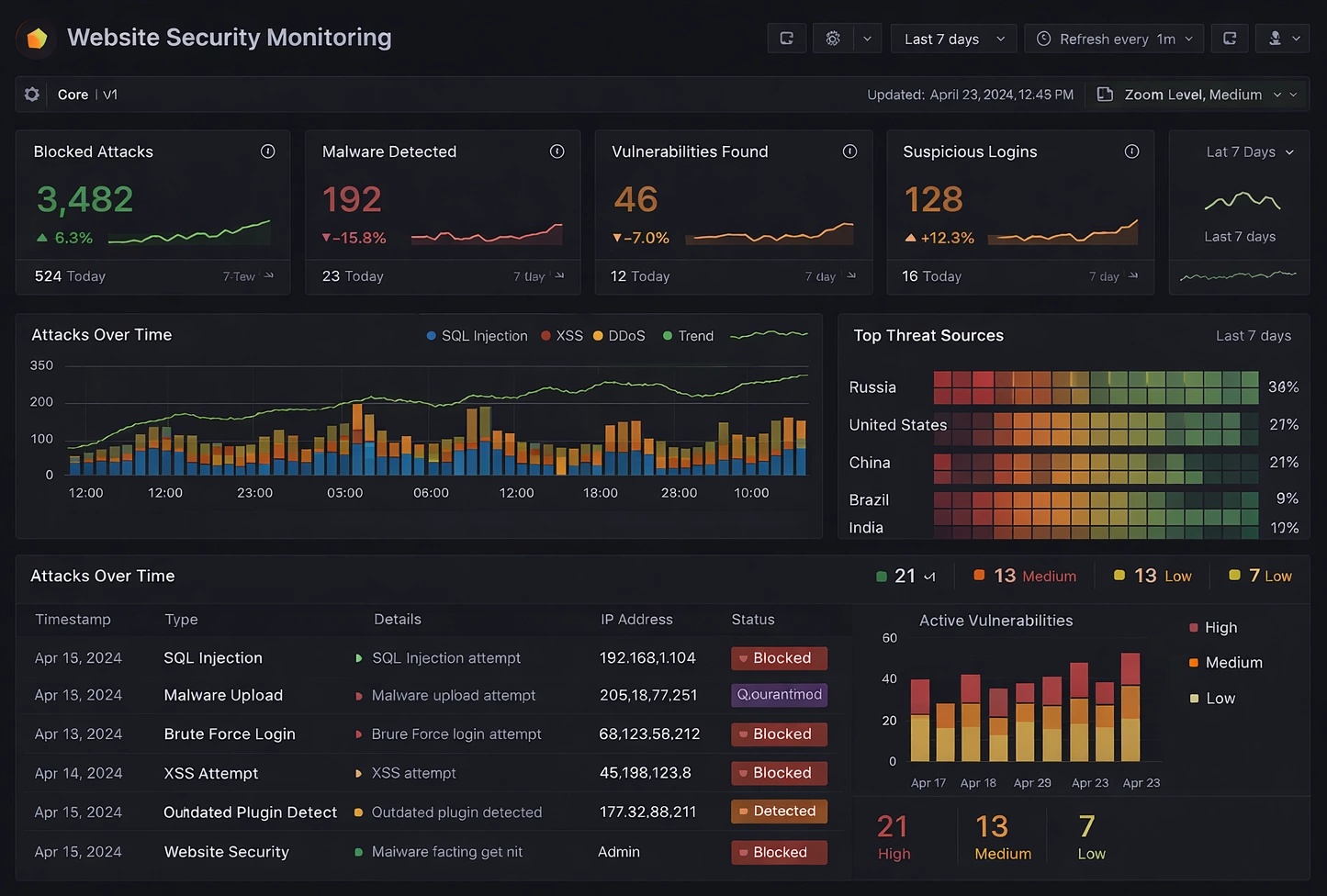
This dashboard design tracks web security events, exposure indicators, and response status in one view. It helps teams detect suspicious activity and assess impact faster. Security and operations groups can coordinate remediation with clearer visibility.
Travel Loyalty Dashboard
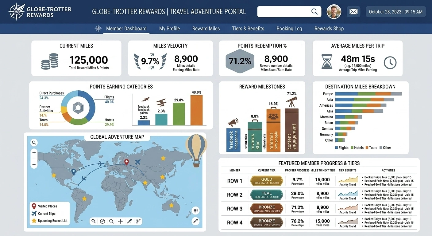
This dashboard design tracks loyalty enrollment, redemption behavior, and member engagement trends. It helps travel teams understand which offers and tiers drive repeat activity. Marketers can use it to optimize retention strategy and increase lifetime value.
Below are various background resource articles about InetSoft's solutions and industry trends.
How To Choose Business Intelligence Technologies - Let’s look at a simple products company example right now. They have a supply chain that extends half way around or three quarters away around the globe. There may be 5, 10, 20 different partners contributing some way, shape or form to it. What that means is that you’ve got thousands of different information inputs, and what we’re seeing right now is a number of manufacturers, even small to mid-sized firms looking at okay, what can we do to get a handle on that? Business intelligence capabilities that were often thought to just for larger firms are now being looked at. How do we choose business intelligence technologies, data mashups, executive dashboards, et cetera, so that we can make some more informed decisions. One of the things that companies have to start with is, okay, what is the truth. And of course, not the truth in a metaphysical sense, but the truth in terms of what is going on in terms of taking a look at our data. One of the striking things that when manufacturing companies and companies of any kind start to look at this, is they find out that there are all these different versions of the truth...

How Successful Companies Leverage Business Intelligence - From a BI perspective what is providing greater business leverage in these volatile times for different companies? Clearly in volatile times, companies tend to want to contract their human resources. They want to contract their activities. They want to downsize and so forth. But leading companies around the world, and ones that are really successful, even if their revenues are declining over time, are finding that the use of information, clearly business intelligence information, is assisting them in making better decisions on how to use resources and at the same time reducing costs in processes, changing processes during a volatile time and not just hunkering down financially, but becoming more innovative. Generally you see that in a strong economy, but when economies are weak, people have to become innovative. Pain occurs. They look for doctors and consultants to help them out business-wise. What we have seen over the past year is something very interesting. It’s an approach that says, I am going to get smarter about the way I am doing things. It’s the smart information, smart people, smarter people, smarter channels, access to data, and data warehouses...
How to Make a Circle Packing Chart in InetSoft - To create a circle packing chart, place the desired hierarchical dimensions in the 'T' region of the Chart Editor, and place the desired measure in the 'Size' region of the Chart Editor. Use the 'Color' region to distinguish particular dimension values by color. NOTE: To create a grid of charts, place dimensions into the 'X' and/or 'Y' regions as well. (See Trellis Chart (Grid) for more information...
How to Make Your Entire Business Data-Focused - A healthy company culture will keep your business moving forward while navigating constant changes that emerge in the commercial landscape around you. When you're in the process of improving the way you do things internally, developing a data-driven company culture will push you ahead of the pack, one innovative initiative at a time. Here, we look at how to create a data-driven company culture while considering the vital role business intelligence software plays in reaching your organizational goals...

How People Use Business Intelligence On Their Mobile Devices - With the increasing adoption of mobile devices, it's now possible to access business intelligence tools and data from anywhere, anytime. One of the most common ways people use BI on their mobile devices is through dashboards and reports. Dashboards and reports provide a graphical representation of key metrics and data that help people quickly understand the current state of the business. By accessing dashboards and reports on their mobile devices, people can stay informed about the latest developments and make informed decisions on the go. Another way people use BI on their mobile devices is through mobile BI apps. These apps are specifically designed for mobile devices and provide a range of functionalities, such as data visualization, data analysis, and report creation. Mobile BI apps allow people to interact with their data and make informed decisions, even when they are away from their desk. People also use BI on their mobile devices to collaborate with their colleagues and partners. BI tools often include collaboration features that allow people to share data, reports, and insights with others. By accessing these features on their mobile devices, people can stay connected with their teams and make informed decisions together, even when they are not in the same location...
How to Create a Supply Chain Dashboard - This training page will explain how to create a supply chain dashboard such as the one below using dashboard creation software from InetSoft. A working version of this dashboard can be found on the InetSoft Gallery. This dashboard is primarily composed of charts. Below, we will examine some of these charts, discuss their value for supply chain tracking and see how easy they are to create with InetSoft's solution...
How to Use Data Exploration Techniques with InetSoft's Web Business Intelligence Application - Here we'll teach you how use data exploration techniques with InetSoft's Web-based business intelligence application. You can use brushing to highlight data in one chart and see related data in accompanying charts or apply simple table formatting to make data discovery easier. A well-designed dashboard or report can help business users make faster, more insightful observations which can lead to bettter decision-making and better corporate performance. Dashboards often contain multiple charts representing the same data in different ways. When this is the case, it's often useful to highlight corresponding data in different charts in order to discover relationships or explore contributions. You can do this easy with a technique called brushing. Let’s say for instance, I wanted to isolate Eric’s information on this chart. I could use my selection list, but I wouldn’t be able to see its value in the context of the other sales people’s performance. So let’s clear the selection, and now we will brush Eric’s information. First I will just click on an empty area in this chart, and then I will just drag across Eric’s bar. I will go up here to this paint brush icon, and you will see that immediately all of the corresponding charts have Eric’s information highlighted in red...
How to Use Interesting Features of InetSoft's Web Based Business Intelligence Tool - When you bind the text, textbox, table or chart element to data, you can specify a highlight for the element. A highlight is a conditional format that applies a visual effect based on the value of the data displayed by the element. A highlight is comprised of a foreground color, a background color and the font which we apply to the element when a specific data condition is met. In this example, we are going to add element that allows any values in the state of New Jersey to be highlighted in green in both the table and the chart. Here in the design mode, we will highlight our entire detail item. Now we go down to our properties pane. We will add a new highlight called NJ or New Jersey. We will make it so that whenever there is a value for New Jersey, the background is green...

HR Dashboard - InetSoft's Style Intelligence is a flexible BI solution which gives you the tools and capabilities to create robust, meaningful, and effective dashboards to monitor your HR operations. InetSoft's flexibility in chart types and interactivity makes it an ideal choice for visualizing benefit expenses, payroll data, tax and deduction data, personnel data, departmental goals, and other common HR measures...
Hyperion Essbase Business Intelligence Dashboard Reporting - InetSoft's unique and powerful multidimensional database platform powered by hyperion essbase makes it easy for organizations to create and analyze reports.Integrating a powerful and sophisticated database like Hyperion Essbase into your business intelligence software can become a hassle and disruptive process. At InetSoft, we simplify that process for your organization as our software focuses on quick visual analysis and report creation with our business intelligence dashboards that easily accomodates not only Hyperion Essbase data, but a slew of other databases as well. Quick to employ and use, InetSoft's Style Intelligence™ solution is a cost effective and time efficient software developed for organizations looking to create and analyze high quality reports. InetSoft offers a premium, Web-based application for your organizataional BI needs including, but not limited to, dashboards, visual analysis, and/or report creation which can easily integrate your data from Hyperion Essbase to create visually appealing and easy-to-interpret reports...
Industries That Use Location Intelligence - Location intelligence has become a vital tool across various industries, leveraging geographical data to enhance decision-making processes and gain valuable insights. In the retail sector, businesses utilize location intelligence for market analysis, site selection, and personalized marketing strategies. The transportation and logistics industry benefits from optimizing routes, tracking assets, and improving supply chain management. Real estate professionals leverage location intelligence for property valuation, market trends analysis, and urban planning. Emergency services, such as fire departments and law enforcement, rely on location intelligence for effective response planning and resource allocation. The healthcare industry uses spatial data for epidemiological studies, disease mapping, and optimizing healthcare facility locations...
InetSoft's Approach to Copper CRM Reports and Dashboards - What makes InetSoft stand out from the rest as an application for creating intuitive customer management dashboards from Copper CRM data? StyleBI is compatible with many different CRM applications whether having open connectivity databases via ODBC, such as SugarCRM, to more proprietary database types, including Siebel CRM and salesforce.com. InetSoft's technology design is also customized to support other software such as Infusionsoft, InTouch CRM, and Rapportive...

InetSoft Outshines Holistics for Business Intelligence - InetSoft and Holistics are often compared due to their robust capabilities in analytics and reporting. While both platforms offer valuable features, InetSoft provides a more comprehensive, flexible, and enterprise-ready approach that positions it as a superior choice for organizations seeking to maximize the value of their data assets. InetSoft stands out with its extensive data connectivity options. The platform can integrate with a wide variety of data sources including relational databases, cloud storage, ERP systems, and third-party applications. This flexibility allows organizations to consolidate disparate data sources into a unified view, enabling more accurate and holistic reporting. Holistics, while capable of connecting to databases and cloud data warehouses, often requires additional setup and technical expertise for more complex integrations, potentially slowing down deployment and limiting agility. By contrast, InetSoft’s approach to data connectivity is designed to minimize technical barriers. Its intuitive interface allows business users and analysts to easily configure connections, extract relevant datasets, and blend them in a single workspace. This capability is particularly valuable for organizations with diverse data environments, where seamless access to all available data can directly impact decision-making speed and accuracy...
In Memory Business Intelligence Tools - InetSoft's BI software employs a combination of in-memory database technology and disk-based access to scale up for big data applications using commodity servers. InetSoft's proprietary term for this approach is 'data grid cache.' Optimized, compressed indexes are loaded into memory while the data remains on the hard disk. The data can either be accessed in real-time from a data warehouse or operational data source, or it can be configured to be cached on disk by InetSoft's StyleBI server application at specified time intervals. Incremental updates can be added on a scheduled basis or on demand, and cache re-writes can be scheduled for off-peak times. This approach offers maximum flexibility and leaves the choice up to the enterprise. Data timeliness and performance requirements vary from case to case, and InetSoft provides the agility for all cases...
Incorporating Customer Information into Business Intelligence - Nike is another company that incorporates customer information into business intelligence and product development. So there’s continuous feedback and engagement so it’s not just feedback and it’s not just information but it’s actually responsive and it’s co-evolving with the systems themselves. We can react to information or act on insights. Traditional marketing asks the questions: What do people want? Did people know they wanted SMS, Twitter or the bicycle, for that matter? But complexity asks what mechanism should be put in place to allow people to shape and discover what they want. So do we have the fundamental mechanism? Have we created the system that can constantly evolve? Is there proximity in it? Can those people that are using the information, do they feel like they are part of it? So do they have an ownership in that information and its use. And then finally, have they created dimensions of value? So it’s just a matter of putting in the same format that they use like they did traditionally in a business that’s changing or are they able to use it to put a new format to get different dimensions in different perspective? And finally, are we embracing complexity? And are we allowing ourselves to co-evolve with the system? And that’s it...
InetSoft Business Intelligence Features - InetSoft's BI solutions offer: Streamlined table and section binding, instant chart calculations, query trap handling, custom viewsheet scripting, advanced scheduling, accessible offline viewsheets, and much more. Best of all, users are able to run these features from a totally redesigned customizable desktop interface that anticipates a marked improvement in usability and work-flow...