7 Data Discovery Software Options with Data Transformation and Pipeline Features
Modern data discovery tools increasingly blur the line between analytics and data engineering by embedding transformation and lightweight pipeline capabilities directly into their platforms.
Below are seven options, including InetSoft, that support interactive exploration alongside features for shaping, combining, and operationalizing data flows.
1. InetSoft Style Intelligence
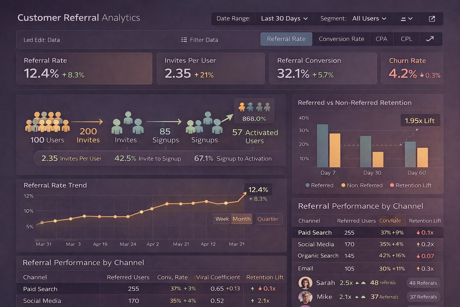
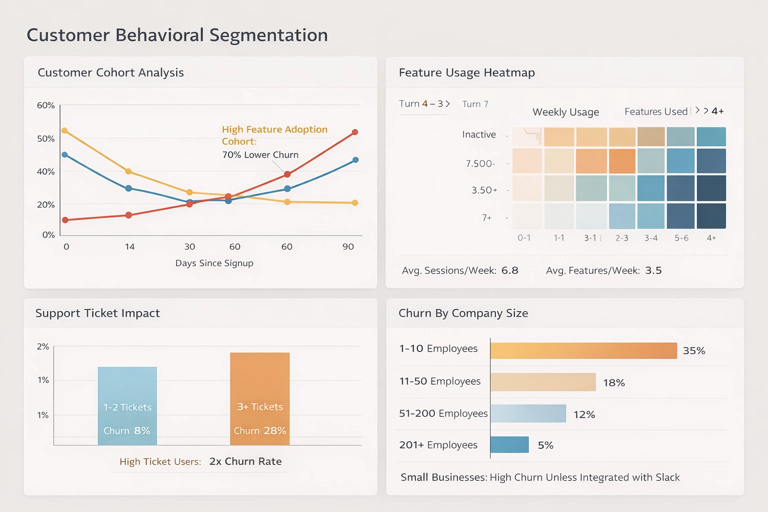
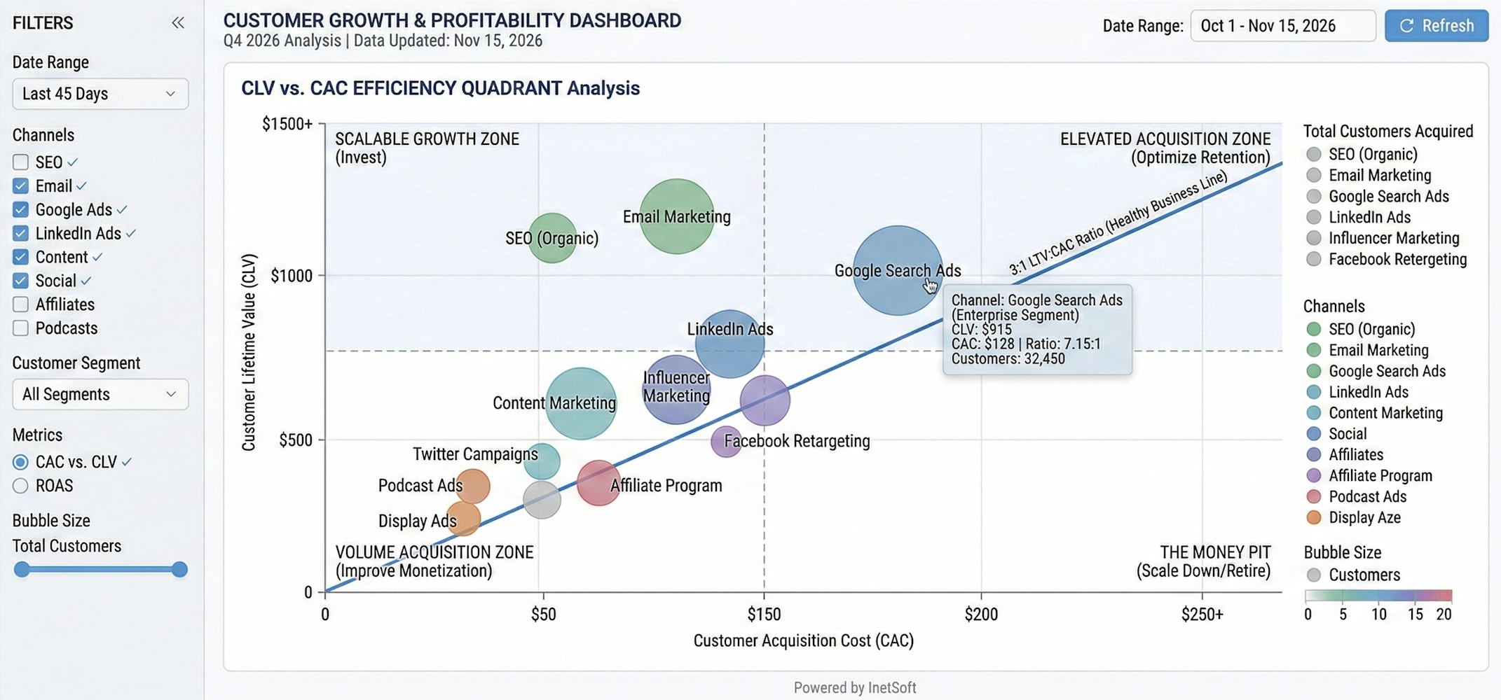
InetSoft's Style Intelligence focuses on tightly coupling data discovery with in-browser data modeling and transformation so that business users can refine data as they explore it. The platform enables users to define joins, aggregations, and calculated fields directly in a mashup layer, which becomes a reusable data model behind dashboards and reports. Its Data Block™ concept lets teams build modular data components that can be assembled into larger analytical views without exposing underlying technical complexity.
From a pipeline perspective, InetSoft includes visual data mashup, transformation, and scheduling capabilities, allowing organizations to create lightweight end-to-end workflows inside the BI environment instead of relying on a separate ETL tool for many scenarios. Users can connect to disparate sources, upload their own datasets, and combine them into live models that refresh on demand or on a schedule, effectively functioning as a governed self-service data pipeline. Real-time and near-real-time data can be transformed on the fly behind interactive dashboards, with formulas and scripts applied to power metrics, filters, and drilldowns.
2. Qlik (Qlik Sense and QlikView)
Qlik has long positioned itself as a data discovery leader, built around its associative engine that lets users explore relationships in data without predefining every query path. It emphasizes flexible exploration of large, heterogeneous datasets, enabling end users to navigate metrics and dimensions interactively while the engine recalculates results in memory. This design supports non-linear analysis, making it easier to uncover unexpected patterns and correlations across business domains.
Qlik's data preparation and transformation layer allows users to load, filter, join, and reshape data using a combination of script-based and visual tools. Its broader portfolio includes data integration components that replicate and stream data from operational systems into analytics-ready stores, effectively forming a pipeline from source to in-memory model. These capabilities enable organizations to standardize ingestion, perform transformations centrally, and then expose governed data sets to analysts for self-service discovery.
3. Pyramid Decision Intelligence Platform
Pyramid Analytics' Decision Intelligence Platform combines traditional BI with advanced analytics to support complex decision-making processes. It is recognized for strengths in data discovery, data science, forecasting, and repository-based governance, making it suitable for organizations that want both visual exploration and advanced modeling in one environment. Users can move from basic dashboards to more sophisticated analytic workflows without leaving the platform.
Pyramid provides integrated data preparation features that let users profile, cleanse, and shape data before it is used in reports or models. Data preparation and discovery sit alongside analytic content in a shared platform, supporting repeatable transformation workflows that can be scheduled or reused. This lets teams turn one-off data wrangling steps into managed pipelines that feed governed datasets and machine learning models while still supporting ad hoc discovery.
4. Yellowfin (with Yellowfin Data Discovery)
Yellowfin offers a suite that includes dashboards, storytelling, and data discovery capabilities, aimed at enabling business users to interpret and communicate insights more effectively. Its data discovery components focus on helping users identify trends and anomalies while combining narrative content with visual analytics. The platform's emphasis on storytelling encourages analysts to turn exploration results into shareable, context-rich presentations.
Yellowfin also covers data preparation, allowing users to bring together datasets, perform basic transformations, and create analytical views suitable for dashboards and exploratory analysis. These data preparation flows can be saved and reused, effectively functioning as simple pipelines that standardize how commonly used data sets are built. By embedding preparation steps into the BI environment, Yellowfin reduces the need for separate ETL tools for many self-service and departmental use cases.
5. Infor Birst and Infor BI
Infor's BI and analytics offerings, including Birst, focus on delivering reporting, dashboards, and advanced analytics tightly integrated with enterprise applications. These tools are highlighted for strengths in business intelligence, machine learning, and artificial intelligence, making them suitable for organizations running core business processes on Infor's ERP and related systems. Built-in connectivity to operational applications helps shorten the path from transactional data to analytical insight.
Birst in particular is known for its networked BI architecture, which supports a shared semantic layer and governed data models that can be reused across departments. It includes data preparation and integration capabilities that allow organizations to extract, transform, and load data into centralized models while also enabling localized refinement for specific teams. This combination allows Infor's platform to act both as a discovery front end and as part of a broader data pipeline that harmonizes information across different business units.
6. DataRobot Platform (for augmented discovery)
While DataRobot is primarily known as an AI and AutoML platform, it has become a key player in the broader analytics stack, especially where organizations want to move from descriptive discovery to predictive insight. Its products span AI, MLOps, and a unified platform that supports model development, deployment, and monitoring. This allows teams to experiment with machine learning models as part of their analytical discovery process.
DataRobot integrates with BI and data platforms to pull in prepared data, but it also provides capabilities for feature engineering, transformation, and data preparation within its modeling workflows. These steps effectively create local pipelines that take raw or semi-structured data, transform it into model-ready features, and then feed the resulting predictions back into downstream dashboards or applications. In environments where predictive models are part of standard analytics, DataRobot can serve as an important transformation and orchestration layer alongside traditional discovery tools.
7. Domo Platform
Domo's cloud-native platform spans dashboards, data visualization, and mobile BI, with an emphasis on making analytics widely accessible across the organization. It is noted for real-time data capabilities, tiles-based dashboards, and support for data science workflows in addition to core reporting. This breadth makes Domo suitable for teams that want both executive dashboards and hands-on exploration in a single environment.
A key part of Domo's value lies in its data pipelines: users can connect to many sources, set up ingestion schedules, and use built-in data transformation to clean and reshape data before it powers dashboards. These ETL-like flows are created in a visual interface, enabling non-engineers to define joins, filters, aggregates, and calculations that become reusable datasets. Because ingestion, transformation, and visualization are all managed in one cloud platform, Domo can serve as both a central pipeline hub and a data discovery layer for business users.
How These Tools Support Data Transformation and Pipelines
Across these seven options, a few common patterns emerge around transformation and pipelines that are useful when evaluating tools. First, many embed data preparation directly into the discovery interface, allowing analysts to perform filtering, blending, and calculated measures without leaving the BI environment. Second, several platforms provide scheduling and refresh management so that prepared datasets and models update regularly, turning ad hoc wrangling into repeatable pipelines. Finally, some options extend beyond simple transformations to support data science workflows, semantic modeling, and integration with external data engineering tools, which is important in more mature analytics organizations.

More Articles About Data Discovery Software
Misrepresentation by the Data Visualization - In fact, the misrepresentation by the data visualization gets even worse. Sometimes you’ll see—USA Today used this a lot—where they’ll have three-dimensional pictures. They represent the point of data as a three-dimensional object. I’ve got a picture in front of me here now where they’re showing the price of oil and it’s represented by a barrel of oil. And the barrel is three dimensional. You can see the top of it, and three of the shots have not only height, and width, but they also have depth. So, that lie factor is increased by order of magnitude. So, if we look at this you would think, “Oh, the price of oil does seem to be steadily going upward”. If you were going by the amount of oil that you actually could fit in this virtual barrel here the most amount you can fit in there is going up at a much, much greater rate than the actual numbers themselves. And people will justify this in a lot of ways. Often in the graphs they’ll actually print the numbers...
Next Point for Making Good Visualizations - So, let’s move on to the next point for making good visualizations, which is context. And we hear “context” a lot in software development. What is it from a visualization standpoint? Data can be misleading - even if it’s completely accurate - if it isn’t presented with some sort of context. And the example I gave here was two data points from the 1950’s showing traffic deaths in Connecticut in 1955 and deaths in Connecticut in 1956. And there’s a notation here saying that, “speed limits were more strictly enforced during this period”. Well, the numbers go down significantly from 325 to I think 277 or so. You can see a diagonal line going down. So, you would think just from those two points that stricter enforced speed limits saved lives, but we really don’t know if that’s true. What we really would like to know is what happened before 1955. Were traffic accidents already going down? Was there some other factor in play...
Reasons Why Visualization Makes Information Processing Faster - Excellent, so let's get back to the reasons why visualization makes information processing faster. What we see here is a clear conclusion. We must use our eyes to best process information, and there's a lot of scientific fact that actually backs it up. Seventy percent of our body sense receptors are in our eyes, and almost 50% of our brain is associated with visual sense. So there's a lot of scientific reason to why it makes a lot of sense. There is more related to our real world of business. Here you can see a set of different trends and indicators for an organization, in this case, for some kind of a manufacturing process. If I were to ask you to tell me how many bad indicators there are, and then I'll put up the poll. Even if I leave you with more than 10 seconds, it will take you a lot of time to really realize which indicator you should focus on. Now, if I were to color those trends, indicators, the up and down arrows with the green and red, for those who are not color blinded, it's going to be much-much easier now to find which indicator to focus on. I can even make one more change and make it even easier, more obvious, by removing the green ones and just focusing on the red ones...
Recommendations for Data Visualization Tools - When it comes to data visualization and business intelligence, it is good to keep in mind the vast array of tools and the one's that match your organization's needs. I think that using some machine learning to apply rules on which data to include and exclude in a portrayal or upon retrieval might be, kind of, a far better investment and it's something far easier to achieve. But I actually think that for a while, we have been advising most of our clients, it's actually better to, sort of, not have a limit on what’s getting portrayed because that’s going to really teach the organization how to be more selective and thoughtful about the information that they are looking at. But I would say the best application for machine learning in this particular context really is around the logic of what’s getting included and excluded as opposed to what gets interpreted...

Second Benefit of Data Visualization - The second benefit of data visualization is speed of thought. And we see this a lot, whether it’s in a meeting in person or on a phone call with someone via Gotomeeting or WebEx. Data is on the screen, and people are trying to slice it different ways, and they do not necessarily know where they want to go with it. They need to have a much ad-hoc experience than a report can give. And we see with many our clients that a more collaborative speed of thought approach eliminates the cycle of pain. By that I mean avoiding the other way to get that information where the user makes the custom report request. It goes it back to IT who writes some queries, runs them, and gets some results to come back. It takes a few days. But then you didn’t get the answer you thought. It goes back through the cycle. The other somewhat less painful version is where you get a download from the source system into Excel. You get some flattened data. You try to slice a dice it, but that’s hard because it’s hard to go through a lot of fields using Excel...
Self-Service Approach to Data Exploration - In order to explore a large collection of data in an efficient and effective manner, the self-service approach must be taken when analyzing. Well I am coming more from the business side of the house. My background is very sales and marketing oriented. So, a lot of times, it's less about someone handing me the reports and allowing me to be able to decipher what it is I need to get out of it as maybe more guided approach and having best practices involved in the delivery of the information itself so that I make the right decision in context with my business. So, I think a lot of what’s missing is the idea of self-service, is the idea that I can actually achieve the goal of pervasive BI which has sort of been a straw man out there we have all been trying to achieve in the business intelligence industry for 30 years now. We have maybe penetrated 14% of the market, and how do we drive the adoption of decision-making further into the organization. And John Chambers from CISCO sort of succinctly put it, if he could have his under-managers, his lower level managers make decisions in an organization such as his, he could make millions more decisions on an annual basis than the few hundred or thousand that his top line managers make....
Self-Service Visual Analysis - Continuing my self-service visual analysis, I sweep over them with the mouse. I have selected them. I can go back now to my ratings page and see what this looks like. Get rid of the rest of the group. I’ve got the 59. Here is the list. I see there are some large donors in here and some smaller donors. Maybe I want to go to the giving history page. This is a last cut to see what the patterns been going on with them. Here is a list to analyze. If I click on him, I see, well he is given half a million dollars, but it was back in 2005 and nothing since. Okay, I am getting my profile for him. Pick another one Ivy Kumar. Ivy, she has given $108,000, but it’s been building recently so this is a really good story so I have a couple of different stories emerging as I prep for my dinner. You can go back to my first view of 59 people, go down to the bottom export this out to my desktop, and I have my list to give my event planner. That’s a good example of this whole concept of eliminating the cycle pain and getting an answer in, you know, 10 minutes instead of several weeks...

Some Possible Reasons to Choose InetSoft - It offers a cloud flexible business intelligence solution that gives you the maximum level of control. - It has a highly versatile platform for different application scenarios in the cloud era. - It allows you to co-locate a fully serviced SaaS BI instance with your primary data source to minimize data movement and deliver the highest performance. - It provides one-on-one expert help and does not require a dedicated BI developer. - It has a patented enterprise data mashup platform that can integrate data from different sources and file types. - It has an easy to use and user-friendly interface. - It has good customer service and support...
Software for Data Mining and Visualization - Researching data visualization and data mining solutions? InetSoft, a provider of award-winning BI software since 1996, offers Web-based enterprise-class software that is easy to deploy and easy to use...
Software for Visual Analysis - InetSoft's software for visual analytics is an enterprise-grade solution for accessing multiple data sources and easily generating visualizations to explore and analyze data. InetSoft's solutions are a unique blend of modern interactive visualization technology and a robust enterprise deployment architecture...