Upgrading from Amplitude to InetSoft for Visual Performance Analysis
For a fast-growing social media company, data is not just a byproduct of user activity; it is the core feedback loop that shapes product decisions, ad strategies, and content ranking algorithms.
As the platform scaled, the analytics team began to feel the limits of its existing setup with Amplitude.
While Amplitude had been invaluable for event tracking and product analytics in the early stages, the company’s needs evolved toward richer, more flexible visual performance analysis that could span product, marketing, and operations in a unified way.
This is where the decision to upgrade to InetSoft came into focus.
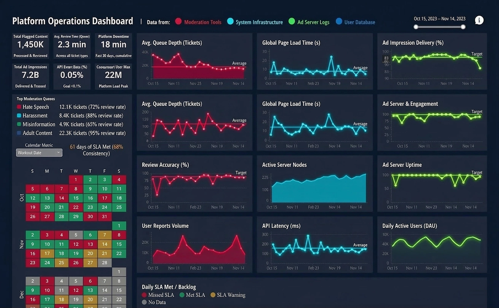

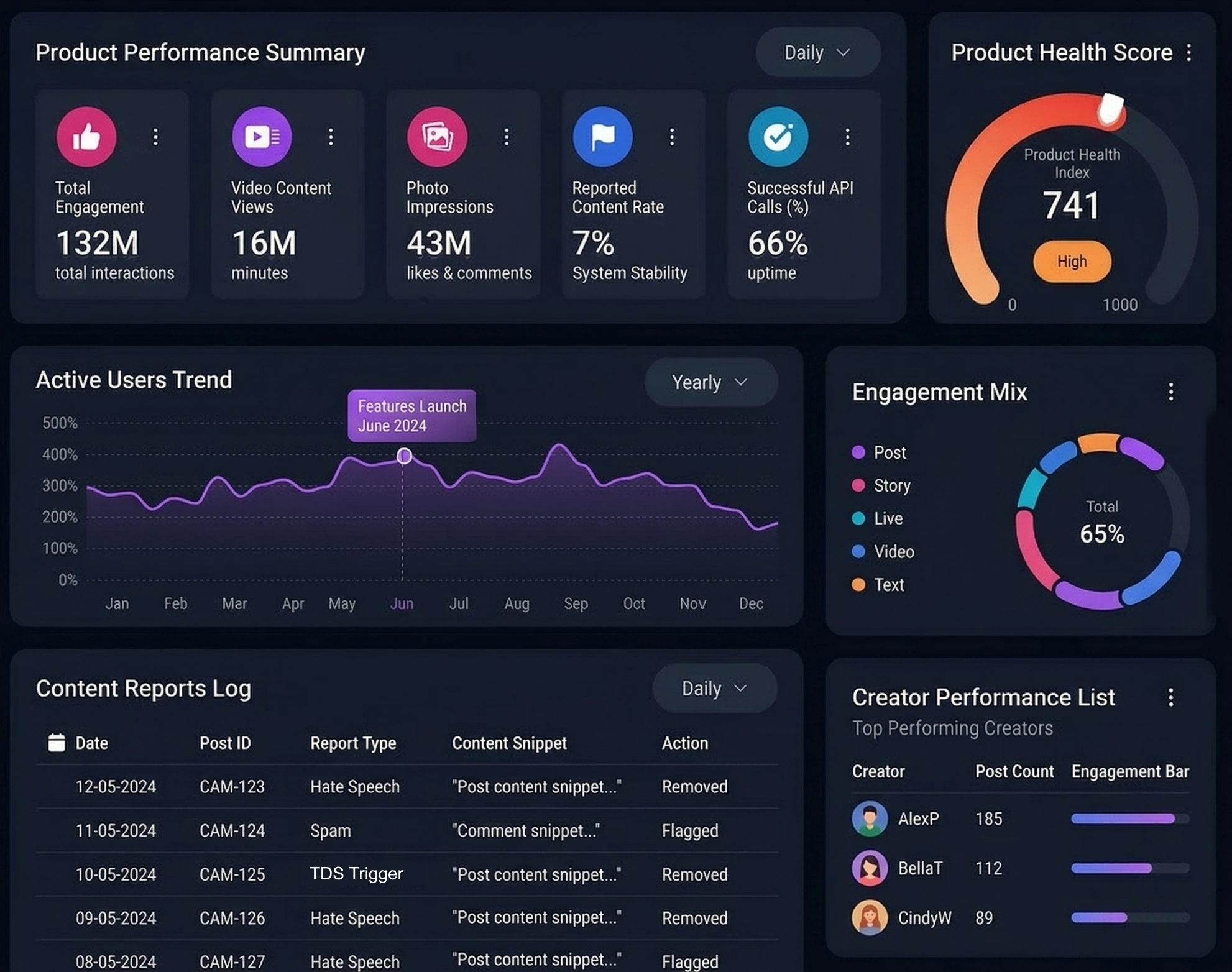
The first driver of the migration was the need for more customizable, enterprise-grade dashboards that could serve very different audiences: product managers, growth marketers, sales leaders, and executive stakeholders. Amplitude’s strength lies in behavioral funnels, cohorts, and experimentation, but the social media company wanted to blend those behavioral insights with financial metrics, ad delivery performance, infrastructure costs, and even customer support data. InetSoft’s Visual Performance Analysis capabilities allowed the team to connect to a broader range of data sources and design dashboards that were not only interactive but also highly tailored to each stakeholder’s decision-making process.
Another key factor was governance and scalability. As the company grew, more teams wanted access to analytics, and the risk of fragmented metrics and conflicting definitions increased. With Amplitude, much of the analysis lived in product-centric workspaces, which worked well for feature teams but less so for cross-functional reporting. InetSoft offered a more centralized semantic layer and stronger control over metric definitions, data security, and role-based access. This meant the analytics team could define “one version of the truth” for core KPIs like daily active users, session depth, ad impressions, and revenue, while still giving teams the freedom to explore within those guardrails.
Visual performance analysis was also a major upgrade in terms of storytelling. The social media company’s leadership wanted dashboards that did more than show charts; they wanted visual narratives that highlighted anomalies, trends, and root causes. InetSoft’s design flexibility made it easier to create multi-level views: high-level scorecards for executives, drill-down paths for analysts, and operational dashboards for teams monitoring campaigns or content performance in real time. Instead of exporting Amplitude charts into slide decks, the company could now build live, presentation-ready views directly in InetSoft.
Integration Is Important
Integration with the broader data ecosystem was another important consideration. Over time, the company had invested heavily in a cloud data warehouse, streaming pipelines, and third-party marketing platforms. While Amplitude integrated with some of these tools, it was primarily optimized for event data. InetSoft, by contrast, was chosen for its ability to connect to relational databases, warehouses, APIs, and flat files, and then blend those sources into unified visual analyses. This allowed the team to combine user behavior, ad spend, content metadata, and infrastructure logs into a single performance view, something that had previously required manual stitching in spreadsheets or custom scripts.
Cost and value also played a role in the decision. As usage of Amplitude expanded across teams, licensing and event volume costs became a recurring discussion. The company realized that a significant portion of its analytics needs—especially for reporting, monitoring, and executive dashboards—could be better served by a BI-style visual analysis platform. InetSoft provided a more predictable cost structure for broad consumption, while the company retained a smaller, more focused footprint for specialized product analytics where Amplitude still excelled. In that sense, the “upgrade” was not a complete replacement but a rebalancing of tools toward their strengths.
The migration process itself required careful planning. The analytics team started by cataloging the most-used Amplitude charts and dashboards, then mapping them to InetSoft equivalents. Rather than simply recreating everything, they used the transition as an opportunity to rationalize metrics, remove redundant reports, and redesign dashboards around clear business questions. They worked closely with stakeholders to define what success looked like: faster time to insight, fewer ad hoc data pulls, and more self-service exploration without sacrificing data quality.

Adoption Is Critical
Training and adoption were critical. Many product managers and marketers were comfortable with Amplitude’s interface and worried that a new tool would slow them down. To address this, the analytics team created role-specific InetSoft training sessions, quick-start templates, and “starter dashboards” that mirrored familiar views while showcasing new capabilities. Over time, users began to appreciate features like richer visual options, cross-domain data blending, and the ability to build narratives that spanned multiple teams and objectives.
From a strategic perspective, upgrading to InetSoft for Visual Performance Analysis signaled a shift in how the social media company thought about analytics. Instead of treating product analytics as a separate island, the company moved toward a holistic performance view that connected user behavior, monetization, reliability, and growth. InetSoft became the central canvas where these threads came together, enabling leadership to see not just what users were doing, but how those behaviors translated into business outcomes and operational trade-offs.
In the end, the move from Amplitude to InetSoft was less about abandoning one tool and more about evolving the analytics stack to match the company’s maturity. Amplitude had been the right choice when the primary focus was understanding user flows and feature adoption. As the platform scaled and the questions became more complex, InetSoft’s visual performance analysis capabilities offered the flexibility, governance, and storytelling power the organization needed. The result was a more integrated, visually compelling, and strategically aligned analytics environment that could keep pace with the company’s growth and ambition.

Additional Reading
Top 10 Reasons to Use Visualization - When it comes to Information Visualization, here are the top 10 reasons how utilizing visualization will enhance your business. So I am just getting back to normal charts and graphs as opposed to traditional tables or cross tabs and things of that nature. So there were a couple of things that I had in mind. One, obviously there are some tasks that are just better suited for looking at the data in a visual manner, right. The first one that pops to mind is trending. If you are seeing data spread out over at a timeline, obviously you can see the shape of that trend much better in a visual display. I mean nobody is going to argue that you can't see an increase or a decrease by looking at the pure numbers but in terms of is this trend a linear increase, is it logarithmic or exponential, you can get a sense for that pattern a lot better when you are looking at a chart or graph...
Top Mistakes Using Data Visualization - It's always good to know how BI tools can benefit your organization but it's also worth knowing how organizations can misuse data visualization. I think the point made about sort of trending is exactly right. I mean that’s why I think you see so much movement around people kind of trying to incorporate geospatial analysis to their data, where they can actually sort of look at and identify trending information based on a map. Just being able to overlay different context on that trending information tends to really drive a much more rapid level -- you get insight more rapidly and the insight becomes much more rich, and I think that underlines the point that Jessie made exactly with his case study...
Topology of the Visualization Vendor Landscape - As I was thinking of an agenda for today’s Webinar, I was thinking of talking about how to create a topology or framework for sorting out what visualization does. I could talk about the different kinds of visualization vendor options out there because this is a field where every tool is not the same. There are some solutions that focus on displaying information more like static reports. There are others that are more aimed at exploration, and it’s the set of tools out that focus on data discovery and analysis and those associated challenges that often all get grouped in the same bucket from a marketing perspective. So I thought it would be enlightening to try to create a framework to sort some of this out and clarity some of the differences. So we’ll go through that, and then we’re going to talk about who leads where, profiling some of the visualization vendors, and we will look at what really matters and then go through some use cases...
Understanding Key Business Metrics - Key Business Metrics (KBMs) are business indicators that are used to follow a company's performance. All companies, non-profit organizations, and government entities need to judge their performance on a time-sensitive basis. These business metrics are the statistics that are deemed important enough to track in order to meet projected business goals...

Understanding Key Performance Goals - Key performance goals are the important, strategic final and intermediate outcomes that management sets for either overall corporate performance, or for departmental performance. Examples could be higher sales or higher customer satisfaction. After the goals are set, then organizations track the progress of their efforts towards these goals by monitoring the key performance indicators or KPI, the numbers that measure the current level of the metric associated with the goal. The corresponding examples would be monthly sales figures or percent of customer who are highly satisfied.
Useful Tips on Information Visualization - What are some good useful tips to know when using information visualization? It's good to have these tips at the back of your head. Well, I think that just because we are using an advanced technique does not mean that we cannot try to triangulate and confirm our results, right. I mean I think that people sort of get a little bit enamored and can sort of like identify trends that may or may not be accurate. There sort of can be a whole series of false positives. And the idea to cross-check your conclusions in data using more than one technique or more than one dataset cannot be abandoned just because you can look at information in a more sophisticated way and sort of attempt to identify patterns in some different ways, right. You still need to use the intellectual rigor and the analytic discipline to make sure that you are taking the correct actions based on the data that you are seeing...
User Created Visual Analyses - Another question, someone still has to create the initial sandbox to be explored, so where is IT required, or can the user create a visual analysis on their own? The big issue is understanding the data. An end-user generally is not going to be able to go and sort through the Oracle Warehouse and figure it out the 105 tables they need to load to get the content they need do the analysis. On the other hand, if it’s just two tables they need to work with, sure they can figure it out. Even simpler a person can easily import their own spreadsheet and doing everything on their own. So it depends on where the data is that they need to work with. While it’s not all wizard driven, it’s not hard to do it once the data is in the software. The challenge usually is what’s in the data, and what has to be selected from where to use it. Typically in those situations where it’s going to a group of people using it, and the data is come from an Oracle data warehouse with a lot of tables, you’ll need your IT staff to set up the software...
Using a Visual Analysis of Multidimensional Data - Let’s continue on using this visual analysis of multidimensional data from the Census. So let's say I want to choose a state to live in, I want to live in the West Coast, so I can immediately filter out all the states in the West Coast. Notice how all the other selection lists updated themselves to show me compatible selections. I am only looking at the states with West Coast of the US. I can further filter my data. I only want to live in a state where the median household income is at least $40,000. Now just by looking at this picture, I can immediately spot the outliers. This is not a very good state to live in, very heavily populated, a horrible commuted time, not a very large median household income. It's California. On the other hand, I have an outlier, high household income, decent commute time, not a large population, but it's Alaska. I can always zoom in to certain portions in my chart. These two look like good states, not very populated, good commuted time, decent income, Utah and Nevada. I can filter by any other region and really explore and visualize my data...
Using Google Maps in a BI Dashboard or Visualization - InetSoft's business intelligence dashboarding software lets you chart data on a Google map for interactive data visualizatons. Using the Google map API and InetSoft's script language, you can request a static map from Google to be the background of the chart you design in InetSoft's StyleBI application. Then you can plot your geocoded data from almost any data source based on latitude and longitude. Add to your interactive dashboard selection lists, range sliders and a calendar selector, and you can build an efficient way to explore data in relation to geographic features such as as streets, buildings, and terrain features. This gives you the ability to visualize data on a very local basis when using the standard boundary map files that come with InetSoft's charting engine and plotting data based on postal code or region isn't sufficient...

Using Interactive Visualizations on iPads - One customer of ours found something else out by using interactive visualizations on iPads. What they found is when they gave iPads with StyleBI on them to their customers who are shopping for refinance, mortgage and home loans, who could then interact with the data in their office, they got a 30% increase in customer conversion rates and up to 90% in regular inquiries. Why is that? I think it’s because when people can interact with the data, they get that physical sense of working with the data. And in fact, viewing the mobile device is not just a way of viewing the data. It’s a way of interacting with the data, and it becomes part of the narrative of the customer relationship. It becomes part of that narrative experience, which is very powerful for users. How does the use of data discovery tools change a business? Well, one of the things that happens is that we move away from this traditional view. There’s this very telling phrase that we use in business intelligence. We talk about end users. And you can see in this diagram there are end users that are purely passive receivers of knowledge that comes out from the center...
Very Common Mistakes In Data Visualization - Nowadays, data makes up the fabric of anything and everything digital. However, data can be complicated at times, especially for those who try to study and understand it. This is especially a problem for enterprises, because with data growing every single day, visualization is needed. Data visualization allows data scientists and analysts to study the data in larger quantities then and there. Unfortunately, there are many mistakes to be had, when it comes to data visualization. No matter what tools you use for such a task, mistakes are bound to happen. With that said, here are 5 mistakes to avoid in data visualization...
Visual Analysis - an article about the power of visual analysis, a relatively new innovation in information management software that allows a person to explore data in an interactive, visual manner. At its simplest, it means charting and graphing data, but the novelty is in multi-dimensional charting and interactivity. Multi-dimensional charting means being able to depict more than just two dimensions on a graph. The standard simple graph charts just two dimension, on the x and y axes. In a two-dimensional chart you can identify basic trends, such as time-based one: is a measure like sales, increasing or decreasing, but you can’t see any other dimension that might help explain why...
Visual Analysis Examples- InetSoft's visual analysis software StyleBI™ uses a reporting-driven approach to enable rapid deployment of analytical dashboards. Dashboard software has been established as a highly effective business intelligence tool. Our dashboards can be monitoring-oriented or reporting-oriented and are a foundation of performance management software.....
Visual Analysis Example Using Airline Performance Data - Here is another visual analysis example that uses airline on-time performance data from the Federal Aviation Administration. The colors represent on-time performance for a certain time block by day of week with red being the worst and green the best. Again, we can uncover systemic problem areas much faster than we could using tables of information. Rather than discuss this some more let's just take a look at StyleBI in action. Airports are geographical entities so map is a logical way of summarizing airport information. By using the latitude and longitude information of airports this analytical map now has marked the location of all the airports in my data. Next, I will color code these airports using the on-time percent measure, and from this default range of colors I can see there is a lot of variation in airport performance. If I open up the option menu here, I can personalize the color distribution of my liking simply by adjusting the performance bands in terms of color and the corresponding range of values that those colors represent...

Visual Analysis Software - an article about the business benefits of visual analysis, such as exploring data inexpensively, speeding up data analysis, and how for reasons that all members of an organization can value, visual analysis is a very attractive business tool. Traditional information access methods are frustratingly human resource intensive. A business person might have a question in mind, but previously he or she needed to make a data or report request to a database analyst to get an answer. If the request was misunderstood or, after seeing the result, the asker realized a mistake in the question, the process had to be repeated...
Visual Analysis Solutions - InetSoft's Style Scope™ is easy to use, interactive dashboard software that includes real time reporting capabilities. It is an edition of StyleBI that focuses on business data exploration by combining Data Block™ technology with visualization. Visual analysis is constructed in real-time by dropping data items into visual elements such as charts, metrics and selections. The resulting view reveals the intrinsic relationships among the data...
Visual Analytics Company - Are you looking for a good visual analytics company? Since 1996 InetSoft has been making business software that is easy to deploy and easy to use. Build self-service oriented dashboards and visual analyses quickly. View a 3-minute demo and download a free version...
Visual Analytics Evaluation - Visual analysis is a relatively new innovation in information management software that allows a person to explore data in an interactive, visual manner. At its simplest, it means charting and graphing data, but the novelty is in multi-dimensional charting and interactivity. Multi-dimensional charting allows you to add coloring and implement sizing options. Coloring means coloring different data points on a two-dimensional chart to denote more information. For example start with a graph of sales opportunities where closing probability is depicted on the y-axis and days until expected close date on the y-axis, with dots represented a single opportunity. You would already be able to identify imminently winnable opportunities in the upper left corner. Now color the dots by sales person, a different color for each person. Now a scan of the color patterns shows who has more open opportunities and where they are in the likelihood and timeliness to close. Add another dimension by sizing those dots by dollar amount, such that the larger the revenue potential of the opportunity, the larger the circle is. Now, at a glance you can prioritize opportunities to focus on...

Visual Analytics Solutions - InetSoft's software for visual analytics is an enterprise-grade solution for accessing multiple data sources and easily generating visualizations to explore and analyze data. InetSoft's solutions are a unique blend of modern interactive visualization technology and a robust enterprise deployment architecture...
Visual Data Tool - Visualization and analysis benefits include unlimited multi-dimensional charting, brushing for data exploration, drag and drop design in a Web browser, spreadsheet-like design, use gauges, thermometers, and other familiar objects, use charts, maps, and other advanced visual displays. In the past year several powerful advances in visualization capabilities have been introduced. Users can now: * Make multi-dimensional charts even more information-rich thanks to new coloring, shape, and sizing options that, for instance, turn a 3D bubble chart into a 4D or 5D chart * Create multi-charts (aka trellis graphs, visual crosstab, or small multiples). * Use brushing techniques where by selecting data points in one chart highlights corresponding data points in accompanying charts...