Market Survey Analysis Dashboards
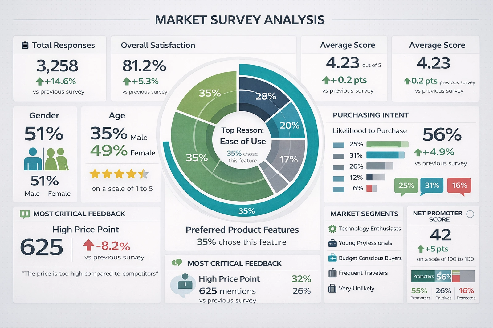
The Market Survey Analysis Dashboard is a visual decision-support tool designed to transform raw survey data into structured, interpretable business intelligence. By consolidating respondent counts, satisfaction metrics, demographic distributions, and behavioral intent indicators into a single full-screen interface, the dashboard enables analysts, marketers, and executives to understand customer sentiment at a glance.
Rather than relying on spreadsheets or static charts scattered across reports, this dashboard integrates key performance indicators (KPIs) into a unified narrative about customer experience and market positioning.
At its core, the dashboard answers four essential questions: How many people responded? How satisfied are they? Who are they? And what are they likely to do next? Each panel contributes to this narrative using consistent typography, color-coded indicators, and spatial hierarchy that emphasizes the most critical insights first.
Total Responses and Trend Comparison
The Total Responses card provides immediate context for data reliability. A higher number of responses improves statistical confidence and reduces sampling bias. The percentage change versus the previous survey period adds a temporal dimension, indicating whether engagement is increasing or declining. Growth in responses often signals improved outreach, stronger brand visibility, or increased customer motivation to share feedback. Conversely, declining participation may suggest survey fatigue or reduced customer trust.
This metric also functions as an operational KPI for survey program health. When paired with outreach channel data, it can help teams optimize email campaigns, in-app prompts, or post-purchase feedback requests.
Overall Satisfaction and Average Score
Overall Satisfaction expresses customer sentiment as a percentage, translating complex response distributions into a simple benchmark. This value typically reflects aggregated ratings such as “satisfied” or “very satisfied.” The accompanying average score (out of five) provides a more granular view, capturing subtle shifts in sentiment that percentages alone may conceal.
The directional indicator comparing results to the previous survey cycle enables trend monitoring. A rising satisfaction score implies successful improvements in product quality, service responsiveness, or pricing alignment. A decline, on the other hand, serves as an early warning signal that customer expectations may be evolving faster than current offerings.
Together, these metrics support performance management frameworks such as Customer Experience (CX) optimization and continuous improvement programs.
Demographic Snapshot
The demographic cards replace pie charts with large numeric indicators, improving legibility and accessibility. Gender and age distributions reveal who is participating in the survey and, by extension, who is most engaged with the product or brand. A balanced demographic mix improves confidence that results reflect the broader market rather than a niche subgroup.
These metrics also enable segmentation strategies. For example, if younger respondents report lower satisfaction, targeted product updates or communication strategies can be developed specifically for that cohort. Demographic data therefore shifts the dashboard from descriptive analytics into prescriptive potential.
Read why choosing InetSoft's
cloud-flexible BI provides advantages over other BI options.
Radial Preference Chart
The central radial chart functions as the analytical focal point. Modeled after multi-layer traffic source visualizations, it represents preferred product features in concentric segments. Each arc corresponds to a feature category, while the arc length represents the proportion of respondents selecting that feature as most important.
This format is particularly effective for comparative emphasis. Viewers can quickly identify dominant drivers of value, such as “Ease of Use,” and compare them against secondary factors like price, performance, or support. Unlike traditional pie charts, the layered radial design reduces visual clutter while enabling multiple data layers to coexist without confusion.
Strategically, this chart guides prioritization. Product managers can allocate development resources toward features with the highest proportional representation, while marketing teams can align messaging with the most valued attributes.
Purchasing Intent
The Purchasing Intent panel translates satisfaction into probable behavior. Likelihood to purchase, displayed as a percentage and supported by bar indicators, bridges perception with action. High satisfaction without high purchase intent may indicate pricing friction or insufficient perceived value, while high purchase intent suggests readiness for conversion-focused campaigns.
Monitoring changes in this metric over time enables forecasting. A rising intent score can be correlated with promotional efforts or feature launches, providing evidence-based validation of strategic initiatives.
Critical Feedback Analysis
The Most Critical Feedback section captures the dominant negative theme, such as “High Price Point,” along with the number of mentions and its trend compared to the previous period. This transforms qualitative complaints into quantifiable insight.
Rather than reviewing hundreds of open-text responses manually, stakeholders can immediately see which issue is most damaging to customer perception. This allows prioritization of corrective actions such as pricing adjustments, discount strategies, or communication clarifications.
Embedding a representative quote further humanizes the data, reinforcing that these metrics reflect real customer voices rather than abstract percentages.
Read how InetSoft saves money and resources with deployment flexibility.
Market Segments
The Market Segments list categorizes respondents into behavioral or psychographic groups such as Technology Enthusiasts, Young Professionals, or Budget-Conscious Buyers. These labels support persona development and targeted strategy design.
By pairing segment categories with satisfaction or intent metrics, organizations can identify which customer types are thriving and which require attention. This supports differentiated marketing and reduces reliance on one-size-fits-all approaches.
Net Promoter Score
Net Promoter Score (NPS) provides a standardized loyalty metric widely used for benchmarking across industries. The breakdown into Promoters, Passives, and Detractors reveals not just overall sentiment but the balance between advocacy and risk.
A rising NPS suggests strengthening brand affinity and organic growth potential through word-of-mouth. A declining NPS warns of reputational risk and potential churn. Displaying this metric alongside satisfaction and intent allows triangulation of emotional, behavioral, and attitudinal signals.
Strategic Value of the Dashboard
The primary value of this dashboard lies in integration. Rather than isolating survey results into static reports, it creates a living analytical environment where metrics reinforce one another. Decision-makers can observe how demographics influence satisfaction, how satisfaction influences intent, and how intent aligns with loyalty.
From a governance perspective, this dashboard also supports transparency. When metrics are visible and standardized, teams can align around shared definitions of success and failure. Over time, this consistency builds institutional memory and improves long-term strategy formulation.
Operational Applications
Marketing teams can use this dashboard to refine campaign messaging based on preferred features and demographic patterns. Product teams can prioritize enhancements aligned with dominant satisfaction drivers. Customer service departments can anticipate issues highlighted in critical feedback trends.
Executives benefit from its high-level clarity. Instead of reviewing dozens of slides, they can assess performance health within minutes, focusing discussions on action rather than interpretation.
View a 2-minute
introduction to InetSoft's serverless BI solution.
External Resources
More InetSoft Articles About Departmental Dashboards
-
This article explains how interactive dashboards transform raw information into actionable insights across business operations. It emphasizes the importance of focusing on the data that truly matters instead of drowning in noise. By leveraging Power Of Data Intelligence, organizations can align KPIs with strategic goals and improve decision-making speed. The piece walks through examples of KPI visualizations that highlight performance gaps and opportunities. It concludes with guidance on building a culture that consistently uses KPI dashboards to drive continuous optimization.
-
This solution page introduces InetSoft’s flexible platform for building and maintaining KPI dashboards without heavy IT involvement. It shows how users can connect to multiple data sources and create tailored views that reflect their unique performance metrics. The software supports self-service exploration so managers can monitor a Live View Of Organizational Performance in real time. The page highlights scalability from departmental scorecards to enterprise-wide KPI monitoring. It also underscores how easy modification of dashboards helps organizations keep pace with evolving business priorities.
-
This gallery showcases a variety of prebuilt dashboards for different roles and industries. Visitors can explore a management dashboard that breaks down revenue, prices, and profits by product line. Another example focuses on call centers, where supervisors track How Many Calls Employees Handle and how long they take. The page illustrates how color, interactivity, and mouseover details enrich KPI storytelling. It serves as inspiration for designing custom dashboards that match specific departmental needs.
-
This page describes dashboards tailored for marketing teams that need to track campaign performance across channels. It explains how marketers can visualize a Comprehensive View Of Key Performance Indicators such as leads, conversions, and engagement. Users can drill down into specific segments to understand which tactics are driving results. The content stresses that non-technical marketers can adjust dashboards and mash up data sources on their own. It also touches on handling the explosion of digital marketing data from search, social, and traditional media.
-
This solution overview focuses on visually rich dashboards that present KPIs in an intuitive format. It explains how organizations in any industry can monitor daily, monthly, or quarterly performance metrics. The dashboards provide a Dynamic Easy To Understand Visual Display of critical measures. The page discusses how different users can focus on the KPIs most relevant to their roles. It also gives examples such as comparing sales performance across representatives to support better operational decisions.
-
This page outlines dashboards designed for sales leaders and account managers. It highlights how teams can track pipeline health, win rates, and quota attainment in one place. By surfacing Key Metrics Across Sales Territories, the dashboards help identify high-performing regions and underperforming segments. The content explains how drill-down capabilities reveal details at the rep, product, or opportunity level. It also emphasizes real-time updates so sales teams can react quickly to changing conditions.
-
This solution page focuses on dashboards for finance departments that need to monitor profitability and cash flow. It shows how controllers and CFOs can consolidate data from multiple systems into a single view. The dashboards present Critical Indicators Of Financial Health such as margins, expenses, and revenue trends. The page explains how scenario analysis and time comparisons support budgeting and forecasting. It also notes that secure, role-based access ensures sensitive financial KPIs are shared appropriately.
-
This page describes dashboards that help HR teams understand workforce composition and performance. It covers metrics like headcount, turnover, hiring velocity, and training completion. By visualizing Trends In Employee Retention Rates, HR leaders can spot problem areas early. The content explains how segmentation by department, location, or role reveals deeper insights. It also highlights how HR dashboards support strategic initiatives such as diversity, engagement, and talent development.
-
This solution page targets healthcare organizations seeking better visibility into clinical and operational KPIs. It explains how providers can track patient volumes, readmission rates, and resource utilization. Dashboards present Quality Of Care Performance Measures alongside financial indicators. The page discusses how role-based views support executives, clinicians, and operations managers differently. It also emphasizes compliance and data governance considerations when working with sensitive healthcare data.
-
This page focuses on dashboards for manufacturing plants and supply chain teams. It highlights KPIs such as throughput, scrap rates, downtime, and on-time delivery. By monitoring Performance Across Production Lines, managers can quickly identify bottlenecks and quality issues. The content explains how real-time data from machines and systems feeds into visual displays. It also shows how historical trends support continuous improvement and lean manufacturing initiatives.


