Data Visualization Products: Comparing the Leading Choices
Visualization tools are software applications that convert raw data into graphical formats such as charts, graphs, maps, and interactive dashboards.
These data visualization solutions bridge the gap between complex datasets and human comprehension, enabling decision-makers to grasp patterns, trends, and anomalies at a glance rather than sifting through spreadsheets filled with numbers.
The transformation from tabular data to visual representation fundamentally changes how organizations interact with information, making insights accessible to stakeholders across all levels of technical expertise.

Organizations face exponentially growing data volumes from customer interactions, operational systems, market feeds, and IoT devices. Without effective visualization capabilities, this wealth of information remains underutilized or completely inaccessible to those who need it most. Companies that implement robust visualization platforms report faster decision cycles, improved cross-departmental collaboration, and enhanced ability to identify opportunities and risks before competitors. The shift toward data-driven cultures requires tools that democratize access to insights, and visualization software serves as the foundation for this transformation.
As businesses grapple with ever-increasing data, the ability to transform complex datasets into actionable insights becomes paramount. This is where data analysis tools come into play, offering a bridge between raw information and strategic decision-making.

Data analysis tools - transforming complex datasets into actionable insights
Modern data analysis platforms combine statistical processing, algorithmic modeling, and visual output to help organizations extract meaning from their information assets. These tools handle the technical complexity of data manipulation—cleaning inconsistencies, joining disparate sources, performing calculations, and applying analytical models—while presenting results in formats that business users can immediately understand and act upon. The most effective solutions balance analytical depth with accessibility, ensuring that sophisticated techniques remain available to data scientists while basic exploration capabilities serve broader audiences.
What distinguishes advanced analysis platforms from basic reporting tools is their ability to support iterative exploration. Rather than generating static reports, these systems enable users to ask follow-up questions, drill into unexpected findings, and test hypotheses in real time. This interactive approach accelerates the path from data to decision, particularly in fast-moving business environments where waiting for IT departments to generate custom reports creates competitive disadvantages.
The technical capabilities that define leading platforms include support for multiple data source types, from traditional databases to cloud storage and streaming feeds. Robust data preparation features handle the reality that most organizational data requires significant cleaning and transformation before analysis. Advanced statistical functions and machine learning integration allow users to move beyond descriptive analytics into predictive and prescriptive insights. Collaboration features ensure that discoveries can be shared, discussed, and refined across teams, turning individual insights into organizational knowledge.
The implementation of these tools yields significant advantages, streamlining operations and enhancing strategic decision-making.
Key benefits of implementing data analysis tools
Organizations that deploy comprehensive analysis platforms experience measurable improvements across multiple dimensions. Decision velocity increases dramatically when executives and managers can access current information through intuitive dashboards rather than requesting reports and waiting for delivery. Companies report reducing decision cycles from days or weeks to hours or minutes, enabling more agile responses to market conditions and operational challenges.
Operational efficiency gains emerge as teams identify process bottlenecks, resource allocation issues, and workflow inefficiencies that were previously invisible in aggregated reports. The ability to segment data by location, time period, product line, or customer segment reveals optimization opportunities that drive cost reductions and productivity improvements. Customer experience enhancements follow naturally when organizations can analyze behavior patterns, preference trends, and satisfaction drivers with granularity that supports personalization and targeted interventions.
Building upon the foundation of data analysis, business intelligence tools (BI) offer a more expansive and integrated approach to leveraging data for strategic advantage.
Business intelligence tools - leading platforms for data-driven decisions
Business intelligence tools represent the enterprise-grade evolution of data analysis, offering comprehensive ecosystems that span data integration, warehousing, modeling, analysis, and distribution. These solutions address the full lifecycle of organizational intelligence, from connecting to source systems through delivering insights to end users. What sets BI tools apart from standalone visualization applications is their architectural approach to data management, governance, and scalability, making them suitable for organizations with complex requirements around security, compliance, and performance.
Integration capabilities form the foundation of effective BI platforms. Modern businesses operate dozens or hundreds of systems—ERP, CRM, marketing automation, financial management, supply chain, and more—each containing valuable information. Leading BI tools provide pre-built connectors for common applications alongside flexible APIs for custom integrations, ensuring that analysis can span the complete data landscape. This unified approach eliminates the information silos that plague organizations relying on disconnected reporting tools.
The governance and security features embedded in enterprise BI platforms address critical concerns around data access, privacy, and regulatory compliance. Role-based permissions ensure users see only information appropriate to their responsibilities. Audit trails track who accessed what data and when, supporting compliance requirements and security investigations. Data lineage capabilities document how metrics are calculated and where source data originates, building trust in reported figures and facilitating troubleshooting when questions arise about accuracy.
Within the broader category of BI, data visualization software plays a crucial role, offering a range of solutions tailored to diverse business needs in the US market.
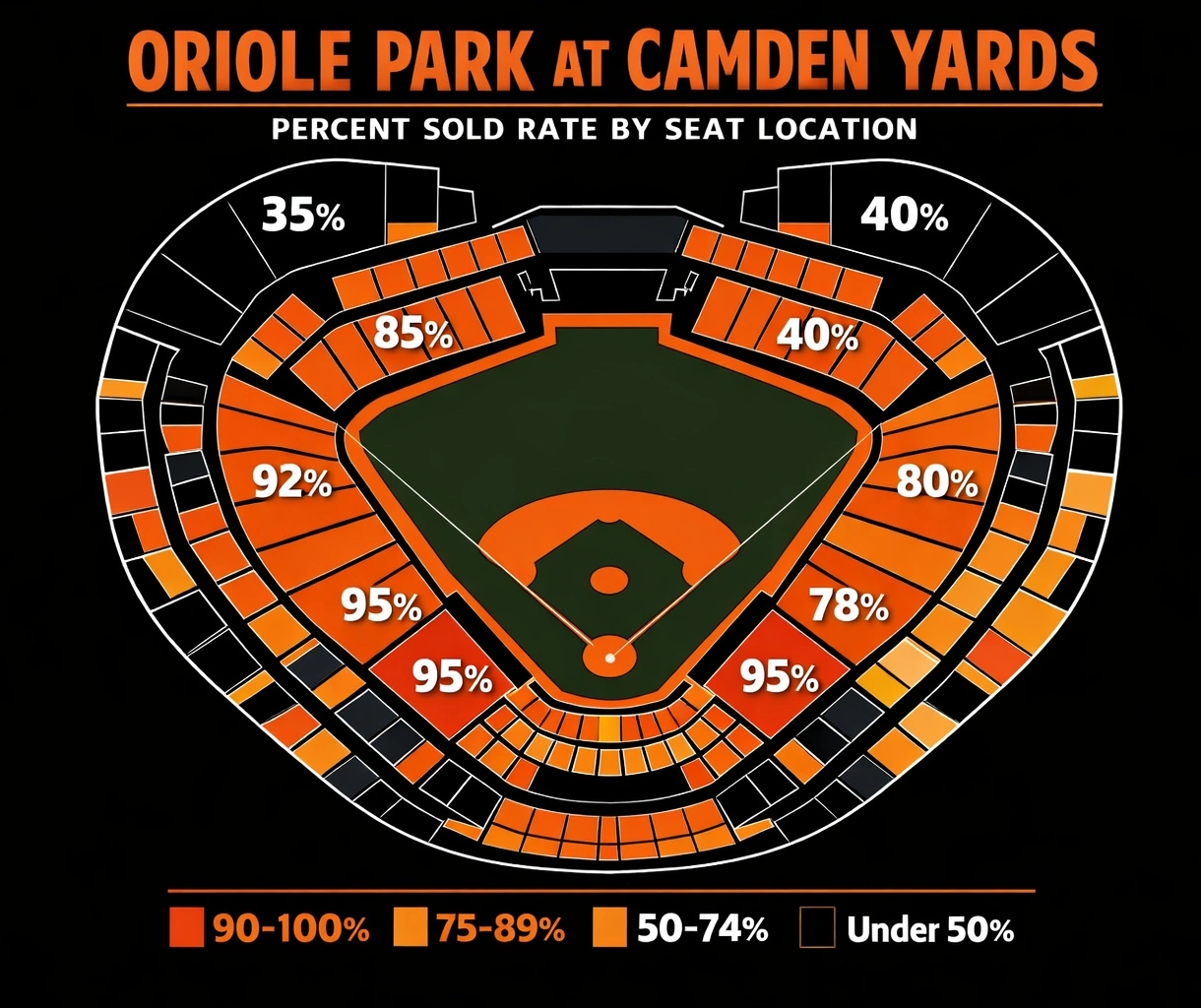
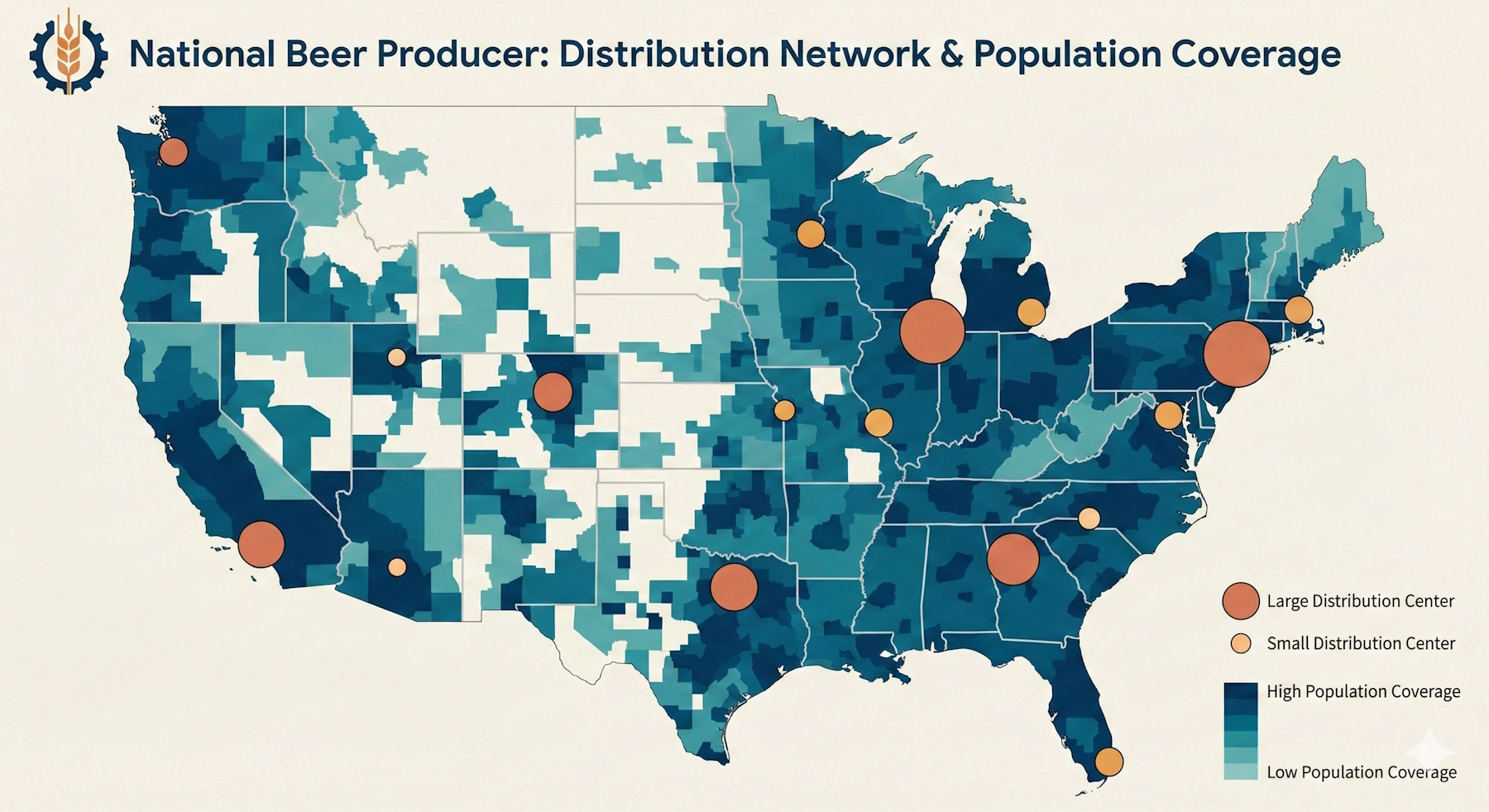
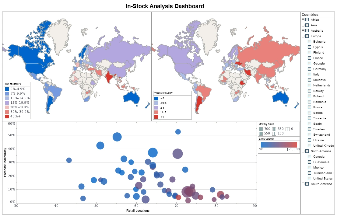
A practical example of effective data visualization can be seen in stadium occupancy analysis, where real-time seat availability and capacity metrics are visualized to optimize venue management and enhance the fan experience.
Data visualization software - top solutions for US businesses
The American market for data visualization software reflects diverse organizational needs, from startups seeking affordable cloud solutions to Fortune 500 enterprises requiring scalable platforms supporting thousands of users. Several vendors have established strong positions by addressing specific segments or use cases, while others compete on breadth of functionality and ecosystem integration. Understanding the landscape requires examining not just feature lists but also pricing models, implementation complexity, learning curves, and vendor stability.
Market leaders have achieved their positions through different strategies. Some prioritize ease of use and rapid deployment, appealing to business users who want to create visualizations without IT involvement. Others focus on analytical depth and customization, attracting data science teams and organizations with sophisticated requirements. Cloud-native platforms emphasize accessibility and collaboration, while on-premises solutions address security and compliance concerns in regulated industries.
Adoption patterns across US industries reveal interesting variations. Financial services organizations gravitate toward platforms with strong security credentials and regulatory compliance features. Healthcare providers prioritize tools that handle sensitive patient data while supporting clinical analytics and operational dashboards. Retail companies seek solutions that integrate marketing, sales, and inventory data to support omnichannel strategies. Technology firms often prefer platforms that support embedded analytics, allowing them to incorporate visualizations into their own products.
Among these solutions, Tableau stands out as an industry-leading platform, known for its robust capabilities and widespread adoption.
Tableau - industry-leading visualization platform
Tableau has maintained its position as a market leader through a combination of intuitive design, powerful analytical capabilities, and extensive community support. The platform's drag-and-drop interface allows users to create sophisticated visualizations without writing code, while advanced users can leverage calculated fields, parameters, and table calculations for complex analyses. Tableau's strength lies in exploratory analytics, enabling users to quickly test hypotheses and uncover unexpected patterns through interactive dashboards that respond instantly to filtering and drilling actions.
The acquisition by Salesforce has expanded Tableau's integration capabilities, particularly for organizations using Salesforce CRM and related cloud applications. This ecosystem approach provides seamless data flow between sales, marketing, and analytics functions, supporting unified views of customer relationships and business performance.
Another prominent player in the BI landscape is Microsoft Power BI, which offers tight integration with the Microsoft ecosystem and a compelling value proposition.
Microsoft Power BI - integrated business intelligence solution
Power BI's rapid growth stems largely from its deep integration with the Microsoft ecosystem that dominates enterprise IT environments. Organizations already using Excel, SQL Server, Azure, and Office 365 find that Power BI fits naturally into existing workflows and infrastructure. The platform leverages familiar interfaces and concepts from Excel, reducing learning curves for business users while offering advanced capabilities through DAX formulas and custom visualizations for power users.
The pricing model represents another significant advantage, with free desktop versions supporting individual users and affordable cloud subscriptions enabling enterprise deployment. Real-time streaming capabilities allow organizations to monitor operational metrics as they occur, supporting use cases from manufacturing floor monitoring to social media sentiment tracking. Microsoft's continuous investment in AI features, including natural language queries and automated insight discovery, positions Power BI at the forefront of intelligent analytics.
For organizations seeking accessible and cost-effective cloud-based visualization, Google Data Studio presents a compelling option.
Google Data Studio - accessible cloud-based visualization
Google Data Studio appeals particularly to small and medium-sized businesses seeking capable visualization tools without licensing costs. Similarly, users can explore data visualization capabilities with a free cloud-hosted, zero-client app for data visualization and analytics. The platform's free tier provides substantial functionality, including unlimited reports and data sources, making it accessible to organizations with limited budgets. Integration with Google's advertising and analytics platforms—Google Ads, Google Analytics, YouTube Analytics—creates natural workflows for marketing teams tracking digital campaign performance.
The collaborative features reflect Google's expertise in cloud-based productivity tools, allowing multiple users to edit reports simultaneously and share results through simple links. While the platform lacks some advanced analytical capabilities found in premium tools, its combination of zero cost, ease of use, and Google ecosystem integration makes it a compelling choice for specific use cases.
Beyond these leading platforms, several other enterprise visualization solutions cater to specific industry needs and analytical requirements.

Additional enterprise visualization platforms
Qlik - associative engine for discovery-oriented analysis
Qlik's associative engine differentiates it from competitors by maintaining relationships across all data elements, allowing users to explore connections that traditional query-based tools might miss. This approach supports discovery-oriented analysis where users don't know in advance what questions to ask. Looker, now part of Google Cloud, has gained traction among data-forward organizations through its modeling layer that defines business logic once and ensures consistency across all analyses. Domo targets executives with mobile-first dashboards and pre-built connectors for hundreds of business applications, emphasizing speed to insight over analytical depth.
Complementing these visualization tools, dashboard software and reporting tools provide real-time insights that empower organizations to monitor performance and make informed decisions.
A lesser known but arguably powerful option in the enterprise visualization space is StyleBI, which combines advanced data transformation capabilities with intuitive visual analytics.
StyleBI - enterprise-grade data visualization and transformation
StyleBI represents a comprehensive solution for organizations seeking to transform raw data into compelling visual narratives while maintaining enterprise-level security and scalability. Built on InetSoft's decades of innovation in visualization technology, StyleBI combines intuitive design with powerful analytical capabilities, enabling both business users and data professionals to create sophisticated dashboards and reports without extensive technical expertise. The platform's architecture prioritizes ease of deployment and integration, allowing organizations to move from data source to actionable insights in significantly less time than traditional BI implementations, reducing time-to-value and accelerating organizational decision-making cycles.
One of StyleBI's key advantages lies in its approach to data transformation and preparation. The platform streamlines the complex process of connecting disparate data sources, cleaning inconsistencies, and reshaping information into formats suitable for analysis. Advanced data modeling capabilities enable users to define business logic once and apply it consistently across all visualizations, eliminating discrepancies that plague organizations relying on multiple isolated reporting tools. This systematic approach to data governance ensures that metrics are calculated uniformly, building stakeholder confidence in reported figures while dramatically reducing the time analysts spend on repetitive data preparation tasks.

StyleBI's visual analytics engine provides sophisticated exploratory capabilities that help users uncover hidden patterns and relationships within complex datasets. The platform's guided analysis features recommend appropriate visualization types based on data characteristics, supporting users in selecting the most effective representations for their analytical questions. Whether analyzing financial performance, operational metrics, or customer behavior, StyleBI delivers interactive dashboards that respond instantly to filtering and drilling actions, enabling users to move from high-level overviews to detailed investigation without context switching or performance degradation.
The platform's flexibility in deployment models—cloud-based, on-premises, or hybrid—accommodates diverse organizational requirements and compliance constraints. StyleBI's enterprise security features, including role-based access control, comprehensive audit trails, and data encryption, address the governance requirements of regulated industries while maintaining the accessibility and usability that characterize modern analytics platforms. For organizations evaluating comprehensive visualization solutions, StyleBI's combination of transformation capabilities, analytical depth, and enterprise-grade reliability positions it as a compelling alternative to both specialized point solutions and heavyweight BI platforms.
Dashboard software and reporting tools - real-time insights at your fingertips
Dashboard software platforms serve as command centers for modern organizations, consolidating key performance indicators from across the business into unified views that support monitoring and rapid response. The evolution from static reports delivered on fixed schedules to dynamic dashboards that update continuously reflects fundamental changes in business tempo and competitive dynamics. Organizations can no longer afford to make decisions based on information that's days or weeks old when competitors operate on real-time data.
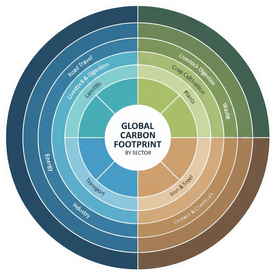
Real-time dashboard effectiveness depends on more than just technical capabilities—it requires thoughtful design that matches information presentation to user needs. Consider a practical example: environmental monitoring dashboards that track carbon footprint metrics across facilities and operations. These dashboards visualize emissions data, progress toward sustainability goals, and actionable opportunities for reduction, enabling organizations to meet corporate environmental commitments while identifying cost-saving opportunities in energy consumption.
Effective dashboard software solutions balance comprehensiveness with focus, presenting enough information to provide context while avoiding the cognitive overload that comes from cluttered displays. The best implementations follow design principles that guide attention to the most important metrics, use color and visual encoding to communicate status at a glance, and provide drill-down capabilities for users who need additional detail. Mobile optimization has become essential as executives and managers expect to monitor business performance from anywhere, requiring responsive designs that adapt to different screen sizes without sacrificing usability.
The technical requirements for real-time dashboards extend beyond visualization capabilities to encompass data infrastructure. Streaming data pipelines, in-memory processing, and efficient query optimization ensure that dashboards reflect current conditions rather than stale snapshots. Alert mechanisms notify stakeholders when metrics exceed thresholds or exhibit unusual patterns, enabling proactive intervention before small issues become major problems.
To illustrate the practical applications of these tools, and to see real-world dashboard examples, let's examine how various industries leverage data visualization to address specific challenges and opportunities.
Data visualization tools examples - practical applications across industries
Healthcare organizations deploy visualization tools to improve patient outcomes and operational efficiency simultaneously. Clinical dashboards track patient flow through emergency departments, identifying bottlenecks that increase wait times and highlighting resource allocation issues. Population health analytics visualize disease prevalence patterns, vaccination rates, and social determinants of health across geographic regions, supporting public health interventions and preventive care programs. Financial dashboards help hospital administrators monitor revenue cycles, insurance claim statuses, and cost per procedure, enabling data-driven decisions about service lines and operational improvements.
Financial services firms leverage visualization platforms for risk management, trading operations, and customer analytics. Risk dashboards aggregate exposures across portfolios, counterparties, and market conditions, providing real-time views of potential vulnerabilities. Trading floor displays visualize market movements, order flows, and position performance, supporting split-second decisions in fast-moving markets. Customer relationship dashboards help wealth managers understand client portfolios, life events, and engagement patterns, enabling personalized service and proactive outreach.
Retail companies use visualization tools to optimize inventory, understand customer behavior, and coordinate omnichannel operations. Store performance dashboards compare sales, traffic, and conversion rates across locations, identifying top performers and struggling outlets. Inventory visualizations track stock levels, turnover rates, and supply chain status, preventing stockouts and reducing excess inventory. Customer analytics platforms visualize purchase patterns, segment characteristics, and campaign responses, informing merchandising decisions and marketing strategies.
As we look ahead, several key trends are poised to shape the future of the data visualization market in the United States.
Current trends shaping the US data visualization market
Artificial intelligence and machine learning integration represents the most significant evolution in visualization platforms, moving beyond passive display of data to active insight generation. Modern tools automatically identify anomalies, forecast trends, and suggest relevant analyses based on user behavior and data patterns. Natural language processing enables users to ask questions in plain English and receive visualized answers, dramatically lowering barriers to data exploration. These intelligent features don't replace human judgment but augment it, surfacing patterns that might otherwise remain hidden in complex datasets.
The shift toward embedded analytics reflects growing recognition that insights deliver maximum value when integrated into operational workflows rather than isolated in separate BI tools. Software vendors across industries are incorporating visualization capabilities into their applications, allowing users to access relevant analytics without switching contexts. This trend drives demand for platforms that support white-labeling, API-based integration, and multi-tenant architectures, enabling seamless embedding while maintaining performance and security.
Data governance and privacy concerns are reshaping platform capabilities as organizations navigate increasingly complex regulatory landscapes. GDPR, CCPA, and industry-specific regulations require careful controls over data access, usage tracking, and consent management. Visualization tools are responding with enhanced governance features, including automated data classification, privacy-preserving analytics techniques, and comprehensive audit capabilities. These features transform from nice-to-have additions into essential requirements for organizations operating in regulated environments.
One of the most impactful trends is the rise of self-service analytics, which empowers users across the organization to create their own visualizations and derive insights independently.
Self-service analytics and democratization of data
The self-service analytics movement empowers business users to create their own analyses and visualizations without depending on IT departments or data specialists. This democratization accelerates insight generation by eliminating request queues and enabling domain experts to explore questions as they arise. Modern platforms, such as visual analytics software, support this trend through intuitive interfaces, guided analytics workflows, and curated data catalogs that help users find and understand available information sources.
Democratization introduces challenges around data literacy, governance, and quality control. Organizations must invest in training programs that build analytical skills across their workforce while implementing guardrails that prevent misinterpretation or misuse of data. Certification programs, peer review processes, and centralized metric definitions help balance accessibility with accuracy, ensuring that self-service capabilities enhance rather than undermine decision quality.
Another crucial trend is the increasing importance of mobile-first visualization, which ensures that insights are accessible to decision-makers regardless of their location or device.
Mobile-first visualization and remote accessibility
The acceleration of remote and hybrid work models has elevated mobile accessibility from a convenience feature to a critical requirement. Decision-makers expect to monitor business performance, review analyses, and collaborate with colleagues regardless of location or device. Visualization platforms are responding with responsive designs that adapt to smartphones and tablets, touch-optimized interfaces that replace mouse-based interactions, and offline capabilities that ensure access even without network connectivity.
Mobile-first design principles influence not just technical implementation but also visualization approaches. Charts and dashboards must communicate effectively on small screens, requiring careful consideration of information density, interaction patterns, and visual hierarchy. The most successful mobile implementations recognize that users on phones typically seek quick status checks rather than deep exploration, tailoring experiences accordingly while maintaining pathways to detailed analysis when needed.
Given the wide array of options available, selecting the best data visualisation tool for your organization requires careful consideration of your specific needs and priorities.

Selecting the best data visualisation tool for your organization
Choosing the right visualization platform requires systematic evaluation of organizational needs, technical requirements, and strategic priorities. Begin by assessing your current data landscape—what sources need to be connected, what volumes must be processed, and what latency is acceptable for different use cases. Consider your user community's technical sophistication and the balance between self-service capabilities and centralized control that fits your culture and governance requirements.
Scalability considerations extend beyond current user counts to anticipated growth in data volumes, user populations, and analytical complexity. Platforms that perform well with hundreds of users and gigabytes of data may struggle when scaled to thousands of users and terabytes of information. Evaluate vendor track records with organizations of similar size and complexity, and request performance benchmarks that reflect realistic workloads rather than idealized scenarios.
The total cost of ownership encompasses far more than software licensing fees. Implementation costs, including data integration, dashboard development, and user training, often exceed initial license expenses. Ongoing costs include maintenance, upgrades, additional storage or computing resources, and potentially consulting support. Organizations should model these expenses over multi-year periods to understand true financial commitments and compare alternatives on equal footing.
A key aspect of this selection process involves understanding the budget considerations and pricing models associated with different visualization platforms.
Budget considerations and pricing models
Visualization platform pricing varies dramatically across vendors and deployment models. Cloud-based solutions typically charge per-user subscriptions, with tiers based on capabilities and usage levels. On-premises deployments may involve perpetual licenses with annual maintenance fees or subscription models that include hosting infrastructure. Some vendors offer consumption-based pricing tied to data volumes or query counts, aligning costs with actual usage but introducing variability that complicates budgeting.
Small and medium-sized businesses often find the best value in cloud platforms with straightforward per-user pricing and minimal implementation requirements. These solutions provide predictable costs and rapid deployment without significant upfront investment. Large enterprises with complex requirements may justify higher costs for platforms offering advanced governance, scalability, and customization capabilities. The key is matching platform sophistication to organizational needs rather than over-buying capabilities that won't be utilized or under-investing in ways that create limitations as requirements evolve.
In addition to budget, integration capabilities and technical requirements play a critical role in ensuring seamless data flow and optimal performance.
Integration capabilities and technical requirements
Data source connectivity determines whether a platform can access the information your organization needs to analyze. Evaluate pre-built connectors for your critical systems—ERP, CRM, databases, cloud applications, and assess the flexibility of custom integration options for proprietary or niche systems. Consider both batch and real-time integration capabilities, as different use cases may require different data freshness levels.
API availability and quality enable programmatic control, custom development, and integration with other tools in your technology stack. Well-documented, comprehensive APIs support use cases from automated dashboard deployment to embedding visualizations in custom applications. Security and authentication mechanisms must align with your organization's standards, supporting single sign-on, role-based access control, and encryption both in transit and at rest.
Even with careful planning and tool selection, organizations often encounter challenges during data visualization implementation, which must be addressed proactively.
Overcoming challenges in data visualization implementation
Data quality issues represent the most common obstacle to successful visualization initiatives. Incomplete records, inconsistent formatting, duplicate entries, and outdated information undermine confidence in visualizations and lead to flawed decisions. Organizations must invest in data governance programs that establish quality standards, implement validation rules, and assign accountability for data accuracy. Visualization tools can help identify quality issues through profiling and anomaly detection, but addressing root causes requires process changes and cultural commitment to data stewardship.
 visualization training
session with interactive dashboards and learning materials
visualization training
session with interactive dashboards and learning materials
User adoption challenges emerge when implementations focus on technology deployment rather than change management. Even the most capable platforms deliver no value if users don't embrace them. Successful rollouts include comprehensive training programs tailored to different user roles, executive sponsorship that signals organizational commitment, and quick wins that demonstrate value early in the process. Ongoing support through help desks, user communities, and regular training refreshers sustains adoption as staff turnover occurs and new capabilities are introduced.
Skills gaps in data literacy and analytical thinking limit the value organizations extract from visualization investments. While modern tools reduce technical barriers, effective analysis still requires understanding of statistical concepts, critical thinking about data interpretation, and domain knowledge to contextualize findings. Organizations should invest in building these capabilities through formal training, mentoring programs, and communities of practice that share best practices and lessons learned.
Looking ahead, the future of data visualization products promises even more sophisticated capabilities and transformative applications.

Future outlook - the evolution of data visualization products
Augmented analytics capabilities will continue advancing, with AI systems taking on increasingly sophisticated roles in the analytical process. Future platforms will not only identify patterns but also explain their significance, recommend actions, and even execute approved interventions automatically. Natural language generation will transform dashboards from visual displays into conversational interfaces that answer questions and proactively share relevant insights. These developments will further democratize analytics by making sophisticated techniques accessible to users without statistical training.
Augmented and virtual reality technologies promise to revolutionize how we interact with complex, multidimensional data. Immersive environments could enable analysts to literally walk through data landscapes, manipulating variables and observing outcomes in three-dimensional space. While current applications remain experimental, the potential for VR and AR to enhance understanding of complex systems—from supply chain networks to molecular structures—suggests significant long-term impact on visualization practices.
The convergence of visualization with other enterprise capabilities will accelerate, blurring boundaries between BI platforms, data science tools, and operational applications. Unified platforms will support the full spectrum from data preparation through advanced analytics to automated action, eliminating the friction of moving between specialized tools. This integration will enable more sophisticated use cases while simplifying technology landscapes and reducing the overhead of maintaining multiple systems.
Privacy-preserving analytics techniques will mature in response to regulatory pressures and consumer expectations around data protection. Federated learning, differential privacy, and secure multi-party computation will enable organizations to extract insights from sensitive data without exposing individual records. These capabilities will be particularly important in healthcare, financial services, and other regulated industries where data utility must be balanced against privacy obligations.
Actionable Insights
Data visualization tools are essential for modern businesses, transforming complex data into actionable insights. By understanding the different types of tools available, from basic visualization software to comprehensive business intelligence tools, organizations can choose the solutions that best fit their needs. Investing in data quality, user training, and robust integration capabilities will maximize the value derived from these tools. As AI and augmented reality continue to evolve, the future of data visualization promises even more intuitive and immersive experiences, empowering businesses to make data-driven decisions with greater confidence and speed. Consider exploring options like InetSoft's Style Intelligence for a comprehensive solution.
InetSoft Resources and Articles: Visualization Product Information
This is a table of contents of useful product information about, and benefits of, InetSoft's visualization capabilities built into its business intelligence software for dashboards, reporting, and analytics:
Advanced Visualization - Now let’s talk about advanced visualization. This one is really about time to insight. Or showing us what is beneath the tip of the iceberg. At the tip of the iceberg, that’s where the BI industry does really well, answering the bread and butter questions such as what are my sales by customer or even time period analysis. What are my sales by customer this year versus last year? But where the BI industry lags in general is answering those complex questions, such as what is different about those customers with higher sales? So the less precise or the more exploratory questions, such as what are some of the characteristics of those customers? Or even what are characteristics of customers that are likely to churn...
Advanced Data Visualization Types Added - With addition of the following chart types, InetSoft offers as wide an advanced data visualization library as any analytics solution available. Enhancement for Using R Data Sources Among many user-driven improvements to administrative functions, users of external version control systems get more efficient access to the changes on InetSoft platform assets that concern them. Security management gets additional capabilities including SSO login defaults and user/role/group lookups. Dashboard and Chart Features Tooltips offer more options such as displaying more data point details than just the one selected and the ability to provide more information about a field, including name, alias, and description. Radar charts can now display in pivoted orientations. A new gauge type provides a colored sweep area based on desired data ranges. For example: sweep dashboard gauge Facebook Ad Insights Enhancement Advertisers can better report on their Facebook performance statistics with the ability to use all of the available data parameters. User Portal Functionality Foldering has been added for data asset organization, and intelligent search makes finding dashboards, reports, and worksheets easier For the Full Release Notes To review the complete list of new features and improvements, please see: https://inetsoft-cdn.s3.amazonaws.com/literature/2021_Minor_Features.pdf...
Appropriately Visualizing Big Data - You know what, mistakes not so much as just poor behavior as they constantly use the same type of visualization for data that would bode well in a different one. Again, this whole concept of a guided analysis or being able to understand what best practices, or being able to hand best practices. Do I need a cross tab for this as opposed to having a bar chart or having a pie chart or having some other visualization, which is more appropriate to the data in hand. So it won't be quite as eye catching, and it won't be as impactful if I use even the wrong data element in the wrong visualization. I won't be able to get to the underlying information that I need as quickly, nor will I be able to blend it as quickly. If I am really going to use a scatter plot, that enables me to use and to look at a huge array of information, across product lines or across timeframes whereas if I am just using a map or if I am using a bar chart, I don’t have that same interaction in contextual fields with the data that I need. So I think that that’s actually a big issue, and that’s for people who already have embraced visualization...
Are Pie Charts Good Visualization Choices? - Are pie charts good visualization choices? Well, pie charts have their own problems as well. Pie charts are too rowdy. The issue with the part chart is that they’re designed to represent different percentages. You could say, “Oh, well 37% of people use this toothpaste”, “22% of people use that toothpaste”. There’s no consistent axis where you can actually line up that 27-37% and clearly see which one is larger. Sometimes it’s very difficult to distinguish that. I know Tufte was very anti-pie charts, and I don’t quite take a position quite as strongly as his. I should throw that out at least, but nothing that would be enhanced by making it 3D. All 3D does is makes it a little prettier. So, people do that because they think it makes their graph more eye-popping. It has non-data-ink. It’s distracting. It draws attention away from the data that you’re actually trying to show. There is another ratio I want to talk about which is data-density ratio. Data-density is the number of data points or data entries in your graph, the area of the graphic, and this is something you’d like to maximize within reason in a graphic. And you can do this by increasing the data/ink ratio. Well, you can do that by eliminating all the metadata, the redundant data, and all the chart junk, and so on...
Astronomical Data Visualization - This astronomical data visualization presents a carefully structured, information-dense dashboard designed to support professional astronomers, astrophysicists, and data scientists working with large-scale cosmic datasets. Its layout, color palette, and visual hierarchy reflect both scientific rigor and modern data visualization best practices, balancing aesthetic appeal with analytical clarity. By integrating multiple domains of astronomical data—galactic structure, exoplanet discovery, stellar classification, black hole physics, and recent observations—the dashboard provides a unified interface for understanding the universe at multiple scales. The overall design uses a dark, space-inspired background that mirrors the natural observational environment of astronomy while minimizing eye strain during extended analysis sessions. Against this backdrop, luminous accent colors—blues, golds, purples, and reds—are used selectively to encode meaning rather than decoration. This ensures that visual contrast serves interpretability, allowing astronomers to quickly identify patterns, anomalies, and relationships across datasets...
Avoid These Common Mistakes In Data Visualization - Nowadays, data makes up the fabric of anything and everything digital. However, data can be complicated at times, especially for those who try to study and understand it. This is especially a problem for enterprises, because with data growing every single day, visualization is needed. Data visualization allows data scientists and analysts to study the data in larger quantities then and there. Unfortunately, there are many mistakes to be had, when it comes to data visualization. No matter what tools you use for such a task, mistakes are bound to happen. With that said, here are 5 mistakes to avoid in data visualization...
Benefits of a Visual Reporting Solution - Welcome to our webinar today on “What are the Benefits of a Visual Reporting Solution?” Today we’re going to focus on visual reporting and analysis, what is it, what benefits does it provide? We’re going to summarize some of key research points and then go to three examples of such an application. First we’ll look at an example with a top college, second with a major airline, and third with work with a salesforce.com pipeline analysis. Just for your information we will of course have some time for question and answers at the end of the webinar, and there are several ways that you can get your questions to us. You can use the chat panel that you see in the right hand corner of your Gotomeeting screen, or if you are into tweeting you can use our Twitter hashtag #inetsoftviz, or you can feel free to raise your hands, and we can unmute. You can ask your question live, or wait until the the end of the webinar. And the all important question will the webinar and slides be available afterwards? Yes we’re recording the webinar, and we will make both the webinar and slides available on our website...
Big Data Visualization Tips - Such amount of data is generated and produced daily that it has been possible for organizations to analyze, discover and verify this enormous amount of information through specific technologies for it. ...

Build One of These Visualizations - So now let’s build one of these visualizations. I know I want to look at risk and return. I’m going to create another tab. This tab is going to be called ‘reporting view.’ Now I’m going to have a third tab which is ‘portfolio view.’ So I’m going to the first tab, and I’m going to bring up some charts. We have 15 different charts. We’ll see them in a minute to see a little more detail, but I’m going to bring up a data sheet. It’s like a spreadsheet. I’m going to bring up some fields, maybe look a ten-year performance and expense ratios. I also need the fund category, fund name, fund family and volatility. So now this chart shows about 2,000 funds in here. I’m going to bring in fund category. I can see look at my fund category. It looks like I have a have a dozen of them. Okay if I’m looking at risk and return, I would probably want to see that on a scatterplot because that will split these funds out on a grid. So I want to put this three year performance on the X axis and volatility on the Y axis. I click okay, and I’m going to move this up top to arrange the layout a little bit better, and move it over the left. I will bring up one more chart. I want to see these grouped by fund category. So I bring up a bar chart, and pick the field, fund category. I’m going to show may the investment position so the bars will be the sum of the net assets of all the funds in each category...
Building a Visualization Off of Excel Spreadsheets - I can choose a database. I could even be using an Excel spreadsheet to build this visualization. And then I open up a new worksheet, and you see here those fields that I was showing you before come up on the left hand side. And the basic user experience is all visual. The whole desire of visual analysis is to make it so that people can think with their data. And here I can browse through my data just simply through drag and drop. It’s a very simple experience. If I want to look at markets, I drag them over. I see I have four markets. And if I want to look at the sales, I drag that here. And this is the aggregated sales for the central region, and I can right click here, and you can see here is the raw data that I was showing you a moment before. Here is all the data for central that’s been aggregated together. Anyone listening who has ever used pivot table, they will recognize this basic drag-and-drop style. A pivot table is also an example of this. I can drop product type here, and now I have the aggregated sales for coffee in central. And I can continue to proceed forward here. I could break this down by flavor. So I have the aggregated amaretto for central...
Categories of Data Visualization Tools - So on those two axes we can start plotting categories of data visualization tools. And the first category is what I would call display visualization tool. And this are what I would say are very simple dashboards that divide one or two layers of data, that will allow objects on the screen to synchronize with each other, update each other. So if you change one, the others on the screen will automatically update as well. A simple dashboard allows that. It’s a highly visualized interface that can be very appealing to users. And the next category of data visualization tools is what I would called exploratory visualization tools that are really conducive to allowing an analyst to go source any data they want from any place or any system they want. With these apps, you can start exploring that data by turning any metric or dimension into a filter, applying multiple filters at once or choosing which data to chart. You can start from some simple higher-level view and drill down to do some degree of analysis...

Choosing the Best Data Visualization Tool - What do business decision makers look for when choosing the best data visualization tool for their company? Factors to consider are the ability to mashup different types of data sources, the ability to import data, integration with data warehousing, options for prototyping new data, accessibility, and user-friendly features that speed up decision making...
Create a Data Visualization - So I am going to create another data visualization. I think I will simplify it a little bit. I will show you something along the way. I drag product type in market. Now we just have the states. I can make it a density plot. And in fact, I can even break it down further, and here is a density plot of all the area codes in this data set. And as you can see, there are some significant outliers, and there are also a lot of them that follow along a linear curve. And actually, if I select the trend line, you can see that that’s significant. I’ll create a geographic visualization now because I am dealing with states and area codes. So here is a map view where I can see that some of my states I have different profit levels since I have sized on profit. I can see I have modest profits. And in other places, I have significant profits. So that could be very interesting to me. Or I may want to decide to drill down into a particular area and look at the area code, say, in the New York area or something like that. So here are a lot of different views. And furthermore, sometimes you want to be able to look at different views at the same time. So we have a dashboarding feature where I could bring up these different views at the same time and add them and put them next to each other and do question answering involving them. I might even want to bring up a filter...
Current State of Information - Well you know, I think it's a little bit of all of the above, right. We are at -- in some ways it kind of gets overused, but we really are seeing a perfect storm in the Information Management age, and it's manifesting itself through all of this advancement around visualization. I mean if we just think about the underlying tools and how much they continue to evolve, whether it's in memory databases, whether its Map/Reduce capabilities, our ability technically to process trillions of records and petabytes of data at a relatively reasonable cost, that’s something that wasn’t available to Corporate America even 24-36 months ago. So we are seeing huge amounts of prospects or progress on that dimension. If we couple that with the fact that we are in an economic environment, where information and the ability to be agile and to interpret trends of behavior of your customer before your competitors can, right, and so this is the first time in a really long time where organizations had to focus so heavily on information insight for competitive advantage. So, now we have kind of a burning platform around the economy. We have technology catching up to us, and then we are starting to see a generation of the workforce joining enterprises today who grew up with technology at their fingertips, which are comfortable with and expect to see and interpret data in very different ways than the worker of 10 or 15 years ago...

Data Mining Visualization - InetSoft brings data mining to a new level by coupling it with high-definition visual graphics, interactive dashboards, and its patent pending Data Block™ technology. InetSoft's data mining visualization software allows users to simultaneously extract data from multiple data sources while analyzing trends, discovering correlations, and creating exploratory future scenarios. In a modern business, data mining is an indispensible tool that is capable of providing a competitive edge by using an organization's information to its advantage. InetSoft brings data mining to a whole new level by coupling it with high-definition visual graphics, interactive dashboards, and patent pending Data Block™ technology...
Data Visualization - Researching data visualization solutions for your organization's internal use or to embed in a commercial application? Deploy a small-footprint, easy-to-use Flash-based data visualization application from InetSoft. As an innovator in reporting software since 1996, InetSoft has pioneered the evolution from static reporting towards interactive visualization of data. InetSoft's award-winning software has been deployed at thousands of organizations worldwide...
Data Visualization Dashboard Tools For A BI Portlet - Looking for visualization dashboards, standalone or as a portlet in a BI portal? Since 1996 InetSoft has been making business dashboard software that is easy to deploy and use. InetSoft's server-based dashboard application functions as a visualization tool right out of the box or can be used to create interactive data visualization portlets to run in a BI portal or other Web-based solution...