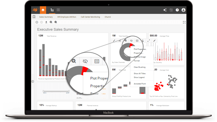
Self-Service Analytics - Auto Wired Data Visualizations, Deep Customization
Visual components are automatically wired together. This allows easy analysis through simple point and click actions. Power users can be empowered with customization to completely change visuals, calculations, or even data, to create completely new perspectives.
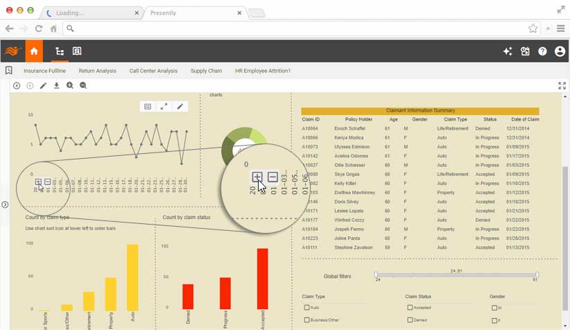
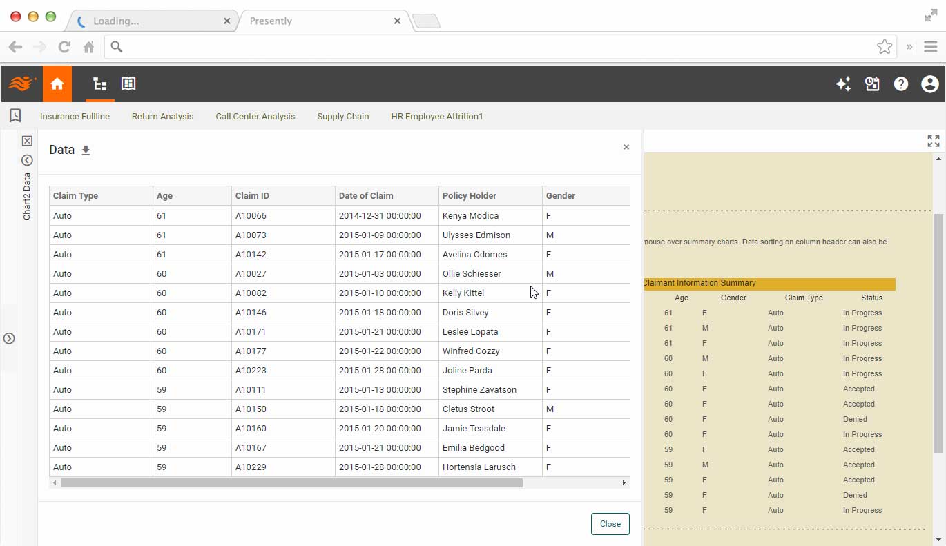
Drilldowns and Details
High-level KPIs and views presented with visualizations provide an excellent overview. Once users decide to focus on a particular area, drilldowns and details allow them to find root causes and take actions.
User Collaboration and Team Sharing
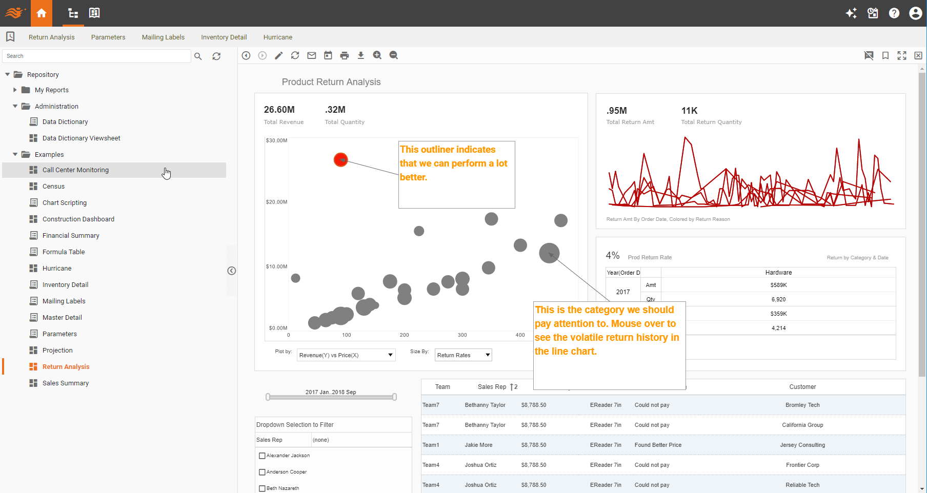
With built-in collaboration functions like annotations, bookmarking and sharing, analysis naturally extends to human collaboration and shared thoughts. Unlike external conversations, human-injected information is live and associated with the data. The association and history is not lost when new and updated data comes in. Conversations can also be secured to various scopes.
Gemological Instrument Manufacturer Upgrades from Infogram to InetSoft for Advanced Data Visualization
In the precision-driven world of gemological instrumentation, where minute variations in light refraction or spectral response can distinguish a flawless gemstone from a synthetic counterpart, data is everything. For manufacturers of these highly specialized instruments, data visualization is not just about marketing dashboards or internal metrics—it’s a critical component of quality control, R&D validation, and client assurance. One such manufacturer recently made the strategic decision to migrate from Infogram to InetSoft for its data visualization solution, marking a major evolution in how it designs, monitors, and presents its measurement analytics to clients around the world.
This transition illustrates a broader shift in the instrumentation and metrology sectors, where companies are moving away from simple cloud charting tools toward more robust, integrative platforms capable of handling complex, multi-dimensional data sets. The gemological instrument manufacturer’s experience highlights how a focus on scalability, interactivity, and data governance can turn visualization from an afterthought into a competitive advantage.
Background: Precision, Transparency, and Data in Gemology
The company in question designs and produces advanced gemological instruments—spectrometers, refractometers, polariscopes, and fluorescence detectors used by certification laboratories, gem dealers, and jewelry manufacturers. These tools generate large volumes of calibration and test data, including spectral intensity curves, optical absorption graphs, and temperature-controlled measurements. Each reading provides scientific evidence of a gemstone’s authenticity, treatment history, or origin.
In the past, the company relied heavily on Infogram, a cloud-based visualization tool known for its user-friendly templates and quick publishing capabilities. Infogram allowed the manufacturer’s marketing and training departments to create polished visuals for product demos and technical documentation. However, when it came to R&D analytics, production quality control, and customer data reporting, Infogram’s simplicity became a limitation. Engineers and scientists needed more control over data modeling, interactivity, and automation—features Infogram wasn’t designed to deliver.

Challenges with Infogram’s Capabilities
Infogram excelled at static and semi-interactive presentations, but the gemological manufacturer’s analytical demands quickly surpassed its scope. Three main limitations stood out:
- Data Complexity: Instrument readings weren’t simple tables—they involved time series, multi-channel sensor outputs, and spectral matrices. Infogram’s support for such structured scientific data was minimal, forcing engineers to preprocess and flatten data manually before visualization.
- Lack of Integration: The company used SQL-based data repositories and a custom-built calibration database. Infogram’s integrations were geared toward web analytics and marketing sources, not technical systems. Data had to be exported and uploaded, introducing delays and versioning errors.
- Limited Automation and Security: Because visualizations couldn’t be automatically updated or embedded with role-based access, each report had to be generated manually. This posed risks for client confidentiality, especially when instrument performance data was shared externally with gemological labs or trade partners.
These bottlenecks affected not only engineering workflows but also the company’s relationships with customers who depended on data-rich reports for compliance and certification. In the high-trust world of gemstone authentication, even small inefficiencies in data transparency can translate into reputational risks.
Evaluating InetSoft as a Successor
The company’s IT and engineering teams began evaluating alternatives with three key priorities: integration flexibility, scientific data handling, and embedded analytics capabilities. InetSoft quickly emerged as a strong candidate due to its combination of a robust data mashup engine, extensive API support, and advanced visualization toolkit.
InetSoft’s platform offered a full-fledged business intelligence environment rather than a charting utility. It could connect directly to SQL databases, instrument control systems, and cloud storage platforms, creating real-time dashboards that reflected the current state of test and calibration operations. Moreover, InetSoft’s visual layer supported scientific-style charting—multi-axis graphs, spectrum overlays, and data drill-down capabilities essential for understanding optical phenomena in gem testing.
After a proof-of-concept period, the engineering team confirmed that InetSoft could process raw sensor data streams directly, aggregate them within the platform’s mashup engine, and present interactive dashboards to both internal and external stakeholders—all without requiring manual data preparation. That finding made the migration decision straightforward.

The Migration: From Static Graphics to Dynamic Insight
The transition from Infogram to InetSoft took place in stages. The first goal was to replicate existing visual templates used for client-facing quality reports. Within weeks, the design team had recreated these visuals using InetSoft’s style definition framework, but with enhanced interactivity. Clients could now adjust parameters, filter results by gemstone type or instrument model, and view comparisons across calibration dates.
Next came the integration of live data pipelines. The company linked InetSoft directly to its manufacturing database and instrument logs, allowing dashboards to update automatically as new measurements were recorded. Engineers gained the ability to monitor instrument performance trends in near real time, identifying anomalies such as sensor drift or optical misalignment long before they affected product output.
The final phase focused on embedding InetSoft dashboards into the customer portal. Using InetSoft’s REST APIs and single sign-on integration, clients could log in and access detailed performance summaries for the instruments they owned. This transformed the post-sale experience—customers no longer had to request reports by email; instead, they could see live data visualizations of their equipment’s calibration history and compliance status.
Technical Benefits for Developers and Engineers
For the development team, InetSoft provided a more scalable and maintainable environment. Unlike Infogram, which was largely a closed SaaS application, InetSoft offered API-level access for customization and automation. The engineering team built custom widgets to represent optical spectra and incorporated algorithms that automatically highlight deviations from expected calibration curves.
The platform’s support for parameterized dashboards meant that engineers could reuse visualization templates across different instruments and data sets. When a new model of spectrometer was introduced, it required only minor modifications to the existing dashboard definitions rather than a full redesign. This modular approach significantly reduced development time and maintenance overhead.
InetSoft’s security and governance features also made life easier for the IT department. Role-based access ensured that internal calibration engineers, external lab partners, and management users each saw only the data relevant to their role. Data masking and audit trails satisfied both ISO laboratory standards and internal compliance requirements.

Operational and Customer Impact
The adoption of InetSoft transformed how the gemological instrument manufacturer approached both production analytics and client communication. On the production side, dashboards provided visibility into process efficiency, material yield, and component performance over time. Engineers used InetSoft’s drill-down capability to trace defects to specific batches or supplier parts, reducing rework and waste.
Externally, the customer experience improved dramatically. Clients could visualize complex measurement data without needing specialized software or technical training. For gemological labs, being able to see calibration stability over months of use helped build trust in the manufacturer’s instruments. Many clients even integrated these visualizations into their own quality assurance workflows, making InetSoft-powered dashboards a differentiating feature in the marketplace.
Furthermore, the marketing and product management teams discovered new value in InetSoft’s analytics. They could aggregate usage statistics across deployed instruments, identifying which product lines were most active, which regions showed rising demand, and which features customers relied on most. This data-driven insight guided product roadmap decisions and service offerings.
Quantifiable Gains from the Switch
Within the first year after switching to InetSoft, the manufacturer documented measurable improvements:
- Dashboard load times decreased by over 60%, thanks to InetSoft’s optimized query caching.
- Report generation time for calibration validation dropped from hours to minutes due to automated data refreshes.
- Engineering resource hours spent on data preparation were reduced by 40%, freeing staff for higher-value R&D work.
- Customer satisfaction surveys showed a 25% improvement in perceived transparency and accessibility of instrument data.
- Support requests related to data exports and report errors declined by half, indicating smoother client self-service.
Financially, the switch also provided cost efficiencies. The company moved from a per-user SaaS subscription under Infogram to a flexible licensing model under InetSoft that scaled with its infrastructure rather than headcount. This aligned better with its OEM and enterprise sales model, where hundreds of customers access dashboards under each corporate account.

Strategic Outcomes and Future Vision
More than just a visualization upgrade, the migration to InetSoft set the stage for broader data-driven innovation. With centralized analytics now in place, the company is exploring machine learning integrations to predict instrument calibration drift before it occurs. The engineering team is also planning to use InetSoft’s advanced mashup capabilities to combine sensor performance data with supplier quality metrics, creating an end-to-end quality intelligence platform.
By transforming how data flows through its ecosystem—from sensor readings to customer dashboards—the manufacturer strengthened its reputation as both a technology leader and a transparency advocate in gemological science. The decision to move from Infogram to InetSoft wasn’t about abandoning simplicity; it was about embracing sophistication in a way that fit seamlessly into their workflow and their clients’ trust-driven business model.