About Software for Making Performance Management Charts
Looking for software to make making performance management charts? InetSoft offers Web-based BI tools to create whatever charts or dashboards your enterprise needs, easily and quickly. Read articles below for more information:
Online Chart Generator - Looking for an online chart generator? Since 1996, InetSoft has been offering free and commercial charting and reporting tools. RectForm.setTopLeftValues(value) specifies the point in logical space for the top left corner of the rectangle. The coordinates of the point are relative to prevailing axis scaling prior to transformation. So, for a categorical X-axis (e.g., 'NJ', 'NY', 'PA', etc.), the X-value of topLeftValues should specify a categorical value (e.g., 'NJ'). LabelForm.setAlignmentY(value) Specifies the vertical alignment of the label with respect to the specified Y location. LabelForm.setCollisionModifier(value) Specifies how collisions (labels occupying the same location) should be handled. LabelForm.setInsets(value) Specifies the padding in pixels surrounding the label text. LabelForm.setPoint(value) Specifies the pixel location (integer values) or proportional location (fractional values) for the label. (Positive values specify distance from left/bottom. Negative values specify distance from right/top...
 |
Click this screenshot to view a two-minute demo and get an overview of what InetSoft's BI dashboard reporting software, Style Intelligence, can do and how easy it is to use. |
Pareto Charts - Definition, When To Use, and How to Make Them -This page will discuss the uses of Pareto Charts, show you how to create them in InetSoft, and provide access to a free online tool for creating Pareto Charts as well as complete functioning business intelligence dashboards. A Pareto chart is a dual axis chart which consists of a bar chart and a line chart. The bar chart aspect is fairly standard except it is always sorted so that the chart displays the highest amount, or tallest bar, on the left and the lowest amount on the right....
Production Dashboard Example - Enhance your business with InetSoft's Style Intelligence platform. This platform allows users of all skill levels to create interactive dashboards which are shareable across all devices. Using production performance data to create metrics for companywide use, InetSoft's production dashboard application measures output performance and identifies input problems, enabling production managers to face any challenge with ease. Designed with accessibility in mind, businesses can easily adopt this solution...
Product Return Analysis Example - Give your data a more polished look and gain a competitive edge utilizing InetSofts business intelligence software! Create a visualization of data in an interactive dashboard that is designed specifically for self-service and with the end-user in mind. Comparing Inetsofts BI tools to traditional processes which import all required data into a single data warehouse, a now more innovative approach known as data mash-up allows a virtual single source data environment to be created from different tables in a way that moves past the ETL steps that slow down business decision making. In addition to ease of use, and mitigating the fear of end-user abuse of the datasource, analysts and business users are able to enjoy the benefit of greater access to data...
Radar Charts - the Definition, an Example, How to Create Them - This page discusses the uses of radar charts, and explains how you can create them in both Google Sheets and InetSoft. This page also provides access to a free online tool for creating radar charts and complete functioning business intelligence dashboards. A radar chart, also known as a spider chart or star chart, is a type of chart used to display multivariate data in the form of a two-dimensional chart of three or more quantitative variables represented on axes starting from the same point. The data is plotted in the form of a polygon, with each vertex of the polygon representing one of the variables. This chart is often used to compare the values of multiple variables for a single data point. The design of the chart can vary depending on whether there are multiple dimensions and measures (most typical, like above) or just a single dimension and measure, in which case the axes may represent the dimension values instead of the multiple measures...
Recommendations for Data Visualization Tools - When it comes to data visualization and business intelligence, it is good to keep in mind the vast array of tools and the one's that match your organization's needs. I think that using some machine learning to apply rules on which data to include and exclude in a portrayal or upon retrieval might be, kind of, a far better investment and it's something far easier to achieve. But I actually think that for a while, we have been advising most of our clients, it's actually better to, sort of, not have a limit on what’s getting portrayed because that’s going to really teach the organization how to be more selective and thoughtful about the information that they are looking at. But I would say the best application for machine learning in this particular context really is around the logic of what’s getting included and excluded as opposed to what gets interpreted...
| #1 Ranking: Read how InetSoft was rated #1 for user adoption in G2's user survey-based index |
|
Read More |
Self-Service Approach to Data Exploration - In order to explore a large collection of data in an efficient and effective manner, the self-service approach must be taken when analyzing. Well I am coming more from the business side of the house. My background is very sales and marketing oriented. So, a lot of times, it's less about someone handing me the reports and allowing me to be able to decipher what it is I need to get out of it as maybe more guided approach and having best practices involved in the delivery of the information itself so that I make the right decision in context with my business. So, I think a lot of what’s missing is the idea of self-service, is the idea that I can actually achieve the goal of pervasive BI which has sort of been a straw man out there we have all been trying to achieve in the business intelligence industry for 30 years now. We have maybe penetrated 14% of the market, and how do we drive the adoption of decision-making further into the organization. And John Chambers from CISCO sort of succinctly put it, if he could have his under-managers, his lower level managers make decisions in an organization such as his, he could make millions more decisions on an annual basis than the few hundred or thousand that his top line managers make....
Software for the Visualization of Data - InetSoft's Style Scope™ is easy to use, interactive dashboard software that includes real time reporting capabilities. It is an edition of Style Intelligence that focuses on business data exploration by combining Data Block™ technology with visualization. Data Visualizations are constructed in real-time by dropping data items into visual elements such as charts, metrics and selections. The resulting view reveals the intrinsic relationships among the data. Visualization and analysis features include: * Unlimited multi-dimensional charting * Brushing for data exploration * Drag and drop in a web browser, spreadsheet-like design * Use gauges, thermometers, and other familiar objects * Use charts, maps, and other advanced visual displays * Dual purpose input/output elements * Views assembled from sub-level views * Monitoring and analysis oriented views * OLAP data source mashup and visualization...
Sparkline Charts - Definition, Example, and How to Make Them - This page will discuss the uses of Sparkline Charts, show you how to create them in InetSoft, and provide access to a free online tool for creating Sparkline Charts as well as complete functioning business intelligence dashboards....
Step Line Charts - Definition, When To Use, and How to Make Them -A step line chart, also called a stair chart or a step chart, is a type of chart that is useful for visualizing changes in data over a period of time. It is a variation of a line chart, but instead of connecting the data points with a continuous line, it connects them with horizontal and vertical lines, forming a series of steps. The vertical lines display a change in value from one point to the next, while the horizontal lines display a period of time or category...
Style Chart API - Object Hierarchy - The figure below shows the object structure of the Style Chart API. Among the significant objects, GraphElement contains the elements that graphically represent data (lines, bars, etc.). VisualFrame contains information about mapping data dimensions to physical properties (size, color, etc.), and Scale contains the scaling information for such mappings. GraphForm contains information for manually-drawn chart objects. The Chart API provides “getter” and “setter” methods that allow you to read and write most chart properties from script. This following section provides definitions and examples for the “setter” methods. In general, you can call the “getter” method corresponding to a particular “setter” method by simply changing the method name prefix. For example, the “getter” method corresponding to LabelForm.setAlignmentY() is LabelForm.getAlignmentY(). ..
 |
“Flexible product with great training and support. The product has been very useful for quickly creating dashboards and data views. Support and training has always been available to us and quick to respond.
- George R, Information Technology Specialist at Sonepar USA
|
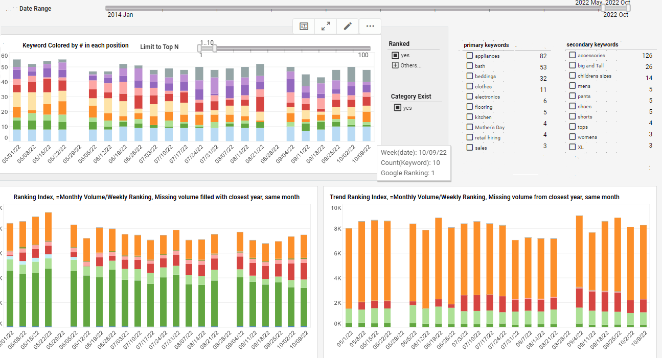
Time Period Comparisons in Charts - This document will discuss the types of time period groupings that users commonly want to explore using charts, as well as standard time period comparisons. It will also illustrate how to do all these types of operations using the InetSoft charting features. The most basic time adjustment that users make on a chart is date grouping level, the choice of whether dates are represented at the level of year, quarter, month, week, etc. This is a fundamental requirement simply because data is often meaningful only at a particular level of granularity. For example, for a luxury car manufacturer, sales per hour or sales per day may not be informative, whereas sales per week or month give a better picture of the health of the business. In InetSoft charting, date level can always be easily modified in the Chart Editor, as shown below...
Tool to Create Box and Whiskers Charts - This document will discuss the uses of Box and Whiskers Charts, and will show how you can create them in Google Sheets and InetSoft. It will also provide access to a free online tool for creating Box and Whiskers Charts and complete functioning business intelligence dashboards. A Box and Whiskers Chart, also known as a Box Plot, is a graphical representation of statistical data that displays the distribution of a dataset. It is created by dividing the data into four quartiles, with the top and bottom quartiles representing the upper and lower "boxes" of the plot. The middle line represents the median of the data, and the "whiskers" extending from the box represent the range of the data, excluding any outliers. Outliers, which are data points that are significantly different from the rest of the data, are typically represented by small circles or crosses outside the range of the whiskers...
Tools to Create Fractal Charts for Free - This page explains how you can create fractal charts such as the Mandelbrot Set in both Google Sheets and InetSoft. This page also provides access to a free online tool for creating charts and complete functioning business intelligence dashboards. A fractal is a complex, self-similar pattern that is found in nature and can be described mathematically. The term "fractal" was coined by mathematician Benoit Mandelbrot in 1975 and comes from the Latin word "fractus", which means "broken" or "fractured". In mathematics, a fractal is a geometric shape that has the property of self-similarity, meaning that it looks similar to a smaller or larger version of itself. This self-similarity is demonstrated over an infinite number of scales and can result in very complex and detailed patterns. Fractals are commonly found in many areas of science, including mathematics, physics, biology, and computer graphics. They are used to describe natural phenomena such as coastlines, mountain ranges, and cloud formations, as well as in artificial designs, such as computer-generated graphics and computer simulations. The Mandelbrot set is a famous and important fractal that is defined as the set of complex numbers that remain bounded under a certain iterative process. The iterative process used to generate the Mandelbrot set is known as the "Mandelbrot iteration" and involves the repeated application of a simple mathematical formula to a complex number. The formula involves taking the complex number and squaring it, and then adding the original complex number back in...
Tools for Creating a Web Chart - CategoricalColorFrame.getColor(val) returns the color assigned to the specified value. Parameter val a data value Example (Report) Bind a bar-type chart to the sample 'All Sales' query, with 'Company' (top 5) on the X-axis, and Sum(Total) on the Y-axis. Add the following script in the onLoad Handler. The SizeFrame object contains the size scale for visual chart objects. You can use a SizeFrame object to represent data dimensions with size (size coding), or to apply a fixed (static) size. Bind a point-type chart to the sample 'All Sales' query, with 'Company' (top 5) on the X-axis, and Sum(Total) on the Y-axis. Add the following script in the onLoad Handler. Bind a point-type chart to the sample 'All Sales' query, with 'Company' (top 5) on the X-axis, and Sum(Total) on the Y-axis...
Top 10 Reasons to Use Visualization - When it comes to Information Visualization, here are the top 10 reasons how utilizing visualization will enhance your business. So I am just getting back to normal charts and graphs as opposed to traditional tables or cross tabs and things of that nature. So there were a couple of things that I had in mind. One, obviously there are some tasks that are just better suited for looking at the data in a visual manner, right. The first one that pops to mind is trending. If you are seeing data spread out over at a timeline, obviously you can see the shape of that trend much better in a visual display. I mean nobody is going to argue that you can't see an increase or a decrease by looking at the pure numbers but in terms of is this trend a linear increase, is it logarithmic or exponential, you can get a sense for that pattern a lot better when you are looking at a chart or graph...
Top Mistakes Using Data Visualization - It's always good to know how BI tools can benefit your organization but it's also worth knowing how organizations can misuse data visualization. I think the point made about sort of trending is exactly right. I mean that’s why I think you see so much movement around people kind of trying to incorporate geospatial analysis to their data, where they can actually sort of look at and identify trending information based on a map. Just being able to overlay different context on that trending information tends to really drive a much more rapid level -- you get insight more rapidly and the insight becomes much more rich, and I think that underlines the point that Byron made exactly with his case study...
 |
Read how InetSoft saves money and resources with deployment flexibility. |
Top Strengths Assessment Chart - Now those areas where you have white on your top strengths assessment chart, it may be that there is no process or that there is no relationship between that particular strategic value and that position. Those areas where you have yellow, well those would be the areas where you may not have some training materials or where you not have identified the skills or where you do not have provided the skills to that workforce. And then those areas in red might be areas where you don’t have any descriptions whatsoever or where the descriptions are outdated or where the training materials are completely lacking. So it's another area where we look into, and the issue really here is that we want to make sure that we are pairing up the right people with the right task to set them up to succeed. Another means, you can tell this is a very formal process, another one here is to essentially identify organizational processes and procedures and policies. Again, you have your corporate strategy. You have your values up there, and you are going to now say, okay what processes do I have within the organization, and then you are essentially defining the interrelationship between them...
Treemap Charts Definition - This article will discuss the uses of Treemap Charts, how you can create them in Google Sheets and InetSoft, and will provide access to a free online tool for creating Treemap Charts as well as complete functioning business intelligence dashboards. A Treemap Chart is a graphical display of hierarchical data in the form of nested rectangles, where each individual rectangle represents a subgroup whose aggregate is reflected by the area of the rectangle, and possibly also by its color. At each level of the hierarchy as well, the size of the parent rectangle formed by the assemblage of sub-rectangles represents the aggregate measure associated with that parent level of the hierarchy. For example, if a hierarchy is composed of products and product categories, and the measure is average total dollar amount, then a treemap might look like this, although the legend is typically omitted...
Trellis Charts - Definition, Example, and How to Make Them - This page will discuss the uses of Trellis Charts, show you how to create them in InetSoft, and provide access to a free online tool for creating Trellis Charts as well as complete functioning business intelligence dashboards.. Trellis charts, also known as multiple minicharts, are a powerful data visualization technique that allows for the comparison of multiple subsets of data within a single visualization. This technique is particularly useful when dealing with large or complex data sets, as it helps to break down the data into smaller, more manageable chunks....
Useful Tips on Information Visualization - What are some good useful tips to know when using information visualization? It's good to have these tips at the back of your head. Well, I think that just because we are using an advanced technique does not mean that we cannot try to triangulate and confirm our results, right. I mean I think that people sort of get a little bit enamored and can sort of like identify trends that may or may not be accurate. There sort of can be a whole series of false positives. And the idea to cross-check your conclusions in data using more than one technique or more than one dataset cannot be abandoned just because you can look at information in a more sophisticated way and sort of attempt to identify patterns in some different ways, right. You still need to use the intellectual rigor and the analytic discipline to make sure that you are taking the correct actions based on the data that you are seeing...
Using Images to Chart Data - This page explains how you can use images to chart data in an InetSoft chart. This page also provides access to a free online tool for creating charts and complete functioning business intelligence dashboards. An image chart is simply a chart that incorporates image files into the data display, augmenting or replacing the normal chart elements such as bars, points, or lines. The use of images within a chart can often make the chart easier to read, more meaningful to users, or simply aid in branding and marketing the material to an intended audience. The chart above is an elementary bar chart displaying Olympic medal results, but is enhanced by using the flags of the participating countries as the data points. This transforms a pedestrian bar chart into a more interesting visual experience...
Using InetSoft to Build Your Real-time Chart - Consider using InetSoft to build your real-time chart. InetSoft offers both free and commercial software for making charts. View a demo and try them out for free. Style Chart is a free charting API for Web developers to embed graphs in their site based on dynamically changing data. Some of the documentation follows below. The TextureFrame object contains the texture for visual chart objects. You can use a TextureFrame object to represent data dimensions with texture (texture coding), or to apply a fixed (static) texture pattern. The StaticTextureFrame object contains a texture frame defined by explicit texture data in the VisualFrame.setField(field) column, or by the fixed texture in StaticTextureFrame.setTexture(value) / StaticTextureFrame.Texture. To create a StaticTextureFrame object, call the StaticTextureFrame constructor. StaticTextureFrame.Texture Specifies the static texture for graphical elements. If the data in the column assigned to the inherited VisualFrame.setField(field) property are GTexture numbers, these data values are used instead of StaticTextureFrame.texture...
Using Mini (In-Line) Charts - Displaying data in the most efficient way is not always the easiest task. Sometimes it requires a bit of clever thinking to really get your point across efficiently...
Visualization Of Data - Researching solutions for the visualization of data for your organization's internal use or to embed in a commercial application? Deploy a small-footprint, easy-to-use Flash-based visualization application from InetSoft. As an innovator in reporting software since 1996, InetSoft has pioneered the evolution from static reporting towards interactive visualization of data...
Visualized Data Powerful Persuasion - What makes visualized data, rather than static data, more powerful in persuading others in a business environment. I think that’s one of the shifts in -- well it's not even a shift, people have always used this information for these purposes because you don’t make organizational decisions in a vacuum. You typically have to convince other people that your definition of the problem, your understanding of the problem is right, but then you have to go on to convince people to take an action.And so the old model of BI was this publishing, saying, well here it is and then PowerPoint and Excel and things like that became the means to deliver it. And that environment was really great for explanation. It was great for things where you have known bounds because the exploration was already done for you by some IT analyst, who modeled the data and built a metadata layer in a particular way so, the known question, known bounds of the data for the answer. Then we get into the exploration which you didn’t really touch on there where visualization can enable that. And then you explore it. You explain it. You have got to educate people going from here it is to here is how it works and why we need to take an action, to persuasion: to this is the action I think we should take...
Web Chart Generator - Looking for a Web chart creator? Since 1996, InetSoft has been offering free and commercial Web-based charting and reporting tools. ShapeForm.setPoint(value) Specifies the pixel location or proportional location where the shape is placed. (Positive values specify distance from left/bottom. Negative values specify distance from right/top.) ShapeForm.setRotation(value) Specifies the shape rotation in degrees. ShapeForm.setShape(shape) Specifies the type of shape. ShapeForm.setSize(value) Specifies the size of the shape in pixels. ShapeForm.setTuple(value) Specifies the location of the shape in logical space. The coordinates of the location are relative to the prevailing axis scaling. ShapeForm.setValues(value) Specifies the location of the shape in logical space. The coordinates of the location are relative to prevailing axis scaling prior to transformation. So, for a categorical X-axis (e.g., 'NJ', 'NY', 'PA', etc.), the X-value of the location should specify a categorical value (e.g., 'NJ'...
What Are the Attributes of a Well-designed Business Application User Interface? - A well-designed business application user interface (UI) is crucial for enhancing user experience, productivity, and satisfaction. Here are several attributes that contribute to a well-designed UI for business applications: Intuitive Navigation: The UI should have a clear and intuitive navigation structure that allows users to easily access different features, functions, and sections of the application. Use familiar patterns such as menus, tabs, and breadcrumbs to guide users through the interface. Consistent Design Language: Maintain consistency in design elements such as colors, fonts, icons, and layout across the application. Consistency helps users quickly learn and understand how to interact with different parts of the application, reducing cognitive load and enhancing usability. Responsive and Adaptive Design: Ensure the UI is responsive and adaptive to different screen sizes, resolutions, and devices, including desktops, laptops, tablets, and smartphones. This ensures a seamless user experience regardless of the device used to access the application...
What Are the Drawbacks to Business Objects? - Here are some common drawbacks to using Business Objects: Complexity and Learning Curve: Business Objects can be complex and challenging to learn, especially for users who are not familiar with SAP's ecosystem or BI concepts in general. Setting up and configuring the platform, designing reports, and creating queries often require specialized skills and training, which can be time-consuming and costly for organizations. Cost of Ownership: The initial cost of purchasing and implementing Business Objects, as well as ongoing maintenance and support fees, can be significant. Additionally, as organizations scale their usage or require additional features and modules, the cost of ownership can increase further, potentially becoming prohibitive for smaller businesses or organizations with limited budgets. Integration Challenges: Integrating Business Objects with other systems, databases, and applications outside of the SAP ecosystem can be complex and require additional development effort. While Business Objects provides connectors and APIs for integration, compatibility issues may arise, particularly when working with non-SAP systems or legacy applications...
What Are the Drawbacks of Google Looker App? - Google Looker, like any software application, has its share of drawbacks. While it offers numerous benefits for data analysis and visualization, users may encounter several challenges or limitations when using the platform. Here are some potential drawbacks of Google Looker: Learning Curve: One significant drawback of Google Looker is its steep learning curve. While the platform aims to make data analytics accessible to non-technical users, mastering its features and functionalities can take time. Users may need to invest significant resources in training and onboarding to effectively utilize the platform, especially if they are not familiar with SQL or data modeling concepts. Complexity of Data Modeling: Google Looker relies heavily on data modeling to create interactive dashboards and reports. While this approach offers flexibility and customization options, it also introduces complexity, especially for users with limited experience in data modeling. Creating and maintaining data models can be challenging, requiring a deep understanding of the underlying data structure and business requirements. Performance Issues: Depending on the size and complexity of the data being analyzed, users may experience performance issues when querying and visualizing data in Google Looker. Slow query execution times and laggy dashboard loading can hinder productivity and impact user experience, especially when dealing with large datasets or complex analytical queries...
What Are Network Charts? - This document will discuss the uses of Network Charts, show you how to create them in InetSoft, and provide access to a free online tool for creating Network Charts as well as complete functioning business intelligence dashboards. A Network Chart is any graphical display of a network topology, representing a set of items defined by peer relationships. For each pair of items, if a relationship exists between the two, the items are connected by a line on the chart; otherwise, they remain unconnected. The nature of the peer relationship depends on the application; it may represent social connectivity (social network), financial connectivity (financial network), or any other domain where patterns of peer relationships are significant. A Network Chart differs from a Tree Chart in that relationships are not strictly hierarchical; the items or "nodes" in a Network Chart need not be "parents" or "children" of one another. A traditional sample data set for a social network is the "Southern Women" data. This data set records meetings between 18 different women at different social events over a nine-month period around 1950. More details about the data can be found at https://networkdata.ics.uci.edu/netdata/html/davis.html. The chart below uses the width of the connecting lines to signify the number of interactions between each pair of women, and connects only women who had three or more mutual interactions...
What Are Some Interesting Charts You Can Make Based on Social Media Usage Data? - Social media usage data provides a wealth of information that can be visualized in various interesting and informative charts. These charts can help analyze trends, user behavior, engagement metrics, and content performance across different social media platforms. Here are some examples of interesting charts that can be created based on social media usage data: Trend Analysis: Line chart showing the trend in the number of active users or engagement levels over time. Area chart illustrating the distribution of social media activity by day of the week or hour of the day to identify peak usage times. Bar chart comparing the growth rates of different social media platforms or the adoption of new features over time. Demographic Insights: Pie chart depicting the demographic breakdown of social media users by age group, gender, location, or income level. Stacked bar chart showing the distribution of user demographics across different social media platforms. Engagement Metrics: Scatter plot correlating the frequency of posts or content sharing with the level of user engagement (likes, comments, shares). Heatmap visualizing the engagement levels of social media posts based on time of day and day of the week. Content Analysis: Word cloud highlighting the most frequently used keywords or hashtags in social media posts. Sankey diagram illustrating the flow of traffic between different types of content (e.g., links, images, videos) shared on social media...
What Features Does a Cloud Application Developer Need in a Chart Tool? - Cloud application developers often rely on chart tools to visualize data and present it in a comprehensible manner. The choice of a chart tool can significantly impact the effectiveness of data representation in applications. Here are several features that a cloud application developer might find crucial in a chart tool: Versatility: Chart Types: A good chart tool should offer a variety of chart types (e.g., bar charts, line charts, pie charts) to accommodate different data visualization needs. Customization: Developers need the ability to customize the appearance of charts to align with the application's design and user preferences. Interactivity: Data Interactivity: Developers often require the capability to enable interactive features like tooltips, zooming, and panning for users to explore and understand the data better. Event Handling: The ability to handle user interactions like clicks and hovers is essential for creating dynamic and responsive applications. Real-Time Data Support: Streaming: For applications dealing with real-time data, the chart tool should support streaming data to provide up-to-the-minute visualizations...
What KPIs and Charts Are Used on Hospice Management Dashboards? - Providing patients and their families with compassionate end-of-life care is the delicate and complex work of hospice administration. Key Performance Indicators (KPIs) and charts are essential tools for tracking, assessing, and improving care quality in this setting. Hospice care managers may make well-informed choices and maximize their services by using the visual depiction of vital data that hospice management dashboards provide. Now let's examine the key KPIs and charts included in dashboards for hospice management. A key performance indicator (KPI) in hospice management dashboards is the number of patient admissions and duration of stay. This measure sheds light on how quickly patients are admitted to hospice care and how long they stay there on average. Administrators can spot trends, evaluate how resources are allocated, and guarantee that patients get the right kind of care the whole time they are there by monitoring these KPIs. One possible graphic that goes along with this KPI would be a trendline that shows the monthly or quarterly variations inpatient admissions. The distribution of duration of stay might be shown in a different bar chart, which would help identify any outliers or potential improvement areas. Hospice managers may tailor their facilities to accommodate changing patient needs and facilitate a smooth transition for patients joining and leaving the program by concentrating on these criteria...
What KPIs and Charts Are Used on a Satellite Launch Tracking Dashboard? - A Satellite Launch Tracking Dashboard is essential for monitoring and managing the launch of satellites into space. It provides real-time and historical data on various aspects of the launch process. Here are some key performance indicators (KPIs) and charts commonly used in such dashboards. Countdown Timer: Real-Time Countdown: A visual representation of the time remaining until launch. Launch Status: Launch Outcome: Indicates whether the launch was successful, partially successful, or failed. Mission Success Rate: Cumulative success rate of all launches conducted. Launch Schedule: Upcoming Launches: Provides details about the next scheduled launches, including dates, times, and mission objectives. Rocket Performance: Velocity and Altitude Charts: Graphs showing the rocket's velocity and altitude during different phases of the launch. Acceleration Profile: Displaying how the rocket's acceleration changes over time...
What Performance Tracking Charts and Metrics Are Included on a Corporate Sustainability Dashboard? - A corporate sustainability dashboard typically includes a variety of performance tracking charts and metrics to monitor an organization's progress towards its sustainability goals and objectives. These metrics help measure environmental, social, and governance (ESG) performance, identify areas for improvement, and communicate sustainability efforts to stakeholders. Here are some common performance tracking charts and metrics included on a corporate sustainability dashboard: Energy Consumption and Carbon Emissions: Energy Consumption Trends: Tracking energy consumption over time, including electricity, gas, and other energy sources, to identify patterns and opportunities for energy efficiency improvements. Carbon Emissions: Monitoring greenhouse gas emissions, including Scope 1, Scope 2, and Scope 3 emissions, to assess environmental impact and track progress towards emissions reduction targets. Water Usage and Conservation: Water Consumption Trends: Tracking water usage and consumption patterns across facilities and operations to identify opportunities for water conservation and efficiency. Water Efficiency Metrics: Monitoring water efficiency metrics such as water intensity (water used per unit of production) and water recycling rates to optimize water management practices...
When To Use Gauge Charts - This article will discuss the uses of Gauge Charts, how you can create them in Excel and InetSoft, and will provide access to a free online tool for creating Gauge Charts as well as complete functioning business intelligence dashboards. A Gauge Chart is a graphical display in the form of a gauge, such as a speedometer, and displays the value of a metric by using a needle, but in some cases by using color alone. While the vast majority of gauge charts display a single aggregated value or KPI such as 'total sales' or 'average population', advanced charts may break out the metric along a dimension to create the effect of a donut chart that displays the association of metric with dimension in circular gauge format. A gauge chart is typically used when there are certain KPIs that must be immediately brought to the user's attention. The gauge format is large and immediately recognizable to almost everyone. Just as the speedometer is prominent on a car's dashboard and says "look at me first," the presence of a gauge on a report or dashboard grabs the user's attention and instantly communicates that the data being represented on the gauge is highly significant. The gauge effectively says "Look at me first." This is extremely important for business users and executives who may not have time to study complex traditional charts or tables. The Gauge Chart delivers at a quick glance the most significant information the business user needs...
Win-Loss Sparkline Charts - Example and How to Create - This page explains how you can create a win-loss sparkline in InetSoft. This page also provides access to a free online tool for creating charts and complete functioning business intelligence dashboards. A win-loss chart is a visual representation of the results of a series of events, typically in sports or competitive games. The chart lists the outcomes of each game or match in a column, with wins marked by a "+" sign and losses marked by a "-" sign, or with wins and losses distinguished by different colors. Win-loss charts are often used by coaches, players, and fans to track a team's progress over a season, as well as to identify patterns and areas for improvement. They can also be used to compare the performance of different teams or players over time. Win-loss charts can be simple or complex, depending on the level of detail desired. Some charts may include additional information such as the date of each game, the opponent, or the score. A win-loss chart like the one above (especially if filtered to show just a single team) is sometimes also called a win-loss sparkline because of compact horizontal form. Win-loss sparklines can be used to quickly and easily communicate the performance of a team or player without the need for a more detailed chart or table. They are often used in sports analytics and business reporting to provide a quick overview of key metrics...
Word Cloud Charts - Definition, When To Use, and Types - This document will discuss the uses of Word Cloud Charts, and how you can create them in Google Docs and InetSoft. It will also provide access to a free online tool for creating Word Clouds and complete functioning business intelligence dashboards. A Word Cloud or Tag Cloud Chart typically displays the relative frequency of terms in a document or other text source. The most common terms appear in the largest, most prominent font, while less common terms appear at progressively smaller font sizes. An example Word Cloud for the U.S. Declaration of Independence is shown here. A Word Cloud is an attention-grabbing chart type that very rapidly conveys which terms have the greatest frequency in the document or text source, which are often among the most important terms. However, as a data analysis tool, the Word Cloud has severe limitations. Two particular shortcomings are that it is very difficult to accurately judge the relative value of a measure by using font sizes or font weights, and, secondly, that certain words are simply larger than others, not owing at all to their importance in the document...