Why Developers Should Evaluate InetSoft for Interactive Charting in Cloud Applications
Modern cloud-based applications are expected to deliver more than static data displays.
Users demand responsive, interactive, and visually compelling charting experiences that allow them to explore data in real time.
For developers tasked with building these capabilities, selecting the right charting and analytics platform can significantly impact both development efficiency and user satisfaction.
InetSoft stands out as a powerful option worth serious evaluation due to its flexibility, performance, and deep focus on data interaction.


1. Built for Embedding in Cloud Applications
InetSoft is designed with embedding in mind, making it a natural fit for SaaS platforms and cloud-native applications. Developers can seamlessly integrate dashboards and charts into existing web applications without forcing users to switch contexts. This allows for a cohesive user experience where analytics feels like a native feature rather than an add-on.
2. Strong Interactivity Out of the Box
Interactive charting is not limited to simple hover effects. InetSoft supports drill-downs, filtering, brushing, and linking across multiple visualizations. These features enable users to explore data dynamically, uncovering insights without requiring page reloads or manual queries. Developers benefit by not having to build these complex behaviors from scratch.
3. Minimal Coding Requirements
While many charting libraries require extensive JavaScript coding, InetSoft reduces development overhead with a visual design environment. Developers can configure sophisticated charts and dashboards using drag-and-drop tools, then fine-tune them programmatically if needed. This hybrid approach accelerates development while preserving flexibility.
4. Scalable for Growing Data Volumes
Cloud applications often deal with rapidly increasing data volumes. InetSoft is built to handle large datasets efficiently, leveraging server-side processing and data caching to maintain performance. This scalability ensures that applications remain responsive even as user demand and data complexity grow.

5. Real-Time Data Integration
Many modern applications rely on real-time or near-real-time data streams. InetSoft supports live data connections, enabling charts to update automatically as new data arrives. This is especially valuable for monitoring dashboards, operational analytics, and time-sensitive decision-making tools.
6. Wide Range of Visualization Types
Developers are not limited to basic bar or line charts. InetSoft offers a comprehensive library of visualization options, including heatmaps, geographic maps, scatter plots, and more. This variety allows developers to match the right visualization to the data, improving clarity and user engagement.
7. Customization and Theming
Consistency in design is critical for user-facing applications. InetSoft provides extensive customization options, allowing developers to match charts to their application's branding and UI standards. Fonts, colors, layouts, and interactions can all be tailored to create a seamless visual experience.
8. Data Mashup Capabilities
One of InetSoft’s standout features is its ability to mash up data from multiple sources. Developers can combine data from databases, APIs, spreadsheets, and cloud services into a unified dataset without complex ETL processes. This flexibility simplifies data preparation and enables richer visualizations.
9. API and Integration Flexibility
InetSoft provides robust APIs that allow developers to control chart behavior, manage data connections, and automate workflows. This level of integration makes it easier to embed analytics into custom applications and align them with existing backend systems.
10. Security and Multi-Tenancy Support
Cloud applications often serve multiple users or organizations, each with unique data access requirements. InetSoft supports multi-tenancy and role-based security, ensuring that users only see the data they are authorized to access. This is essential for SaaS platforms that prioritize data privacy and compliance.

11. Performance Optimization Features
Performance is a critical factor in user experience. InetSoft includes features such as data caching, query optimization, and incremental loading to ensure that charts render quickly. Developers can deliver smooth, responsive interfaces even when dealing with complex datasets.
12. Mobile-Friendly Design
Users increasingly access applications from mobile devices. InetSoft’s responsive design capabilities ensure that charts and dashboards adapt to different screen sizes without sacrificing usability. Developers can build once and deliver consistent experiences across devices.
13. Reduced Development Time
By providing pre-built components and visual tools, InetSoft significantly reduces the time required to implement interactive charting. Developers can focus on application logic and user experience rather than spending weeks building custom visualization features.
14. Advanced Data Exploration Features
InetSoft goes beyond basic charting by enabling advanced data exploration. Users can filter, sort, and analyze data directly within the visualization layer. This reduces the need for additional reporting tools and enhances the overall value of the application.
15. Cloud Deployment Flexibility
InetSoft supports deployment in various cloud environments, including public, private, and hybrid clouds. This flexibility allows developers to align the platform with their organization’s infrastructure strategy and scalability requirements.
16. Strong Support for REST and Web Services
Modern applications rely heavily on APIs. InetSoft integrates easily with RESTful services, allowing developers to pull in data from external systems and display it in interactive charts. This capability is essential for applications that aggregate data from multiple sources.

17. User Self-Service Capabilities
Developers can empower end users with self-service analytics features. InetSoft allows users to create and customize their own charts and dashboards within defined parameters. This reduces the burden on development teams and increases user satisfaction.
18. Continuous Innovation and Updates
InetSoft has a long history of innovation in the business intelligence space. Regular updates introduce new features, performance improvements, and compatibility enhancements. Developers benefit from a platform that evolves alongside modern technology trends.
19. Cost-Effective Alternative
Compared to building custom charting solutions or licensing multiple tools, InetSoft can be a cost-effective option. It consolidates data integration, visualization, and analytics into a single platform, reducing overall development and maintenance costs.
20. Ideal for Data-Driven Applications
Applications that rely heavily on data insights require more than basic charting. InetSoft provides a comprehensive analytics layer that enhances the value of the application. Developers can deliver richer experiences that keep users engaged and informed.
Evaluating InetSoft goes far beyond simply adding charts to an application. It brings a deeper level of interaction, insight, and performance that aligns with the expectations of modern cloud users. Developers who want scalable, high-performance applications without rebuilding complex visualization logic gain a clear advantage with InetSoft. It removes friction from development, accelerates time to value, and delivers the kind of robust, interactive analytics layer that users now expect as a standard.

Related Information About Cloud Systems to Embed Insights
Cloud Systems to Embed Insights - This is important for these kinds of specialized cloud systems to embed insights. They are beginning to develop another kind of term of art out there as opposed to being just systems of record and business or transactional systems. They are certainly growing around business analytics and BI and so forth. To build out these systems that different types of users can use, as we've been talking about here to make good use of data, to bring data in, to have data-driven decision-making, and to be able to collaborate on data. To use things like data storytelling to explain what they're seeing and maybe in a predictive trend that they can build predictions off of, and then make recommendations for different kinds of actions to improve processes or operations. To be able to plug these in, use that kind of cloud development infrastructure I was talking about, is very valuable and important. Using open APIs, call the microservices, using standards instead of just specialized APIs or specialized connectors that use standards effectively can improve connectivity, enable easier data flow between them and allow for more customizable functionality. Through this way you can easily serve third party developers' customers' needs for expanding data interaction and increasing flexibility. Then also as I mentioned, different points in the workflows often become a frustration users have with embedded systems. It could invoke an embedded report maybe at one point, but they really need that capability at another point in the business process workflow. Can they provide it there...
Contour Charts - Definition, Example, and How to Make Them - This page will discuss the different kinds of Contour Charts, show you how to create them in InetSoft, and provide access to a free online tool for creating Contour Charts as well as complete functioning business intelligence dashboards...
Contour Chart Software - Hello, and welcome to the InetSoft 2022 New Release Webinar. It's been a while since our last product release webinar, so we're very excited to show all of you our latest product updates. My name is Ben Williams, I work in marketing here at InetSoft. With me here is Katie Roussey, who is a Systems Engineer at InetSoft. This webinar will mostly focus on what's new in the 2022 Release, but it's also going to feature some important updates from the the last 2 releases. I'm going to briefly summarize these updates, and then Katie is going to demonstrate them and describe them in greater detail...
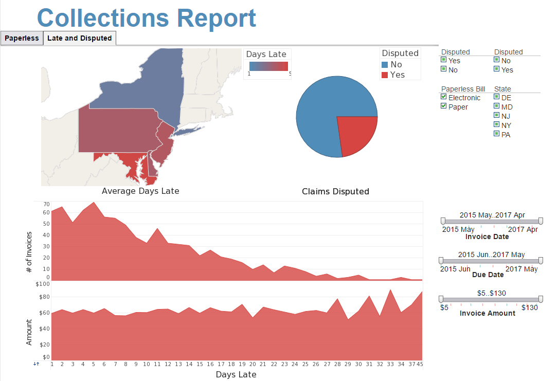
Create a Chart - Create a chart with InetSoft's free or commercial charting tools. View a demo and try them for free. LabelForm.setTextSpec(spec) specifies the label text attributes, such as color, font, format, etc. LabelForm.setTuple(value) specifies the point in logical space for the label text. The coordinates of the point are relative to the prevailing axis scaling. LabelForm.setvalues(value) specifies the location of the label text using coordinate values, numeric or categorical. The coordinates of the point are relative to the prevailing axis scaling. So, for a categorical X-axis (e.g., 'NJ', 'NY', 'PA', etc.), the X-value of setValues should specify a categorical value (e.g., 'NJ'). ShapeForm.setAlignmentX(value) Specifies the horizontal alignment of the shape with respect to the specified X position...
Create and Embed Dynamic Charts - Consider using InetSoft to create and embed dynamic charts into your Web site or application. InetSoft offers both free and commercial software for making charts. View a demo and try them out for free. StyleBI is a commercial business intelligence software package with dashboarding, reporting, and real-time access to almost any data source. OvalShapeFrame.setFill(value) / OvalShapeFrame.fill specifies the fill for the oval elements. FillShapeFrame The FillShapeFrame object contains the shape styles for oval elements with variable degree of fill. To create a FillShapeFrame object, call the FillShapeFrame constructor. You can pass the name of a field (e.g., 'Total') to the constructor, or specify this later using the inherited VisualFrame.setField(field) property...
Create a Web Chart - Create a chart with InetSoft's free or commercial Web charting tools. The GTexture object contains a set of patterns. Create a GTexture object by referring to a pattern number, 1–19. The GLine object provides the following predefined line style constants: GLine.THIN_LINE GLine.DOT_LINE GLine.DASH_LINE GLine.MEDIUM_DASH GLine.LARGE_DASH. Example (Report) Bind a line-type chart to the sample 'All Sales' query, with 'Company' (top 5) on the X-axis, and Sum(Total) on the Y-axis. Add the following script in the onLoad Handler. The GShape object contains a set of shapes. For element properties requiring a GShape object, the shape can be specified as shown below...

Creating a Chart Using API Functions - Previous sections explained how to modify the data binding and element properties of an existing chart. This section explains how to create a new chart from the ground-up using Chart API commands. In this example, you will create a new chart, define the chart data, and display the data on the chart. Follow the steps below. 1. Add a new Chart to the Report. (Do not open the 'Data Binding' dialog box for the chart.) Note: Chart API script (which operates on the Chart's 'Egraph' property) should be placed in element scope. See Adding Element-Level Script for more information. 2. Click the Chart to select it. Right-click and select 'Script' from the context menu. This opens the Script Editor, where you can enter the chart script. 3. (Optional) Enter the following lines to import the packages required by the script. You only need to import packages that the script actually uses...
Creating a Multidimensional Visualization Using Color, Shape and Size - But for now we will keep this data visualization simple, in most cases it would be simple. We want to take this large block of data and build a nice interactive dashboard over it. I am going to save my worksheet. Everything gets saved on the server. This is a zero-client tool. These worksheets are reusable. It's just data. I can take one worksheet and visualize it in 10 different ways. I click on viewsheet, and it asks me to select my worksheet. This is the one we just built. I see a grid again, but this time on the left I see my visual toolbox with all the elements I can use to filter my data or group and aggregate my data. This is the structure of my worksheet, the basis of my visualization. So let’s see, I will drag and drop this one. The first thing I want to do is I am going to add a little time slider to filter my date field. I take the range slider. I drag it and drop it anywhere I like. Now I take the date field and drag it and drop it over the range slider. So now I am applying order dates. Let me add a selection list to filter my companies. I drag and drop a selection list, take the company field, and I drag it and drop over the selection list...

Current State of Information - Well you know, I think it's a little bit of all of the above, right. We are at -- in some ways it kind of gets overused, but we really are seeing a perfect storm in the Information Management age, and it's manifesting itself through all of this advancement around visualization. I mean if we just think about the underlying tools and how much they continue to evolve, whether it's in memory databases, whether its Map/Reduce capabilities, our ability technically to process trillions of records and petabytes of data at a relatively reasonable cost, that’s something that wasn’t available to Corporate America even 24-36 months ago. So we are seeing huge amounts of prospects or progress on that dimension. If we couple that with the fact that we are in an economic environment, where information and the ability to be agile and to interpret trends of behavior of your customer before your competitors can, right, and so this is the first time in a really long time where organizations had to focus so heavily on information insight for competitive advantage. So, now we have kind of a burning platform around the economy. We have technology catching up to us, and then we are starting to see a generation of the workforce joining enterprises today who grew up with technology at their fingertips, which are comfortable with and expect to see and interpret data in very different ways than the worker of 10 or 15 years ago...
Data Illustration Tool - The benefits of data illustration(also known as data visualization) are endless. Businesses can utilize a data illustration in many different ways, taking complex data and creating new levels of understanding for their managers. Normally, raw data is a long tedious list of information...
Data Visualisation - Researching data visualisation solutions for your organization's internal use or to embed in a commercial application? Deploy a small-footprint, easy-to-use Flash-based data visualisation application from InetSoft. As an innovator in reporting software since 1996, InetSoft has pioneered the evolution from static reporting towards interactive visualisation of data. InetSoft's award-winning software has been deployed at thousands of organizations worldwide and integrated into dozens of other application providers' solutions serving vertical and horizontal markets of their own...
Data Visualization Chart Types - The following is a listing of the various chart types enabled by InetSoft's Style Intelligence data visualization software. Gantt Chart: A Gantt chart is a visual representation of a project schedule, showing the start and end dates, duration, and dependencies of each task. It is commonly used in project management to track progress and help coordinate the efforts of team members. The chart is named after Henry Gantt, who developed the concept in the 1910s...