Comparing InetSoft to Common Performance Management Charting Solutions
Organizations evaluating tools for performance management charts often look beyond simple visualization features. While many platforms offer chart creation, the real value comes from how effectively those charts connect to data, enable analysis, and drive decision-making. Below is an easily readable comparison of InetSoft with five widely used solutions: Microsoft Power BI, Tableau, Qlik Sense, BambooHR, and Rippling.
InetSoft vs Microsoft Power BI
- Approach to Data Integration
InetSoft emphasizes data mashup capabilities, allowing users to combine multiple data sources without heavy modeling. Power BI relies more heavily on structured data models and ETL processes. - Ease of Use for Business Users
InetSoft provides a flexible interface that allows both technical and non-technical users to build dashboards. Power BI can be user-friendly, but complex models often require technical expertise. - Real-Time Data Access
InetSoft supports live connections and streaming data without requiring full data loads. Power BI often depends on scheduled refreshes unless using specialized configurations. - Customization and Embedding
InetSoft offers strong embedding capabilities for OEM use and custom applications. Power BI embedding often requires licensing considerations and Azure integration. - Performance Management Focus
InetSoft is designed for operational dashboards and performance tracking. Power BI is more general-purpose BI with broader use cases beyond performance management.
InetSoft vs Tableau
- Visualization vs Full Analytics
Tableau excels at creating visually polished charts. InetSoft focuses on combining visualization with data preparation and transformation in one platform. - Data Preparation
InetSoft allows users to mash up data directly in the platform. Tableau often requires Tableau Prep or external tools for advanced data transformation. - Deployment Flexibility
InetSoft supports on-premise, cloud, and embedded deployments. Tableau deployments can become complex and costly as organizations scale. - Cost Efficiency
InetSoft is typically more cost-effective, especially for larger user bases. Tableau’s per-user licensing model can increase costs quickly. - Operational Reporting
InetSoft is well-suited for operational dashboards and performance monitoring. Tableau is often used for exploratory analytics and storytelling.
InetSoft vs Qlik Sense
- Data Engine Philosophy
Qlik Sense uses an associative data model that can be powerful but complex. InetSoft uses a more straightforward data mashup approach that is easier to understand. - Learning Curve
InetSoft tends to have a shorter learning curve for building dashboards. Qlik Sense often requires training to fully leverage its data model. - Self-Service Analytics
Both platforms support self-service, but InetSoft simplifies access by reducing dependency on data specialists. - Real-Time Insights
InetSoft supports real-time data streaming more naturally. Qlik often relies on in-memory processing and data reloads. - Performance Monitoring
InetSoft is optimized for KPI tracking and performance dashboards. Qlik is more focused on associative exploration of data.
InetSoft vs BambooHR
- Purpose and Scope
InetSoft is a full business intelligence platform. BambooHR is an HR management system with built-in reporting and dashboards. - Charting Flexibility
InetSoft offers a wide range of customizable charts across any business domain. BambooHR focuses on HR-specific metrics such as turnover and employee performance. - Data Sources
InetSoft can connect to virtually any data source across the enterprise. BambooHR primarily works with internal HR data. - Customization
InetSoft allows deep customization of dashboards and KPIs. BambooHR offers configurable dashboards but within predefined HR contexts. - Analytics Depth
InetSoft supports advanced analytics and data transformation. BambooHR focuses on accessible reporting and visualization of workforce data rather than complex analysis. - Use Case Fit
InetSoft is ideal for enterprise-wide performance management. BambooHR is best suited for HR departments needing straightforward reporting and visualization.
InetSoft vs Rippling
- Platform Scope
InetSoft is a dedicated analytics and dashboarding platform. Rippling is an all-in-one system for HR, IT, payroll, and finance with built-in analytics. - Data Integration
InetSoft can mash up data from multiple systems across the organization. Rippling centralizes employee-related data and connects multiple business functions into one platform. - Reporting Flexibility
InetSoft provides highly customizable dashboards and KPIs. Rippling offers customizable reporting, pivot tables, and visualizations based on its internal data model. - Cross-Functional Analytics
InetSoft can analyze any type of business data, from finance to operations. Rippling focuses on cross-functional insights primarily related to workforce, payroll, and IT systems. - Advanced Analytics
InetSoft supports complex data transformation and mashup across systems. Rippling enables real-time reporting and analysis across its unified data architecture. - Use Case Fit
InetSoft is better suited for organizations needing enterprise-wide performance dashboards. Rippling is ideal for organizations looking to manage employee data and generate insights within that ecosystem.
Key Takeaways
- Beyond Charting
InetSoft stands out because it goes beyond simple charting, offering integrated data mashup, transformation, and visualization in one platform. - Enterprise Flexibility
Unlike HR-focused tools such as BambooHR and Rippling, InetSoft supports analytics across all business functions. - Reduced Complexity
Compared to platforms like Tableau and Qlik Sense, InetSoft simplifies data preparation and dashboard creation. - Cost Efficiency
InetSoft often provides a more cost-effective option for organizations that need broad access to dashboards without per-user pricing escalation. - Performance Management Focus
InetSoft is specifically designed for performance monitoring, KPI tracking, and operational dashboards, making it a strong choice for organizations focused on data-driven decision-making.

More Articles About Performance Management Charting Software
Data Visualisation Software - InetSoft's StyleBI™ is easy to use, interactive dashboard software that includes real time reporting capabilities. It is an edition of StyleBI that focuses on business data exploration by combining Data Block™ technology with visualization. Data visualisations are constructed in real-time by dropping data items into visual elements such as charts, metrics and selections...
Definition of Binary Dot Plot Charts - This page discusses the uses of binary ("yes/no") dot plot charts, and explains how you can create them in both Google Sheets and InetSoft. This page also provides access to a free online tool for creating dot plot charts and complete functioning business intelligence dashboards. A dot plot is a type of data visualization that represents individual values of a set of numerical data by plotting dots or markers on a number line or an x-axis. Each dot represents a single data point and is placed along the axis based on its value. This type of plot does not aggregate a measure, but merely displays the raw data points. In some respects, therefore, the basic dot plot is similar to a histogram. Some benefits of a dot plot include: Easy to understand: Dot plots are easy to read and interpret, making them a good choice for presenting data to a wide audience. Clear representation of distribution: Dot plots clearly show the distribution of the data, making it easier to see the distribution of values and identify any outliers or patterns. Space-saving: Dot plots can often be made very compact, making them a good choice for reports or presentations where space is limited...
Definition of Candlestick Charts - This page discusses the uses of Candlestick charts, and explains how you can create them in both Google Sheets and InetSoft. This page also provides access to a free online tool for creating Candlestick charts and complete functioning business intelligence dashboards. A "Candlestick" or "Candle" chart is a financial chart that displays the high, low, open, and close prices of a security for a specific period. It is often used to visualize stock prices over time. Each candle is composed of a body (or box) and an upper tail and lower tail (or wick). The bottom of the lower wick represents the low value for the security over the specified period. The top of the upper wick represents the high value for the security over the specified period...
Definition of a Contour Chart - A Contour Chart, or Scatter Plot, displays contours that correspond to the density of the plotted points. The points themselves are not displayed. Contour Charts are an intuitive method of displaying two dimensional point data., and can display data trends and correlations between any two dimensions. This form of charting makes outliers easy to identify, since regions with a higher density of points are grouped visually....
Definition of a Heat Map - A heat map is a visual representation of data that uses colors to indicate the relative values of the data points. A heat map displays a measure using a colored grid, where the value of the measure for a given combination of dimension values is used to determine the color of the grid at that location. Heat maps are often used to visualize data that has a spatial or geographical component, such as weather data, traffic patterns, or population density. In a heat map, each data point is represented by a colored square or rectangle, with the color indicating the intensity of the value being represented...
Definition of a Map With Path - A map with a path is a type of map that includes information about a specific path or route. This type of map can be used to provide directions or to show the location of a particular point of interest along a route. A map with a path typically includes a line or series of lines that represent the path or route, along with various symbols or labels that indicate landmarks, intersections, or other points of interest along the way. The path may also be accompanied by written instructions or directions to help the user navigate the route....
Definition of a Radar Chart - This page discusses the uses of radar charts, and explains how you can create them in both Google Sheets and InetSoft. This page also provides access to a free online tool for creating radar charts and complete functioning business intelligence dashboards. A radar chart, also known as a spider chart or star chart, is a type of chart used to display multivariate data in the form of a two-dimensional chart of three or more quantitative variables represented on axes starting from the same point. The data is plotted in the form of a polygon, with each vertex of the polygon representing one of the variables. This chart is often used to compare the values of multiple variables for a single data point. The design of the chart can vary depending on whether there are multiple dimensions and measures (most typical, like above) or just a single dimension and measure, in which case the axes may represent the dimension values instead of the multiple measures...
Definition of a Regional Map - A regional map is a type of map that shows the political or administrative boundaries of a particular land mass,. such as states, provinces, or counties. Regional maps can also show important cultural or economic features of an area, such as cities, roads, and landmarks.A regional map is a type of map that shows the political or administrative boundaries of a particular land mass,. such as states, provinces, or counties. Regional maps can also show important cultural or economic features of an area, such as cities, roads, and landmarks...
Definition of a Sparkline Chart - A sparkline is a small line chart, usually with axes or coordinates removed. The point of styling a line chart this way is to present the general shape of the data's variation over time, in a simple and highly condensed fashion. Sparklines are small enough to be embedded among text, or are often grouped with several other sparklines in a line or grid....
Definition of a Treemap Chart - A Treemap Chart is a graphical display of hierarchical data in the form of nested rectangles, where each individual rectangle represents a subgroup whose aggregate is reflected by the area of the rectangle, and possibly also by its color. At each level of the hierarchy as well, the size of the parent rectangle formed by the assemblage of sub-rectangles represents the aggregate measure associated with that parent level of the hierarchy. For example, if a hierarchy is composed of products and product categories, and the measure is average total dollar amount, then a treemap might look like this, although the legend is typically omitted. A common example of a treemap that is well suited to its data is the stock heat map generated by FinViz. The small rectangles are individual company ticker symbols, and the rectangular groups are the sectors (healthcare, real estate, etc.) comprised of these companies. In this instance, the color represents the individual stock's gain or loss, and the size of the rectangle represents the company's market cap...

Definition of a Waterfall Chart - A waterfall chart is a variation of bar chart that displays the causes behind a net change in value between two points. Instead of simply showing a beginning value in one bar and an ending value in a second bar, a waterfall chart dis-aggregates all of those unique components that contributed to the net change, and displays them individually. The waterfall chart is named from its shape. The first bar in a waterfall chart typically starts from a baseline of zero, and represents the initial quantity of the displayed measure. Then, there are a series of smaller floating bars, rising in a peak up to one final bar, which represents the ending quantity of the chosen measure, which, like the first bar, starts from the zero baseline of the x-axis...
Definition of an Interval Chart - An interval chart is a type of bar chart that displays the range of data values for each category. It is also known as a range bar chart or a floating bar chart. In an interval bar chart, each category is represented by a bar that spans from the minimum value to the maximum value of the data for that category. The length of the bar indicates the range of values, while the position of the bar indicates the category. Interval bar charts are useful when you want to show the variability or range of data within each category. They are commonly used in project management to display timelines or Gantt charts, where the bars represent the start and end dates of different tasks or activities. They can also be used in other contexts where you want to show the range of values, such as in financial analysis to show the high and low stock prices for each day..
Demo of Advanced Charting - The last thing in this demo of advanced charting we want to look at is advance correlations. It’s a very statistical chart that’s great for analysis. This is analyzing the same set of funds. We’ve taken the categories and their size by how big they are. They’re colored the same way. You see the fund name and their performance over 26 weeks, one year, three years, five years, and 10 years. So there is an increase range of performances. These are bunch of numeric measures. Unless you’re going to do a selection, use the top of this one, and I’ll show you. I just selected some so these are box plots. This is the grey. It’s all the data. This is the median. The number above of 10 year performances is 10.8%. This is the 25, 75 percentile distribution. This is the fifth to 95% percentiles of the whole data set. I’ll just grab the top 5% of the 10 year performers. It is about 20 funds in that group. I can now see these lines are each of the funds. This orange line is one fund. This green line is another fund. They are generally pretty good in five year performance, generally above the median on three years, but some of them are pretty bad on 26-week performance and one year performance...

Dynamic Charts - Looking for a tool to make dynamic charts? InetSoft offers both free and commercial software for making dynamic charts. Style Chart is a free charting API for Web developers to embed graphs in their site based on dynamically changing data. Some of the documentation follows below. VisualFrame.setScaleOption(value) Specifies a scaling option for the default scaling. The Scale.TICKS and Scale.ZERO options determine the maximum and minimum values that are used to calculate the scale range. The Scale.TICKS option uses the maximum and minimum tick values (i.e., rounded numbers) rather than the maximum and minimum data values. The Scale.ZERO option uses zero as the minimum rather than the minimum data value (if positive). To combine multiple options, use the pipe (“or”) operator. A ColorFrame object contains the color treatment for visual chart elements. You can use a ColorFrame object to represent data dimensions with color (color coding), or to apply a fixed (static) color style...
Dynamic Top 10 Rank in a Dashboard Chart - The first question was, can you have a dynamic top 10 rank in a dashboard chart? Navish Javed: Yes, absolutely, so the top ‘n’, in this case 10, can be dynamic. So if you wanted the number of top ranked items to be specified by the user maybe even using a slider, that is possible. You could do so with a variable, and you can also do so with script. Flaherty: Next question is about mobile application development, is there any way to make the checkboxes or drill downs plus or minus controllers, larger so they are easier to hit with the finger? Navish Javed: Oh okay. We actually do support the mobile pinch gestures, so you can easily zoom into the dashboard and with a simple double-click do a zoom to screen. So essentially it's just a matter of designing your dashboard to be a little bit smaller and requiring a little bit less real estate so that the users can simply zoom to fill their screen, in which case, all of the controls will scale appropriately...

Embedded Chart - A listing of the features and benefits for an ISV or SaaS provider looking to embed charts in their application, for instance, a visually compelling charts and graphs that will appeal to all users...
Embedded Graphs - InetSoft provides a graphing and data access engine that ISV's, SaaS providers, or enterprise developers can use to embed graphs into their applications. Leveraging InetSoft's StyleBI, provider solutions will become more attractive to potential and current customers, and enterprise end-users will be more satisfied with their information access...
Embedded Insights in Cloud Systems - This is important for these kinds of specialized cloud systems to provide embedded insights. They are beginning to develop another kind of term of art out there as opposed to being just systems of record and business or transactional systems. They are certainly growing around business analytics and BI and so forth. To build out these systems that different types of users can use, as we've been talking about here to make good use of data, to bring data in, to have data-driven decision-making, and to be able to collaborate on data. To use things like data storytelling to explain what they're seeing and maybe in a predictive trend that they can build predictions off of, and then make recommendations for different kinds of actions to improve processes or operations. To be able to plug these in, use that kind of cloud development infrastructure I was talking about, is very valuable and important. Using open APIs, call the microservices, using standards instead of just specialized APIs or specialized connectors that use standards effectively can improve connectivity, enable easier data flow between them and allow for more customizable functionality. Through this way you can easily serve third party developers' customers' needs for expanding data interaction and increasing flexibility. Then also as I mentioned, different points in the workflows often become a frustration users have with embedded systems. It could invoke an embedded report maybe at one point, but they really need that capability at another point in the business process workflow. Can they provide it there...
Example of a Win-Loss Sparkline Chart - This page explains how you can create a win-loss sparkline in InetSoft. This page also provides access to a free online tool for creating charts and complete functioning business intelligence dashboards. A win-loss chart is a visual representation of the results of a series of events, typically in sports or competitive games. The chart lists the outcomes of each game or match in a column, with wins marked by a "+" sign and losses marked by a "-" sign, or with wins and losses distinguished by different colors. Win-loss charts are often used by coaches, players, and fans to track a team's progress over a season, as well as to identify patterns and areas for improvement. They can also be used to compare the performance of different teams or players over time. Win-loss charts can be simple or complex, depending on the level of detail desired. Some charts may include additional information such as the date of each game, the opponent, or the score. A win-loss chart like the one above (especially if filtered to show just a single team) is sometimes also called a win-loss sparkline because of compact horizontal form. Win-loss sparklines can be used to quickly and easily communicate the performance of a team or player without the need for a more detailed chart or table. They are often used in sports analytics and business reporting to provide a quick overview of key metrics...
Features a Cloud Application Developer Needs in a Chart Tool - Cloud application developers often rely on chart tools to visualize data and present it in a comprehensible manner. The choice of a chart tool can significantly impact the effectiveness of data representation in applications. Here are several features that a cloud application developer might find crucial in a chart tool: Versatility: Chart Types: A good chart tool should offer a variety of chart types (e.g., bar charts, line charts, pie charts) to accommodate different data visualization needs. Customization: Developers need the ability to customize the appearance of charts to align with the application's design and user preferences. Interactivity: Data Interactivity: Developers often require the capability to enable interactive features like tooltips, zooming, and panning for users to explore and understand the data better. Event Handling: The ability to handle user interactions like clicks and hovers is essential for creating dynamic and responsive applications. Real-Time Data Support: Streaming: For applications dealing with real-time data, the chart tool should support streaming data to provide up-to-the-minute visualizations...
Free Chart Tools - Looking for free chart tools? InetSoft provides both free and commercial chart tools. View a demo and try them out for free. Style Chart is a free charting API for Web developers to embed graphs in their site. Some of the documentation follows below. Coordinate.transpose() Interchanges the axes. For example, in a rectangular coordinate system, the X-axis becomes the Y-axis, and the Y-axis becomes the X-axis. The PolarCoord object contains polar coordinates against which data can be represented. To create a PolarCoord object, call the PolarCoord constructor. PolarCoord.setType(value) specifies the type of polar transformation. PolarCoord.setCoordinate(coord) Specifies the rectangular coordinates on which the polar coordinates should be based...
Free Charting Service - Visualize is a free charting service where you can upload a spreadsheet and build cool, interactive visual analyses using advanced multimensional chart types. A completed chart can be shared publicly via a standalone URL or embedded in anoter web page. Or you can keep your chart private...
Funnel Charts - Definition, Examples, and How-To - This article will discuss the uses of Funnel Charts, how you can create them in Google Sheets and InetSoft, and will provide access to a free online tool for creating Funnel Charts and complete functioning business intelligence dashboards. A Funnel Chart typically displays the sequential stages of a process, where the aggregate for each stage represents a subset of the aggregate from the previous stage. This results in the characteristic monotonic narrowing that creates the "funnel" shape. An example is shown below: Here each stage in a sales process represents a refinement of the stage above it: Only a fraction of sales leads produce sales calls, while only a fraction of those sales calls yield follow-ups, and so on until the channel ends with the final successful sales numbers. This "funnel" representation is simply a helpful way to visualize the narrowing or "winnowing" of data in each successive stage...
Future of Data Visualization - With data visualization being more and more recognized, it is emerging to be a useful and quality tool for organizations moving forward. I think the biggest thing that’s going to be happening is, I believe, demand around in-memory computing to support visualization. That is the thing that’s going to be the hottest. I think as more organizations are becoming sophisticated around the kinds of questions they want to get answered from their data that they could not answer before, they are going to find that the limiting factor is computing power to actually combine all that data based on velocity, volume, and variety in a way to actually use the new visualization software products to their advantage. So I firmly believe that that’s going to be, kind of, the hottest area that we see begin to take off. And I believe that a lot of major vendors in that space are making some very substantial investments and getting some pretty exciting products to market...
Gantt Charts - Definition, When To Use, and How to Make Them - This page will discuss the uses of Gantt Charts, show you how to create them in InetSoft, and provide access to a free online tool for creating Gantt Charts as well as complete functioning business intelligence dashboards. A Gantt chart is a variation of a bar chart utilized for displaying project schedules, including the dependent relationships between the various stages of a project. The projects or project segments are displayed as horizontal bars which vary in length based on their duration, often displayed in relation to the amount of time planned for that particular project or project segment...

Gauge Charts - Definition, When To Use, and Types - This article will discuss the uses of Gauge Charts, how you can create them in Excel and InetSoft, and will provide access to a free online tool for creating Gauge Charts as well as complete functioning business intelligence dashboards. A Gauge Chart is a graphical display in the form of a gauge, such as a speedometer, and displays the value of a metric by using a needle, but in some cases by using color alone. While the vast majority of gauge charts display a single aggregated value or KPI such as 'total sales' or 'average population', advanced charts may break out the metric along a dimension to create the effect of a donut chart that displays the association of metric with dimension in circular gauge format. A gauge chart is typically used when there are certain KPIs that must be immediately brought to the user's attention. The gauge format is large and immediately recognizable to almost everyone. Just as the speedometer is prominent on a car's dashboard and says "look at me first," the presence of a gauge on a report or dashboard grabs the user's attention and instantly communicates that the data being represented on the gauge is highly significant. The gauge effectively says "Look at me first." This is extremely important for business users and executives who may not have time to study complex traditional charts or tables. The Gauge Chart delivers at a quick glance the most significant information the business user needs...
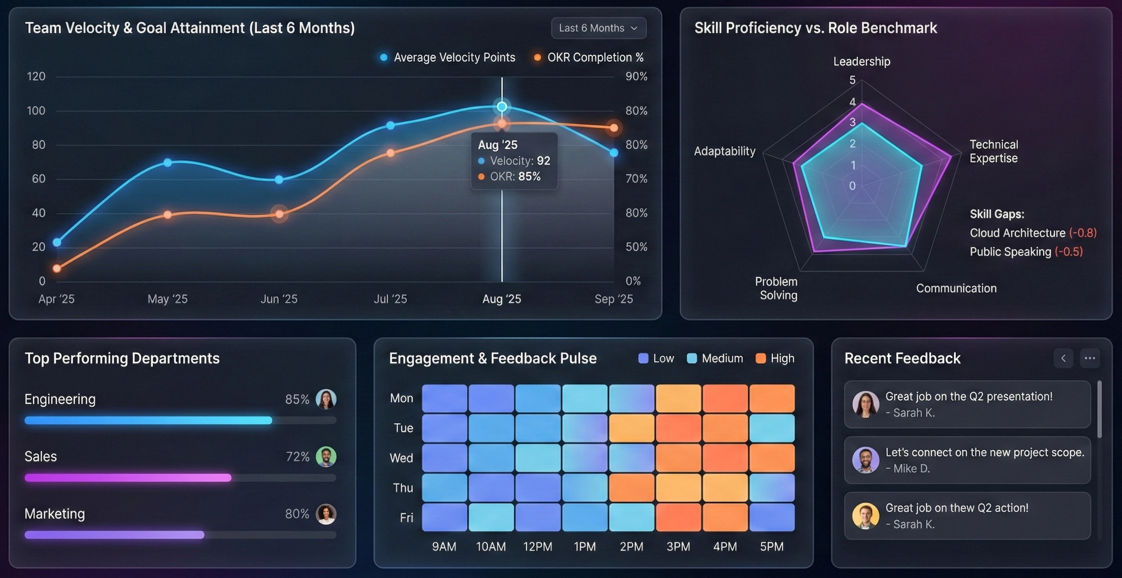
Graphic KPI Dashboard - Key Performance Indicators (KPI's) are business metrics used to track an organization's performance and determine whether business goals are being met. Every industry, agency, or organization must measure its performance on a daily, monthly, or quarterly basis to ensure health and sustainability...
Good Amazon QuickSight Replacement - Looking for a good alternative to Amazon QuickSight? InetSoft's pioneering BI application produces great-looking cloud-based dashboards with an easy-to-use drag-and-drop designer. Mashup Amazon-hosted data with other enterprise or cloud-based sources. Maximize self-service for business and technical staff. View a demo and try interactive examples...
How Data Visualization Helps - It's important for businesses to learn the benefits of data visualization when implemented correctly to business plans and models. It is the information age. And the topic we are going to talk about today is that last mile of the whole data management process arguably. We are going to talk about data visualization. So we are trying to be trendy here and thus the title is, the Eyes Have It: 10 Reasons Why Data Visualization Rocks. We are very pleased to have an all-star cast for you today. First of all, a quick nod to our sponsor. Today’s episode of DM Radio is brought to you by Tableau Software. Hop online for more information about those folks. We have an all-star cast lined up. Jim Ericson is in a meeting today so our usual co-host won't be with us but he sends his best wishes, and I am sure he will be checking the show out later. But we have our very own Mark Madsen on the show today. Mark Madsen of Third Nature is going to be our guest host along with Rich Penkowski of Deloitte. We will also be hearing from Doug Cogswell of ADVIZOR Solutions, Suzanne Hoffman of Tableau, and Navish Javed of InetSoft...

How to Make a Bubble Chart - SizeFrame.setLargest(value) / SizeFrame.Largest specifies the highest value in the range. For point and line graphs, this is the size (in pixels) at which the largest value in the bound column is displayed. Smaller values are scaled according to the mapping defined by the object's scaling method (e.g., linear for LinearSizeFrame, etc.). For schema and bar graphs, the value specified for the largest property is relative to the SizeFrame.setMax(value) / SizeFrame.max value. For example, if largest=50 and max=100, the largest value in the bound column is displayed at one half of the maximum allowable size. The value of largest should be less than the value of max. SizeFrame.setMax(value) / SizeFrame.max specifies an arbitrary value representing the maximum allowable size for a graphical element. For schema and bar graphs, the values specified for the SizeFrame.setLargest(value) / SizeFrame.Largest and SizeFrame.setSmallest(value) / SizeFrame.smallest properties are relative to the max value. For example, if smallest=50 and max=100, the smallest value in the bound column is displayed at one half of the maximum allowable size. For point and line graphs, the max property is ignored...