Interval Charts - Definition, Example, and How to Make Them
This page will discuss the different kinds of Interval Charts, show you how to create them in InetSoft, and provide access to a free online tool for creating Interval Charts as well as complete functioning business intelligence dashboards.
Contents
Definition and Types of Interval Charts
An Example of an Interval Chart
How to Make an Interval Chart
Tool to Make Interval Charts Online for Free

An interval chart is a type of bar chart that displays the range of data values for each category. It is also known as a range bar chart or a floating bar chart. In an interval bar chart, each category is represented by a bar that spans from the minimum value to the maximum value of the data for that category. The length of the bar indicates the range of values, while the position of the bar indicates the category.
Interval bar charts are useful when you want to show the variability or range of data within each category. They are commonly used in project management to display timelines or Gantt charts, where the bars represent the start and end dates of different tasks or activities. They can also be used in other contexts where you want to show the range of values, such as in financial analysis to show the high and low stock prices for each day.
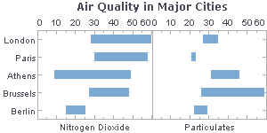
Example of an Interval Chart
This InetSoft example image features an an interval bar chart to show range of air quality by city. This is very valuable because it allows you to easily compare the range of air quality values across different cities. Each city can be represented by a horizontal bar that shows the range of air quality values, with the position of the bar indicating the city.
By looking at the interval bars, you can quickly see which cities have the highest and lowest air quality values, as well as how much variation there is within each city. This can help you identify patterns and trends in air quality data, and also help you compare the conditions of different areas.
Interval bar charts can be very effective at communicating complex data to a wide audience, as they are easy to read and understand. This makes interval charts like the one provided a useful tool for scientists, policymakers, and the general public to understand and evaluate air quality data across different cities.
How to Make an Interval Chart in InetSoft
To create a Interval chart, follow the basic steps below.
Prepare Your Data
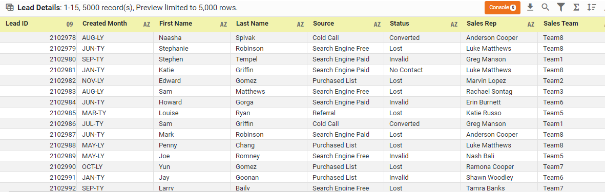
The data source for the chart (data block, query, or data model) should represent dimensions and measures as independent columns or fields, including a date column, as shown below. See Prepare Your Data for information on how to manipulate your data, if it is not currently in this form. (Note: A properly designed data model will already have the correct structure.)
Open a Chart for Editing
If necessary, create a new Dashboard. For information on how to create a new Dashboard, see Create a New Dashboard.
From the Toolbox panel, drag a Chart component into the Dashboard.

Resize the Chart as desired by dragging the handles.
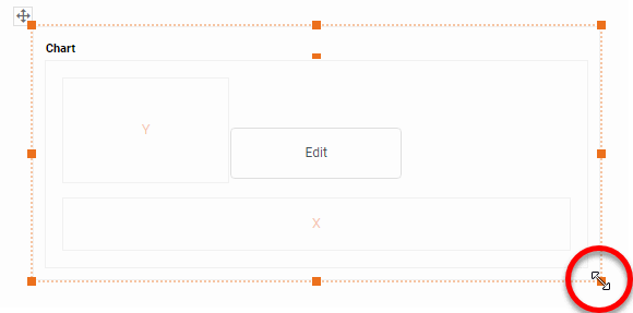
Press the 'Edit button in the center of the Chart or press the Edit' button in the top-right corner.

This opens the Visualization Recommender. Bypass the Recommender by pressing the 'Full Editor' button at the top right to open the Chart Editor.

Then follow the steps below to add data to the chart:
Press the 'Select Chart Style' button . Choose the 'Interval Chart' style. Press the 'Apply' button

From the 'Dimensions' folder of the Data Source panel, drag a desired dimension to the 'X' region. To convert a measure to a dimension, right-click the measure in the Data Source panel and select 'Convert to Dimension'.

Optional: For a date dimension, press the 'Edit Dimension' button next to the field name in the Chart Editor, and set the 'Level' to the desired date grouping. Then press the 'Apply' button.

Optional: You can add additional dimensions to the Chart if desired. See Trellis Chart (Grid) for information about adding multiple dimensions to a chart axis. See Basic Charting Steps for information on how to add dimensions using color, shape, or size representation. To convert a dimension to a measure, right-click the dimension in the Data Source panel and select 'Convert to Measure'.
From the 'Measures folder of the Data Source panel, drag a measure to the 'Y' region. This measure defines the lower value of each bar/interval on the chart.

Press the 'Edit Measure' button next to the measure, and select the desired aggregation method for the measure.

From the 'Measures' folder of the Data Source panel, drag a measure to the 'Size' region. This measure defines the height of each bar/interval on the chart.

Press the 'Edit Measure' button next to the 'Size' measure, and select the desired aggregation method for the measure.

The lower value of each bar is specified by the aggregate 'Y' measure, and its height (vertical span) is specified by the aggregate 'Size' measure.

Optional: You can add additional measures to the Chart if desired. See Basic Charting Steps for information on how to add measures using color, shape, or size representation.
Press the 'Finish button' to close the Editor.
You can proceed to edit the titles, legend, etc. See Basic Charting Steps and Chart Properties for more information. See Format Data for information on how to format text on a Chart.
Tool to Make Interval Charts Online for Free
To easily and quickly create Interval Charts online for free, create a Free Individual Account on the InetSoft website. You will then be able to upload a spreadsheet data set.

Once you have done that, you will be able to proceed past the Visualization Recommender, which can usually get you started creating a dashboard. Since the Recommender does not suggest Interval Chart as an option, press the Full Editor button.
Then proceed to build the Chart as described in the previous section.