Evaluate InetSoft's Sales Pipeline Dashboard Solution
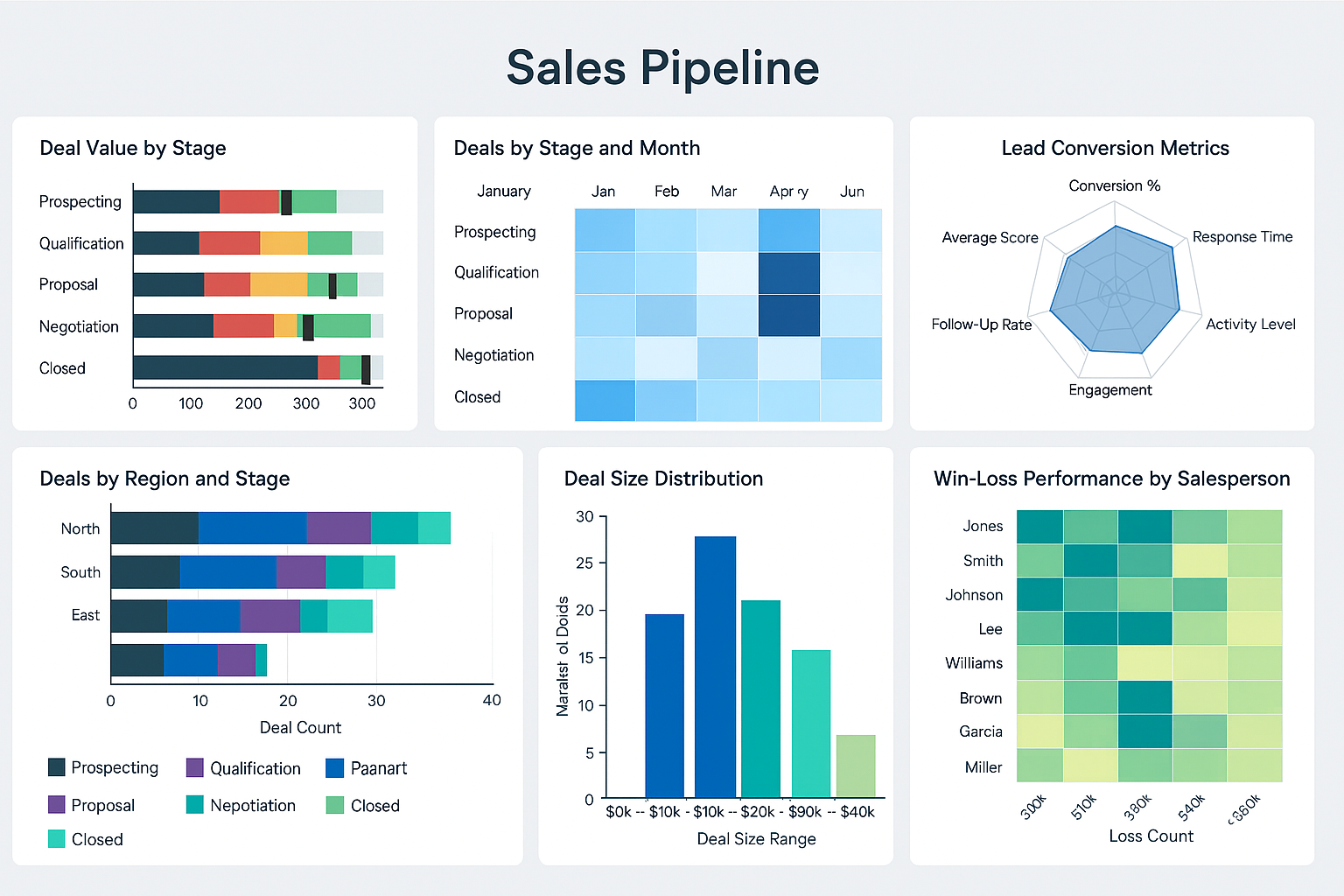
A sales pipeline dashboard is a powerful tool for sales managers to monitor and analyze their sales pipeline. It provides:
- Real-Time Visibility: A Sales Pipeline Dashboard provides the Sales VP with up-to-date insights into every stage of the sales funnel, enabling quick identification of bottlenecks or stalled deals.
- Forecast Accuracy: With visual breakdowns of deal value, close probability, and expected close dates, the dashboard helps the VP create more reliable sales forecasts.
- Team Performance Monitoring: The dashboard displays individual rep activity and progress, allowing the VP to track performance against quotas and coach underperforming team members.
- Opportunity Prioritization: Interactive charts allow the VP to segment opportunities by size, stage, or region, helping focus resources on high-value deals that are closer to closing.
- Strategic Decision Support: Trends in win/loss ratios, sales cycle duration, and conversion rates offer strategic insight for refining the sales process and reallocating resources.
- Improved Communication: The dashboard enables more informed discussions with executive leadership and marketing by providing a clear picture of pipeline health and revenue potential.
- Customization and Alerts: Sales VPs can set up KPI thresholds and alerts for pipeline changes, ensuring they are notified immediately when large deals progress or fall off the radar.
#1 Ranking: Read how InetSoft was rated #1 for user adoption in G2's user survey-based index.
More Articles About Sales Dashboards
- Interactive sales dashboard examples: Showcases a range of visual styles and self‑service interactivity such as slider date filters and tool‑tips over bubble, bar, and line charts to reveal aggregated data and aid rapid insight.
- Manufacturing sales dashboard sample: Features bar graphs comparing clients vs. expected revenue, regional breakdowns, plus displays of actual revenue vs. forecast and product mix performance, with real‑time filtering by checkboxes and dates.
- Building a Sales KPI Dashboard: Explains how to create dashboards tracking revenue vs. price, top product sales, return rates, lead volume, close ratio and pipeline value, all via self‑service drag‑and‑drop analytics.
- Sales management application overview: Describes pipeline analytics tools that allow sales managers to identify stuck deals, track stage durations, analyze stage‑by‑rep performance, and automate alerts for opportunities exceeding expected duration.
- Sales reporting tool article: Demonstrates dashboards for tracking employee performance, sales, returns, and filtering by rep, region or product, plus interactive brushing that updates all components simultaneously.
- Sales & Salesforce dashboard solution: Details StyleBI’s mashup ability to combine CRM, order management, call center and social data into unified sales dashboards and interactive opportunity discovery views.
- Industry‑specific KPI dashboard examples: Covers retail, manufacturing, finance and supply‑chain KPI dashboards such as sales per square foot, OEE, margin ratios, and perfect order rate visualized through InetSoft dashboards.
- Dashboard reporting examples: Includes a sales & returns dashboard charting revenue vs price, return reasons, plus executive regional performance and sales exploration by product category with trend lines.
- Summary report dashboards overview: Highlights building high‑level aggregated report dashboards with pixel‑perfect layout, scheduling, and bursting capabilities built into StyleBI for reporting audiences.
- Weekly dashboard reporting software: Describes creating recurring weekly dashboards to regularly monitor business conditions, using drag‑and‑drop design and no developer dependency.
- Analytic dashboard software details: Explains tracking KPIs against goals and quotas using scorecards, exception‑based alerts, and cloud‑flexible interactive dashboards for sales analytics.
- Business insights tool overview: Describes StyleBI’s combined capabilities of interactive dashboards and pixel‑perfect reporting, self‑service adoption, and analytics at scale across sales and other domains.
- Information dashboard design guidelines: Provides step‑by‑step walkthroughs on aggregating and grouping data to build effective dashboards using drag‑and‑drop design for business users.
- Analytics dashboard tools product info: Introduces InetSoft’s web‑based analytical dashboard software emphasizing ease‑of‑use, rapid deployment and suitability for sales and operations teams.
- Supply chain dashboard illustration: Includes KPI cards like perfect order rate and charts on shelf‑time and fill‑rate that sales and supply teams can adapt to monitor order fulfillment efficiency.
We will help you get started
Contact us

