InetSoft Product Information: Dashboard Platform
This is a table of contents of useful product information about, and benefits of, InetSoft's dashboard platform:
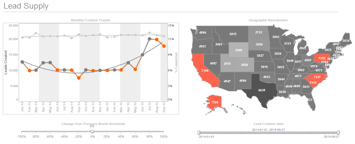
Business Highlights Dashboard - InetSoft's Style Intelligence offers an easily modified powerful visual analytics dashboard. This enables users to study fluctuations and trends at a glance. You can highlight specific geographic levels in a map based on the data they represent. For example, you can highlight an entire state, or highlight just the cities within the state. In this example, you will highlight in green all the states where the Sum(Quantity Purchased) ranges from 0-1500, and highlight in red all the states where the Sum(Quantity Purchased) ranges from 1500-5000. 1. Right-click the map, and select ‘Properties’ from the context menu. This opens the ‘Map Properties’ dialog box. 2. Select the Data tab. From the ‘Value Display’ menu, select ‘Value’. This will display numeric values on the map, rather than state names. 3. Select the Advanced tab. In the ‘Range’ panel, select the geographical layer which you wish to highlight from the ‘Layer’ menu. (In this example, ‘State’ is the only available layer.) 4. Click the ‘More’ button to add the first highlight range: a. Enter “0” in the ‘From’ field and “1500” in the ‘To’ field. b. Choose green from the ‘Background’ selector. 5. Click the ‘More’ button again to add the second highlight range: a. Enter “5000” in the second ‘To’ field...
 |
Click this screenshot to view a two-minute demo and get an overview of what InetSoft’s BI dashboard reporting software, Style Intelligence, can do and how easy it is to use. |


Business Intelligence Dashboard Design - Designing the perfect dashboard is more than just dropping a few charts onto a workspace. Proper dashboard design requires appropriate placement, knowledge of your data, and maybe a bit of color theory. There are a few elements to consider when it comes to placement. Firstly, what do you want in your dashboard? It's important to only focus on important matters when creating a dashboard. Avoid placing too much detail or anything that could distract from the data at hand. Users eyes should be immediately drawn to the most important element of you dashboard. Research has shown that the top left quadrant of a screen is the most commonly looked at space, providing nothing else on the dashboard stands out more than it should. Place your most important data there to ensure it is seen by viewers...
 |
View a 2-minute demonstration of InetSoft's easy, agile, and robust BI software. |
Business Intelligence Dashboard Examples - InetSoft offers award winning dashboard solutions. InetSoft's dashboard tool requires no expensive BI experts or consultants to deploy and offers an intuitive point-and-click, highly visual, easy-to-use interface. InetSoft's dashboard tools reduce TCO and help the enterprise realize immediate ROI by empowering their users with maximum self-service ability. Click on the screenshots below to get a closer look...
Business Mapping Software - InetSoft's business mapping software combines multi-dimensional charting with geographic charting that allows interactive dashboards to display continuous measures such as population or sales volume. The integration of mapping and chart engines also allows for the use of multi-charts that compare multiple maps side-by-side, and also permits the combination of data tables alongside visual maps of data so that drilling-down into a region displays custom metrics and detailed data. The end result is a data-rich application of geospatial mapping that makes finding answers and drawing conclusions from large data sets a much more efficient task for a business user. Multi-dimensional charting is the ability to depict more than two dimensions on a graph by simultaneously representing points through various shapes, sizes, or colors. This enables users to create 3d, 4d, or even 5d charts. Brushing is a technique that allows users to highlight data points within one chart and immediately isolate corresponding data points in accompanying charts leading to quick comparative analysis and recognition of aberrations and outlier...
Business Metrics Dashboard - A business metrics dashboard is vital to understanding the inner workings of large and small organizations alike. Just like the dashboard of your car, without it, you'd have no idea how things were running. In this example, you will create a Viewsheet with a map and a chart. The user will be able to filter the data displayed in the chart by dragging to select regions on the map. First, configure the Map component: 1. Create a new Viewsheet based on the sample ‘US Sales’ Worksheet. 2. Drag a Map element onto the Viewsheet grid. 3. Right-click the map, and select ‘Properties’. This opens the ‘Map Properties’ dialog box. Make the following settings: a. Under the General tab, set ‘As Selection’ to ‘True’. This enables the range selection feature. b. Under the Data tab, select ‘Sales’ from the ‘Table’ menu. c. Select ‘Quantity Purchased’ from the ‘Value Column’ menu. d. Under the Hierarchy tab, add ‘State’ and ‘City’ in the ‘Geography Columns’ box. e. In the ‘Predefined Location’ box, specify ‘North America’ and ‘United States’ as the ‘Continent’ and ‘Nation’, respectively. f. Click the ‘Check’ button to open the ‘Geographical Feature Names’ dialog box and automatically resolve the geographical names. Click ‘OK’ to exit...
Business Performance Dashboard Package - InetSoft's dashboard application is and robust enough to: attract the attention of executives, meet the demands of power users, and scale up for organizations of any size...
Buying On Premise Dashboard Software - Looking for on premise dashboard software? InetSoft is a pioneer in self-service, server-based dashboard software that can easily be installed in any network environmment. View a demo and try interactive examples...
Call Center Dashboard - Let’s look here for a call center dashboard for a moment. These are our call center calls. This is what’s coming into our operators. We look at metrics like how many calls were unanswered, what our totals were. What is pretty amazing is when you start looking at these totals, and you think, "oh gosh, these people were answering 5,000 calls a day." And these are typically very short calls. These are ones like “I need a phone number for x, ” or “can you connect me with whomever?” You can see here that those are down, too, from this time last year. So everything is a little calmer, a little bit better. Let’s look at our knowledgebase contacts. This dashboard shows you how many documents we have in the knowledgebase that are active. 12,623 are active at this point. These are total hits to our knowledgebase. We get 40,000 hits a day. We also break out just what external people are looking at vs. internal people. We even look at applications. This is our course management system...
Call Center Dashboard Examples - Call center dashboards are needed in order to monitor key metrics that can change on a minute-to-minute basis. Therefore, data needs to be accessed in real time and be readily available to all team members throughout the day. InetSoft offers companies a simple yet powerful solution to tracking key metrics such as success rate, productivity, service level, and more in order to increase company efficiency and decrease overhead costs.
Call Center Performance Monitoring - So let’s take a look at this example of a pre-built call center performance monitoring dashboard. There is a team of users, and it pulls from approximately 70 tables and 3 systems loaded in-memory, call record details, alumni data, and student data. It’s loaded and refreshed every night. This can be refreshed however you like, but the point is its pulling these tables from different sources. It can be accessed either by client PC or a mobile device since it’s running in a web portal. We have no pre-set hypothesis to answer these questions. You need to fish in the data or you might call it mucking around in the data to see what really is driving performance. You want the data to tell the story and then make decisions on it and do it in a collaborative ways so it needs to be fast and engaging. Let’s take a look. Let me pop out of the PowerPoint and open our call center project. So the way this is organized there are 10 tabs of this project, and it’s organized by theme. There is a page here on callers which is looking at statistics by the caller. For example, in these groups there were 463,000 calls made. There is the first person Maria. She made 16,000 calls, and she got 178 pledges, which is one percent, which is lower than the average of the whole group...
Campaign Monitoring Dashboards for SEO - An SEO dashboard is a tool that helps your company track and monitor your website's performance in search engines. It allows you to see critical data such as traffic and rankings, which can help you improve your SEO efforts and better target your audience. In short, it helps you make better decisions for your SEO campaigns. If you are unable to do all of the hard work, hiring professional SEO consultants can help improve your website's search engine rankings, save you time and effort, and provide expert advice and strategies. They can also stay updated with the latest trends and updates in the SEO landscape and ultimately lead to more traffic and conversions for your business. Below you will find out everything you need to know to make your SEO campaigns successful and track their success...
Campaign Monitor Dashboarding Tool - Looking for a good solution for Campaign Monitor dashboard reporting? InetSoft's pioneering BI application produces great-looking cloud-based dashboards with an easy-to-use drag-and-drop designer. Mash up your marketing campaign data with other enterprise sources for a unified view of marketing performance. View a demo and try interactive examples...
Can You Make Dashboards Real-time? - Definitely yes. Most dashboard solutions today have to the option to pull data in real-time. The dashboard engine queries the operational database either on premise or in the cloud in real-time and updates the dashboards in seconds. This means all users have the most accurate, up to date information, which is essential especially for front-line workers...
Cash Management Dashboards and What KPIs to Track - Your business's cash flow is like its lifeblood. You can't have a business if you don't have cash flow. That is why you must regularly monitor your company's health, in other words, its cash flow. And this is where cash management dashboards come into play. Your cash flow dashboard, like a heartbeat monitor, allows you to track important metrics for your business. It allows you to monitor every move of your business and help in its overall success. This article will explain what a cash management dashboard is and what KPIs are tracked on it. What Is a Cash Management Dashboard? A cash management dashboard tracks a company's immediate spending power and cash. It is a collection of indicators used to monitor your company over time that will tell you how you're doing and quickly reveal variations that may require corrective action. Because of the timing of income and expenditure, revenue models do not always reflect a company's immediate cash position, that's why company owners and finance directors must track cash flow separately from revenue. Cash and liquidity dashboards display real-time data from cash reporting and forecasting processes and systems that are most important to businesses and their audiences. Furthermore, they concentrate all of their attention on a single version of the truth that is simple to understand and digest...
 |
Read what InetSoft customers and partners have said about their selection of Style Scope for their solution for dashboard reporting. |
CEO Dashboard Software - A CEO dashboard is a 'must have' business intelligence tool. Just as a car dashboard lets drivers know they need gas, or how fast they are going before they get pulled over, a CEO dashboard alerts C-level employees and decision makers alike of potential problems plus optimal solutions, emerging trends and patterns in the market, or even effective strategies and when to deploy them. InetSoft's dashboard application is and robust enough to: attract the attention of executives, meet the demands of power users, and scale up for organizations of any size...
CES Survey Dashboard for Nicereply - Looking for a good solution for Nicereply dashboard reporting? InetSoft's pioneering BI application produces great-looking dashboards that mashup customer satisfaction scores data with other data sources in your organization. Maximize self-service for business users and technical staff. View a demo and try interactive examples...
Chief Nursing Officer Dashboards - The sheer volume of highly confidential data in the healthcare industry makes it prone to theft and medical identity crime. To ensure satisfactory patient experiences and strong public healthcare industry, it is imperative to have KYC (Know Your Customer) systems in place for the verification of patient identities, pre-treatment. We have recently seen the worldwide struggle during this Covid-19 pandemic where the failure to accurately identify patients has resulted in delayed procedures and inaccurate treatments. Several medical facilities still use physical, paper-based setups which are outdated and slow. This leads to inaccurate data transfer, capacity problems, and inefficiency in the care system. The overall system issues often result in wrong medical diagnosis, duplication of medical records, incorrect patient identification and treatment, and insurance fraud. The healthcare sector needs to have a digitized system in place to accumulate, sort through, and manage medical data while also complying with HIPAA. Digitized identity verification systems help to deliver timely and accurate healthcare services with the organization and protection of patient's sensitive data. This also ensures the correct insurance claims, reduces data theft, and helps achieve sustainable progress in the industry...