Articles About a Gauge Chart Generator
Looking for tools to build dashboards with dials, speedometers, and gauges? InetSoft offers Web-based dashboard software that includes a designer where you drag and drop these onto a canvas.
Dynamic Top 10 Rank in a Dashboard Chart - The first question was, can you have a dynamic top 10 rank in a dashboard chart? Navish Javed: Yes, absolutely, so the top ‘n’, in this case 10, can be dynamic. So if you wanted the number of top ranked items to be specified by the user maybe even using a slider, that is possible. You could do so with a variable, and you can also do so with script. Flaherty: Next question is about mobile application development, is there any way to make the checkboxes or drill downs plus or minus controllers, larger so they are easier to hit with the finger? Navish Javed: Oh okay. We actually do support the mobile pinch gestures, so you can easily zoom into the dashboard and with a simple double-click do a zoom to screen. So essentially it's just a matter of designing your dashboard to be a little bit smaller and requiring a little bit less real estate so that the users can simply zoom to fill their screen, in which case, all of the controls will scale appropriately...
Easy Analytical Dashboards - Are you looking for easy analytical dashboard software? Since 1996 InetSoft has been making dashboard software that is easy to deploy and gives you easy self-service oriented interactive analytics. View a demo and read customer reviews...
Easy Cloud Based Dashboard Solution - Are you looking for an easy cloud based dashboard solution? Since 1996 InetSoft has been offering dashboard solutions that are easy to use. Use self-service oriented dashboards and interactive visual analyses quickly. View examples from the gallery and read why InettSoft was rated #1...
Easy Dashboards - Dashboards are an essential data visualization tool that allow users to explore and analyze their data visually in order to find business solutions. Dashboards benefit enterprises by enabling the easy recognition of strengths and weaknesses, and the easy measuring of KPI's and metrics. An effective dashboard can intuitively convey the same information that could only be gleaned by paging through many different reports. Users of InetSoft's StyleBI can configure original dashboard designs or utilize ready-to-use templates. InetSoft's dashboards can be structured to be monitoring-oriented or analysis-oriented...
Easy Dashboard Creation Software - Looking for a tool for easy dashboard creation? InetSoft is a pioneer in self-service dashboard design with a drag-and-drop designer for business users. View a demo and try interactive examples...
Easy Dashboard Development - InetSoft's tool for easy dashboard development, StyleBI, is an essential element of running a competent business. It allows users to monitor various aspects of a business in order to judge its condition. Dashboards can also be used to forecast future business results or customer behaviors. A proper dashboard building tool converts unappealing spreadsheets into pleasant displays of useful information. StyleBI accomplishes this with charts, reports, heat maps, graphs, and a variety of other visual data tools...

Easy Dashboard Software - InetSoft's StyleBI is easy to use, cost efficient, unified BI software that allows users to easily present information through interactive dashboards, enterprise reporting, and scorecards, complete with automatic exception alerts and other advanced functionalities. InetSoft's software is an easy, agile, and robust full featured business intelligence solution. The software runs on a high performance and secure infrastructure. Also, StyleBI is compatible with Android and iOS devices, automatically rendering in Html5 for non-flash browsers...
Easy to Use Dashboard Tools - Dashboard reporting tools offer managers a convenient tool for monitoring their company's performance. They act as a control center for a company, facilitating a 360 degree view of all key business metrics. Unlike a control center, however, dashboards are a much more portable solution. Dashboard tools can be embedded into existing software or exist as stand alone products. The most transportable dashboard tools are entirely Web-based. Web-based dashboard tools, aside from being conveniently cartable, have several advantages over desktop clients...
Ecommerce Dashboard Building Guide - With regards to running an effective internet-based store there's a great deal to monitor. From undeniable level measurements like income or number of requests, down to more itemized data, for example, client input, there basically isn't one internet business investigation toll that covers everything. So as an entrepreneur, how might you administer every one of the various pieces of your web-based store without burning through minutes or even hours each time you want to look into a few significant pieces of information...
eCommerce Dashboard Tool - Technology has made many aspects of our lives easier, and shopping is no exception. Online sales are becoming a larger portion of overall revenue for many businesses. For many businesses, ecommerce transactions are just one of the many kinds of data that it benefits to store and analyze are justIn eCommerce it is very handy to make stats of what's going on in the business. It helps to have the data as accurate as possible, and what's more reliable than using Excel as a reporting tool is having a separate reporting tool that collects and reports the data in real-time. With InetSoft's StyleBI, sales tracking metrics, customer return ratio, and website page views can all be reported in real-time dashboards. With a user-friendly drag and drop tool, it's easy to learn how to create real-time reports with data from your website and online store combined..
Editing a Dashboard Layout - With InetSoft's dashboard software, users can easily edit a dashboard layout for a custom look and feel thanks to an abundant tool set and flexible javascript architecture. To edit an existing dashboard layout, follow the steps below: 1. Open the 'Dashboard Configuration' page (in the Server tab, under 'Presentation' > 'Dashboard'). 2. In the 'Layouts' table, click the 'Edit' button next to the dashboard you wish to edit. The 'Edit' button opens the 'Edit Layout' dialog box. To delete a layout entirely, Click the 'Delete' button in the right-most column. In the following example we will create the portlet layout shown below, which has one “row container” on the top and three “column containers” on the bottom: To create this layout, follow the steps below: 1. Open the 'Dashboard Configuration' page (in the Server tab, under 'Presentation' > 'Dashboard'). 2. Under the 'Layouts' table, click the 'New Layout' button. This opens the 'Layout Properties' dialog box. 3. In the 'Layout Name' field, enter “My Layout”...

Editing Dashboard Tables - Users can easily edit dashboard tables using InetSoft's award-winning dashboard software, an interactive data mashup reporting application that is available as a stand alone product or embeddable solution. Joined Tables and Concatenated Tables are considered Composition Tables. A Composition Table, as well as a Mirrored Table, has two modes: Hierarchical view and Editable view. Hierarchical view shows the exact composition of the table. It displays graphical links between the tables and columns involved in the composition, and indicates the type of concatenation or join being used. You cannot edit a table's columns when the table is in Hierarchical view. To toggle a Composition Table to Hierarchical view, click the 'Show Hierarchical View' button in the table title bar. Editable view allows you to edit column attributes, such as sorting order, visibility, etc. When a Composition Table is in Editable view, it looks similar to a regular Data Table. All of the table's composition information, such as join links, concatenation types, constituent tables, etc., is hidden from view...
Editing Dashboard Worksheets - InetSoft's dashboard software allows users to edit data worksheets to allow for a high level of data customizations for executives and end-users alike. This section provides basic information about working with Worksheets. To create a new Worksheet (in Asset Composer or Visual Composer), click the 'New Worksheet' button in the toolbar. This opens a blank Worksheet named 'Untitled'. To open a saved Worksheet in Visual Composer (or Asset Composer), follow these steps: 1. Expand the 'Global Worksheet' or 'User Worksheet' node in the Asset Repository tree, and locate the desired Worksheet. 2. Double-click the Worksheet in the Asset tree, or right-click the Worksheet and select 'Open Sheet'. The Visual Composer loads the Worksheet into a new page, and displays the name of the Worksheet in the tab at the bottom. Visual Composer allows you to keep many Worksheets (and Viewsheets) open simultaneously...

Education Dashboard - Looking to compare and monitor student performance and effectiveness of the educational process? InetSoft offers a small-footprint, full-featured BI platform that is easy to deploy and use. The single Web-based application provides a streamlined, intuitive interface for all users, teachers and administrators alike...
Education Dashboard Example - Searching for education dashboard software with automated data monitoring and report generating functionality to use with existing systems? InetSoft's dashboard software is easy to deploy and use and offers a highly interactive and customizable design...
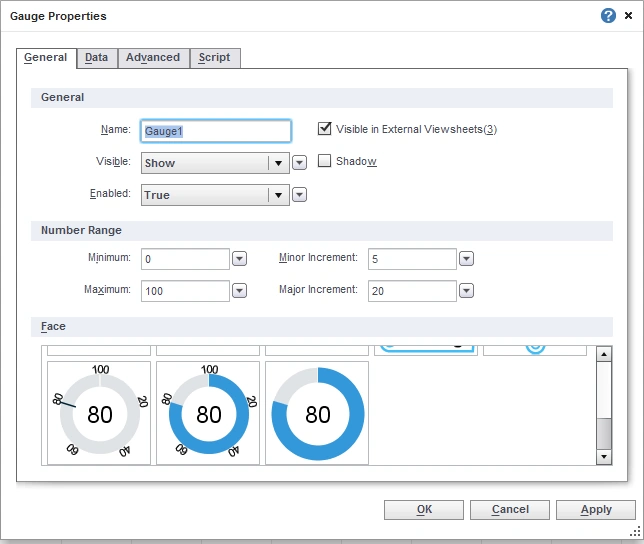
Efficient Dashboard Charts - In today's ever increasingly complex business environment, it's important to relay information in the simplest way possible. Our Dashboard charts exude elegance, simplicity, and efficiency. Find out more. The General tab in the ‘Chart Properties’ dialog box provides the following chart-specific properties. Tooltip: Value is displayed as tooltip when mouse hovers over corresponding chart area. Data Tip View: A Viewsheet component is displayed when mouse hovers over chart area. The component is filtered based on the hover region. In this example, you will create a chart that displays quantity purchased by company. When the user hovers the mouse over a given company, the Chart will display a gauge as a Data Tip. This gauge will display the average quantity purchased by the individual company. 1. Create a new Viewsheet based on the sample ‘US Sales’ Worksheet. 2. Drag a gauge from the Component tree into the Viewsheet. 3. Configure the gauge to display the average quantity purchased...

Effective Dashboards - Lots of BI Software Developers offer Dashboards, so what makes our dashboard any different? InetSoft's offers a web-based dashboard that is quickly deployed and its small java-based footprint allows it to move much faster than the others, and that in turn, allows you to work much faster and efficiently. The following sections explain various aspects of working with multiple datasets and subseries. To set the chart style for an individual dataset on a multi-dataset chart, follow the steps below: 1. Click ‘Switch to Single Graph’ in the title bar of the ‘Data’ panel. This changes the view to present all of the datasets on the same axes. 2. Click the ‘Select Chart Type’ button next to dataset you wish to change. This opens the Chart selection menu. 3. Choose the desired chart type, and click ‘Apply’. By default, when you specify two datasets on the Y-axis, the two datasets are plotted on two adjacent sets of axes. If you want the two datasets to appear on the same set of axes, click the ‘Switch to Single Graph’ button...