All the Ways to Evaluate InetSoft's Dashboard App
Evaluating a dashboard application requires looking at multiple dimensions that determine how useful the software will be for analysts, executives, and operational teams. InetSoft’s dashboard application, commonly delivered through the StyleBI platform, provides a wide range of capabilities that can be assessed through product trials, technical testing, and real-world use cases. A thorough evaluation should consider usability, data connectivity, scalability, analytics functionality, deployment flexibility, and long-term value to the organization.
Hands-On Product Trial
One of the most direct ways to evaluate the dashboard application is through a hands-on product trial or evaluation copy. This approach allows teams to install the platform in a test environment and experiment with dashboard creation, data integration, and performance. Organizations can determine how quickly dashboards can be created and how easily nontechnical users adapt to the interface. Web-based dashboard platforms like InetSoft can often be deployed quickly, making it possible to test the software in a realistic environment before committing to a full implementation.
During a trial, evaluators typically test basic tasks such as building charts, importing data sources, creating filters, and interacting with dashboards. This stage helps determine whether the interface is intuitive and whether the application fits the organization's workflow.
Product Demonstrations
Vendor demonstrations provide another important method of evaluation. A structured demo highlights key features, common use cases, and architectural capabilities of the dashboard platform. Demonstrations allow potential users to observe how dashboards are designed, how visualizations interact with data, and how quickly insights can be delivered.
Demos are also helpful for seeing advanced features that may not be immediately obvious during a self-guided trial. These may include interactive drill-down analysis, predictive analytics features, and embedded dashboard capabilities within other applications.
Testing Data Integration Capabilities
A major factor in dashboard evaluation is the ability to connect to different data sources. Organizations should test how easily the platform connects to databases, spreadsheets, APIs, and cloud services. Modern dashboard software should support real-time connections as well as batch data integration.
InetSoft’s platform is designed to connect to a wide range of data sources and includes a data mashup layer that allows users to combine data from multiple systems without building a separate data warehouse. Evaluating this capability involves testing how easily datasets can be merged, transformed, and visualized within the dashboard environment.
Evaluating Dashboard Design and Visualization Tools
Visualization quality plays a critical role in dashboard effectiveness. Evaluators should explore the available chart types, layout flexibility, and customization options. This includes testing heatmaps, scatter plots, KPI indicators, tables, and advanced charts used for operational monitoring.
A good dashboard platform allows analysts to design highly interactive dashboards with minimal effort. Drag-and-drop interfaces and visual layout tools should make it possible to build dashboards quickly without writing code. Evaluators should measure how easily business users can design dashboards compared with traditional BI tools.
Interactive Analytics Testing
Interactive capabilities are central to modern dashboard software. During evaluation, users should test how dashboards respond to filters, drill-down actions, and parameter changes. The ability to interact with visualizations in real time allows decision makers to explore data and uncover patterns more effectively.
Evaluation should include testing features such as dynamic filtering, drill-through analysis, time sliders, and selection lists. These features allow users to quickly navigate between summary-level insights and detailed data views.
Performance and Scalability Assessment
Organizations should evaluate how the dashboard application performs when working with large datasets or many concurrent users. Performance testing can include loading millions of rows of data, refreshing dashboards frequently, and testing response times during interactive analysis.
Scalability testing ensures the software can support enterprise-level use cases. This includes assessing how the system handles distributed users, multiple dashboards, and complex analytics workloads without degrading performance.
Deployment Flexibility Evaluation
Dashboard software should support multiple deployment options to meet different organizational requirements. Evaluation should consider whether the platform can run in the cloud, on-premise, or in hybrid environments. Organizations may also test how easily dashboards can be embedded into internal portals, SaaS applications, or customer-facing products.
Deployment flexibility can also include assessing mobile access, browser compatibility, and cross-platform support across operating systems.
Security and Governance Testing
Security is essential for enterprise analytics platforms. Evaluation should include reviewing role-based access controls, authentication methods, and data governance features. Dashboards often contain sensitive operational or financial data, so organizations must ensure that users only see the information they are authorized to access.
Testing security capabilities typically involves creating multiple user roles and verifying that each role can only access the appropriate datasets and dashboard views.
Self-Service Analytics Capabilities
Another way to evaluate a dashboard platform is to assess how well it supports self-service analytics. This involves determining whether business users can build dashboards, create queries, and explore data without relying heavily on IT teams. Platforms that support self-service analytics reduce bottlenecks and encourage broader adoption across the organization.
Evaluation should measure how quickly new users can learn the interface and whether training requirements are minimal.
Embedded Analytics Testing
For software vendors and organizations building internal applications, embedded analytics can be an important requirement. Evaluation should include testing whether dashboards can be integrated into external systems such as CRM platforms, enterprise portals, or SaaS products.
Embedding capabilities often include APIs, white-label customization, and integration with authentication systems so that analytics can be delivered seamlessly within other applications.
Real-Time Analytics and Monitoring
Operational dashboards frequently require real-time data monitoring. Evaluators should test whether the platform can support streaming data sources and rapid refresh intervals. Real-time dashboards allow organizations to monitor KPIs, detect operational issues, and respond quickly to changes in performance.
Testing real-time capabilities typically involves connecting dashboards to live data feeds and verifying that visualizations update immediately as new data arrives.
User Adoption and Feedback
Another valuable evaluation method involves gathering feedback from real users. Analysts, managers, and executives should all interact with the dashboards during the evaluation period. Their feedback can reveal usability challenges, visualization preferences, and workflow improvements.
High user adoption is often a strong indicator that a dashboard platform provides intuitive design, useful insights, and efficient data access.
Comparative Benchmarking Against Other BI Tools
Organizations often evaluate InetSoft alongside other business intelligence platforms. Comparing the dashboard application with tools such as Tableau, Power BI, or Qlik helps identify differences in usability, visualization capabilities, and cost.
Comparative benchmarking may include scoring platforms across categories such as ease of use, integration capabilities, dashboard performance, and overall feature completeness.
Total Cost of Ownership Analysis
Cost evaluation is another critical component of the decision process. Organizations should assess licensing costs, infrastructure requirements, maintenance needs, and implementation effort. A platform with lower infrastructure requirements or simpler deployment can significantly reduce total cost of ownership over time.
Cost analysis should also include the time required for training users and developing dashboards compared with alternative BI platforms.
Real-World Use Case Testing
Finally, the most reliable evaluation method involves building dashboards that reflect actual business scenarios. This could include sales performance dashboards, operational monitoring dashboards, marketing analytics dashboards, or financial reporting dashboards.
Testing real-world use cases allows organizations to determine whether the dashboard application supports the types of analyses and visualizations needed for daily decision making.
By combining technical evaluation, user feedback, and practical testing, organizations can gain a comprehensive understanding of how well InetSoft’s dashboard application meets their analytics and reporting needs.

Additional Resources
Enterprise Asset Management Solution Provider Offers InetSoft's Analytics and Dashboard Software - AssetPoint, a leading provider of Enterprise Maintenance Management software and industry best practices consulting - now offers visual analytics and KPI dashboard solutions based on InetSoft’s StyleBI application. Users of AssetPoint’s TabWare Xi EAM/CMMS system can opt to add the advanced business intelligence capabilities with TabWare Analytics. Beyond the out-of-the-box dashboards delivered with TabWare Xi that show an at-a-glance view of key performance metrics effecting maintenance operations, TabWare Analytics includes a large number of pre-built reports alongside eleven targeted metrics that can be continually monitored via dashboard and drilled-through for problem identification...
Enterprise Dashboard Software - InetSoft Technology offers users enterprise-grade dashboards software in the form of it's power BI suite, Style Intelligence. StyleBI is an operational business intelligence platform that features a powerful data mashup engine for the creation of dashboards, visual analyses, and reporting. StyleBI is a zero-client, Web-based BI tool that offers greater flexibility than that of its desktop-bound competition.
Equipment Maintenance and Facilities Management - InetSoft, an innovator in BI software since 1996, and AssetPoint, a leading provider of (EAM) Enterprise Asset Management and (CMMS) Computerized Maintenance Management Software solutions for over 30 years, have partnered to offer easy to use, interactive dashboards and advanced analytics. AssetPoint’s flagship product TabWare is an easy-to-use solution for managing all processes of maintaining manufacturing or industrial equipment and the operational facilities of any organization. Integrated into the application is a pre-built KPI dashboard that monitors eleven key metrics: Equipment downtime Maintenance backlog Percentage of planned work for prior month Maintenance cost as a percentage of equipment replacement value Percentage of Preventive Maintenance (PM) and Predictive Maintenance (PdM) worked in the prior month Percentage of PM and PdM overdue in the past month Estimating accuracy Maintenance, Repair and Operations (MRO) inventory turns MRO inventory as a percentage of equipment replacement value Total value of outstanding purchase orders Total value of receipts that have not been invoiced...
ERP Dashboard - Enterprise resource planning (ERP) systems help businesses mange the important parts of their operations. These systems unite internal and external management information across an organization through various software applications. The end goal is to gather information required to meet corporate objectives. ERP systems run on a wide range of computer hardware and network set ups, using a database to store vital information...
ESRI Dashboards Alternative - Are you looking for a good alternative to to ESRI dashboards? InetSoft's pioneering dashboard application can mashup mapping data with almost any other in your organization. Produce great-looking web-based dashboards with an easy-to-use drag-and-drop designer. Get cloud-flexibility for your deployment. Minimize costs with a small-footprint solution. Maximize self-service for all types of users. No dedicated BI developer required. View a demo and try interactive examples...
Event Streaming Dashboard Solution for Keen - Looking for a good dashboard solution for Keen event streaming? InetSoft's pioneering ddashboard platform can mashup your streaming data with other enterprise sources. Make great-looking cloud-based dashboards with an easy-to-use drag-and-drop designer. View a demo and try interactive examples...
Everyday Dashboard App - Are you looking for a good daily dashboard app? InetSoft's easy-to-use dashboard reporting application produces great-looking web-based dashboards with an easy-to-use drag-and-drop designer. Get cloud-flexibility for your deployment. Minimize costs with a small-footprint solution. Maximize self-service for all types of users. No dedicated BI developer required. View a demo and try interactive examples...

Example of a Dashboard Telling a Story - Here's another great example of a marketing dashboard that tells a story. This is with a partner of ours, one that works on lot of marketing automation systems and here's the dashboard they've built that shows sales won and estimated in pipeline. So, what I love about the story of this particular dashboard is the idea that the sales goal, our goals, our revenue goals, is like a mountain to climb, and that is exactly what this is showing. So, it's showing how over time this organization has had a particular sales goal, and in particular had sales opportunities in different stages and how over time that mountain is getting climbed. It's dark blue color if it is closed won business. The blue is in some paperwork. The green is in commitment, and so and so on, up to even the point of a sales accepted lead which is for a lot of us in the marketing world this is where sales team picks up on the work we do. So this is a great dramatic point about how we're climbing the mountain of sales, where are we. We are almost there. We are nearly to the place we want to be with our funnel. And in fact over here it has expressed the funnel in a more traditional way rather than a cumulative way which is of course a great way to look at it. So what we see here is the number of leads coming in, the number turning into qualified opportunities and so on all the way down to paperwork approval and closed won for this last quarter and quarter four. So, again this is not our data, but a great example of a funnel and of a story that has real drama about how we're climbing this mountain...
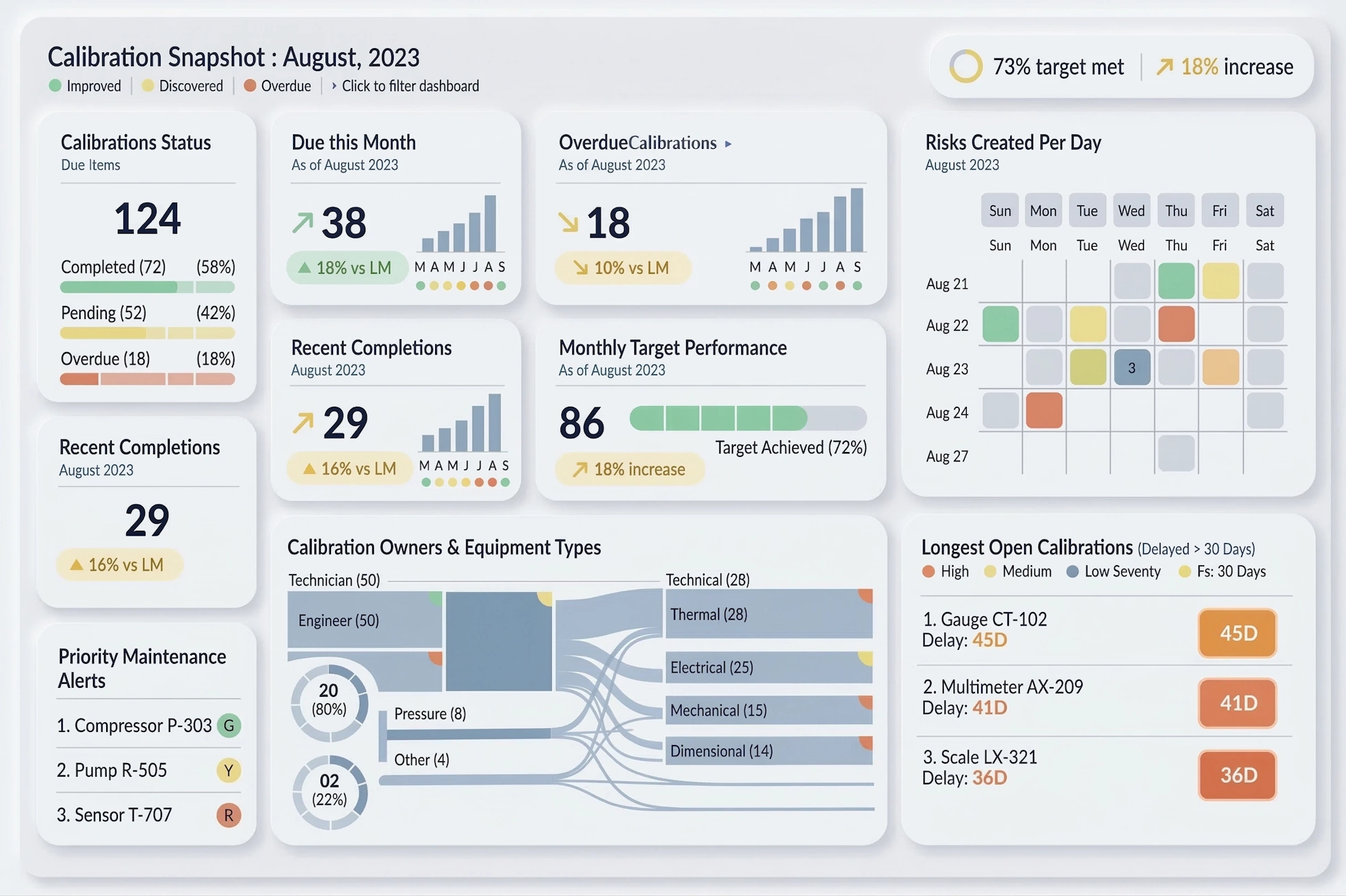
Example of a Data Center KPI Dashboard - To visualize how some common KPI's can be charted and analyzed in InetSoft's application look at the example of an IT data center monitoring dashboard. Server Uptime: Percentage of time servers are operational. CPU Utilization: Usage percentage of the central processing unit (CPU). Memory Utilization: Usage percentage of available RAM. Storage Capacity Utilization: Percentage of storage capacity in use. Network Traffic: Data transfer rates on the network. Latency: Time delay in data transmission. Packet Loss Rate: Percentage of lost data packets in network communication. Power Consumption: Energy usage by the data center. Cooling Efficiency: Effectiveness of data center cooling systems. UPS (Uninterruptible Power Supply) Status: Operational status of UPS devices...

Example of an Interactive Sales Performance Dashboard - In this example of an interactive sales performance dashboard, the salesperson can play with different dimensions and measures. I can view sales. I can view returns. Anytime I have aggregated data, be it a chart or a presentation table, there is out-of-the-box functionality for drilling into your detail information. So what if I want to look at all of Robert’s sales made this year. I click on the bar corresponding to Robert. I click on Show Details, and I automatically drill into all of Robert’s sales made this year. I can quickly export these into Excel. And I can always go back to my global view and zoom into any one of these other modules. Let’s look at another example. This is a single unit and again. I am exploring my sales, viewing it by different dimensions, by product category, by states, by sales rep, and by time period. On the left, I have my filters. Here’s a little time slider which lets me interact when we choose different time dimensions...
Example of a Facebook Ads Manager Visual Analysis - This example above illustrates the analysis of Facebook Ads performance. With Facebook's built-in reporting interface you can filter on all of the PPC metrics, but you can only sort on one at a time, which quickly frustrates you when you are trying to simultaneously maximize or minimize two of them, such as conversion rate and click through rate...
Example of a Mail Handling Dashboard - This Mail Handling Dashboard is designed as a full-screen operational command center for a modern mail or parcel sorting facility. Its primary purpose is to translate high-volume, high-velocity operational data into clear, actionable signals that supervisors, floor managers, and executives can understand at a glance. The dashboard emphasizes real-time visibility, trend awareness, and performance accountability across people, processes, and throughput. By combining high-level KPIs with supporting trend charts and breakdowns, it avoids the common trap of showing “interesting numbers” without operational meaning. The Volume Processed KPI represents the total number of mail pieces handled within the selected time frame. This includes letters, flats, packages, and other defined mail classes...
Example of a Social Media Dashboard - Great, thank you, and it's great to be here with today to talk about executive dashboards and how to measure marketing's performance and impact. One of the great things that I get to do as Chief Marketing Officer is do a lot of marketing, which is fun, and look at a lot of data. So, it's really a pleasure to talk to you about marketing dashboards and why should we have marketing dashboards. Basically it really comes down to organization's needing to understand how they are progressing on their business goals, and so a good marketing executive dashboard will demonstrate that progress, or lack thereof, sometimes, and it will do it in a way that's factual, not necessarily based on opinion. Without data and without dashboards sometimes you get a lot of opinions floating around the office or your organization, and I'm sure many of you marketers would nod your heads in agreement. So, what is it that makes a good marketing dashboard? Well, there are a lot of qualities to a good dashboard. A few that I've highlighted here that I think are really important include things like it's being understandable. That's probably the most important thing, and it has to be understandable in a way that executives will respond to it...
Exampes from a Big Data Dashboard Tool - Looking for good big data dashboard tools? InetSoft's pioneering dashboard reporting application makes producing great-looking web-based reports and dashboards easy with a drag-and-drop designer and the ability to connect to all types of big data sources. View a demo and try interactive examples...

Executive CXO Dashboard Product - Looking for good CXO dashboard options? InetSoft's pioneering dashboard reporting application produces great-looking web-based dashboards with an easy-to-use drag-and-drop designer. Give your c-level team maximum self-service to answer their ad hoc questions. View a demo and try interactive examples...
Executive Dashboard API - A VisualFrame object contains information about how data values are mapped to physical properties of chart elements. For example, a BrightnessColorFrame contains information about how data values in a field map to the brightness of corresponding chart elements. Mappings of this type require a Scale. Note that in this chart the IntervalElement object implicitly defines a linear Y-axis scale. However, the data values on the chart are widely different in magnitude, which suggests that a log scale might be more appropriate. Follow these steps: 1. Define the desired Scale object explicitly. In this case, create a LinearScale based on the 'Total' field. var scale = new LinearScale("Total"); scale.setFields("Total")...

Executive Dashboard Product Demo - Looking for an executive dashboard product? Since 1996 InetSoft has been making dashboard software that is easy to deploy and easy to use. Build self-service oriented dashboards quickly . View a demo and read customer reviews...
Executive Management Dashboard - Researching dashboard solutions for your organization's internal use or to embed in a commercial application? Deploy a small-footprint, easy-to-use Flash-based data dashboard application from InetSoft...
Executive Reporting Dashboard Application - Are you looking executive reporting dashboard software? Since 1996 InetSoft has been making dashboard software that is easy to deploy and easy to use. Build self-service oriented dashboards and visual reports quickly. View a 3-minute demo and download a free version...
Executive Status Dashboard Report Tool - Looking for a good tool for executive status dashboard reports? InetSoft's pioneering dashboard reporting application produces great-looking web-based dashboards with an easy-to-use drag-and-drop designer. View a demo and try interactive examples...
Exploratory Visualization Tool - Business are constantly being bombarded with new sources of information. The challenge has always been how to interpret that information. With InetSoft's exploratory visualization tool, you will be able to explore your data from every angle to discover new patterns, test new ideas, and envision new opportunities. A Viewsheet is a visualization of a Data Worksheet. Data Worksheets are built using Data Block™ technology, the flexible framework that allows you to mash up and manipulate data from multiple sources in real time. The Viewsheet extracts the data relationships that you develop in the Data Worksheet, and presents them within an intuitive and interactive visual interface. You can use the Viewsheet to navigate any inherent hierarchy in the data, and you can add new information for “what-if ” analysis and other advanced applications...

Exploring Dashboards - Using InetSoft's free online test drive (Try Now button above). Viewing a Dashboard Click to Enlarge Dynamic Chart Example • Interacting with charts • Using dashboard filters • Using selection lists • Using range sliders Editing a Dashboard Click to Enlarge This Editing a Dashboard Sample • Adding a chart • Adding a table • Adding a filter...
Exporting Dashboards and Reports to Excel - A spreadsheet is a popular tool for performing simple data analysis. It also has fairly strong formatting support. InetSoft products support exporting a report to an Excel file. The Excel export is based on report layout and the following two assumptions: the generated Excel file contains the actual data in the report, so it can be further manipulated in a spreadsheet application, and the Excel file should match the report layout and formatting as closely as possible, so it can be printed out in a form that reasonably resembles the original report. Due to these two assumptions certain formatting characteristics of the original report will not be retained after an Excel file is generated. For example, page margin settings created in the Designer are not available in the exported Excel .xls file. StyleBI has some advanced features that can be utilized during Excel exporting. You can export supported formulas to Excel tables. This is available for the two Excel export formats: Excel (no pagination) and Excel (best data editing). StyleBI supports GroupFilter and TableSummaryFilter for export in Excel format. The NthMostFrequent and WeightedAverage formulae are not supported. ..
Exporting Dashboards and Reports to Rich Text Format (RTF) - Rich Text Format (RTF) is an ASCII based file format that can be used to store documents with style information. It is readable by most word processors to allow editing of the contents. The InetSoft Builder class supports exporting a file to RTF format. The RTF format does not have as many layout options as StyleBI has. Therefore the generated RTF file will not always capture the complete format information of a report. However, all report data, including text, table and image (painters), is saved in the RTF file. The main purpose of exporting a report to an RTF file is for further human manipulation of the report information, rather than for printing. Therefore, the loss of report formatting information is not critical in most instances. If the purpose of saving a report is only for later viewing, PDF or Postscript files would be a much better choice. Creating an RTF file follows the same procedure as saving a report file. We first obtain a Builder object for the RTF export and then write the report to the output file...

Fast Drag and Drop Dashboard Builder - Are you looking for a good drag and drop dashboard builder? InetSoft's pioneering dashboard application produces great-looking web-based dashboard with an easy-to-use drag and drop designer. Get cloud-flexibility for your deployment. Minimize costs with a small-footprint solution. Maximize self-service for all types of users. No dedicated BI developer required. View a demo and try interactive examples...
Federal Budget Monitoring Dashboard - The Federal Budget Monitoring Dashboard below is an example of one of InetSoft's interactive web-based applications for federal agencies or departments. This particular chart allows users to monitor and research recipients of federal monetary funds by geography or type of award. With a point and click environment, users can drilldown into details by specific query such as state or population for an accurate analysis on one unified screen...
Features and Advantages of Using an API to Create Embedded Dashboards - Data is the cornerstone of strategic decision-making. Organizations, regardless of their size or industry, are increasingly relying on data-driven insights to stay competitive and drive growth. Embedded dashboards, powered by Application Programming Interfaces (APIs), have taken center stage as a powerful tool for democratizing data visualization and analysis. In this article, we'll delve into the advantages and features that make API-driven embedded dashboards a game-changer for your business. Embedded dashboards are no longer confined to the realm of data analysts and IT professionals. With the most advanced proxy API seamlessly integrating these dashboards into existing applications and platforms, your organization can offer data-driven insights to a wider range of stakeholders. The democratization of data empowers teams across departments, from marketing to finance, to make informed decisions...
Filtering Dashboard Data - Using InetSoft's award-winning dashboard software, users can sort and filter complex dashboard data in custom ways and create compelling visual reports. You can filter the data in a table by applying conditions to any of the table columns. For example, you may want to display only products that have a 'product price' greater than $100, or that have an 'order date' within the past year. When you specify conditions, the table will only display the data records that satisfy those conditions. Simple conditions are conditions defined on the pre-aggregate data, that is, before any grouping or summarization. Simple conditions are always joined together using the 'AND' operator. To gain greater flexibility, you can use advanced conditions. Note: Filtering conditions are only applied to data that is retrieved from the database. The amount of data (number of rows) retrieved is determined by the 'Max Rows' setting and the global 'Design mode sample data size' setting...