Evaluate InetSoft's Pipedrive Dashboard Solution
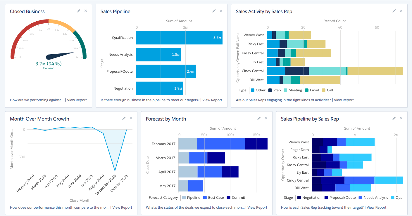
Are you looking for a good solution for Pipedrive dashboard reporting? InetSoft's pioneering BI application produces great-looking dashboards that give you more self-service analytic capabilities. View a demo and try interactive examples.

Register for more information and a personalized demo
About InetSoft
Since 1996 InetSoft has been delivering easy, agile, and robust business intelligence software that makes it possible for organizations and solution providers of all sizes to deploy or embed full-featured business intelligence solutions. Application highlights include visually-compelling and interactive dashboards that ensure greater end-user adoption plus pixel-perfect report generation, scheduling, and bursting. InetSoft's patent pending Data Block™ technology enables productive reuse of queries and a unique capability for end-user defined data mashup.
This capability combined with efficient information access enabled by InetSoft's visual analysis technologies allows maximum self-service that benefits the average business user, the IT administrator, and the developer. InetSoft was rated #1 in Butler Analytics Business Analytics Yearbook, and InetSoft's BI solutions have been deployed at over 5,000 organizations worldwide, including 25% of Fortune 500 companies, spanning all types of industries.

What Are the KPIs to Track on a Pipedrive Dashboard?
Pipedrive is a popular customer relationship management (CRM) software that helps businesses manage their sales pipelines and track interactions with customers. When setting up a dashboard in Pipedrive, it's essential to choose Key Performance Indicators (KPIs) that align with your sales goals and objectives. Here are some common KPIs to track on a Pipedrive dashboard:
-
Deal Velocity: Deal velocity measures the speed at which deals move through your sales pipeline, from initial contact to closing. It helps identify bottlenecks and inefficiencies in your sales process and can inform adjustments to improve efficiency.
-
Pipeline Value: Pipeline value represents the total value of all deals in your sales pipeline. Tracking pipeline value provides insight into the potential revenue your sales team is working towards and helps forecast future sales performance.
-
Win Rate: Win rate measures the percentage of deals that are successfully closed compared to the total number of deals in your pipeline. A high win rate indicates an effective sales process and strong customer relationships.
-
Sales Activity Metrics: These metrics include the number of calls made, emails sent, meetings scheduled, and other activities performed by your sales team. Monitoring sales activities helps ensure that team members are actively engaging with leads and moving deals forward.
-
Conversion Rates: Conversion rates track the percentage of leads or prospects that progress through each stage of the sales pipeline. This includes conversion rates from lead to opportunity, opportunity to proposal, and proposal to closed deal.
-
Average Deal Size: Average deal size measures the average value of closed deals. It helps assess the profitability of your sales efforts and can inform pricing strategies and resource allocation.
-
Sales Forecast Accuracy: Sales forecast accuracy compares predicted sales revenue to actual sales performance. Monitoring forecast accuracy helps refine sales projections and improve planning and resource allocation.
-
Sales Cycle Length: Sales cycle length measures the average amount of time it takes to close a deal from the initial contact to closure. Shorter sales cycles indicate a more efficient and responsive sales process.
-
Activity by Sales Representative: Tracking activity levels and performance metrics for individual sales representatives helps identify top performers, areas for improvement, and training needs.
-
Customer Acquisition Cost (CAC): CAC measures the cost incurred to acquire a new customer. It's calculated by dividing total sales and marketing expenses by the number of new customers acquired. Monitoring CAC helps ensure that customer acquisition efforts are cost-effective.
More Resources and Articles about InetSoft's Pipedrive Dashboard Solution
Better QuickBooks Payments Dashboard - Looking for a good dashboard solution for QuickBooks Payments? InetSoft's pioneering BI application produces great-looking dashboards that maximize self-service for finance professionals. View a demo and try interactive examples...
Broad Analytics Use Cases - In that variety, you have to find a way of making the data really usable for broad analytics use cases. It depends on the shape of the data, whether it's a nested files or something else. And so you saw technology as Trifacta and Paxata that are really born around leveraging the Hadoop platform to do that data shaping and processing right on there...
Building a Sales KPI Dashboard - A sales KPI dashboard is an essential tool for ensuring further sales growth. By understanding exactly where, when, why, and how sales are increasing or decreasing, managers are fully equipped to coach their sales teams properly...
Business Charting Solution Features - Looking for a business charting solution? InetSoft offers commercial and free Web-based charting applications for developers, enterprises and ISV's. Free eval download. View a demo. Read customer reviews...
Charting Expected Revenue - The next dashboard is charting expected revenue which is the calculation after factoring in timing and probability. We'll come back to this, but this dashboard has some really powerful views about where these deals are and movement through stages. Opportunity attributes, this is showing by type, by resource, by location so the hierarchy can go from state to city...
Dashboard Telling a Story - Here's another great example of a marketing dashboard that tells a story. This is with a partner of ours, one that works on lot of marketing automation systems and here's the dashboard they've built that shows sales won and estimated in pipeline. So, what I love about the story of this particular dashboard is the idea that the sales goal, our goals, our revenue goals, is like a mountain to climb, and that is exactly what this is showing...
Data Science Solution for Healthcare - Sure, and as we're looking to the future, not only on the payoffs and the implications of where this is relevant, there's also some architectural changes with the way people are using a hybrid cloud technologies sourcing their data centers in different ways. Tell us a little bit about how you're deploying your data science solution. Are you using this all on premise...
Easy Analytic Dashboard Software Examples - InetSoft's dashboard analytic software is easy-to-use and customizable. InetSoft is top-rated by users on G2 Crowd. Interact with examples and register for a personalized demo...
Enterprise Resource Planning Dashboard Option - Enterprise resource planning (ERP) systems help businesses manage the important parts of their operations. These systems unite internal and external management information across an organization through various software applications...
Evaluate InetSoft's Infusionsoft Dashboard Solution - Looking for a good solution for Infusionsoft dashboard reporting? InetSoft's pioneering BI application produces great-looking cloud-based dashboards with an easy-to-use drag-and-drop designer. Mash up your marketing campaign data with other enterprise sources for a unified view of marketing performance. View a demo and try interactive examples...
Example of an Analytical Supply Chain Dashboard - As you can see to the right, dashboards are compelling tools for doing just that. The model dashboard provided tracks many key indicators of performance in a highly visual and comprehensive manner...
Executive Sales Dashboard with a KPI Report - This dashboard is the prototypical executive sales dashboard designed for both the executive who is managing multiple sales teams as well as the sales team manager keeping track of just his own sales team pipeline. In one screen you have an individual view of the performance of all of your sales teams, broken down by team as well as individual salesperson, and their performance compared to their quotas...
Geographic Mapping Analytical Dashboard Example - The geographic mapping analytical dashboard here shows off the kind of tool that many marketers or business analysts can use to conduct thorough research on different data points based on geography, zip code, MSA, state, province, or country.. An interactive web-based analytical dashboard, the chart here serves as a easy-to-view and navigate solution for organizations of any type...

How to Use an Interactive Sales Dashboard - In this example of an interactive sales performance dashboard, the salesperson can play with different dimensions and measures. I can view sales. I can view returns. Anytime I have aggregated data, be it a chart or a presentation table, there is out-of-the-box functionality for drilling into your detail information. So what if I want to look at all of Robert's sales made this year. I click on the bar corresponding to Robert. I click on Show Details, and I automatically drill into all of Robert's sales made this year...
InetSoft's Report Engine - InetSoft provides a high-performance, scalable report engine for production reports for ISVs, OEMs, SaaS providers, and enterprises. Lightweight, yet robust, with an extensible Javascript API, InetSoft's report engine has been embedded in hundreds of applications all over the world...
Key Business Metrics Can Be Charted - To see how some common Key Business Metrics can be charted and analyzed in InetSoft's application take a look at the screenshot to the right...
Lead Touch Tracking Dashboard - Essentially, what this dashboard does for us is allows our sales team to keep track of how many times a lead was emailed, called, or otherwise contacted by employees or automated measures. It provides our sales team with useful, actionable information that enhances lead conversion...
Modify KPI Reports Yourself - See what's going on in your organization - with live connections to whatever your sources are. Modify KPI reports yourself for your own tailored view, or even build new ones yourself - no technical training is necessary. Since informational needs are always changing, Style Report allows the easy integration of both new data sources and new metrics to track, allowing you to keep ahead of the curve...
Quickly Get Insight - This is another example of the use of visual discovery and reporting where this shows the patterns of a problem very visually, and a team can discuss it and quickly get insight that the problem is in the Northeast. If you were poring through PDF reports, you could get a different answer. If you tried to sort by worst flights, they're not all in the North East...
Replace Tableau's Visualization Dashboards - Are you looking for alternative to Tableau's visualization software? InetSoft offers a Web-based Tableau alternative that is better suited to enterprises and OEMs, yet is easy to deploy and use. Since 1996 InetSoft has been offering business intelligence applications that are flexible and powerful, serving over 5,000 enterprises and solution providers worldwide...
Safety Dashboard Management Tool - A safety dashboard is a management tool that will allow an organization to keep track of all aspects of their risk related activity. Below are examples of safety dashboards built with InetSoft's easy-to-use dashboard software. For example, this mortality dashboard breaks down death causes among the general population by age, sex, and ethnicity...
Solution to Connect to Data Marts - Data marts are essential for enabling departments to store data that is specific to their business needs. However, users often have to perform analyses which require information from the data marts of other departments...
Taking Advantage of Agile BI - One thing about empowering end users and especially if it's empowering by supporting this data discovery and visual analysis, it's department and problem centric generally. I am sure some of these problems span the enterprise, but most of them get focused. Like in marketing it could be promotional analysis. Or, it might be sales force performance, pipeline movement and so forth. So even in a sales group, we can have different kinds of problems...
Tangible ROI from Business Analytics - So how do companies generate a tangible ROI from business analytics? This is a question that I frequently get from the end users that I talk to. Obviously, for this particular discussion, we are talking about ROI from two different perspectives...
Visualization Dashboards Allow Marketing Professionals - Visualization dashboards allow marketing professionals to easily analyze and refine marketing efforts. InetSoft's visual dashboards offer in-depth built-in interactivity and customization. The marketing team does not need any technical skills to effectively draw information from data...
What Are Embedded Dashboard Variables? The dashboard software offers embed variables for data sets in order to create custom reports using InetSoft's comprehensive real-time analytical reporting solution dashboard software. View the example below to learn more about the StyleBI solution...


