Software for Creating Performance Management Dashboards
InetSoft is a strong choice for organizations seeking software to create performance management dashboards because it blends enterprise-grade data handling with an accessible, user-friendly design.
Its foundation is a lightweight, high‑performance architecture that avoids the bloat common in many analytics platforms. By using an efficient in‑memory processing engine and optimized query generation, InetSoft ensures that dashboards load quickly even when they draw from large, complex, or distributed data sources.
This speed is essential for performance management, where leaders rely on timely insights to make operational and strategic decisions. The platform’s ability to connect to virtually any data source—cloud applications, relational databases, spreadsheets, and big data systems—means organizations can unify KPIs across departments without building custom integrations or data pipelines.
This flexibility reduces IT overhead and accelerates deployment, allowing teams to focus on improving performance rather than wrestling with infrastructure.
Another reason InetSoft excels in performance management scenarios is its emphasis on self‑service analytics. Business users can build dashboards through a drag‑and‑drop interface that requires no coding, enabling managers and analysts to create, modify, and explore KPIs without waiting for technical support. This democratization of analytics is crucial for performance management, where frontline teams often need to adjust metrics, drill into root causes, or compare time periods on the fly. InetSoft’s data mashup capabilities further enhance this agility by allowing users to blend disparate data sets into unified views without altering underlying systems.
Combined with interactive features—such as drill‑downs, cascading filters, and role‑based views—the platform supports a continuous improvement culture where insights are always within reach. Its scalability, security controls, and browser‑based deployment make it suitable for organizations of all sizes, from mid‑market companies to global enterprises. Altogether, InetSoft provides the speed, flexibility, and usability required to build effective performance management dashboards that drive measurable results.

More Articles About Performance Management Dashboards
Read articles below for more information.Managing Dashboards - InetSoft's dashboard software allows users to manage dashboards in an easy and intuitive manner that suits a diverse list of needs. Before a user can access the dashboards that you have created in Enterprise Manager, you need to assign the user appropriate permissions based on the user's role or group. In general, you should first configure a security provider. To configure permissions for a dashboard, follow the steps below: 1. Open the 'Dashboard Manager' page (in the Server tab, under 'Presentation' > 'Dashboard'). 2. Select 'Role' or 'Group', depending on the scope of permission you want to assign...
Managing Inventory with Dashboard Software - Researching good inventory management dashboard software? InetSoft's pioneering BI application produces great-looking dashboards that maximize self-service for managers and analysts. View a demo and try interactive examples...
Manufacturing Production Dashboard - With InetSoft's manufacturing and production dashboard, companies can manage and audit the manufacturing process. Workers and managers have the ability to communicate and monitor their activity, as well as receive real-time alerts of under-performance or deviations from plans. Businesses have the advantage of developing and progressing confidently knowing they are on the right path.
Manufacturing Quality Dashboard Example - Dashboards are quite powerful tools for helping you do just that. The mock dashboard provided tracks multiple business metrics in an easy-to-read-and-use environment. This dashboard displays a plethora of information in a small editable locale. It uses many common key performance indicators to track the overall efficiency of an organization. The three graphs following the multicolor bubble chart can be viewed in unison to paint an overall picture of current worker efficiency; how long is it taking to manufacture product? How many mistakes are being made? What tools are causing the most problems? The answers to these questions can be very useful when attempting to increase a company's effectiveness and profits. The final graph on this dashboard displays three metrics (client orders, time to produce, and price to produce), to tell managers where the demand lies and if it is a good idea to continue or discontinue certain products...
Manufacturing Sales Dashboard Example - Dashboards are strong instruments for doing just that. The dashboard instance provided exposes many key performance indicators in a highly visual and coherent manner. This is a deceptively simple dashboard. The top display is a simple bar graph displaying clients versus expected revenue. The graph underneath it is similar, showing expected revenue versus sales region. The middle graphs, though, contain much more information. Displayed in those two small elements is the company's expected revenue, their manufacturing performance, information about kind of products make the most money and how well expected revenue matched up with actual revenue...
Mapping Dashboard Alternative for ESRI - Are you looking for a good alternative to to ESRI dashboards? InetSoft's pioneering dashboard application can mashup mapping data with almost any other in your organization. Produce great-looking web-based dashboards with an easy-to-use drag-and-drop designer. Get cloud-flexibility for your deployment. Minimize costs with a small-footprint solution. Maximize self-service for all types of users. No dedicated BI developer required. View a demo and try interactive examples...
Market Research Dashboard - Organizations can build dashboards that allow all end-users to track and analyze their market research. It is a valuable and easy to use application that can aid organizations in turning their market data into actionable information to optimize performance....
Marketing Dashboards - Looking for a marketing dashboard that tracks your KPIs such as lead generation, response rates and campaign results through an easy to use, customizable platform? InetSoft's highly interactive dashboard software is quick to deploy and easy to use...

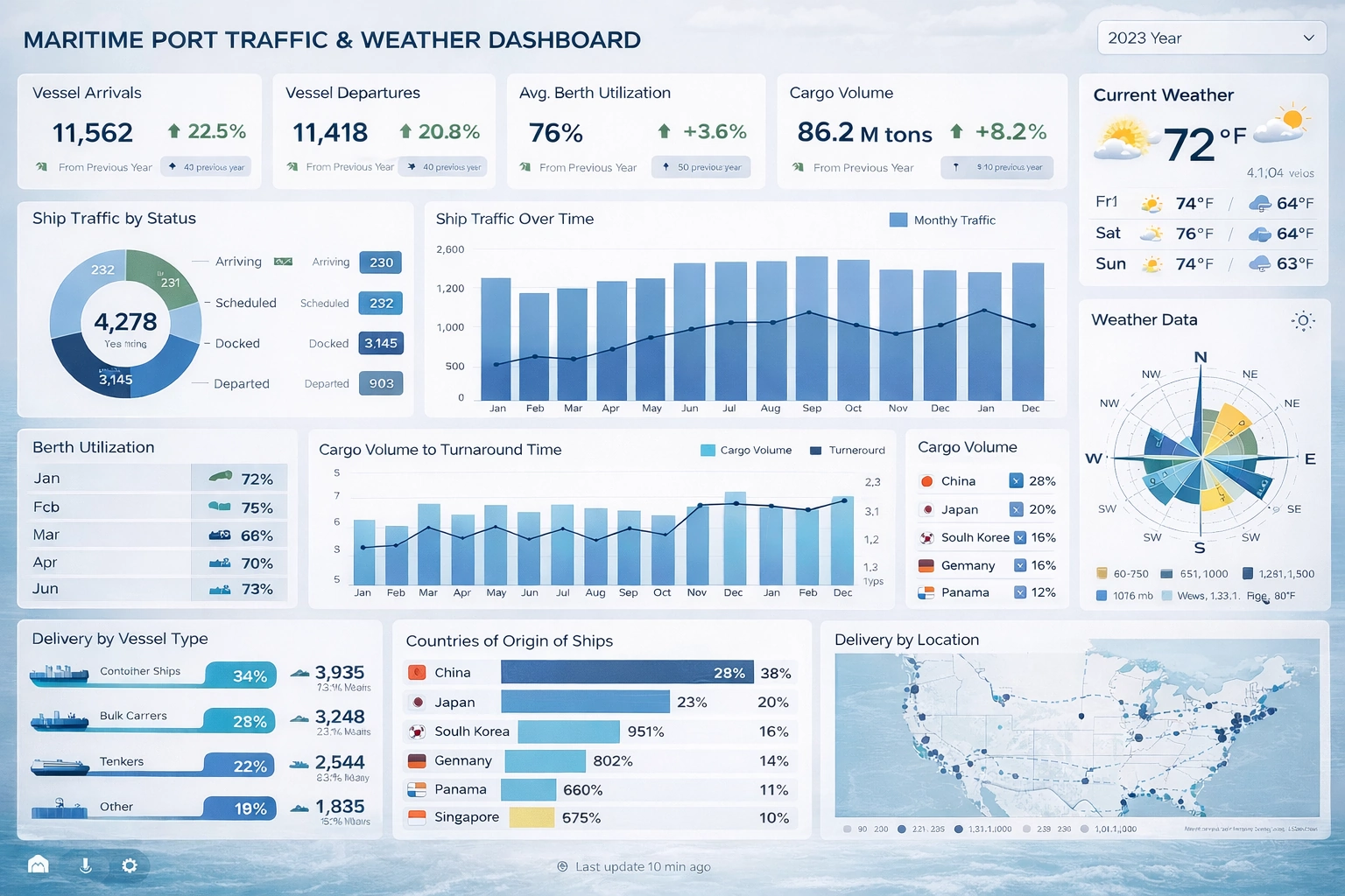
Maritime Port Traffic and Weather Dashboards - The Maritime Port Traffic and Weather Dashboard presents a comprehensive operational view of vessel activity, cargo movement, berth utilization, and environmental conditions within a single, unified interface. The dashboard integrates operational throughput data with live weather intelligence, reflecting the reality that port performance is deeply influenced by environmental conditions. The sections below break down traffic patterns, berth efficiency, cargo performance, vessel mix, and geographic origins to support both operational control and strategic planning. Across the top row, the dashboard highlights essential performance indicators. These include Vessel Arrivals, Vessel Departures, Average Berth Utilization, Cargo Volume, and Current Weather conditions. Presenting these indicators first establishes immediate situational awareness. For example, Vessel Arrivals and Vessel Departures offer insight into traffic balance. A sustained gap between arrivals and departures may indicate congestion risk or berthing inefficiencies...
Marketing Client Management Dashboard - Using the above dashboard as an example, you can more intuitively understand and feel the help InetSoft can provide in this area. Take this multidimensional fill chart, which shows the cost of converting leads through different marketing channels over the course of a year. The various colors represent different marketing channels to help viewers quickly assess which channels are becoming more cost-effective over time...
Marketing Dashboard Solution - Looking to monitor KPIs on marketing activities in real-time? InetSoft offers a small-footprint, full-featured BI platform that can be deployed on commodity servers. The single Web-based application provides a streamlined, intuitive interface for all users, business executives and database analysts...
Marketing Dashboard Tool for Hubspot - Looking for a good solution for Hubspot dashboard reporting? InetSoft's pioneering BI application produces great-looking cloud-based dashboards with an easy-to-use drag-and-drop designer. Mash up your marketing campaign data with other enterprise sources for a unified view of marketing performance. View a demo and try interactive examples...
Marketing Executive Dashboards - Great, thank you, and it's great to be here with today to talk about executive dashboards and how to measure marketing's performance and impact. One of the great things that I get to do as Chief Marketing Officer at Tableau is do a lot of marketing, which is fun, and look at a lot of data. So, it's really a pleasure to talk to you about marketing dashboards and why should we have marketing dashboards. Basically it really comes down to organization's needing to understand how they are progressing on their business goals, and so a good marketing executive dashboard will demonstrate that progress, or lack thereof, sometimes, and it will do it in a way that's factual, not necessarily based on opinion. Without data and without dashboards sometimes you get a lot of opinions floating around the office or your organization, and I'm sure many of you marketers would nod your heads in agreement. So, what is it that makes a good marketing dashboard? Well, there are a lot of qualities to a good dashboard. A few that I've highlighted here that I think are really important include things like it's being understandable. That's probably the most important thing, and it has to be understandable in a way that executives will respond to it...

Mapbox Integrations Dashboards - Next we'll go over some of the different charts and some of those enhancements that have happened for version 2022. The support for the new connections through either a Mapbox or Google Maps for use as the background when looking to do map based data presentation is something that I didn't hook up personally within my explicit design environment. So I'm going to be showcasing actually stuff on the website for you to be able to look out on gallery...
Maximizing Website Security with Monitoring Dashboards - In today's digital age, website security is a crucial component of any online business. Cyberattacks such as hacking, phishing, and malware can cause significant damage to a website's reputation, user trust, and revenue. As a result, many organizations are turning to monitoring dashboards to help maximize their website security. Monitoring dashboards provide real-time visibility into a website's security posture, enabling organizations to quickly identify and respond to security threats. In this article, we will explore how monitoring dashboards can be used to analyze key performance indicators (KPIs), interpret charts, and take action to improve website security. Furthermore, monitoring dashboards can provide insights into website performance and availability. By monitoring website uptime and response times, organizations can ensure that their website is always available to customers and that it is performing optimally. This can help to prevent issues such as slow page load times, which can lead to a poor user experience and potentially lost revenue. In addition to identifying security threats, monitoring dashboards can also track wildcard SSL certificate to ensure that they are up-to-date and correctly configured. This is important because SSL certificates provide a secure connection between a website and its users, and any vulnerabilities in the certificate can be exploited by cybercriminals. By using monitoring dashboards to track SSL certificate updates and configurations, organizations can proactively address potential vulnerabilities and ensure the security of their website and user data...
Media Monitoring Dashboards KPIs - It's essential to stay up to date on the public view of your business and its internet presence. Media monitoring has become a crucial discipline that aids businesses in extracting information from massive volumes of web data. Dashboards for media monitoring work as command centers by providing key performance indicators (KPIs) that provide useful information. This article examines the important KPIs found on media monitoring dashboards and their importance in determining the effect, sentiment, and visibility of a business. An important KPI is monitoring brand mentions across multiple media outlets. It illustrates how widely your brand is being spoken about online. This statistic takes into account the reach and quality of those mentions in addition to their number. Analyzing where and by whom your brand is being discussed may help you determine its general exposure...
Medical Field Dashboard Examples - A dashboard can be described as a business tool that is used to keep a check and track on Key Performance Index (KPI's), data, or other important, relevant points to business, process or a department. With the help of better and improved visualization, a dashboard helps people and businesses to understand complex information of current performances in a more straightforward manner. Critical Need for Dashboards in Healthcare Industries What we need to understand is the definition of business dashboards is different as it plays distinct roles in different industries. Because data dashboards are used for diverse purposes, therefore, the definition of each one differs. Let's talk about dashboards in a particular industry, the health sector, for example. There have been evident signs of digital revolutions taking place over the past few years in the health sector's usage of dashboards. Dashboards used in the health industry are known as 'healthcare dashboards' or 'clinical dashboards...
Merger and Acquisition Dashboards: KPIs and Advanced Analytics - Merger and acquisition activity is inherently complex, high stakes, and time sensitive. A well designed M&A dashboard does far more than summarize numbers. It becomes a strategic command center that helps partners, deal teams, analysts, and operating executives understand pipeline health, risk exposure, valuation trends, and post-close performance in real time. When built correctly, it transforms fragmented deal data into actionable intelligence. An effective M&A dashboard reflects the full lifecycle of a transaction: origination, qualification, diligence, negotiation, closing, and post-merger integration. Each stage generates its own set of key performance indicators, and each KPI serves a different strategic purpose. Together, they provide visibility into growth velocity, execution quality, and value creation...
Merging Dashboard Data - Users of InetSoft's award-winning dashboard software can merge dashboard data to create custom interactive reports across various industries. The Merge Join is a special type of join that creates no relationship between the two base tables. The base tables are simply merged into a single table by collecting their columns together and placing corresponding rows side by side. To create a merge join, follow these steps: 1. Select both tables by Ctrl-clicking on each table's title row. 2. Click the 'Join Table' button in the Worksheet toolbar, and select 'Merge Join'. A new merge-joined table is created. In the merge-joined table, the columns of the shorter table are padded with empty rows to match the length of the longer table. The number of columns in the final merge-joined table is the sum of the columns in the two base tables...
Merging Hierarchical Dashboard Data - Hierarchical dashboard data can be merged seamlessly to create custom interactive reports using InetSoft's award-winning dashboard software. The join type can be changed for all joined tables except for Merge-joins and Cross-joins. (Merge joins and cross joins do not define relationships between tables, so there is no relationship that can be changed.) To change the join type of a joined table, follow these steps: 1. If the joined table is in Editable view, switch the table to Hierarchical view. 2. Click the join connector link to select it. The selected link is highlighted in blue. 3. Right-click on the highlighted join connector link and select 'Join Properties' from the context menu. This opens up the 'Join Type' dialog box. 4. In the 'Join Type' dialog box, select the join columns from the drop-down menus for each table. 5. Select the join condition operator from the middle menu. The '=' operator produces the “equi-join.” The inequality operators produce their respective “non-equijoins.” 6. (Optional) To convert an equi-join to an outer join, select 'include all values' for the top or bottom table, or for both tables...

Metrics Dashboard and Scorecard Application - Are you looking for metrics dashboard and scorecard solutions? Since 1996 InetSoft has been making business software that is easy to deploy and easy to use. Build self-service oriented dashboards quickly. View a demo and read customer reviews...
Metrics to Monitor on Your SEO Dashboard - There are practically unlimited parameters you may monitor when gauging the effectiveness of your SEO strategy or performing an SEO audit. Here are the top nine SEO metrics and how to track them to assist you in focusing on the proper metrics, regardless of the nature of your organization. Key performance indicators for SEO are essential for a company that expands consistently. Let's begin with the most obvious. The traffic you receive from search engine results pages (SERPs) without having to pay for ad placement is known as organic traffic. Narrowing your emphasis to organic traffic demonstrates your website's presence in search for terms related to your business. Your overall traffic may come from a variety of sources (search engines, social networks, direct searches, and other sites). Therefore, if your SEO approach is effective, you should see a consistent increase in the number of visitors coming through search results...
Metrics for Recruiter Dashboards - A recruitment dashboard shows you how your recruitment funnel is doing through a visual compilation of data-driven analytics, reports, as well as key performance indicators (KPIs). Budget, campaigns, hires, and applications are all part of this data. Your company will be able to enhance sourcing to locate the best applicants for the roles you are hiring for, create innovative tactics and strategies, and lower recruitment expenses with the use of these analytics. Read on to learn which key metrics to visualize on a recruiting dashboard. Finding important indicators for recruiting and selection that can be used to gauge the effectiveness of the hiring process can be difficult for human resources professionals. The only way to enhance and optimize these internal processes, though, is through automation. Even a basic analysis can generate suggestions for enhancement to produce immediate effects. For instance, shortening the hiring process can improve financial results since the business loses money each day a position is open...
Microsoft's Team Dashboard App Alternative - Are you looking for a good alternative to Microsoft Team's dashboard app? InetSoft's pioneering dashboard reporting application produces great-looking web-based dashboards with an easy-to-use drag-and-drop designer. Mash up Team data with other data in your organization. Get cloud-flexibility for your deployment. Minimize costs with a small-footprint solution. Maximize self-service for all types of users. No dedicated BI developer required. View a demo and try interactive examples...
Mixed Dashboard Data - InetSoft's dashboard software provides users with the power to access mixed sources of data at the same time. The following expressions allow you to access any cell in a table by absolute reference. table[rowIx][colIx] data[rowIx][colIx] Simply set the rowIx and colIx indexes to specify the position of the desired cell. For example: • table[0][0]: Value in first row, first column. • table[2][4]: Value in third row, fifth column. The “table.length” property yields the total number of rows in the table. The data and table constructs yield the same results for tables, but may produce different results when used in crosstab tables. The data syntax references the data prior to any summarization, while the table syntax references the tabular data as displayed...
Mobile App Dashboarding Tool for 42matters - Looking for a good solution for 42matters dashboard reporting? Mashup your mobile app data with other enterprise data for a wider view of performance. InetSoft's pioneering BI application produces great-looking cloud-based dashboards with an easy-to-use drag-and-drop designer. View a demo and try interactive examples...

Mobile BI Dashboard Examples - More and more organizations demand mobile business intelligence tools. The buzz behind mobile business intelligence is the result of new technologies rising up to serve an old enterprise need – faster, richer, and more reliable information. Organizations that frequently monitor key performance indicators and quickly respond to changes in the market have always outperformed their slower, less informed counterparts...
monday.com Dashboard Solution - Looking for a good solution for monday.com dashboard reporting? Create more interactive views of your projects and increase team performance. InetSoft's pioneering BI application produces great-looking cloud-based dashboards with an easy-to-use drag-and-drop designer. View a demo and try interactive examples...
Modernizing PeopleSoft Dashboards - PeopleSoft has long been a reliable enterprise resource planning (ERP) solution for organizations managing human capital, finance, and campus operations. Its built-in reporting tools, such as Query Manager and nVision, have allowed administrators to generate lists, summaries, and basic dashboards for decades. However, as organizations increasingly demand real-time insights, cross-module analysis, and self-service capabilities, the limitations of PeopleSoft’s native dashboards become more apparent. For many, the question is no longer whether they need dashboards, but how to modernize them without replacing the entire ERP system. PeopleSoft’s delivered dashboards provide out-of-the-box visibility into key metrics, but they come with several constraints. For one, they are often static and inflexible. Query Manager reports require a predefined structure, and nVision dashboards, while powerful for financial reporting, are heavily grid-based and can be difficult to adapt for other operational needs. Customizations are possible, but they often require technical expertise and complex scripting, creating a bottleneck for business users who need timely insights...
Monitor Business Activity - InetSoft’s business intelligence software, StyleBI, can compile data and build interactive charts, informative graphs, and high-performance dashboard reports. Given these facts, company managers can then analyze and apply their knowledge to make proper decisions for the company. InetSoft's comprehensive reporting platform can be used to create over 30 chart styles including bar, pie, line, curve, radar, waterfall, speedometer, pareto, candle, stock, stick, and bubble. These charts can be customized to show targets, provide desired x/y-axis formats and intervals, and even to show multiple datasets.
Monitoring Dashboards for Amazon Aurora - Looking for a good solution for Amazon Aurora dashboard reporting? InetSoft's pioneering BI application produces great-looking cloud-based dashboards with an easy-to-use drag-and-drop designer. View a demo and try interactive examples...
Monitoring Dashboard Interface - From the monitoring dashboard interface, users can fully customize data using InetSoft's dashboard software. The 'Monitoring' node under the Server tab also allows you to configure the following options. The 'Monitoring Level' menu on the 'Settings' page determines which of the other pages are available. A setting of at least 'Low' is required: -Configure the granularity at which server activity is monitored. -View and manage executing, queued, and completed reports. -View and manage executing and open Viewsheets. View and manage executing queries. -View report and data cache usage. Requires 'Monitoring Level' set to 'High' on the 'Settings' page. -View server requests by component: Report, Viewsheet, Visual Composer, Ad Hoc. Requires 'Monitoring Level' set to 'High' on the 'Settings' page. -View and manage current user logins. Requires 'Monitoring Level' set to 'High' on the 'Settings' page. -View user and system errors. -View a variety of summary statistics related to memory, disk, CPU usage, top reports, and top users...
Monitoring the Dashboard Server - Administrators are easily able to monitor their dashboard's server with InetSoft's dashboard software- a powerful and flexible business intelligence platform that has shaped the course of business at nearly a quarter of all Fortune 500 companies. The servlet status can be 'Running' or 'Stopped', and is displayed on the 'Server' > 'Status' page (in the Server tab). The servlet can be started, stopped, or restarted using the 'Start', 'Stop' or 'Restart' buttons on the 'Servlet' page. Note that if a web based servlet is being used, it can only be restarted. Starting and stopping are not supported in this case. A License Key can be administered in the Enterprise Manager through the 'Server' > 'Status' page. A new license key can be added using the 'Add' button. Once the new license key is entered in the text box provided, it can be saved by clicking on the 'Apply' button. One or more of the registered license keys can be deleted by simply selecting the license key to be deleted and clicking on the 'Delete' button...
Monitoring ETL Processes Via a Dashboard - Another part of these ETL processes is monitoring them via a dashboard. Once you’ve loaded that data, you’re going to be doing data loads, you’re going to be loading new data into that on a recurring basis. Think of your ERP loading into a data warehouse. You have to monitor that data as well. So what that does is that it allows us to not only do the loading and correcting of data but also monitor over time as new data comes in, our new data quality problems and what’s the impact of those down the line? This lets us do is monitor those data quality issues more regularly and more proactively. Let’s take a look at monitoring some of these jobs over time. What I have here are four different data warehouses, and we’ve got some uploads going on. We want to see how those are behaving over time. So in my sales warehouse here, I’ve got a chart, and I’ll click on that. Open it up, and what it shows me is a high level overview. We’re uploading a customer master and a product master here, and there’s several rules we’ve defined based on our own business logic. We’ve grouped those into three major categories, whether that will affect the accuracy of the data, the conformity of that data, whether it conforms to our business rules or the integrity of that data. Now if I want to then drill down and understand how that trend is going over time, I can click on more when it loads. On the dashboard here, I can see that I have all my different custom rules on the right hand side...
Monthly Dashboard Examples - As your business grows, so does your need for monthly dashboards that will automate business monitoring and management. Better sales numbers, more salespeople, more clients and accounts to manage also means more products to ship and track, more employee information to file, and more variables to react to...
Most Intuitive Dashboards - InetSoft is in the business of producing the most intuitive dashboards available for your business needs. Not only are they easy to navigate, but they're also easy to develop. What sets InetSoft's StyleBI apart from the competition is the seemless drag-and-drop interface for data mashup, report formatting, and dashboard design...

MTTR and MTTA Dashboard KPIs - It is essential for organizations to track and evaluate their IT performance given the complexity and interconnection of the world today. Two crucial metrics that aid firms in assessing the effectiveness of their incident management procedures are mean time to resolve (MTTR) and mean time to acknowledge (MTTA). Businesses may learn a lot about their incident response and resolution capabilities by monitoring and analyzing key performance indicators (KPIs) and using analytics on an MTTR and MTTA dashboard. The different KPIs and metrics that are often utilized on an MTTR and MTTA dashboard will be discussed in this post. Average Time to Acknowledge: This KPI monitors the typical amount of time it takes for the support staff to acknowledge an event once it has been reported or identified. It demonstrates the organization's response to occurrences by demonstrating how promptly a problem is acknowledged...
Multiple Database Dashboard - InetSoft's award-winning dashboard software allows users to mine multiple databases simultaneously for data, leading to comprehensive and accessible reporting solutions. The test values of a filtering condition can be a SQL or a JavaScript expression. To filter a field in a data block based on an expression, follow these steps: 1. Open the Worksheet containing the data block you want to filter. 2. Click the 'Condition' button on the title bar of the data block you wish to filter. This opens the 'Condition' dialog box. 3. Select the field and the desired logical operator. 4. Click on the arrow button to choose 'Expression' from the menu. 5. Click the 'sql' or 'js' button at the left of the expression text field to choose the expression type. 6. Click on the 'Fx' button to launch the expression edit dialog and enter your expression. Expressions that use SQL syntax are processed by the database, while expressions that use JavaScript syntax are post-processed by the Worksheet. Because post-processing is CPU-intensive for the query engine, and may additionally cause retrieval of a large amounts of raw data, it is preferable to use SQL syntax when possible. Note, however, that SQL functions are database-specific and vary from one database to another...
Multi-tenant Dashboard Reporting - In certain deployment scenarios, you may need to provide different groups of users (i.e., “tenants”) with access to different sets of data. This is called a multi-tenant environment. For example, if you are serving user groups from different departments or organizations, you may need to give each tenant access to data stored in a unique database or schema (different login permissions, etc.). To facilitate design of a multi-tenant environment, StyleBI allows you to define independent data connections for each tenant. Each tenant can access only the unique connections for which they have privileges. Additionally, you can define a common set of data that is accessible to all tenants. The steps below guide you through the process of configuring StyleBI for multi-tenancy. 1. Add database connections to your Data Source. Each connection may access a different database or schema that is specific to a particular tenant. See Adding Additional Connections in the Data Modeler for complete information. 2. Extend a common Physical View by incorporating database tables/columns from a tenant-specific connection. The extended physical view will provide the common tables/columns as well as tables/columns that are specific to the particular tenant. See Extending a Physical View in the Data Modeler for complete information...
MySQL Dashboarding Tool with Drilldown - Looking for a good MySQL reporting tool with drilldown capabilities? InetSoft's pioneering dashboard reporting application produces great-looking web-based reports and dashboards with an easy-to-use drag-and-drop designer. View a demo and try interactive examples...
Need to Know About Executive Dashboards? - Data may be seen in real time in a wide variety of ways. Executives find it simpler to conduct analyses and come to choices when data is accessible in a single location. In this post, we'll define an executive dashboard and discuss the advantages of using it for reporting. We'll also provide advice on how to create your own executive dashboard while maximizing its benefits. How do executive dashboards work? Executive dashboards are personalized user interfaces that provide your company's data graphically and in an orderly fashion. You may gather data using executive dashboards to monitor team objectives, make adjustments, spot patterns, forecast outcomes, and more. Your executive dashboards promote strategic decision-making by showing the most important facts for your business in real time, eliminating the need for further, pointless research...
New Dashboard Software - InetSoft's StyleBI software offers an easy-to-deploy, and even easier-to-use, BI platform at a lower cost. Designed with accessibility in mind, businesses can easily adopt this solution. StyleBI is easy, agile, and robust, enabling high-level reporting and dashboarding at all employee levels...

Need Third Party Dashboard Software? - Looking for good third party dashboard software? InetSoft, a pioneer in self-service oriented dashboard software integrates with almost any application. View a demo and try interactive examples...
New Dashboard Scheduler Options - Now, there are some minor features that we haven't necessarily made note of yet. The scheduler it -- when you're doing the ability to save to server in terms of an action with a scheduled task. The new scheduler options will include ability to restrict the server locations available for that action and the ability to automatically append a parameterized suffix to the file names for such actions. That's a really great enhancement for those that are looking to leverage that feature. That is a great feature to have in mind and keep available. When you are doing dashboard design, or even ad hoc design of dashboards, normally for the charts you can do a right click, right? Right click condition, right click properties, etc. We've now introduced a dot, dot, dot menu where you can also have those same right click options, so then you get a single left click to be able to enter into that. As I mentioned before, it's something that you can also see in the user portal...
Next Point for Great Dashboard Design - And this is a good segue to next point for great dashboard design. You want to make every pixel count. You don't want to waste attention on something that is not important. Like the title of your dashboard, bright background colors, or big lines. The difficult problem is often what you need to get rid of and not what you need to add to your dashboard. So that's where really you can make your dashboard effective. A great way to achieve that is by applying the data-ink-ratio. That's another rule by Tufte, which is saying that the ink you use on your dashboard to present data divided by the total ink that you use on your graphics will help your dashboard to be more data centric. So you want to have a higher number, and that's where your design is more effective. So let's take a look at an example that explains that rule. So here's a loaded ink ratio chart, and I am going apply a few changes to it to make it a high data ink ratio chart. So first I am going to remove the background, and then I would remove the frames. Only change to a single color, remove the effects, remove the gridlines, reduce the font width...
Nicereply Dashboard Solution - Looking for a good solution for Nicereply dashboard reporting? InetSoft's pioneering BI application produces great-looking dashboards that mashup customer satisfaction scores data with other data sources in your organization. Maximize self-service for business users and technical staff. View a demo and try interactive examples...
NOC Dashboard Software - Are you looking for a good solution for NOC dashboards? InetSoft's pioneering dashboard application produces great-looking dashboards that cover the entirety of your network activity and performance. View a demo and try interactive examples. Get cloud-flexibility for your deployment. Minimize costs with a small-footprint solution. Maximize self-service for all types of users. No dedicated BI developer required. View a demo and try interactive examples...
Not Free Linux Dashboard Software - Are you looking for Linux dashboard software that is easy to deploy? InetSoft's pioneering dashboard reporting application produces great-looking web-based dashboards with an easy-to-use drag-and-drop designer. Get cloud-flexibility for your deployment. Minimize costs with a Java-based small-footprint solution. Maximize self-service for all types of users. No dedicated BI developer required. View a demo and try interactive examples...