InetSoft Webinar: Dashboard Running on the iPad
This is of the continuation of the transcript of a Webinar hosted by InetSoft on the topic of "How to Use Your Business Intelligence As a Competitive Edge". The speaker is Mark Flaherty, CMO at InetSoft.
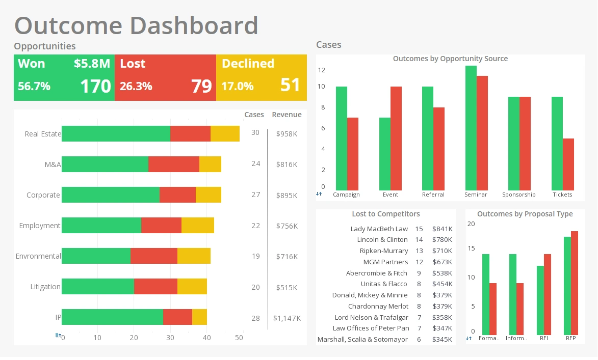
Let’s look at an example in order to visualize what we mean by taking that raw data and actually putting it into a format the end users could see What I have open here is my iPad, and this is an InetSoft StyleBI dashboard running on the iPad. You might have seen example dashboard already, and it’s a really great way to take your data, visualize that and manipulate that data, but I’m going to show you something that you might not know. What I’m going to do is click on this dashboard here, and what it’s going to show me is my data, but it’s going to show me my data sorted by distance from my current location.
The reason it can do this is on the backend data services generated the geocodes for me for all my different franchises. The idea here is that I can get off the plane, and then say ok, well I’m in this location, show me all my franchises within a certain distance from me. At that point I can click on one of those local franchises, open that up and then I’m back to my standard explorer interface where I can then go and manipulate that. So what I’ll do now is I’ll show you how this actually looks on the backend, what this actually looks like on the data services side. So I’m just going to switch over to my data services.
And this is the job that is is actually used to create that job there. And what we’re doing here is we’re taking two files, we’re combining them together so it’s a bit of an ETL process. This transformation actually cleanses those addresses there as if they were real and then generates geocodes for them. Now let’s step back for a second and actually talk about some of the backend data information challenges that most organizations face, especially when they try to move beyond reporting and empower their end users.
In this slide here you can see how the data landscape of a typical company might look like. You have all these different repositories of data. You have your CRM data. You have Web site data. You might have some data warehousing or a budgeting system. With a simple reporting tool like Crystal Reports, it’s pretty easy to create a report from one of these systems and get information out of it. But what if you’re sending something to your executive, and he wants to understand how the whole organization is working? So that’s what we mean when we say delivering data for cross functional types of analysis.
You may want to see how your marketing spend is impacting orders in your ERP or how different customers in your CRM are affecting all different processes coming out of the ERP. It’s a little bit harder to do that and when you’re bringing that data together do you have a solid process for addressing data redundancy or inconsistency or data error? And do you have the ability to really easily migrate that data to support new applications and implementations. A lot of time information overload isn’t so much about having too much information, as it is about having too much unusable data or having it kept in silos.
Really the solution is to take that wealth of missing data and make it usable. Take all that siloed data across organization and make it possible to put some frontend dashboarding tools on top of this well structured data so that we can focus on analyzing the data rather than getting it shoehorned into a particular report So the first part or big part of empowering business users actually starts with combining and structuring the data in the right way. It starts with the transforming data, but that transformation is really going to include a cleansing process as well.
This is all just combined as separate processors, so they previously have processed the data into a single unified interface. So what good are the reports and charts if you can’t really trust the data here? Data services can provide results, can transform addresses can check them against a list of valid addresses, and correct the addresses. Some times people use false addresses. People want to correct for that in order to reduce returned mail. They also use that to detect fraud. If someone enters a false address, you can detect that. We can come in and remove duplicate records. So for example maybe a product is in there in centimeters and inches, we can detect that, find out if that’s the same product, merge that record together, reduce the information in the database.
Another example is if someone has registered as Bill or William, that’s really the same person. We can detect that and determine that’s the same record. And then as we saw, you can generate missing information such as the geocode information to get some additional analysis of the data you already have. One your address data has gone through a solid cleansing process, you will actually reduce your mailing costs Not only can a data services solutions bring data from multiple data silos like you showed in the previous slide, but it has built in transformations that easily correct addresses or identify duplicates or fill in missing information so that data that you do have becomes something that is truly usable. Now is this data quality processed that we’re talking about, is it a one time affair, is it something you have to monitor over time, what’s involved?


